- Art Essentials Artists Brush Pen set of 50 Pieces
- Staedtler Double-Ended Watercolour Brush Pen Wallets
- Pentel Colour Brush Pen
A guide to painting outdoors, where do I start?
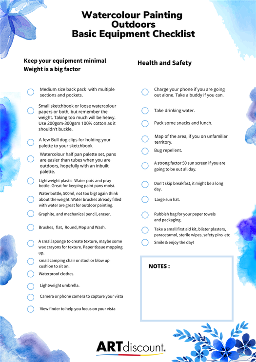
Once you have decided on a location, start by making small studies in your sketchbook. This is less daunting than jumping straight into a painting. Work quickly and freely. Remember that preliminary studies are supposed to be ideas, not hyper realistic or labor intensive. Organic and quick working studies are great. Add annotations whilst sketching, commenting on value or tone or what kind of colours you can see, how they move from cool to warm or vice versa, where the light direction is coming from and so on. Noticing these elements will help you create the mood, atmosphere and a sense of place.
- Once you have made a few quick preliminary studies of your surroundings and are set up with your paints, you could lightly plan out your composition on your chosen surface. If using paper, aim to use 100% cotton and between 200gsm to 300gsm, this paper shouldn’t buckle too much under heavy water applications.
- Don’t try to put everything in your painting. Be selective, look through a viewfinder or your camera. Determine what will be your focus, and where your horizon line will be. Place your horizon line in your composition first, you can do this with some masking tape so you have a crisp line that separates the sky from the land.
- Try not to be too heavy if using a soft graphite pencil when you are drafting out, too much graphite will make things muddy. As an alternative to a soft pencil, a mechanical or automatic pencil will allow you to create a very thin lightweight line which is also less dusty. Water Soluble graphite pencils are also very useful along with coloured watercolour pencils, watercolour sticks or watercolour pens to plot out shapes and structural lines. These are all water soluble so will bleed and blend together with the watercolour paint washes. Just remember not to apply them with a heavy hand, keep a very light touch..
- Once you have drawn your foundation composition lightly, you can paint your sky in and once it has dried, remove the masking tape and continue painting in the larger shapes above and below.
- Alternatively, rather than making a linear plan, you could squint your eyes and try to see the dark and light values, and paint these shapes in without laying too much paint on your paper. With watercolours it is easier if you work light to dark and build up your tones in layers rather than go straight in with really dark pigments that cannot be lifted out. Use a short flat bush or a large round brush or a mop brush to help you cover larger areas, or use their smaller counterparts if working smaller.
- Remember to use the white of the paper, to represent the whitest and lightest part of your composition. Keep your paints well diluted at first. You can use masking fluid on some small parts of the composition to retain bright white highlights before you start to paint in the colours. Areas to consider within your image would be small dots and dashes on large areas of water, reflecting the shimmering light, small dots of light touching leaves, branches or petals, or tall masts on ships, or light reflected on glass windows. The edges of roof tops or buildings. The masking fluid will need to dry completely before you begin to use your watercolour paints over them. This doesn’t take long.

What Colours should I use?
If you are a complete beginner and are unfamiliar with watercolours, a limited palette of colours could help you gain confidence. Working in nature some of the palettes can be a combination of muted greens, blues, purples and browns in autumn, and the same scene could be vibrant and vivid colours in summer! Because all landscapes are not the same in colour palette, it can get somewhat confusing as to what primary, reds, blues and yellows to choose from! Here are some examples of palettes below to help you, but really experimentation is the key with these palettes and the more you experiment the more you will develop your own personal preferences and style. The compact watercolour sets are very useful for plein air painting as they have an array of colours to use, however you can buy empty half pan tins and custom your own half pan watercolour palettes and create the one just for the right occasion and setting.

For a spring woodland consider – cadmium red, yellow ochre, lemon yellow, alizarin crimson, phthalocyanine blue, cobalt blue and raw umber.
Autumn trees consider – cadmium yellow, burnt sienna, alizarin crimson, cobalt blue sepia, violet.
Woodland waterfall consider using – cadmium lemon, phthalocyanine green, payne’s grey, burnt sienna, phthalocyanine blue and alizarin crimson.
Clouds at sunset consider using – cobalt blue, cerulean blue, cadmium yellow, cadmium red, alizarin crimson and ultramarine violet.
Beaches and harbours consider using – cadmium orange, naples yellow, phthalocyanine blue, cerulean blue, permanent rose, raw sienna, ultramarine blue, burnt umber, cadmium red, burnt sienna, and a light red.
Lakes and trees, consider using – alizarin crimson, naples yellow, phthalocyanine blue, phthalocyanine green, burnt sienna, french ultramarine, Payne’s grey and quinacridone magenta.
Summer and late spring flower garden, consider using – cerulean blue, opera pink, rose, linden green, dark olive, olive green, cobalt blue, cadmium yellow, Naples yellow burnt sienna, vermillion, alizarin crimson and payne’s grey.
Craggy, moody mountains, consider using – ultramarine blue, burnt sienna, cobalt blue, phthalocyanine blue, alizarin crimson, raw umber and yellow ochre.
Vivid turquoise Oceans, consider using – ultramarine blue, phthalocyanine blue and green, payne’s grey, cerulean blue, cobalt, viridian, prussian blue, alizarin crimson and yellow ochre gamboge yellow.

Atmospheric perspective
- Even though watercolours dry lighter, don’t be too tempted to lay dark colours on too thickly. Work in layers building up your tones. If you have put too much pigment down and need to lighten your work, you can pull some pigment out with a wet clean brush and tissue.
- To create a flat blue sky start by wetting the surface first then starting at the top left hand corner with a large wash brush, work across to the other side without stopping. Work quickly and continue down the paper.
- For a gradated sky start off the same with a loaded wash brush of pigment, work pigment across from one side to the other side of the paper, but instead of laying down more colour, dip your brush in water to dilute the pigment already on your brush, dab off a little excess water, this next layer will be lighter in colour. Continue to dilute and dab off excess water and lay diluted pigment until you reach your horizon line, and you should achieve a seamless finish.
- The fall of directional light and the time of day will alter your colours aslo, so work quickly if you can. Dusk can be stronger and more intense l colours, while sunrise can be cooler and brighter colours. However this isn’t set in stone.
- Colours become grayer and cooler the further away they are.
- Colours in the foreground will be stronger and more vibrant.Wet-on-wet techniques work well for atmospheric perspective as they blend and bleed together.
- Keep standing back and resting and evaluating your colours, tones and mark making, keep adjusting until there is parity of marks, tones and textures across the canvas..

Painting Guide: Florals

Here’s a step-by-step guide on painting Poppies with watercolor. First step is to prepare your materials: Printed line art on Arches Watercolor Paper, LifeAfterBreakfast Handmade Watercolors, Paint brush, Water in a cup, and Tissue.

We’ll color one petal at a time and create a gradient on each petal. You’ll want to create shadows, midtones, and highlights–at least 3 value levels on each petal. Wet your brush and swirl the brush tip around the pigment. Apply a creamy mixture of pigment onto the paper. Apply pigment only on 1/3 of the petal.

Dilute the edge with water, and fill in the rest of the petal with water. Make sure you move slowly with the brush on the edge of the petals, so you get nice, crisp edges.

You can apply more creamy pigment on the dark area to deepen the shadows. You can also apply a secondary color (orange) onto a little part of the midtone area.

Skip petals to let each gradient dry. Don’t paint next to wet areas so that the pigments don’t flow out of the shape. Apply pigment on the shadow areas: areas of the petal that are close to the base/tip, and areas that have petals overlapping above it.

Dab your brush in tissue to clean it, right before getting water for your gradient. This will create cleaner and brighter highlights.

On your mixing plate, get creamy mixtures of yellow, magenta, and blue. Mix these evenly until you get a dark gray color.


Use the dark gray pigment to color the center of the flower, and to darken areas. Continue coloring the each petal, and then mix a green hue (yellow + blue) to paint the stem and leaves. Using the tip of the brush, and a very dry mixture, outline some creases on the flower.
TAGS: paintingguide
Share this Post
You May Also Like.
January 9, 2018
September 1, 2014
April 15, 2016
March 20, 2012
Painting Guide: Succulents
Painting Guide: Mushroom


Patterned paper is . Designed 5 new patterns for gift wrappers: Tagetes, Gumamela, Blue Ternate, Guava, and Malunggay. And they come as a book with tear-out pages! Each folded sheet opens up to 20×28″, 105gsm matte finish, and there are 10 sheets in each book! Oh, and stickers. The book comes with a page of sticker gift tags! ️ The Gift Wrapper Book is part of the At Your Own Pace paper collection, a special collaboration between @lifeafterbreakfastph & @ifexph. Printed in the Philippines by @primex_printers on Heidelberg carbon-neutral press, using papers manufactured sustainably from well-managed forests. These are now available at the webshop for ₱349 each. Visit lifeafterbreakfast.ph/shop to order! #LABxIFEX