Explore the best white paint colors for your home, get tips on warm and cool white hues, and more.
13 Best Colors That Go With White
Oh yes, affiliate links may be sprinkled throughout the awesome, free article you see below. We’ll receive a small commission when you purchase from our links (at no extra cost to you). For the full scoop of what this means, please read our affiliate disclosure.
Are you decorating with white and want more color inspiration? Here’s a list of colors that go with white.
In color psychology, white is a color that represents peace, purity, and cleanliness. It brings clarity and calms down.
In decor, white can go with any color on the color wheel not only because it is considered a neutral color but because it reflects all wavelengths of light.
This makes white a versatile color that you can use with a wide range of colors (including your favorite ones) to achieve the right vibes in each room.
Wondering what colors go well with white? Let’s find out!
13 Colors That Go With White
Here are our favorite colors that go with white.
1. Black

These opposite and gorgeous colors create unique designs when paired together. Black evokes sophistication and traps space, while the color white evokes innocence and open space.
This color combination is timeless and elegant yet clean, crisp, and contemporary. It delivers a powerful message.
You can use black and white in your living room to accentuate the contrast between the two colors, like pairing a beautiful white leather couch with black and white striped or floral curtains.
Or paint your door frames lighter shades of black, which will look amazing against the white walls.
2. Silver
Silver brings glamour to a white bedroom and evokes the feeling of luxury, wealth, and success.
It creates a sense of relaxation and is easy on the eye. Add metallic silver cushions and a silver and white throw to white linen bedding.
Or cover the wall behind the bed with rich, ornate silver wallpaper. Add a magnificent chandelier for extra bling, and you have a beautiful regal bedroom.
Continue with this color palette in the ensuite bathroom. Beautiful silver mosaic tiles showcase a lovely white bath, basin, and toilet.
Lay a black shaggy rug on the white floor for a dramatic touch.
3. Light Blue
The color blue symbolizes peace, calm, serenity, and sensitivity.
The white and blue color combination creates a clean and relaxing feeling and is ideal for a bedroom. It is also a popular color choice for a bathroom.
White cabinets, tiles, flooring, bath, toilet, and basin will look lovely against soft, muted blue patterned wallpaper.
Add some blue towels and a rug in a darker shade of blue. Add some pretty yellow flowers or a yellow ornament for an extra splash of color and happy thoughts.
4. Red

Red represents energy and passion. It is the most dynamic and warmest color but is also associated with anger and danger.
Red increases your heart rate and makes you excited. Because red is such a bold color, it must be used with caution so as not to overwhelm the room.
You can use something other than the brightest red but rather paint an accent wall a more subtle and toned-down shade.
Keep the furniture mainly white but accessorize with red and white patterned fabric in cushions or drapes. Add touches of black or navy blue for extra depth and pops of color.
5. Green
Green is associated with nature, abundance, and refreshment, representing growth, harmony, and new beginnings.
White is the perfect color to match green, adding contrast and clean lines to the décor. This ideal combination is for a crisp, clean, and fresh kitchen.
You can paint the kitchen walls a gorgeous candy apple green. It will look delightful against white cupboards and a white floor.
Add splashes of different hues of green in ornaments and tea towels for more depth. Hang soft white sheer curtains for a smooth and pristine look.
6. Yellow
Both white and yellow are bright colors that can lighten a room’s atmosphere and look cheerful in a space with a lot of natural light.
Yellow is a vibrant and warm color that makes you happy and content. It is associated with laughter, sunshine, and hope.
When paired with white, it gives a clean and fresh vibe and will never be dull or washed out. Wherever you use yellow and white, the mood will feel energized.
You can choose yellow and white for a bedroom, dining room, kitchen, and lounge area.
Add primarily white furniture and brighten it up with soft yellow walls and yellow accessories. Or vice versa, using yellow as the primary color and painting the walls white.
7. Pink

Pink is the color of femininity, love, and kindness. When paired with white in a room, pink creates a feeling of crisp freshness and is warm and inviting.
If you’re looking for a sense of comfort and calm, go for a pink and white color scheme. Pink and white can be used in living rooms, kitchens, and bedrooms.
This pink combination can look chic when used in accessories or soft pink walls. Or, if you want bold, go with a pink sofa or pink floral wallpaper.
There are many shades of pink, from a barely there pink to dusky pink or a splash of bright pink. All these hues bring joy and warmth to the room.
8. Orange
Orange is the color of joy, creativity, warmth, expression, and success. It is a perfect color for a space with social interaction, such as a kitchen.
It can also be used in an entertainment area such as a dining or living room.
The vibrancy of orange, when paired with the neutral color of white to calm it down, will create a happy and youthful ambiance.
The softer or paler colors of orange, such as salmon, peach, or apricot, can be used in a bedroom.
9. Purple

Purple, the color of luxury and royalty, awakens the senses creating a harmonious balance of awareness and peace.
Purple is an optimistic and deep color and will work well in a living room, bedroom, kitchen, and bathroom.
White always blends well with purple, and the mixture will bring serenity and calm, which is ideal for the bedroom.
You can choose beautiful white and purple wallpaper for the wall against the bed. Add white linen to the bed and accessorize with purple pillows and a throw.
10. Navy Blue
The beautiful navy blue is a bold choice that brings an ambiance of elegant sophistication.
When navy is paired with white, it brings a freshness to the room. You can use this combination in bedrooms, living rooms, and bathrooms.
For the living room, be bold and paint the walls navy, which will look amazing with a gorgeous white sectional.
Add patterned navy and shades of blue to pillows, throws, and carpets. Hang beautifully patterned or solid white drapes against the windows.
11. Brown
Brown is an earthy color that signifies maturity and stability. Furniture in all shades of brown pairs well with the crispness of white.
Brown and white give the room a clean contrast that will work well in a formal dining or living room. They are also favorite colors for bedrooms.
A deep brown wood dining room table and chairs will look lovely in a room with white walls.
Choose beautiful brocade fabric in white and brown for the chair upholstery. Lay a crisp white linen runner edged with lace on the table to enhance the beauty of the wood.
12. Beige
Pairing white with beige is an excellent way to introduce soft, neutral colors into your home.
Both colors are popular choices for creating a tranquil living space. To create depth, scatter the accent color through the room, and use different shades of white.
White and beige work well in a living room, hallway, or bathroom to create a clean and minimalist look.
If you have beige walls, incorporate white artwork or decorative pieces, such as vases and frames—the stark contrast between them is stunning.
Adding fresh white flowers will also add a finishing touch to the beige and white color palette.
13. Royal Blue
White, as a neutral color, goes well with royal blue. The crisp, cool contrast between these two colors can lend to a modern look or a comfortable, coastal feeling.
For rooms to be light-filled and look more spacious, use white furniture and curtains in lighter shades. Introduce royal blue with cushions, standing light shades, and patterned fabrics.
To compensate for the cooler white and royal blue, you can use a warm white shade like off-white, cream, or ivory on the walls.
Final Thoughts On Colors That Go With White
Whether you have a white room and want to add a pop of color or understand the emotions white evokes with specific colors, this article has many excellent color suggestions to help you decorate your home.
Now, off to create your own white color palette!
Did you enjoy reading about the colors that match white? Then share this article on your social media!
Posted on Last updated: January 9, 2023
Hey there!
I’m so glad you’re here! My name is Bruna, and I’m the creative soul behind Colors Explained. My goal is to simplify and discuss all things colors. From color theory to psychological effects, I want to bring information to you in an easy-to-follow and interesting way. Stick around and join me on this epic journey through colors and emotions.
Expert Tips for Choosing the Best White Paint for Every Space in Your Home

Choosing the right white paint is no simple black-and-white matter. We talked to paint and interior design experts to help you choose the best white paint for your home.
If you think white paint is a “seen one, seen ’em all” kind of matter, then you clearly haven’t seen the dizzying array of white paint colors available at the paint store. That includes the many different colors of interior paint and exterior paint, not to mention the finishes you can choose from. Those effectively multiply your number of white paint choices, because one shade of white may work for your living room in satin but not in eggshell, while another may sparkle in semi-gloss but fall flat in matte finish.
Because there are dozens of different shades of white paint that, if used wrong, can wreak havoc on the aesthetics of a space, we turned to the experts to help you find the best white paint colors and to help you decide which rooms can benefit from all white walls; when white paint should be reserved for trim, moldings, and doors; and when you should call in the experts to help you choose between a creamy white and a clean white.
In fact, before talking about choosing a shade of white, let’s address when and when not to use it at all.
When is white paint a good idea?
Before you think about finding the right shade of white paint for a room, you need to think of the room itself. Deirdre McGettrick, home expert and cofounder and CEO of ufurnish.com says: “If you are considering painting a room in your home white, there are a couple of things you need to consider before you choose the right shade. Firstly, you need to think about the position of the room and the light that it is going to get. Generally, a north-facing room will get less light, so the room will appear cooler, whereas a south-facing room will normally get a lot of light for the majority of the day, making the room appear much warmer. Because of this, you want to figure out how you want the room to feel.”
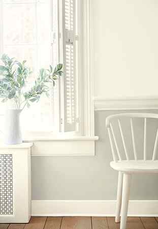
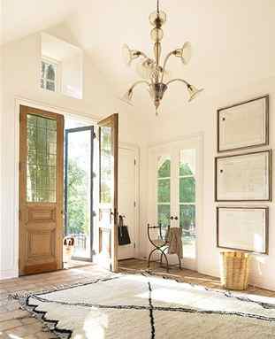
Consider the other colors that will fill the space.
Photo: Laure Joliet
Though the perfect white paint color might look great in your dining room when it’s empty, think about what the space will look like when it is full. “The second thing you need to consider is your furniture and furnishings. What are you putting in this room?” McGettrick adds. “What color woods, fabrics, and soft furnishings? These will all influence the shade of white you should choose.”
Got that? Lots of natural light means a warm room, so more of a cool white may be merited. Less sunlight means a room with a cooler feel, so, per McGettrick, a “warmer-toned white” may be a good idea. And opting for a color instead of white may even be a better idea in cooler-light spaces.
Lane Ball, director of marketing at Zibra, says “Although white is likely the most popular color for painting an interior room, it can be one of the most challenging in arriving at the right shade for your space. A few things to consider when embarking on this decision is the mood of the room you are seeking to create, the lighting of the room—natural and artificial—and the sheen.”
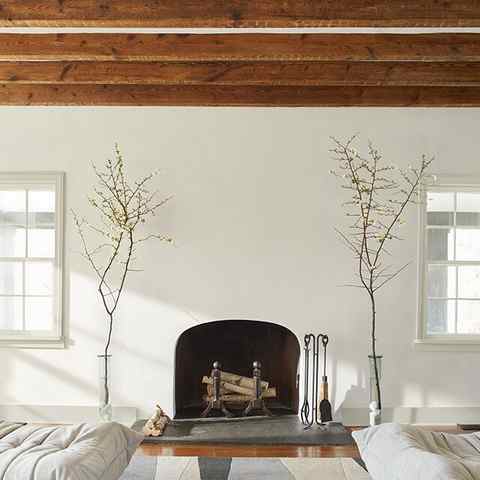
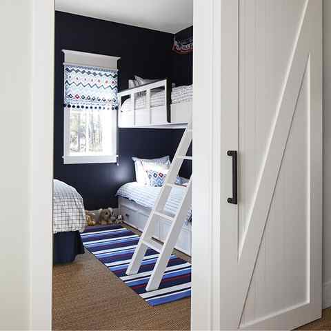
Natural light can affect the appearance of the shade of white you choose.
Photo: Laura Resen
Most Popular
Architecture + Design
This Colorful Notting Hill Home Received an Elaborate Refresh in Just 12 Months
By Kathleen Hackett
Travel
The 38 Most Haunted Places in the World
By Mitchell Gilburne
Architecture + Design
Was Egypt’s Great Sphinx Actually Formed by Erosion?
By Katherine McLaughlin
Playing it safe, a bright shade of white paint is a good wall color choice for hallways, stairways, basements, bathrooms, and other spaces that don’t get as much natural light, and white almost always works for doors and trim, even when the walls may be dark or color-rich. If you’re choosing white paint not merely based on the logistics of lighting or the space in the home—which is to say you’re treating white paint as a true color, not just as an achromatic pigmented liquid—then we have to go deeper than describing it as warm or cold.
How to choose the right color of white paint
When considering a shade of white paint, design, and color expert Donald Kaufman advises you to do just that: Think about a shade on its own merits. “The first mistake to avoid is getting caught up on the name of the color or holding the whites against other colors,” Kaufman says. Think about how the white paint will look in the space and when contrasted with the furniture, flooring, artwork, and other objects and surfaces in the room; don’t think about Chantilly Lace compared to Swiss Coffee compared to Alabaster and so on, in other words.
Instead of comparing apples to apples like that, pick a few colors of white paint that you like of their own accord, giving them as much consideration as you would a shade of dark navy blue, soft dusty rose, or a dramatic burnt sienna, and then bring those colors into the space, first in the form of a paint swatch, and then with an actual painted patch. And don’t worry, you don’t need to paint the walls.
“Remember that any accent colors you currently have in your room and the warm natural lighting from windows can change white dramatically,” Ball says. “Because of these variables, we recommend grabbing a large sheet of sturdy illustration board or foam board minimally 3/8″ thick and painting each of your paint selections on the full test boards. Make sure you paint with the appropriate sheen. Once your test boards are dry, position them throughout the room at different times of the day. This will give you the most accurate representation without having to paint your walls.”
Q. What is the most neutral white paint color?
A. If you are looking for our most neutral white paint color, consider Chantilly Lace OC-65. This neutral white is a classic go-to white hue that elicits images of fresh cotton and pure silk.
A. The most popular Benjamin Moore white paint color is White Dove OC-17, a clean and classic white hue. White Dove is also our most sampled paint color.
Favorites Chantilly Lace OC-65 and Swiss Coffee OC-45 are close behind as most popular Benjamin Moore white paint colors. You’ll find these three favorite white hues and many more in the Benjamin Moore Off White Collection.
Q. What shade of white is best for walls?
A. The best white paint for interior walls depends on many factors, from décor to lighting in a space. Three favorites include Chantilly Lace OC-65 and Decorator’s White OC-149—both cooler whites, and Simply White OC-117, a former Benjamin Moore Color of the Year, which leans warmer in tone.
A. Shades of white are typically divided into either “warm” or “cool” categories. Warm white hues include red, orange and yellow undertones. Cool white hues include green, blue and violet undertones.
When designing your space, consider that red, yellow and neutral home accessories will harmonize with warmer white paint colors. Green, blue and cool gray furnishings and fabrics synch with cooler white paint colors.
Q. What are warm white paint colors?
A. Warm white paint colors have red, orange and yellow undertones, evoking a soft glow and welcoming energy. Popular warm white hues include White Opulence OC-69 and Pink Damask OC-72 (red undertones), Pompeii OC-82 and Onyx White OC-74 (orange undertones), and Mayonnaise OC-85, and Acadia White OC-38 (yellow undertones).
A. Cool white paint colors have undertones of green, blue, and violet. Cool whites evoke a crisp, clean, fresh look. Favorite cool white paint colors include Minced Onion OC-128 and Meadow Mist OC-134 (green undertones), Distant Gray OC-68 and White Ice OC-58 (blue undertones) and Mirage White 2116-70, and Calm OC-22 (violet undertones).