We Compare Six Popular Oil Paint Colors Across Brands
Analyze differences in paint colors among brands

We Compare Six Popular Oil Paint Colors Across Brands
I t is not known exactly when oil paint was first developed, but the oldest known oil paintings were found in 2008 in a cave in Afghanistan and are estimated to date from 650 A.D. In Europe, oil paint was used initially as a decorative medium, and was not widely adopted for artistic purposes until the 15th century. The earliest painters could not just pop down to the local art supply store when they needed paint. They had to buy the raw pigments and laboriously grind them down into extremely fine powders. Then they had to obtain, or make, the binders and oils with which to mix the powdered pigment so that it would become a usable liquid paint. They also had to make paint dryers, and thinners of some sort to thin the viscous paint and clean up. In essence, they had to be chemists in order to have any colors with which to paint. It might take days or weeks just to prepare the materials before they even got started with the fun part. These were very determined people!
Until the portrait painter John Goffe Rand invented the collapsible paint tube in 1841, artists mixed their pigments and binders together and put them in pig bladders or glass vials if they wanted to take them outside the studio. This invention kick started the modern revolution in premixed and packaged paint specifically for artists. Another important advance was the acceptance, and loose standardization of commonly used names for premixed paint pigments, such as Cerulean Blue. We say loose, because even today, paint formulas are not completely consistent, although the name of the color or pigment used on the label may seem to be. As paint manufacturers innovate and improve on paint formulas – lowering toxicity and increasing lightfastness, etc., these improvements can lead to changes in paint formulas, which can and do alter the appearance of colors. To really know what color is in the tube one must try to compare the color charts which manufacturers often supply or buy the color outright and test it. Buying colors from different makers can get expensive quickly. (We have a drawer full of tubes of colors bought this way which we don’t use.)
Many student grade colors are either made with substituted pigments or are loaded with excess fillers to make them affordable to the student. The only way an artist can be aware of the substitutions is to have memorized the proper pigment numbers for every color and note the difference by reading the label or technical specifications on the web page. So we’re back to being chemists!
To illustrate the variability in the hues of common pigments between manufacturers using the same high-quality pigments, we created these comparison charts. We have limited the color range to a “Split Primary” – a warm and a cool each of red, yellow and blue (although it is more common to use Cobalt instead of Cerulean Blue). The paint sample images are from the manufacturers’ websites, so the accuracy of these images is probably not perfect. However, these charts are a useful education in the differences of six common colors across popular brands. To mix paint reliably, we need reliable colors which are consistent in hue and body. The pigments must not separate from their binders and they must handle with the same consistency, tube after tube. This is why professional artists generally latch on to a select few brands of paint which give them the hues and handling they like.
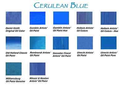
Our cerulean may not be the cerulean you like, and it’s great to have these choices. But be aware when crossing brands that you may not be getting what you think, just because the pigment is called by the same name. Cerulean Blue is made of the pigment PB 35, a relatively expensive pigment. Depending on the ratio of that pigment to the oils, binders, driers or fillers, the color can look and handle significantly differently between manufacturers. Price-sensitive painters and students may decide to look around for a cheaper alternative. To offer a less-expensive alternative, many manufacturers make a substitute, often labeled Cerulean Blue Hue, generally made from a mixture of PB 15 (Phthalo Blue) and either Zinc (PW 4) or Titanium (PW 6) White. As you can see from the chart, it is not the same as PB35, and in our experience, will not mix the same with other colors. (Too much white!) Depending on the needs of the individual, those differences may not matter or they could make the painting come to life.
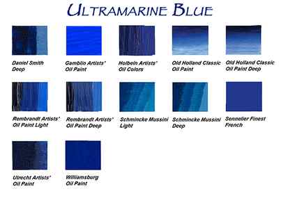
The word “ultra” means “beyond” and “mare” means “sea”. Because this pigment was shipped from Asia to Europe by sea, it was given the name “ultramarine”. It was originally made from lapis lazuli and was one of the most expensive pigments in 16th century Europe (worth twice its weight in gold). Modern day Ultramarine pigment is called PB 29. All the samples above were made from PB 29. Because Ultramarine leans toward a reddish tone, it is considered a “warm” blue on the palette. Because of that red tone, it is not the best choice for mixing bright greens but can make good violets.
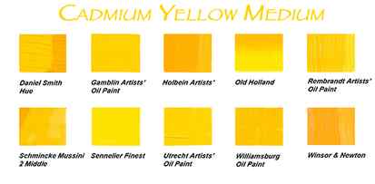
Cadmium Yellow Medium is typically made from PY 35 and/or PY 37, except for Holbein, who added a little Cadmium Orange (PY 20) to lean it toward the red side. See what we mean? You might want that Holbein color, but the orange in it may react with any blues to dull the greens! Better to realize that before buying it.
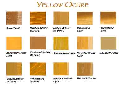
Yellow Ochre is generally made from PY 42 and PY 43 and is considered a “cool” yellow. Sennelier combines the PY 42 with PBk11 (Mars Black), and PR 101 (Red Iron Oxide). Rembrandt’s Yellow Ochre Light and Sennelier’s Light Yellow Ochre are made from Chrome Antimony Titanate ( PBr24), which is considered a less toxic substitute for either Chrome Yellow or Naples. Old Holland and Winsor & Newton use PY43 for the light and dark.
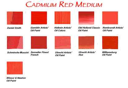
Cadmium Red Medium is typically PR 108 . Utrecht offers a Hue made from Hansa Yellow (PY 73), Napthol Red AS-D (PR 112), and Zinc White (PW4) . The hue is much less expensive to buy, but using it in a painting may be more so.
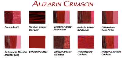
Alizarin is our cool red and there are two basic products from which to choose – Alizarin (PR 83), and Alizarin Permanent (PR 177 and others). Alizarin Permanent was developed to overcome the problem of surface cracking in thick applications of PR 83, and its tendency to fade over time. Alizarin was originally made from the juice of the madder plant, and is also called madder lake or lake. Alizarin Permanent is made from Quinacridone Violet (PV 19) and Anthraquinone (PR 177) or Perylene (PR 149) Red along with other colors, and is considered lightfast. Gamblin uses Ultramarine Blue in their Permanent formulation to make the color cool and Old Holland uses VanDyke Brown to give their Lake Extra a warmish look.
Analyze differences in paint colors among brands


Color Muse 2 is our most accurate and easy-to-use colorimeter. Scan colors and instantly find the closest matching paint colors, products, and sheen in the Color Muse app.
Add to Cart
Available to ship in 1-3 business days
Free 30 day return period
1-year limited warranty
Click a button, match to paint and products
Matching colors can be a difficult and time consuming process. Fandecks are bulky and fade over time, which forces you to purchase new fandecks or settle for less accurate color matches. Alternatively, cutting a sample from your wall means you’ll have to patch the hole later on.
Color Muse 2 removes the guesswork around paint matching by instantly finding the closest paint colors and sheen. Scan the color of any flat surface and match to thousands of products in the Color Muse app from brands like Sherwin-Williams, Behr, Benjamin Moore, and others.
Match. Coordinate. Save. Share.
In addition to finding the closest paint color and sheen, Color Muse 2 finds coordinating colors, real-world inspiration photos, and even the color’s Hex, CMYK, RGB, Lab, LCH, LRV, and HSB values.
Explore coordinating colors to create your perfect color palette.
Keep your projects organized with saved colors. Share your saved colors with others.
Compare two colors and sheens to see the numerical difference.
Designed for the ultimate color matching experience, Color Muse 2 is built for fast, accurate color matching no matter where you are.
The aluminum body and calibration shutter help protect the internal optics and calibration paper from dirt and debris.
Durability meets performance