Corel PHOTO-PAINT Help : Painting and special effects : Applying special effects : Applying Lighting effects
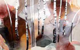
Creating the illusion of sun rays with paint
The concept of “warm light/cool shadows”, and “cool light/ warm shadows” is quite logically based upon an optical illusion, and its scientific foundation is complementary colors. Since so many have scoffed at that concept whenever I have mentioned it in the open forum, I don’t mention it any more. Please PM me for my explanation, if you are interested.:) I have all sorts of examples that support it. D
wfmartin. My Blog “Creative Realism”.
https://williamfmartin.blogspot.com
May 3, 2015 at 11:24 pm #1224343
Default
I see so little practical difference in the side-by-side studies that I don’t think it matters in this case.
May 3, 2015 at 11:32 pm #1224334
Default
I don’t know much about these steadfast rules and theories. I normally just go with what “feels” right for the individual situation. So, for what its worth, the proposed color changes look better to me.
“Extraordinary claims require extraordinary evidence.”
— Carl Sagan Brian Firth
May 4, 2015 at 1:38 am #1224350
Default
^^^^What he said.^^^^
May 4, 2015 at 1:54 am #1224332
Default
Lighting and shadows have so many little nuances associated with them from my experience. Warm shadows are often warm in my experience (especially for landscapes) because there is nice warm sunlight bouncing of the nice warm earth colors into the shadow areas. By thinking first of the shadows as just local color then applying warm light bouncing from the ground into any part that would receive bounced light from the ground, and then applying cool bounced light from the sky to areas hit by that you end with shadows that are both Warm in some areas and Cool in others. It’s very dependent on what bounced light is getting into it. That said, I’ve also found that for achieving a realistic look regardless of my reference that making my shadow areas a touch warmer or cooler depending on my light source’s temperature has helped me greatly in the past. (not that I’m nearly as good as some artists around here, but I think the input might help someone) To go a bit deeper into the effect, light waves passing in front of a shadow and illuminating the light of the air between the viewer and the subject matter shadow colors can end up even more desaturated and leaning warmer than would be expected depending on the atmospheric color (certain gases have their own color that is then filters out certain wavelengths of light lending even more interesting results to atmospheric influence on shadows of an object behind the gases). Yipes, that can get SUPER complicated quickly, shortcut below. In short, shadow temperature seems to be more based around the reflected light into the shadow than the actual color of the shadow itself. (which was mentioned earlier normally is just a darker version of the local color) Edit: As to what “feels” right, there is a psychological and scientific reason for what feels right, and some people like myself need to understand those in order for us to communicate the feeling we are trying to convey.
– Delo Delofasht
May 4, 2015 at 2:05 am #1224349
Default
Dan Edmonson has a video on Youtube about the misconception of warm light/cool shadows and vice versa. https://www.youtube.com/watch?v=Ija-SUT6AOU It’s basically along the lines of what Don explained, and he also demonstrates some actual situations that show warm light/warm shadows and cool light/cool shadows.
May 4, 2015 at 3:43 am #1224344
Default
The pure local color (no highlights or shadows) is either warm or cool. Then the highlights AND shadows are the opposite. So warm midtones equal cool highlights and shadows. And vice versa. Sometimes the light is very close to neutral, then it is hard to determine which is which. Easiest to see on a white object. Easily tested – get a white object – egg and block say – arrange with a very warm yellow light. Then under a cool light – or just put blue around your lamp or whatever.
Being born places you at a greater risk of dying later in life. http://www.artallison.com/
May 4, 2015 at 9:33 am #1224335
Default
The color of the dominant subject will force a contrasting hue onto its submissive neighbor. If the dominant subject is in yellow orange sunlight in late afternoon, the neighbor subject (in this case, shadow) will appear blueer to your eye. And vice versa. Bill Martin calls it an optical illusion. Chevreul calls it simultaneous contrast. I recommend you look this up and study it–simultaneous contrast is an important phenomenon to learn about.
Your capitol dome is yellowish, so the eye will sense blue more strongly in the shadows.
Once you get the hang of this contrast phenomenon, you can paint the contrast into the painting. The contrast would happen in the viewer’s eye anyway, but you heighten the effect if you wish, with your paint.
May 4, 2015 at 10:28 pm #1224346
Default
I agree with those above that are saying that the colour of objects and their shadows are dependant on the light sources illuminating them. Simultaneous contrast works by itself and unless you want to exaggerate the effect, you don’t have to be concerned with it too much. A photograph exhibits simultaneous contrast effects without following this rule because it is our eyes that that create the illusion, not the subject.
I think following rules like the warm/cool thing would probably do more harm than good. In many cases, particularly indoors, a warm light will produce warmer shadows. This is because most walls, furniture, carpets, floorboards etc, are warm, so the warm light is losing even more blue (that gets absorbed into these surfaces), before it reflects into the shadows.
Ron
www.RonaldFrancis.com
May 5, 2015 at 8:19 am #1224336
Default
Ron writes: Simultaneous contrast works by itself and unless you want to exaggerate the effect, you don’t have to be concerned with it
———————————————————————————–
Well you don’t need to be concerned with anything at all, but if you are concerned with getting your colors to project the effect you intend, you do need to be concerned about simultaneous contrast. Because it means your colors will be perceptibly changed from the color on your palette to the apparent color on the painting once you apply the color to the painting. The reason is,
the neighboring colors on your painting will change the apparent color of the next color you apply due to simultaneous contrast.
For some people this is TMI; for those who are seriously interested in getting things right by understanding color perception, it’s OK to be concerned with it!
May 5, 2015 at 11:27 am #1224341
Anonymous
What is warm and or cool can vary and depends upon personal feelings. To quote David Briggs “you might as well ask which is happier or sadder”.
Be that as it may,
What do you think the right color temperature scheme is?
I can tell you what I think, but since temperature is a personal thing, I will leave it to you.
The whole durn world is absolutely full of light and shadow. I have been looking at light and shadow all of my life. I follow sid’s rule because I absolutely know what is cooler and what is warmer when I look at light vs shadow.
You can add light sources to an RGB or grayscale image to create the illusion of spotlights, floodlights, or sunlight. You can specify the type and number of light sources, the intensity of the light, and the color of the light. You can also create embossed reliefs by applying a preset or modifying color channel information. You can use a preset light and texture style, or you can customize a preset style and save it in the preset list.
| To apply a lighting effect |
| 1 . | Click Effects Camera Lighting effects. |
| 2 . | Click the Light source tab. |
| 3 . | Enable the Spotlight option in the Type area. |
| 4 . | In the preview window, drag the Light source selector to set the position and direction for the light. |
| 5 . | Type a value in the Angle box to set the angle of the light relative to the image. |
| 6 . | Move any of the following sliders: |
| • | Brightness — lets you set the intensity of the light source |
| • | Cone size — lets you set the width of the light beam. Higher values produce a wider, more diffused light beam. |
| • | Edge — lets you set the diffusion of the light along the edge of the beam |
| • | Opacity — lets you set the density of the light |
| 7 . | Click the Atmosphere tab, and move the Brightness slider to adjust the brightness of the entire image. |
Click the Color picker, and choose a color swatch.
Click the Add light button .
Click the Delete light button .
Click the Hide/Reveal Light source button .
Click the Presets tab, choose a preset that adds texture to the image, and click the Image texture tab to set the properties you want.
Click the Image texture tab, choose a color channel from the Channels list box, and modify the settings you want.
Not all suite components documented in this Help are available in our Trial, Academic, and OEM versions. Unavailable components may include Corel applications, product features, third-party utilities, and extra content files.
Was this page helpful? Send feedback. (Internet connection required.)
Copyright 2018 Corel Corporation. All rights reserved.