In this blog, we show you two different ways lavender, lilac, pale purple was used on wedding days.
Lavender, Lilac Wedding Color Palette

How does one decide on wedding colors when there are so many beautiful colors to choose from!? Deciding on your wedding color is essential; your details, decorations, and how you set up the space are essential. Wedding colors are all part of the detailing and planning! Do you want neutral pale tones, or do you want those vibrant colors? That choice is yours, it is your wedding day, after all!
In this blog, we show you two different ways lavender, lilac, pale purple was used on wedding days.
Kristi + Tim
Kristi and Tim chose pale purple and neutral tones for their wedding day at The English Manor . The couple decided to have their wedding at The English Manor because they loved the greenery garden and “manor” rustic vibes they got from the venue. They incorporated pastel and neutral colors like lilac, lavender, and silver into their wedding details. The lavender complimented Tim and the groomsmen’s black Men’s Warehouse tuxedos and contrasted extremely well with Kristi’s beautiful wedding gown from Sales Unlimited . During bride prep, Kristi had her girls in light lavender silk robes, and each bridesmaid had personalized drinking tumblers with lavender bows tied to the straws. HOW CUTE! Tim had his groomsmen in a solid black and white look. The contrast between the pastel and the black was really divine.
Kristi met Tim at her cousins’ liquor store, where he worked as a beer salesman. A decade and a beautiful daughter later… Tim proposed to Kristi, “when I woke up and walked to the kitchen. There were roses and a ring on the table with him standing there with our 10-month-old daughter!” The love these two have with each other is endless and so beautiful. We love love! Speaking of love… we LOVED Kristi’s bouquet. The ivory and green bouquet was arranged by Flowers by Vanbrunt , they turned out BEAUTIFUL. The white tulips mixed with other white florals and greenery looked absolutely stunning. The contrast between the light lavender and greenery was so pretty and extremely fun to photograph.
There are so many colors to choose from, so narrowing it down to your favorite may be difficult. When paired together, specific colors will pop and complement each other nicely. Deciding on colors, keep in mind that you might want to consider how sunlight and the surrounding “environment” can affect the way colors are seen together.
To Kristi and Tim, it was such an honor to photograph your special day. Thank you for choosing Limelight Entertainment.
Lilac, Plum and Soft Mint Color Palette
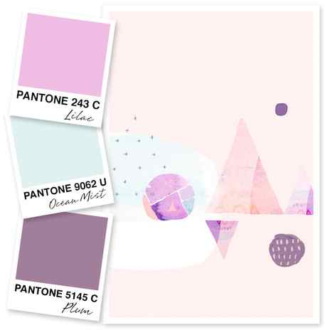
It’s true, if I had to choose, purple would be my least favorite color. Nothing personal, but I tend to prefer warm hues. But this color palette of lilac and plum has me rethinking my love of purple. Pair it with a very pale mint, like an ocean mist, and I’d say purple is pretty ok.
Painting by Ammiki. Print available in her shop.
Share this Post
You May Also Like.
Pink, Gold and Blue Color Palette
August 30, 2011
Chestnut, Sand, Sage and Ebony Color Palette 11
August 2, 2010
Peach, Red and Silver Color Palette
February 1, 2014
Sarah
July 9, 2014
Oh, I love this combination! I’m like you, I tend to steer away from from purple but this is magical! It kind of reminds me of the colors in Frozen–maybe that is why I like it! 🙂
Tan of Squirrelly Minds
July 15, 2014
I have this print and LOVE IT. So soft and pretty

Hi, I’m Sarah
And I’m so glad you’re here! I’m a graphic designer turned maker who finds joy in creating things and helping others do the same. Here you can find my shop, over a decade of blog posts, beautiful wallpaper downloads, video tutorials, and more.
New in the shop


Art Supply Patches


Thanks It’s Vintage Labels