To understand why it’s so difficult to mix a decent purple color we need to talk about color theory.
Achieving purple without the use of blue pigment
About a year ago I did a mixing test to see which gives the cleaner purple (I was aiming for the hue of dioxazine or ultramarine violet): -phthalo blue (I think it was red shade) + quin. magenta
or
-ultramarine blue + quin. magenta ? I was expecting the mix with ultramarine would be significantly more chromatic, but to my surprise, it was only very slightly more so. Both were slightly but significantly less chromatic than pure dioxazine. I posted it on this forum about a year ago. I did this one yesterday, but using phthalo blue GS, which is closer to cyan. On the sides I mixed in some white gesso. I didn’t get both sides the same thickness, dilution, etc., so this is far from scientific and conclusive, but still, I’m surprised how little difference there is in the middle purple regions in the tints. In fact, I can’t even say for sure I see a difference. In the non-tinted gradation, there seems to be more difference, but I inadvertently diluted the right one with water a lot more then the left, so I can’t draw much conclusions about the untinted mixes. If I had a lot of time, I could’ve done carefully-mixed discrete blocks instead of rough gradations like this…for more conclusive results. But at any rate, I’ll give more value to my mixing results than my theory.
February 9, 2005 at 12:57 pm #1046444
Default
Is it just me, or do other artists react as if hearing nails on a blackboard when “violet” and “purple” are used interchangeably? eeeeeeeeek I can see violet in a spectrum (rainbow), for me purple is a (roughly) even mix of red and blue. (Not even amounts of pigment, obviously. ) They look really different to my eyes. And, they clash!
[FONT=Times New Roman] Audacity allows you to be at ease with your inadequacy, safe in the knowledge that while things may not be perfect, they are at least under way.
Robert Genn[/I]
February 9, 2005 at 2:07 pm #1046455
Default
I can see violet in a spectrum (rainbow), for me purple is a (roughly) even mix of red and blue. (Not even amounts of pigment, obviously. ) They look really different to my eyes. And, they clash!
CLASH—-now there’s a word that I have never heard applied to anything that had to do with art. Here are some definitions of “clash.” 3 entries found for clash. (dictionary.com)
clash ( P ) Pronunciation Key (klsh)
v. clashed, clash·ing, clash·es
v. intr.
To collide with a loud, harsh, usually metallic noise: cymbals clashing.
To come into conflict; be in opposition: factions that clashed on a tax increase; an eyewitness account that clashed with published reports.
To create an unpleasant visual impression when placed together: colors that clash. v. tr.
To strike together with a loud, harsh, metallic noise. n.
A loud, harsh noise, such as that made by two metal objects in collision.
A conflict, as between opposing or irreconcilable ideas. See Synonyms at discord.
An encounter between hostile forces; a battle or skirmish I would have to say that I would find it very hard to see two(or more) colors that “did not go together.” In nature, we see ALL combinations of colors. We don’t think of them as clashing. Clashing is a fashionable thing. In the ’40, pink and red “clashed”. During another period of time, red and green clashed. I remember an art teach telling me if I used blue and green together again she would fail me as the two colors “clashed.” I told her God didn’t think so, he put blue flowers on green stems. The definition which relates to color mentions “To create an unpleasant visual impression when placed together: colors that clash.” That doesn’t mean that they will not appear in nature side by side. Maybe clashing can be used as a visual affect. I used to have opinions about what colors “went together.” After purchasing a book on color theory which was published in Japan and written by Japanese authors, I had to rethink my ideas of color. Eastern perceptions and combinations of color are totally different than ours, but I cannot say they clash, even though by our traditional standards they may. I would be willing to use any two colors in combination, and may issue this as a challenge to my students in my next painting class. Perhaps if they take two colors they think clash and combine them to create a painting, they may be able to see the beauty in all colors (and combinations thereof). I know I am letting myself in for a sheaf of grief from all the color theorists out there. Londondeon
Life is not measured by the number of breaths we take but by the number of moments that take our breath away.—George Carlin Clothes make the man. Naked people have little or no influence on society. — Mark Twain
February 9, 2005 at 2:56 pm #1046433
Default
Is it just me, or do other artists react as if hearing nails on a blackboard when “violet” and “purple” are used interchangeably? eeeeeeeeek I can see violet in a spectrum (rainbow), for me purple is a (roughly) even mix of red and blue. (Not even amounts of pigment, obviously. ) They look really different to my eyes. And, they clash!
The terms, “violet” and “purple” are simply artistic terms which have been used interchangeably for a long time. I suppose the term, “violet” is actually more scientific than “purple”, because it is usually used in describing a color of the visible electromagnetic spectrum occurring next to “ultraviolet”, which is, in fact, invisible to the eye. To some, I suppose, the term, “violet” may have the connotation of having a slightly more magenta bias from blue, but to others, the term “violet” may, in fact, signify that it is more cyan biased. I’m not sure. These are simply different terms to describe the same, basic color, which is, from a practical and scientific standpoint, “blue”. In my opinion, it’s purely a case of semantics. As I mentioned on another thread, there are no definite boundary lines drawn on a color wheel. Colors smoothly and un-abruptly flow and meld into each other. Where your visual interpretation of “violet” leaves off, and “purple” or “blue” begins can be quite open for discussion. To me, the terms, “violet” and “purple”, are not only trivial in their importance in actually describing a color, but carry just about the same accuracy in defining a color as “buff”, “mauve”, “chartreuse”, “teal”, “flesh”, etc. Nearly everyones’ ideas of those colors are quite loose, I think you’d admit, and to me–so are the terms, “violet”, and “purple”. To me they are simply slightly different hue directions from blue. I simply don’t see much distinction in drawing some sort of imaginary line separating “violet” from “purple”, and I’d bet if you smeared your version of each on a painting, and asked others to define which was “violet” and which was “purple”, you’d get many different answers from artists as well as non-artist viewers. There is a flower called a “violet”, and (get your fingernails-on-the-blackboard defense ready) to me, “violets”, are “purple”. Haha That’s just my take on it. Don’t take all this too seriously. As I have said earlier, simply go out and buy whatever color turns you on, and you certainly don’t need anyone else’s permission to call it anything you wish. For example, I have a tube of Winsor & Newton’s Permanent Rose 502, which says it is made of Quinacridone PV19. I am not offended that some manufacturer has chosen to call it “Permanent Rose”; I choose to call it “magenta”. Why? Because, in my definition of “magenta”, it looks and acts like magenta when used and mixed with other colors, and that is truly the only thing I care about when dealing with the primary color, magenta. It mixes equally with yellow, to produce “reds”, and with pthalo blue (my “cyan”), to produce “blues” (“purples”/”violets”, or whatever you may choose to call them). It’s how it appears, and how it mixes with other colors that truly are important, and that’s known as “color behavior”, and that’s what helps artists to get their paintings painted–not simply what it has been assigned as a name, wouldn’t you agree? Bill
wfmartin. My Blog “Creative Realism”.
https://williamfmartin.blogspot.com
February 9, 2005 at 3:01 pm #1046419
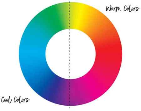
have to correct something I said earlier – I meant to say I buy *permanent violet* (er, dark, I think) as a mix. Not quin violet. Duh. And this has been quite interesting… all the talk of blues got me curious so I pulled out my Mayer and looked and the wavelength graphs. And yes, pthalo does have the strongest peak within the blue wavelength range (in a tint) out of all the blues! Interesting. Of course, there are differences between red shade and green shade. It was fun to look up anyway. Perhaps I’ve always used the wrong pthalo… might go try one of each shade. Hitting Atlantis tomorrow anyway for some canvases. Tina. Side note: I don’t really think of separate distinct colours, I’m afraid. Though the general mixing rules and colour wheels/systems I understand I always think of colours as a continuum of wavelengths. So purple and violet are of a ‘family’ in my mind. I get warm violets (or close, towards the red end of the spectrum) from warm reds/pinks and warm blues, and cool violets (or distant, towards the blue end of the spectrum) with cool pinks and cool blues. (by close and distant I mean where you feel your eye is focusing, this is how I’ve always distinguished it if the terms warm and cool don’t make sense to someone)
Abstract coast and geology art: www.tina-m.com | Art/Science gallery: www.grejczikgallery.com
February 9, 2005 at 4:29 pm #1046441
Default
Side note: I don’t really think of separate distinct colours, I’m afraid. Though the general mixing rules and colour wheels/systems I understand I always think of colours as a continuum of wavelengths. So purple and violet are of a ‘family’ in my mind. I get warm violets (or close, towards the red end of the spectrum) from warm reds/pinks and warm blues, and cool violets (or distant, towards the blue end of the spectrum) with cool pinks and cool blues. (by close and distant I mean where you feel your eye is focusing, this is how I’ve always distinguished it if the terms warm and cool don’t make sense to someone)
I agree that it is convenient to think of colors as belonging to a continuum, although it is a geometrical continuum (the color circle) not numerical (wavelengths). Magenta and purples (red + violet/blue) are polychromatic (non-spectral) and do not have even a dominant wavelength. You can stare at the visible electromagnetic spectrum all day and never see magenta, ’cause it ain’t there.
C&C is welcome.
Richard
February 9, 2005 at 5:37 pm #1046434
Default

Einion, I hope that you will admit that I’m at least honest, if nothing else. The following are oil paints, applied to white canvas-pad paper. I did exactly as you suggested: I mixed my Winsor Newton Permanent Rose 502 with both Winsor Newton Winsor Blue (Red Shade), and Grumbacher French Ultramarine Blue. The differences were not very great, but possibly might favor the Ultramarine Blue + Permanent Rose as being a tad cleaner (purer/more saturation), as you had suggested. The two on the left represent those two mixes, with white, of course, to get away from the masstone. Then, I mixed Grumbacher Dioxazine Purple with white. That’s the one in the middle Then, I added enough Permanent Rose to each of the Winsor Blue (Red Shade), and French Ultramarine Blue, to come as close to possible to matching the hue of the Dioxazine Purple. Those are the two examples on the far right of the swatches. So, my conclusion, is 1) that the mix, using Fr. Ultramarine could be seen as being a little bit more pure than that mix using Winsor Blue (Red Shade), and 2) the Dioxazine Purple beats the socks off of either of our mixtures, as far as purity is concerned, when our choices had enough Permanent Rose mixed with them to each have achieved the hue of Dioxazine Purple, as closely as possible.. Again, the Fr. Ultramarine Blue mix might be seen as being a little more pure than the mix using Winsor Blue (Red Shade), again, as you had suggested. The white used was Old Holland’s Cremnitz White. So, Einion, What can I say? You are correct……….barely. You win, buddy! (I’m not going to do these tests much any more, because it takes time away from my art, and uses a TON of paint.) Hahaha It WAS interesting, however. And, Richard, You are absolutely correct in stating that magenta does not exist in the natural spectrum of light (although Violet, truly does), but I’m afraid you and I will need to stand back-to-back, in order to fight off all the arguments on that one. Hahaha (Best way to prove that is to have anyone who doubts it to simply “Google” under the heading, “magenta in the spectrum”. The percentages will be with us, I believe.) The color, magenta, exists, of course (in paints, inks, color models, wheels, etc.)–just not in the spectrum of light. Bill
wfmartin. My Blog “Creative Realism”.
https://williamfmartin.blogspot.com
February 10, 2005 at 12:26 pm #1046425
Is it just me, or do other artists react as if hearing nails on a blackboard when “violet” and “purple” are used interchangeably? eeeeeeeeek
No, it’s not just you However the two words are essentially exactly synonymous in English. As I’ve mentioned before, I like to use the word violet purely because I think of purple as being a specific colour as you do, so the former is more generic to my mind.
So, Einion, What can I say? You are correct……….barely. You win, buddy!
Barely? A win’s a win, no matter how small the edge But all joking aside, we weren’t having a contest or anything but thanks all the same. The saturation costs of mixing between Cyan and Magenta are much more pronounced than one might think but this does make the point about colour bias being perhaps the most important factor in mixing outcomes (or to put it another way, the distance between the starting colours is critical in practical mixing). Although it must be said, the lower chroma of mixed violets is of little consequence to the average painter since we almost never need it, saturated violets being so rare in nature. It is interesting how Dioxazine Purple is totally unbeatable when you come down to it isn’t it? The difference in the tints would be more pronounced using Titanium White by the way, those of PV23 beating the socks of either mix.
CLASH—-now there’s a word that I have never heard applied to anything that had to do with art. Here are some definitions of “clash.”
Never, really?
I know I am letting myself in for a sheaf of grief from all the color theorists out there.
You certainly are! There are plenty of colours that clash to a given person’s eyes – visual complements can clash terribly and don’t make harmonious images in most cases when used together. What colours ‘go together’ is very much a matter of personal preference of course, but it’s largely driven by one’s culture, so it is important for anyone interested in colour usage to know that there are no absolutes; I grew up in Hong Kong and what would be a lovely medley of colours to Chinese eyes would be an awful visual cacophony to the average Westerner! A classic example that has stuck with me all these years being a crimson-hued pink, orange, red and light yellows as the dominant notes, with more than one hue of green as background. Einion

D o y o u k n o w i f y o u r c o l o u r i s o f f i n h u e , v a l u e , c h r o m a . . . o r a l l t h r e e ?
Colour Theory & Mixing forum WetCanvas Glossary Search Tips Advanced Search Acrylics forum Acrylics – Information Kiosk
Why didn’t the ancients produce purple dye via admixture?
A great deal of prestige is attached to the colour purple – the hue of bishops and emperors alike – and, if you’ve read a little about the ancient world, you’ll probably have heard the story explaining why this is the case. The Greeks and Romans – the story goes – knew of only one way of obtaining purple dye: a painstaking and eye-wateringly expensive process involving the extraction of the precious substance from sea snails. As a boy, I always imagined that the root of this purple business was an inability on the part of the Greeks and the Romans to produce blue dye. I know little about dyes, but the colour blue is notable for occurring in the natural world only very rarely. So it makes sense, at least at first glance, that the ancients would have struggled to produce dye of this colour. The colour purple was the closest that they could come to achieving to such a rarity, hence its prestige. In any case, if they could produce blue dye in quantity, they could just have mixed it with red dye – which has always been one of the cheaper pigments – and every Roman and his dog could have strolled across the forum in lurid purple vestments. This theory took a bit of a knock a couple of years ago, when I read that the colour purple only became available to the non-fabuously wealthy in 1860 with the invention of magenta pigment (named for the Battle of Magenta of the previous year). Given that, for centuries before that date, the armies of Britain and France marched into battle wearing vivid red and blue uniforms respectively, it seems unlikely that lack of blue pigment was the main contributor to the rarity of purple. Given that both red and blue dyes were plentiful pre-1860, what, then, was stopping the ancients (or anyone else for that matter) from mixing the two to create purple? Do clothing dyes not mix the way that acrylic paints do?
Follow
asked Jan 7, 2020 at 19:30
Tom Hosker Tom Hosker
2,073 8 8 silver badges 21 21 bronze badges
This might be a good question over on chemistry.stackexchange.com or on hsm.stackexchange.com
Jan 7, 2020 at 22:21
The jews had Tekhelet which was an ancient blue dye, it is produced from murex shells just the same as tyrian red. I seem to remember reading in an article if you exposed this dye to a catalyst it would change it into a more purple color. See the pic at the bottom of en.wikipedia.org/wiki/Tekhelet . Also i believe our current idea of purple is not the same as the ancient idea of purple, but that is just a personal opinion.
Jan 8, 2020 at 13:39
Google images for bishops and you’ll see they wear red. Because that was the purple colour back then: a bright, intense, pure red. Other reddish dyes were known, but they weren’t as bright, and usually turned brownish with use. According to Vitruvius, the exact hue of the “purple” could vary from red scarlet to violet, but it was the high quality of the dye what they really appreciate, since most dyes washed away quickly.
Jan 8, 2020 at 14:26
@Tom Hosker Possibly the ancients did make purple dye by mixing red and blue. Remember that there is a difference between dye that produces a purple color in cloth and dye that is PURPLE, the super expensive sea snail dye which had several good properties. I once read that in medieval Ireland there were allegedly rules about which colors which classes could wear, kings wearing the most colors, and the extra color which kings wore was purple. I doubt that the Irish imported PURPLE so they probably mixed red and blue dyes to make ordinary purple.
Jan 8, 2020 at 16:10
1 Answer 1
Sorted by: Reset to default
I think the ancients did produce purple dye via admixture.
Various challenges with that approach (and purple dyes in general) likely affected its historical ubiquity or our perception of that ubiquity.
Regarding your specific sub-questions:
- Though challenging, ancient humans have mixed dye components to create purple dye, however, more complex factors probably limited the ubiquity of this approach and, likely, our current perception of the ubiquity of that technique.
- The physical and chemical mixing and application of dye components have challenges unique to the principles of mixing and applying acrylic paint, notably in the mass-produced textile context you discuss.
Related details:
My basic art training hints that creating a color-fast, long lasting dye of a singular hue and applying in bulk to textiles is more challenging than applying opaque pigments mixed as a media and applied to a surface. Color combinations often muddy or dilute themselves, which is why a distinct natural source like chemical (animal, vegetable, mineral) derivations are superior as a pigment and probably more so in a dye context.
There are historical precedents for using mixtures to create purple dye (in Western culture and beyond) but it is likely that certain chemical or environmental factors limit our perception of the ubiquity of purple dyed textiles (admixture or otherwise) throughout antiquity.
Long-term instability of dye and pigment constituents for a purple hues can affect their discoverability. Defining the optical aspects of colors described in spoken or written history and matching to modern colors becomes more challenging with fewer corroborating artifacts. From Wikipedia:
A popular new dye which arrived in Europe from the New World during the Renaissance was made from the wood of the logwood tree (Haematoxylum campechianum), which grew in Spanish Mexico. Depending on the different minerals added to the dye, it produced a blue, red, black or, with the addition of alum, a purple color, It made a good color, but, like earlier dyes, it did not resist sunlight or washing.
Though the time period for the above excerpt might not be considered ancient, the techniques used could be applied further back in time.
Social constructs including popularity and marketability are also likely discriminating factors. Iconic desirability can actually hamper something becoming popular or ubiquitous when other forces influence availability.
In the middle ages, color-segregated guilds were forbidden to dye colors by other guilds. That sort of rigidity certainly wouldn’t invite more inventive experiments – admixtures included – during that time period.
Though an edge case example, one possible reason ancient tekhelet (one of it’s suggested color ranges being purple) dye was not replaced with an alternative replacement was the precious nature of the source that reinforces the sacred ritualistic nature of its use. From Wikipedia:
Yet, although this dye was much cheaper to obtain, the rabbis cursed those who substituted techelet with some low-priced equivalent and in fact preferred to annul the obligation altogether rather than to compromise its value
Perhaps it’s possible that an absence in the historical record of a societal mass-market of a cheap or plentiful purple in ancient times is also related to both this and other intentional or unintentional limitations in the traditions and trade of dye production and human-made artifacts.
The intersection of ritual, including apprenticed traditions and closely held trade knowledge, combined with rigid societal structures (rare-colored goods as a symbol of power) and market forces further restricted by comparatively less free time or interest in novelty when compared to modern times could have simply choked out more egalitarian access to this royally symbolic hue by any number of subversive inventors or entrepreneurs.
I think the ingenuity required to source a stable purple hue – let alone devise a process through mixing – and establish a mass market definitely has had numerous challenges through the ages.
The secondary color purple
Color theory tells us that purple is a secondary color and to mix it we need to combine red and blue.
So much for the theory.
This standard formula is true to a certain extent, but artists mix paints, not colors.
Pigments are the real carriers of color in paints, and each paint produces its own unique color appearance, and mixing results.
As watercolor artists we need all kinds of purples. Dull purples produce beautiful rich shade and shadow areas while brilliant lively purple creates intensity and focus.
The key is understanding how to mix the right purple for the right occasion.
So what are the color combinations for mixing desaturated dark purples or bright vivid purples ?
Let’s take a look at what happens when you mix together different variations of warm and cool blues and reds.

As you can see the best results for mixing bright purples come from using cool red. But warm reds (because they are closer to yellow), will neutralize the mix. You will always get a dull color purple using a warm red. These colors are nice in their own way, and can add beautiful richness and dark values to your paintings (far better than just using pure black).
The brightest purples come from hues of reds and blues which are closest to purple. So this means warm blues and cool reds.
As you have probably figured out by now, what is often poorly understood is the concept of color temperature. In practice the results of mixing different red and blue pigments produces a wide range of beautiful purples. But the general strategy of red+blue does not always give us a pure saturated purple.
The colors I used for the above test chart are as follows:
- Cool red: Quinacridone Rose
- Warm red: Pyrrol Scarlet
- Cool blue: Phthalo Blue (GS)
- chevron-right Warm blue: French Ultramarine
A quick word of caution.
The color name on a paint doesn’t tell you want is in the paint recipe. Pigments are what produce the final rendered color.
It’s a good idea to get into the habit of learning or at least making note of the pigments contained in your different paints so you don’t get too many surprises when mixing !
Purple direct from the tube
I’ll let you into a secret…
I have a range of purples in my collection for when I’m feeling lazy !
Understanding how to mix different purples gives you so much freedom.
But from time to time you just want to grab a specific purple color directly from the tube – Quinacridone Violet is one of my favorites !
You’ll find many pigment alternatives to choose from if you want a tube of yellow, red or even green watercolor.
But there are relatively few pigment alternatives for purple.
As painters we all want to find the best pigments for specific hues. So if you’re looking for a good purple to use as a convenience color then you can’t go far wrong with the ones I’ve listed below.
Although this list is not exhaustive, I’ve indicated the pigments used in each paint formula to help you identify similar paints from alternative brands.
I try to stick to a set of quality guidelines when choosing my paints, so all of the examples listed here are transparent, single pigment paints, with good or excellent lightfastness ratings. A large number of manufacturers produce purples which are convenience mixtures of two red and blue pigments. For example the Daniel Smith color “Rose of Ultramarine” is a mix of the pigments PV19 and PB29 (Quinacridone Rose + French Ultramarine), which is exactly what I used in the tests above to make bright purple.
All these highly recommended pigments are versatile, and handle well in watercolors.
If you’re not accustomed to pigment names, purple pigments are denoted as “PV” (Pigment Violet). “PR” means Pigment Red.
Another thing I have noticed, if you like granulating watercolors, a large number of purple pigment paints are granulating…
A few recommended purple paints
Daniel Smith Quinacridone Lilac ( Pigment PR122 )
An intense red-purple color, and probably the strongest hue of any red-purple pigment available in watercolors. “Quinacridones” are a family of beautiful highly colorful pigments which all share the same excellent lightfastness and transparency. Quinacridones handle beautifully in washes and mix with other paints extremely well.
Daniel Smith Quinacridone Rose ( Pigment PV19 )
This paint is great for mixing very bright warm colors and purples, and as you can see from the tests above, it’s valuable as a “primary” cool red in a limited color palette. This is probably one of the most versatile and widely used rose pigments.
Daniel Smith Quinacridone Violet ( Pigment PV19 )
A darker valued, slightly warmer purple hue. When used wet on wet it is very ‘energetic’ and can produce some interesting blooms.
M. Graham Dioxazine Violet ( Pigment PV23 )
This is a very dark valued slightly dull purple color. The PV23 pigment is lightfast and highly staining. The color appearance is very similar with other brands of paint using the same pigment.
Daniel Smith Quinacridone Pink ( Pigment PV42 )
Not available from many manufacturers, this color is very similar to Quinacridone Rose. Tests have shown that it is slightly less lightfast, but it mixes wonderful bright purples like the PV19 pigment in Quinacridone Rose. If you have to choose between the two, PV19 would be a better option.
Daniel Smith Cobalt Violet Deep ( Pigment PV14 )
A medium value purple color, this pigment is non-staining and has excellent lightfastness. When this paint dries it shifts slightly towards red. Apparently this pigment is quite rare, making it more expensive. Beware of cheaper paints with the same generic name, which may not contain the real pigment.
Daniel Smith Ultramarine Red ( Pigment PV15 )
This is a medium to dark purple color. The color appearance of paints with this pigment seems to vary slightly from one brand to another. This one from Daniel Smith is a lovely deep blue purple.
Daniel Smith Cobalt Violet ( Pigment PV49 )
A light purple violet color, probably what some would call “fuchsia”. I quite like the granulating quality of this pigment.
Daniel Smith Quinacridone Purple ( Pigment PV55 )
This is a lush deep purple color and as far as I can tell, the use of the pigment PV55 is exclusive to Daniel Smith. It’s a rich transparent color almost like a burgundy wine color.
Conclusion
The “purple dilemma” is not really a problem if you can grasp the fundamental principles of color theory and make use of the color wheel to assist your color mixing choices.
For accurate color mixing it is important to understand how the position of hues on a color wheel affect the mixed color appearance. And if you keep in mind the rule of complementary mixing then you’ll find it easy to choose the right pigments for your desired color.
By the way… Purple continues to be one of my favorite colors !


