How do we make sure we’re using the right colors?
Do purple and blue clothes go together? The best combinations
Combining purple and blue clothes is easier than many might think at first. The two colors are complementary and can create exciting yet gentle contrasts when used together.

Those who like to add some color to their outfit will enjoy this color combination: purple and blue harmonize very well with each other and offer numerous styling possibilities together. This can be both subtle and bold.
But before you reach into your wardrobe and pull out random purple and blue pieces, you should first determine your skin tone. Why? While many “neutral” blue tones like navy or sky blue flatter every skin tone, it’s different for the lilac color palette.
Purple comes in warm and cool tones. If you have a warm undertone in your complexion, you should opt for cooler purple shades that lean towards blue. On the other hand, warm purple tones that flatter your complexion are more suitable for a cooler skin tone. Cool tones can make a pale skin appear even paler. If you have a tanned complexion, then you can wear both cool and warm purple tones. Similarly, pastel purple flatters every skin tone.
From subtle to bold: Purple-blue outfits for every occasion
Once you have chosen the suitable purple tone – cool or warm – you can consider how much color you want. Or, in other words, do you want to try out the color combination with a subtle style or go for it with a bold statement?
Purple-blue beginners can combine a purple top with blue jeans. Blue jeans always appear neutral and can be combined with almost anything. Whether it’s a lavender blouse or a dark purple shirt – the outfit looks stylish with jeans but less extravagant.

Pastel colors are also suitable for newcomers to the field. A pastel blue and a pastel purple create a fresh spring look. It’s hard to go wrong here.
If you prefer something bolder, combine a bold blue with an equally bold purple tone. This works particularly well in the form of a blue suit (fabric trousers and blazer) with a lilac shirt or sweater underneath. A blouse-skirt combination also becomes exciting and fashionable with these two bright colors. It becomes even more extravagant with a third color, such as a medium red.
You can give your style an elegant update by opting for dark tones. A navy blue and a dark purple look more exciting than a completely black or gray look, but still appear serious. This combination is perfect for the office.
Also, combining blue and purple with neutral tones such as beige, gray, or white works very well. An example: a lilac blazer with a white shirt underneath, paired with dark blue fabric trousers and lilac sneakers (preferably in the same tone as the blazer). It’s hard to get more stylish than this. Moreover, this look works both in the office and for going out with friends or strolling around the city.
How to combine colors in clothes: basic recommendations

It is said that they are greeted by clothes. With rare exceptions, this is true, so a modern person, especially women, devotes a lot of time to his wardrobe. A big role in creating a stylish appearance is played by color or a combination of colors.
There are many theories on how to properly combine colors, including contrasting ones, so as not to look like a parrot and at the same time stylish. Below we will talk about the most successful color combinations, both familiar and conservative, and also unusual and avant-garde.
The combination of black with any color of the palette is a classic that is quite difficult to go wrong with. It is worth avoiding, perhaps, the combination of black with different dark shades of blue, brown, green – the image will turn out to be too gloomy.
Ideal can be called a combination of white with any of the colors, both dark and light shades. Gray is also considered an excellent “couple” for anyone else – it does not attract too much attention to itself and only emphasizes the dignity of its “companion”. A dark gray shade should not be combined except with black.
Brown is also a base color and at the same time it can be either warm (having a shade of hot chocolate, terracotta, ocher or coffee with milk), or it can be cold with a gray undertone. Brown is combined with various shades of itself – beige, brick, and also red, peach, yellow, orange. A stylish contrast is obtained by combining warm brown and cold denim, rich blue, burgundy or purple.
One of the most “stylish” and solid colors is blue, especially dark blue. It looks good with various shades of blue, green, beige. Of the contrasting shades with blue, red, yellow (from light yellow to rich lemon hue), fuchsia, emerald, coral are well combined.
Green also comes in cold and warm shades. Cold ones include emerald green, aquamarine, menthol (light green with a blue undertone), warm ones include the color of young grass, pistachio, lettuce, foliage, olive, and khaki. Cool green can be combined with gray, denim, beige, coral, yellow, and also warm brown, ivory. Bordeaux, denim, beetroot, olive, blue, beige, coral are suitable for warm green.
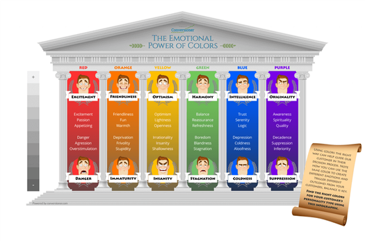
Red is especially good with “classic” colors – black, dark blue, dark brown, white, beige, dark purple. It also goes well with turquoise, menthol, pale blue flowers.
Yellow has many shades – from lemon and pale yellow to gold, mustard, orange and even brown undertones. It looks good with gray, brown, blue, denim, beige. Light yellow can be combined with khaki and olive, salad colors, and rich yellow with “leaving” in orange or brown with cold green. Both pairs well with navy blue and dark gray.
Surprisingly, orange goes well with many, even contrasting colors. In addition to white, black, brown, gray and beige, it forms good pairs with aqua and turquoise, red, dark purple, lilac, yellow. Orange can be peach, carrot, orange shades.
Pastel shades are best suited for pink – pale blue, beige, pearl gray, light lilac, especially when it comes to soft pale pink. More saturated shades of this color, such as hot pink, fuchsia, magenta, can be combined with black, burgundy, blue, gray, purple. All shades of pink look good with denim.
The blue color of a soft shade can be combined with white, pale yellow, pale pink, silver gray, and also black, gray, beige, brown, various shades of green, burgundy and purple. In certain cases, deep blue can look good with hot pinks, reds, oranges, bright greens.
Violet color is saturated, the color of a ripe plum, dark, almost black, eggplant, purple. Such shades are best combined with red, yellow, burgundy, pink, beige, gold, and light purple. Light purple shades (lilac, lavender) can be combined with pale yellow, pink, white, black, gray, sky blue colors.
With any color combination, a balance should be maintained – do not mix more than three colors in one ensemble, especially contrasting ones, do not get carried away with a combination of dark shades of different colors (this does not apply to light pastel shades, they always go well with each other). It is important to have in your wardrobe things of one of the basic colors – black, white, gray, brown, dark blue, they can be combined with almost all existing colors of the spectrum.
When combining bright contrasting colors, there should be no more than two of them in the ensemble.

If you do not risk combining bright contrasting colors, you can try to combine shades of a certain color that are different in saturation: purple and lilac, pale pink and fuchsia, deep blue and light blue, etc. in this case, even more than three colors can be combined and they will all be combined with each other.
In all cases, when choosing the colors of your wardrobe, you also need to rely on your own color type – to know which colors suit you and which ones are best avoided so as not to emphasize the flaws in appearance.
The stylists of Mähirli Zenan boldly use a combination of different colors, including contrasting ones, when creating their exclusive models of clothes in the national Turkmen style. Thanks to their talent and experience in combining shades, the models from Mähirli Zenan differ not only in a variety of styles and embroideries, but also in unusual and stylish color combinations that can emphasize the brightness and originality of the image of a Turkmen woman.

When creating its collections, Mähirli Zenan uses imported and Turkmen fabrics – velvet, keteni, silk, organza, chiffon, and richly decorates each model with national embroidery. In general, the style of Mähirli Zenan can be described as a bold combination of traditional Turkmen silhouettes and decor with non-standard color and texture solutions.
Resources: lookcolor.ru; otkan.ru; zen.yandex.ru.
Photo resource: ru.pinterest.com.
Also read:
- Mähirli Zenan’s new collection was highly appreciated at the Fashion Week-2022
- Defile from Mähirli Zenan completed the Fashion Week in Ashgabat
5: Black
You wouldn’t think that black would play much of a part in most websites’ color schemes. And you’d be right: most sites opt for white space, and a couple of strong colors. But black can be powerful.
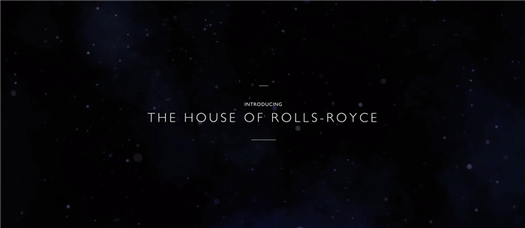
The brands that use black to good effect are luxury or high-end brands, retailing to a mainly male audience. Rolls-Royce. Lamborghini. Rutgers University.
Notice the trend?
What does black do for sales?
Black doesn’t make great conversion elements because it’s tough to see except as an outline. But a black and white color scheme automatically gives you contrast. Squarespace uses a white button on their black backgrounds:
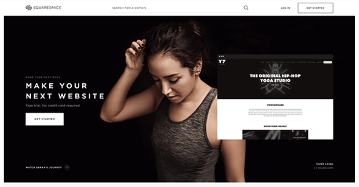
On their lighter colored backgrounds, the button is black with white text:
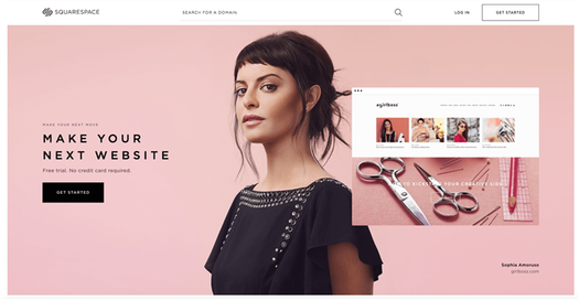
That decision frees them to use a range of colors and hues in their imagery, knowing their black/white branding will stand out among all of it.
Where can you see it in action?
Check out any high-end luxury brand with a male-oriented clientele and you’re likely to see a lot of black. For instance, Rolls Royce:
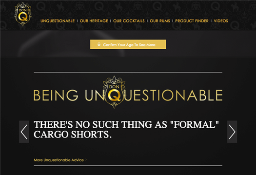
Rum brand Don Q gets some mileage out of black too, pairing it with gold and a line of copy aimed at young men who want to be sophisticated.
Where should you use it?
If you’re not selling luxury cars, use black sparingly. But it can be an effective color as an element, even on a light colored website.
6: Orange
Orange is a bright, bold color that doesn’t have red’s heart-palpitation urgency. It also doesn’t suffer as much as red does from being toned and tinted – pale reds aren’t easy on the eye, and dark reds are difficult to see text against, but orange will support a far greater tonal range.
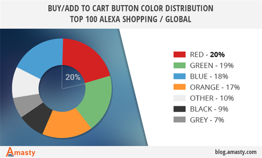
That’s the technical side. Orange features heavily in many websites, where it’s used for calls to action and buy buttons. It stands out clearly against a lot of different backgrounds, and some of its success may be down to the fact that it’s a comparatively rare brand color so an orange button is often the only orange thing on the page.
What does orange do for sales?
Orange is a common choice for conversion elements in clean, simple-looking websites. It stands out clearly from the majority of color schemes and it’s a color that people feel positively about – even though it’s in both men’s and women’s bottom three colors.
Where can you see it in action?
Penguin has orange branding, orange subscribe buttons…

And orange buy buttons.
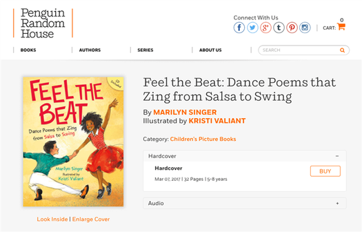
Basically, everything clickable on the page is orange.
And check out how Blogger uses orange.
It’s a classic, simple signup page.
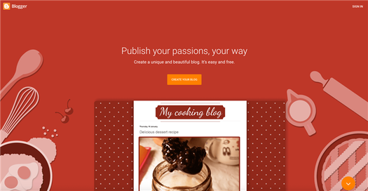
But it’s also a background slider. As the slider turns, we see two more background colors.

Teal gives way to blue…

But the signup button stays orange, because it looks bright, legible and coherent against all those different backgrounds.
How should you use it?
Check out how Harley Davidson use orange:
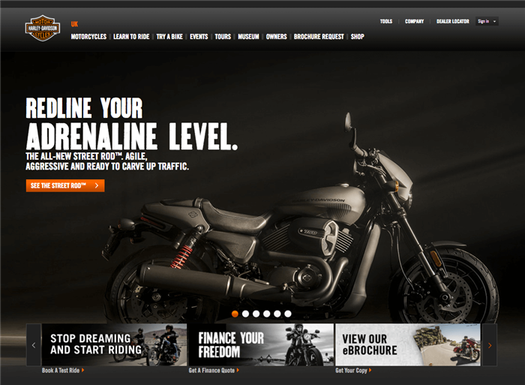
Against a dark background, bold orange stands out. The color is picked up in menu items, and even echoed in the red of the featured bike’s back springs. Most importantly, the whole site is in the colors of the logo: black, orange and white.
Conclusion
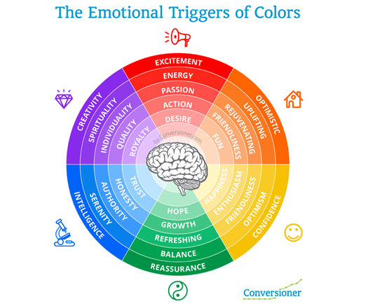
Some colors are effective because they stimulate urgency, others because they soothe anxiety. Some work by calling up feelings of safety. Others bring to mind excitement and danger.
So which should you use?
It’s vital to align the colors you use with your brand identity. If your brand is about excitement, power and freedom, then colors like Harley Davidson’s might work great for you. Victoria’s Secret uses a very different color scheme, because their brand is about something very different.
Never go against branding when you’re making a color choice.
Beyond that, though, color advice is only indicative. Some of these colors have hard facts to show that they improved conversions – for somebody else. HubSpot said it best: ‘The most we can say is that they hold for the conditions in which they occurred: in this page design, on this site, with the audience that viewed it.’
Whether they’ll improve conversions on your site is a different question.
The only way to figure out how your sales will be affected by changing the color of your buy buttons and CTAs is to run your own tests.

Richard Bayston creates copy and content at RBCopywriting.com, mostly about tech, digital marketing and content strategy. When he’s not doing that, he’s arguing amicably with his wife and Googling the answers.


