White and a red that leans towards yellow like cadmium red will make more salmon coloured pinks.
Colour Mixing ideas
These examples illustrate how the primary colors can be combined to create secondary colors. Keep in mind that the specific hues and tones of the resulting colors can vary based on the particular paints or pigments used and the proportions in which they are mixed.
Here are some quick ideas to make a new color by mixing two colours
- Red + Blue = Purple
- Red + Yellow = Orange
- Blue + Yellow = Green
- Blue + Red = Violet
- Yellow + Blue = Green
- Yellow + Red = Orange
- Cyan + Magenta = Blue
- Cyan + Yellow = Green
- Magenta + Cyan = Blue
- Magenta + Yellow = Red
- Green + Red = Brown
- Green + Blue = Teal
- Orange + Yellow = Gold
- Purple + Red = Magenta
- Teal + Yellow = Chartreuse (greenish yellow)
- Orange + Blue = Brown
- Yellow + Green = Lime
- Cyan + Blue = Azure
- Magenta + Blue = Purple
- Red + Green = Brown
Here are some quick ideas to make a new color by mixing three colours
- Red + Blue + Yellow = Brown Mixing all three primary colors together can create various shades of brown.
- Red + Blue + Yellow = Gray By combining the three primary colors in different proportions, you can achieve shades of gray.
- Red + Blue + Yellow = Olive Green Mixing red, blue, and yellow can result in various shades of olive green, depending on the ratios used.
- Red + Blue + Yellow = Dark Purple When you combine red, blue, and yellow in specific proportions, you can achieve darker shades of purple.
- Red + Blue + Yellow = Dark Turquoise By mixing red, blue, and yellow, you can create deep shades of turquoise or teal.
- Red + Blue + Yellow = Warm Gray Adjusting the ratios of red, blue, and yellow can yield warm gray tones.
- Red + Blue + Yellow = Dark Maroon Combining the three primary colors in specific ratios can result in dark maroon shades.
- Red + Blue + Yellow = Olive Brown Mixing red, blue, and yellow can produce earthy olive brown tones.
- Red + Blue + Yellow = Muted Purple By adjusting the proportions of red, blue, and yellow, you can achieve muted or subdued shades of purple.
- Red + Blue + Yellow = Warm Brown Combining the three primary colors in specific ratios can create warm brown hues.
These examples illustrate how mixing the primary colors in various ratios can lead to a wide range of colors and shades. Experimenting with different proportions can help you discover unique and interesting color combinations.
A Brief History of the Purple Hue: The Color of Royalty
Colors have been an integral part of human history since the first humans ground up different berries into the first pigments. As a result, color is so much more than a range of particular lightwave frequencies. An amalgamation of historical and cultural relevance is steeped into every color, and we believe that knowing this history brings it into your works of art. The rarity and expense of purple pigments have made it a favorite color of royalty throughout history.
Tyrian Purple
The purple color first appeared in the Neolithic period. Various Neolithic archeological sites have paintings created with sticks of hematite and manganese powder. Tyrian purple is a deep purple dye created from thousands of tiny snails. The process of making this dye was incredibly laborious and expensive, so anyone who could wear purple robes in Ancient Greece had to be very wealthy. As a result, Tyrian purple became the color associated with priests, nobles, kings, and magistrates throughout the Mediterranean.

La découverte de la pourpr (‘The Discovery of Purple’; 1636) by Peter Paul Rubens. This painting depicts Hercules’ dog, whose mouth has been stained tyrian purple after eating a sea snail. Upon seeing this shade, a nymph demanded that this color be made into a dye, thus resulting in the creation of purple dye for clothing; Peter Paul Rubens, Public domain, via Wikimedia Commons
Purple in China
Rather than using the snails from the Mediterranean, the ancient Chinese used the purple gromwell to make their dyes. The resulting purple dye adhered to the fabric very poorly, making it very expensive. The ruler of the Qi state loved purple, and as a result, it became incredibly popular during this period, and the already inflated price rose even further.
Ancient China ranked colors in terms of propriety and importance. The primary colors were the most valued, and for a long time, purple was not as celebrated as crimson. By the 6th century, however, purple had risen so far in popularity that it overtook crimson.
Purple in the Middle Ages and Renaissance Periods
For many years, the robes of the cardinals and clergy of the church were Tyrian purple. Pope Paul II declared in 1464 that since the Byzantium dye was no longer available, the cardinals should wear scarlet robes instead.
The new robes of the lower-ranking members of the Christian church were not dyed with a purple dye. Instead, the purple robes were made with a combination of indigo and red kermes dyes. The purple color became increasingly prevalent in religious paintings during the Renaissance period. Violet or purple robes often adorned depictions of the Virgin Mary.
Kings and other royal figures began to wear purple less frequently throughout the Medieval and Renaissance periods, but university professors began to wear it more. Students and professors of religious studies, in particular, often wore purple robes. It was during this time that purple began to be associated with wisdom and knowledge.
Purple in the 18th and 19th Centuries
Purple was still the color of the privileged throughout the 18th century, being worn by royalty, members of the aristocracy, and members of the Christian church. It was in the 19th century that this began to change. The experimentations of a British chemistry student who was attempting to create synthetic quinine led to the first synthetic aniline dye. This new purple color was named mauveine, or mauve.
The new purple shade quickly took off, with Queen Victoria wearing a mauve silk gown. Before this new synthetic shade was developed, purple shades had been worn exclusively by those with considerable wealth. New industrial production processes made the color available to the masses, and this dye was one of the first to completely revolutionize the fashion and chemical industries.

Catherine II (c. 1780) by Fyodor Rokotov; Fyodor Rokotov, Public domain, via Wikimedia Commons
So, What Does the Purple Color Mean?
Color psychology associates purple with luxury, wealth, and power. In the same breath, and as you may expect given its history, purple represents nobility and royalty. The blue within purple is said to communicate a sense of stability and calm, which when combined with red, is associated with wisdom and knowledge.
What Two Colors Make Purple?
On the surface, mixing purple seems as easy as combining red and blue pigments. As with everything in life, however, it is not that simple. There are several questions we need to ponder before we even pick up the tubes of paint. What kind of purple do you want? Do you want a bright violet shade or a muted aubergine? Do you need to create highlight and shadow shades of your chosen purple? In time we will answer all of these questions, but let us start at the very beginning.
Pure, primary blue mixed with pure, primary red will result in a shade of pure purple. Purple, like orange and green, is a secondary color. If you are a painting novice, using a color mixing chart can be very helpful. Mixing the two colors that sit opposite each other on the color wheel will create the color that sits between them. In this case, combining red and blue, which are opposites, will create a purple color, which sits between them.
If creating the perfect shade of purple was as simple as that, we would stop the article here and call the whole thing off. Unfortunately, color theory can get a little more complicated. If you want to start mixing varying shades of purple, we need to start considering the color temperature. On the surface, color temperature is also relatively simple. Colors like blues and greens are cool, while your oranges and reds are warm. Within these categories, however, some reds are cooler than others, and some blues are warmer than others.
Cooler reds tend to lean more towards purple shades because they contain a small amount of blue pigment. In contrast, warm reds naturally drift towards orange because they include a little yellow. The tendency of particular colors to veer towards others is known as color bias, and you need to understand color bias to create exact shades. The relative temperature of your two base colors – red and blue – will directly affect the qualities of your purple color.

Navigating the Color Bias to Mix Purple Colors
Mixing the perfect purple color is not as simple as combining the closest blue and red. If you have a collection of paints in your studio, try gathering all of your red and blue colors together. You will see that there is great shade variation in both colors. So yes, blue and red will make purple, but the purple shade depends heavily on the types of blue and red you use.
Purple is a secondary color, and to create vivid secondary colors, you must use only two primary shades. If you use a warm red that contains a little yellow, and a cool blue that also has some yellow, you are mixing together all three primary colors. A combination of all three of these will result in a muddy shade of purple that is closer to brown.
So the bottom line is, to create a vibrant purple color, you need to use a warm blue and a cool red.
Ranking Blue Shades from Warm to Cool
Generally, you can tell the relative temperature of blue shades just by looking at them. Warmer blue shades, like ultramarine blue, appear to be closer to purple already, while cooler blues, like manganese blue, have a green tint. While we have spoken a lot about color temperature, it is very much a relative term. Here is a list of blue shades, ranked from warm to cool:
Ultramarine blue, indanthrone blue, and cobalt blue are your go-to blue shades for creating the most vibrant purple colors. It is not enough to have the right blue, we also need to consider the red.
Ranking Red Shades from Warm to Cool
You can alter the shade of your purple by changing the blue you use and the red you use. While you want warmer shades of blue for a vibrant purple, you want cooler shades of red. Here is a list of possible red colors ranked from warm to cool:
To create pure purple shades, spectrum crimson, alizarin crimson, permanent carmine, and quinacridone rose are your go-to cool reds. Any of these shades combined with a warm blue will create the most beautiful, vibrant pure purple.
Adjusting the Temperature of Your Purple Shades
While we are on color temperature, we should discuss creating warmer and cooler shades of purple. Whether you are painting a field of purple tulips or decadent silken robes, a range of purple hues will lend more realism to your composition. Adjusting the temperature of your purple shades is one way you can begin building a purple pallet.

Throughout the rest of this article, we will be using pure purple as a base color. This pure purple is a combination of alizarin crimson and ultramarine blue.
Making Cooler Purple Colors
The simplest way to cool down your purple color is to add more blue. The most important thing to consider if you choose this method is which blue to use. It is always best to use the same blue you used to make the original purple color. It needs to be a warm blue, or you will make your purple shade muddy.
It is also good practice to only add a small amount of blue to your purple at a time. A small amount of paint can drastically change the color, and if you add too much blue too quickly, you may have to add more red as well to bring it back to your perfect shade.
Making Warmer Purple Colors
It may seem obvious now, but to make a warmer purple, the best way is to add a little more red. You should definitely use the same red you used to make your base purple, and this red should be cooler, or else your purple will become muddy. Once again, if you are adding red to your purple shade, start by adding a small amount and keep adding gradually until you are happy with the hue.

Muting Bright Pure Purple Colors with Complementary Hues
Sometimes a vibrant pure purple is not what we want. If you want to paint realistic scenes, vibrant purple alone will be garish. Muted shades are important elements of any painting because they help the brighter colors stand out. Knowing how to mute bright purple shades is just as important as knowing how to mix them in the first place.
The best way to mute any color is to add a small amount of that color’s complement. A color’s complement is the color that sits directly opposite it on the color wheel. The color that complements purple is yellow. Adding a small amount of yellow to your purple will mute the color, making it less vibrant.
As in every other aspect of color mixing, the temperature of the complementary color is important. A warmer yellow that is closer to orange will mute your purple but keep it fairly warm. If you want a more earthy muted purple color, try mixing it with a little bit of yellow ochre.
In contrast, using a cooler yellow, like cadmium lemon yellow, will mute and cool your purple shade. While on the most basic level, purple and yellow are color complements, each unique shade of purple will have its own unique complement yellow shade. Getting to grips with the color wheel and these basic aspects of color theory will set you in good stead to mix and mute any color you need.
Creating Purple Tints and Shades
If you are looking to mix a dark purple color or a light purple, it is time to consider tints and shades. Dark purple colors and lighter shades of purple are essential for creating depth and dimension in your paintings. As you now know, adjusting colors is a little complicated, and the same goes for creating tints and shades.

How to Make Light Purple Tints
Having highlight shades or tints of your purple hue is essential for capturing the effects of light or depth. Purple colors are typically quite dark colors naturally, so it is likely that you will want to lighten them often. There are a few different methods you can try out for creating light purple colors.
Adding small amounts of white to your purple hue is the most common and easiest way to make light purple. One of the most significant benefits of using white to create light purple tints is that you will not alter the purple hue. Lightening pure purple with white will result in a lighter tint of pure purple.
Another great option for creating light purple tints is to add a little bit of light yellow. Adding a color of a light value to your purple will lighten it. We know that you can use yellow to mute a vibrant purple hue. If you want to make a muted purple tint, then a light yellow is the perfect option.
The best yellows we can suggest are cadmium lemon yellow and cadmium yellow. Cadmium lemon yellow will make your purple hue much lighter than cadmium yellow. The method you choose to use to create purple tints is personal preference, and it may take some experimentation to get the perfect shade.
How to Make Dark Purple Shades
Purple colors are already quite dark, so it is not difficult to make them a little darker. You really need those dark purple shades to add shadows and dimension to your paintings. Depending on the complexity and the light values within the composition, you may need several dark purple shades. It is always a good idea to create a pallet of light and dark variations on your primary purple hue. There are also a few different ways you can make dark purple hues.
As you can use white to lighten purple, you can also use black to darken your mixture. Many artists, us included, will warn you that using black is not the best way to make your purple hues darker. The reason why this is not the best method is that black paint is rarely a pure black pigment.
Most tubes of black paint contain many different color pigments, and they often have a green pigment base. You can test this out yourself. Try mixing your black paint with some white. You will likely find that rather than forming a pure grey, this combination will have a greenish tinge. Using black to make dark purple may result in unwanted tinges of color.
A better option for making dark purple is to use a small amount of burnt umber. Burnt umber is a dark reddish-brown shade, and when you mix it with pure purple, it creates a deep muted shade. In terms of temperature, burnt umber is warmer than purple, and as a result, it will warm up your purple hues.
Phthalo green is another option for creating a rich dark purple. You can create a dark black color by combining phthalo green and alizarin crimson. Mixing some of this combination with your purple shade will result in an incredibly dark purple. Out of all the purple colors that you can mix yourself, this combination is probably the darkest.

Scientific Hex Table for Different Shades of Purple
| Type of Purple | Hex Number | % Red, Green, Blue | % Cyan, Magenta, Yellow, Black | Purple Shade |
| Pure Purple | #660066 | 50% R, 50% B | 68% C, 100% M, 26% Y, 18% K | |
| Lavender | #e6e6ff | 50% R, 50% Blue | 8% C, 8% M, 0% Y, 0% K | |
| Aubergine | #3d0734 | 51% R, 43% B, 6% Black | 76% C, 95% M, 45% Y, 58% K | |
| Mauve | #b784a7 | 38% R, 35% B, 27% G | 29% C, 54% M, 14% Y, 0% K | |
| Plum | #8e4585 | 41% R, 39% B, 20% G | 50% C, 86% M, 17% Y, 2% K | |
| Violet | #7f00ff | 33% R, 67% B | 69% C, 79% M, 0% Y, 0% K | |
| Amethyst | #9966ce | 34% R, 44% B, 22% G | 49% C, 67% M, 0% Y, 0% K |
The purple palette is a wonderful set of colors to use in your paintings. Not only can you craft beautiful purple compositions, but you can also mix purple into a range of different colors. Purple is a wonderful complementing color and it can make the other colors in a painting pop. When it comes to mixing your own purple shades and choosing your color combinations, the only limit is your imagination and your willingness to experiment.
We’ve created a web story of our Top 5 Purple colors and how to mix them.
How to mix colours: the process in steps
Step 1: Study your reference and isolate the colour you want to paint
The colour mixing process requires the painter to study the reference and isolate the colour they want to reproduce in their work. A colour in context is actually pretty difficult to isolate, as the surrounding colours can alter the appearance of the colour in question. This effect is called simultaneous contrast.
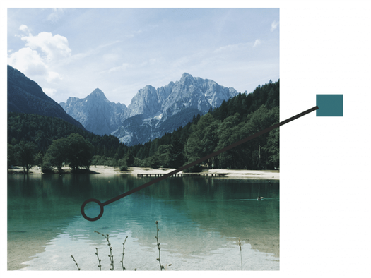
To make it easier, you could use a tool like Photoshop, or another photo editing programme. Use the picker tool to sample the colour from your photo reference. Just make sure that your document is in CMYK mode first.
If you aren’t painting from a photograph—you’re painting from life or on the field, or if you don’t have photo editing software, then you can use a tool to physically isolate colour. Use a viewfinder tool to look through to see the colour in isolation.
Another option is to focus on the colour and describe it. What’s the general colour category? How saturated is it? How dark or light is it? Doing this can advance your natural skills in colour perception.
Step 2: Find its place on the colour wheel
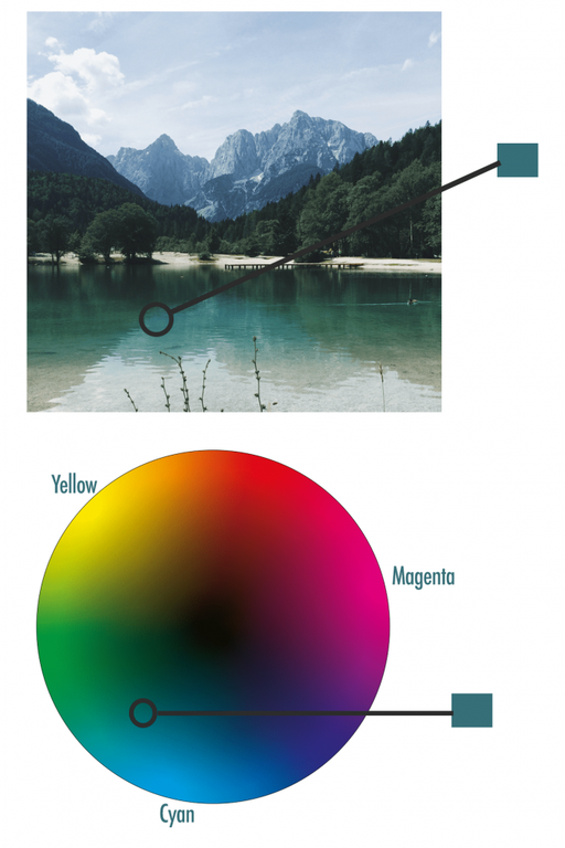
Locate your colour on the wheel. Its coordinates will inform you about the colours you should mix to make it. Describe its position on the wheel.
Step 3: Mix the corresponding pigments
You need to decide which pigments to use to, in the most efficient and cleanest way, get to your intended colour.
With the teal example above, the corresponding pigment to cyan would be phthalocyanine, with the pigment code PB15. For the yellow bias it would make most sense to use transparent yellow PY128 as it is the primary. This will make the cleanest mix.
Magenta PV19 could be used to neutralise the mix.
To create the value of the colour—in the case of the teal example, we had to increase the chroma—use a mix of titanium white and zinc white. Too much titanium would wash the colour out and make it chalky, but zinc is so transparent that it will not increase the chroma of the colour to what we need it to be, it would remain a deeper teal.
It’s only by using pigments that you will get to understand their working properties better. Also by looking at the tubes of paint, you can glean from them certain attributes like transparency and tinting strength.
Applying colour to the canvas: how to mix colours to create contrasts and harmonies
You use colour in art to create special effects, to evoke emotions from the onlooker.
One colour combination may unsettle the viewer and the next could make them feel peaceful or energised.
To create order, or to achieve a particular stylised effect in your painting, you could choose a colour scheme.
Colour mixing: use a colour scheme
Use a split-complementary colour scheme gives strong visual contrast, but is more harmonious than using complementary colours. It uses the two colours either side of the complementary colour of the base colour you have chosen. For example:
Analogous colours are three situated next to one another on the colour wheel, for blue, green and yellow. Use this combination to create colour harmony in a painting. As the colours are so similar, create variation in the saturation and values of the colours.
How to mix colours from a limited palette
Another way to create contrast and harmony in your work is by limiting your palette to just a few colours. Pick colours that give variety in warm and cool tones to give the appearance of variation.
The colours you pick for your limited palette should resemble the primaries to give you a full range of colour contrasts when you paint. Using too many colours in a painting can be overwhelming for the onlooker.
By limiting the colours in your palette, you can tie different sections together, overall giving a more muted appearance. You won’t be able to mix any shade on the spectrum by using a limited palette, but the colours you do choose will relate to one another more.
To create landscapes, still life or portraits with realistic tones, you will hardly ever need to use grey or black for shadows. Simply use contrasting colours already on your palette that you have used throughout your painting. It’s possible to make a variety of warm and cool greys for your shadows that will harmonise with the colours in your painting.
How to mix colours: Pin it!
If you’ve found anything on this site especially useful, you can make a donation to me through PayPal. I take a lot of time to research and write each topic, making sure each tutorial is as detailed as possible and I make all my content freely available. Any small donation (even the price of a cup of coffee!) can help me to cover the running costs of the site. Any help from my readers is much appreciated :).
Follow the link in the button below to support this site.


