If you want to get comfortable with mixing colors, you need to understand the basics of color theory. For example, you may already know the three primary colors: blue, yellow, and red. But are you familiar with the secondary and tertiary colors and how to make them?
Color Mixing Chart: A Guide to Mixing Colors for Absolute Beginners
As an artist, knowing how to mix colors is an essential skill to have. It will help you feel more confident in your craft. Plus, you’ll be able to achieve any aesthetic you want to create. A color mixing chart is a helpful tool to know what colors to mix.

You can’t always rely on paint sets to contain every color you’ll need for your paintings. Even if you buy individual tubes, you’ll still find that you’re limited in the colors you can use.
And so, the secret is to learn how to mix your own colors. Once you’ve mastered this skill, you’ll be able to create any color you could ever need. So, you can make your artwork unique and vibrant with custom colors you’ve mixed yourself.
I’ll guide you through how to mix colors effectively in this article. You’ll learn how to use color mixing charts and become an expert on how to combine colors!
Table Of Contents
- What is a Color Mixing Chart (and why to use it?)
- Color Theory – Primary, Secondary, and Tertiary Colors
- Primary colors
- Secondary Colors
- Tertiary Colors
- How to Use a Color Mixing Chart
- How to Make Your Own Color Mixing Chart
- How to Mix the Colors for your Chart
- The Wrap Up
What is a Color Mixing Chart (and why to use it?)

A color mixing chart is a handy tool for any beginner artist. It’s a simple diagram that shows you what you’ll get when you mix specific colors. So, it’s a great shortcut when you’re getting started with painting or any other similar medium. You can refer to your color mixing chart to find out how to make a specific color. As a result, it will save you a lot of time and effort. Otherwise, you’d have to do the hard work for yourself. That could mean spending hours mixing colors to see if you get the desired result. It’s still a good idea to play around and experiment with mixing colors. When you do this, you’ll come to understand how the different colors work together. But there’s no need to reinvent the wheel. And that’s why a color mixing chart is essential for any artist.
Color Theory – Primary, Secondary, and Tertiary Colors

If you want to get comfortable with mixing colors, you need to understand the basics of color theory. For example, you may already know the three primary colors: blue, yellow, and red. But are you familiar with the secondary and tertiary colors and how to make them?
Primary colors

Let’s start from the beginning with a simple recap. You can’t make a primary color by mixing other colors. But you can make any other color using a combination of the three primary colors, red, yellow, and blue.
Secondary Colors

When you combine two primary colors, you’ll get a secondary color. For example, mix yellow and red, and you’ll get orange. Blue and yellow make green, and blue and red make purple. We often refer to this color with its technical name, violet. Violet is a specific shade of purple, which is a much vaguer term. And so the secondary colors are orange, purple, and green. That’s simple enough and pretty straightforward. But what exactly are tertiary colors, and how do you make them?
Tertiary Colors

You’ll create a tertiary color when you mix a primary and secondary color. Creating tertiary colors gives you a wider range of shades to use in your artwork. Really, tertiary colors are just variations on the secondary colors. They will have a stronger tint or undertone depending on the primary color you use. For example, you’ll get blue-violet when you mix blue and violet. And when you combine green and yellow, you’ll end up with yellow-green. These aren’t the most inventive names, but they are simple and easy to understand. The tertiary colors include:
- Blue-violet
- Red-violet
- Yellow-green
- Blue-green
- Red-orange
- Yellow-orange
Knowing how to mix these tertiary colors will allow you to create a more nuanced painting. You’ll be able to mix the exact shade you need. For example, a fresh, light yellow-green looks nothing like a rich, deep blue-green.
How to Use a Color Mixing Chart
You can find many color mixing chart samples online. So, that’s a quick and easy way to reference which colors you’ll get when you mix certain shades.
That is handy if you’re short on time or just want a general idea. But it won’t be as specific or accurate as if you make your own color mixing chart.
That’s because the artist may have created the chart digitally. So, these colors may not correspond to the exact paint colors you have.
And even if they used paints, they might not have the same paint shades as you. So, the result could be slightly different.
But there’s nothing wrong with using a ready-made color mixing chart. Just don’t expect it to give you perfect results. Instead, you can rely on it as more of a guide.
And there are also helpful websites like TryColor. This digital tool creates different color combinations with just a click. It’s useful for both traditional and digital art to see how to make specific shades.
Jurien72
Have Airbrush – Will Travel!
If you happen to find a chart like that, clue me in!
Air-Valve Autobot!
Here’s what I have,Cost was 12.00 and worth every penny!
Last edited: Nov 5, 2017
Reactions: doc1 and JackEb
Ricky Spanish
“The Hi-Line Bandit”
trycolors.com . might be what you’re looking for.
AKA QuickDraw and very happy #nobrushleftbehind
Staff member
Admin
Depends on the paints you are using so some specific manufacturers (like Golden) can give you some ideas but at the end of the day you are better off doing the hard yards and learning how to do it. Charts give you a hint!
Mr.Micron
Royal pain in the air hose
Staff member
Admin
Is there a good online color mixing chart? One that just has for example 1 drop blue 1drop blue makes purple. Something easy to follow and extensive?
Oh and 1 drop of blue and 1 drop of blue still only gives you BLUE LOL I think you mean Red on the second blue
Reactions: RichardH
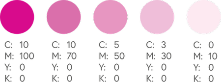
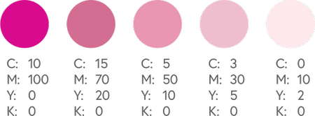
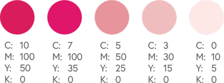
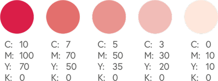
CMYK Pinks
Pinks in CMYK printing are all about the magenta. For stand out pink colors – the magenta levels should be high, and the yellow, cyan, and black low. If you add too much yellow, you will get more red hues, but with too much cyan, it will turn purple.
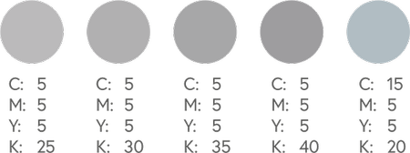
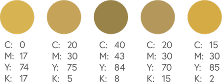
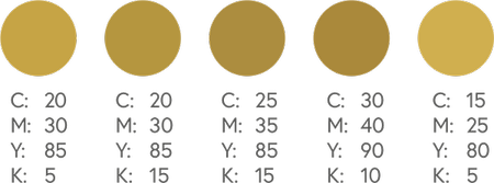
CMYK Golds
We cannot provide a realistic metallic gold finish in CMYK printing, but we can produce a flat or NMM (non-metallic metal) representation of gold. See right for some examples.
If you want a close representation of a metallic finish, you will need to use a metallic Pantone spot ink for your design. Foils are also available for some products.
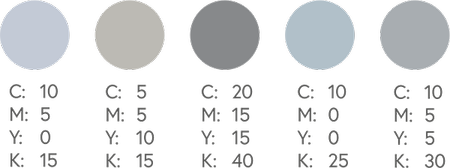
CMYK Silvers
Similar to CMYK golds, you cannot also obtain a metallic silver finish in CMYK printing. Flat or NMM (non-metallic metal) colours are possible, and you can use a metallic Pantone spot ink for your design or foiling.