The colored part of this graph is called a histogram. It’s a map of where each color appears in your image, and how much of it there is. It can help you visualize how your changes will affect the overall color balance of your layer.
What is the gradation between purple and blue?
The original impetus for my research was to make the RGB and CMYK systems of color understandable and useful to art students. I created a color wheel of the RGB system on the computer and on paper with Windsor-Newton cyan, magenta and yellow inks. I created gradations of cyan, magenta and yellow ink mixtures in tiny flasks counting the drops with chemist’s pipettes in geometric progressions. I made the cyan, magenta and yellow inks into solid watercolor blocks with gum arabic and gave them to artists and students to try. Even though I could demonstrate that RGB/CMYK color could create more colors than the red, yellow and blue (RYB) artist’s color wheel, artists were uncomfortable with these colors without being able to tell me why. Students were unable to complete satisfactory complimentary and triad color exercises with either the inks or the watercolor blocks. They also could not produce satisfactory compliments and triads in RGB on the computer.
I reread books of art instruction looking for the precise place in the text that physics and art diverge. This is a typical example from Craig Denton’s1 otherwise excellent essay on color theory:
Color circles or color triangles are graphic vehicles used to organize colors. We will be using the artist’s color circle, which relates to pigments because graphic designers generally follow its traditions and rules. There is another color wheel, composed of light primaries and their subtractive color complements, which we will discuss later. But, subtractive colors are obscurely named and physically transparent, designed to be overlayed in printing, and wind up looking unpleasantly acidic by themselves. A subtractive color circle isn’t aesthetically pleasing so it doesn’t help you understand how to best compose colors.
Luigina De Grandis, in Theory and Use of Color, summarizes the frustration of reconciling artist and scientific color. She defines magenta as “a red tending toward purple” and then says: “. the artist, not bound to the industrial primaries, may continue to use the reds, yellows, and blues of his or her choice.” 2
Johannes Itten’s statement 3 is important because his work is considered authoritative by artists, and because he studied and wrote about Ostwald in an attempt to reconcile art and science:
One essential foundation of any aesthetic color theory is the color circle, because that will determine the classification of colors. The color artist must work with pigments, and therefore his color classification must be constructed in terms of the mixing of pigments. That is to say, diametrically opposed colors must be complementary, mixing to yield gray. Thus in my color circle, the blue stands opposite to an orange; upon mixing, these colors give gray. In Ostwald’s color circle, the blue stands opposite to a yellow, the pigmentary mixture yielding green. This fundamental difference in construction means that Ostwald’s color circle is not serviceable to painting and the applied arts.
In the RGB system yellow and blue subtracted does make gray and totally subtracted makes black. The RGB System should satisfy Itten’s requirement. This observation led me to concentrate on how the hue of blue differs in RGB and RYB systems, and why RGB color did not yield harmonious compliments.
Experiments
I scanned manufactured color wheels, color wheels in books, as well as paint sample color cards into the computer. I asked students to duplicate their RYB color wheels from 2D design class in RGB. On the computer I simulated the subtraction of yellow from a range of blues using a ‘difference’ algorithm. In the RGB color wheel (color picker) cyan is at 180° and blue is at 240°. Halfway between is a blue at 210° that will produce a green of precisely 50% value. It is this darker green that is on artist’s color wheels. The most prevalent mechanical color wheel is the “Artist’s Color Wheel” ©1989 by The Color Wheel Company. On this wheel the blue is 206°, slightly closer to cyan than blue. In most texts on color the blue is close to the 240° blue of the computer and would not yield a green if mixed with yellow.
I then set about understanding what was ‘right’ or useful in the artist color wheel, rather than dismissing artists as merely obdurate and stubborn. What I noticed primarily was differences in value between the same hues in the RGB and RYB systems. I next measured the hues and values of the scanned color wheels and entered the hues and values on a spread sheet. These measurements were used to generate radar (circular) charts of the hues and values. The hues, measured in degrees in the RGB color picker, were plotted on the diameter of the chart while the values were plotted as distance from the center.
In May of 1995 I posted the results of this study on the World Wide Web as “Computer Color and Artist’s Color” I listed four general differences between the RYB and RGB system. The most important demonstration in this study was a figure showing the RYB and RGB color wheels transformed to gray values. In the RYB system, green and red are equal in value. There is an even gradation of values from yellow as the lightest at the top to purple as the darkest at the bottom. Left and right halves of the wheel are almost identical in value. The RGB color wheel shows no such symmetry or evenness in value, green of course being much lighter than its opposite red in RGB. I concluded that the artist’s color wheel was skewed primarily to reduce the difference in value in opposite colors. Understanding what was correct and useful in the RYB system still did not create a tool for managing the larger gamut of colors available in RGB, nor did it create an RGB color wheel with harmonious opposites and triads. I then tried to reinvent the color wheel by various combinations of gradations and layers on the computer. I created radial gradations of red, green, blue, cyan, magenta and yellow in which the diameter corresponded to the value of the color and the placement of the resulting circle was determined by the value on the Y axis and the hue on the X axis. I was hoping that the overlapping of these circles would produce a complete range of possible hues and values in a useful juxtaposition.
Conceptually, a spectrum of all the hues of RGB arrayed on the X axis combined with a gradation from black to white on the Y axis should produce all the possible hue/value combinations. I discovered that the pasting and layering algorithms available on the computer did not produce even gradations or complete sets of intermediate colors. This led to a long series of experiments with layering, pasting, and opacity algorithms.
One of the algorithms I used produced a dominant peak of green in relation to red and blue and distorted the spectrum into what looked like a mountain range. I initially thought this algorithm distorted the hue/value relationship of RGB. In fact it was the value of the RGB colors that were distorted, and this chart put the hues back into their correct value relationship.
Now, instead of having a system that would reconcile artist’s and RGB systems, I had found a system alien and antithetical to both. The chart of the hue/value relationship that I produced further showed that green comprised more than half of the total brightness of RGB and that white was therefor the highest value of green.
My chart of hue/value relationship of color also corresponds to the dominance of green in the spectral luminosity curve in Richard L. Gregory “Eye and Brain” Fig 6.4 and 6.5. Of this he says “The luminosity curve tells us nothing much about colour vision.” because animals without color vision show a similar luminosity curve. P.94. Luminosity is discussed in the chapter on brightness and not mentioned again in the chapter on color. This to me is like the Wizard of Oz saying “Pay no attention to that man behind the curtain.”
Results
I did not wish to draw the conclusion that white is green, but the idea kept reasserting itself. Several phenomena that had been a puzzle to me now made sense, especially Goethe’s experiments with the prism. Looking through the prism at a white rectangle of paper, Goethe saw cyan gradating to blue on one edge and yellow gradating to red on the other edge. If you shine a beam of sunlight through the prism and place a white surface close to the prism you will see a white band with this same phenomenon. As you move the target surface away from the prism, the cyan and yellow color bands will enlarge and the white center band will get narrower. When the cyan and yellow overlap, green will appear in the place of white. At a greater distance the cyan and yellow bands get narrower and red, green and blue predominate. The diagram of this phenomena also makes sense as a chart of basic color organization.
Further evidence seems to reinforce my premise: Because green carries most of the value information in RGB and in video, the most advanced single-chip color CCD has 3 green sensors for each red and blue sensor. In the Kelvin temperature of light, lower K° numbers represent red light increasing to yellow followed by white and finally blue at the highest temperatures. White occurs between yellow and blue in this progression, in the same place as green in the spectrum. Green is even more predominant in the curves that represent the sensitivity of grayscale CCD video chips such as the Sony ICX038DLA (chart available on the Internet5). The development of grayscale sensitivity in film and video has a long history partly based on empirical data from luminosity curves with some adjustment for aesthetic preference to arrive at the current characteristics of black and white film and video. The algorithm that translates RGB to grayscale on the computer yields brightness percentages that total more than 100% but the relative percentages approximate the percentages of RGB in NTSC video quoted in Gregory6
The greyscale conversion algorithm is a useful tool because it allows a dramatic visualization of the relation of hue to value. Red, green and blue must be balanced on computer and video screens to produce white and shades of gray. Because the hue/value relationship is empirically derived from measurements of human perception and carefully adjusted and calibrated, it follows that information about human perception of color is imbedded in the RGB system for it to work.
Conclusion
A color that is 30% red 59% green and 11% blue has an underlying hue of 101° green, close to the hue of chlorophyll. I therefore conclude that if white in the RGB is derived from empirical data from human perception, then white in human perception has the hue of green as well. This corresponds to what appeared to Goethe in the prism. New physiological evidence about perceptual mechanisms is not needed to draw this conclusion, although it might suggest lines of inquiry for scientists, possibly even a reconciliation of tricromat and opponent process theory.
I would like to propose the usefulness of “White is Green” in explaining the hue/value relationship of color. RGB color space is a distortion of the hue/value relationship in the same way that Mercator’s projection map of the globe onto a rectangle is a distortion. Every pure hue in RGB is defined as having a brightness of 100% when in fact every hue has a different brightness. The artist’s red yellow and blue color wheel creates harmonious colors only in a limited range of hues and values. Artists argue that harmony is subjective and culturally determined. Even so, once a convention or style has been established, only very specific colors will fit within that convention. Matching colors and creating variations within established limits requires careful control of hue and value, a task that I hope to make easier.
References
| 1 | Denton, Craig, Graphics for Visual Communication, Wm. C. Brown Publishers, Dubuque, Iowa, 1992. p 108. |
| 2 | De Grandis, Luigina, Theory and Use of Color, Arnoldo Mondadori S.pA., Milan, 1986. p 18. |
| 3 | Itten, Johannes, The Art of Color, Reinhold Publishing Corp, New York, 1961. p 23. |
| 4 | Gregory, Richard, Eye and Brain, Princeton University Press, Princeton, New Jersey, fourth ed., 1990. pp 92-93. |
| 5 | Internet address -http://www.sel.sony.com/semi/ccdarea.html | 6 | Gregory, Richard, Colour Vision. The Oxford Companion to the Mind, Oxford University Press, New York, 1987. p 151. |
Department of Art, California State University, Long Beach
1250 Bellflower Blvd, Long Beach CA 90840
Whether or not you agree with the ideas in this paper, please let me know how you found this site. [email protected]
Color Gradation Meaning
Color gradation refers to the transition from one color to the next. That transition might be smooth or sharp.
Below is a simple example. It features a smooth gradation between different hues.

The image below features the same colors, but the gradations between them are sharper and more abrupt.
The nature of the color gradations you use in painting conveys a significant amount of information. So not only do you need to pick the right colors to paint with, but you also need to paint the right gradations between those colors.
A smooth color gradation might suggest ambiguity (think a foggy landscape or a dark interior painting like Henry Tuke’s A Sailor’s Yarn). Or realism (think of the subtle skin tone gradations in Peter Paul Rubens’ work). Or the gradual change from one object or area to the next (think the change from clear water to the sandy shoreline).
A sharp color gradation suggests clarity or some kind of significant change in the subject.
The gradation might also vary in terms of quality or roughness. The color gradations on a tree trunk tend to be rough compared to, say, the color gradations on an egg or any other smooth object.
It’s important to note that these are all relative terms. A sharp color gradation in one painting might be a smooth color gradation in another. Consider color gradation as a scale between sharp and smooth, rough and refined.
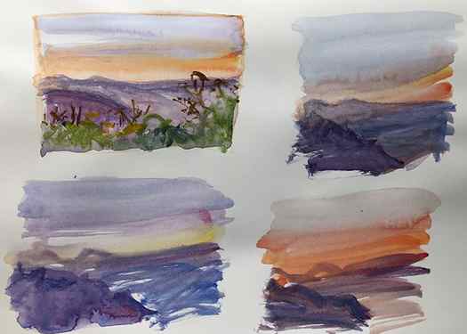
Let’s go back to my Morning Lookout painting as an example.
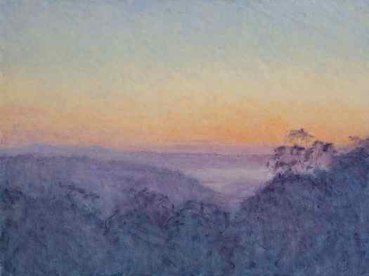
The sky changes from blue to green to yellow to orange to purple. The colors get darker as it goes from the sky to the distant land, and darker yet as the land gets closer in perspective. These are all color gradations. The nature of them is important. Imagine if I had painted the sky with abrupt changes from blue to green to yellow to orange to purple. It would look like the side of a cake, not the morning sky and its pastel colors.
Color Gradation Techniques
Let’s run through a few techniques for painting color gradations.
The simplest technique is to blend one color into the next. This will create a natural and smooth gradation, depending on how refined your brushwork is. For a rougher color gradation, use rougher brushwork.
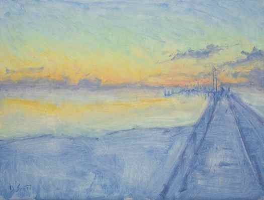
This is the technique I used for both Morning Lookout and Fraser Island, High Key (below). For painting the sky, I worked blue into green, and green into yellow, and yellow into orange, and so on. I left the brushwork rough, but you might prefer a more refined finish.
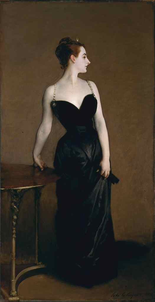
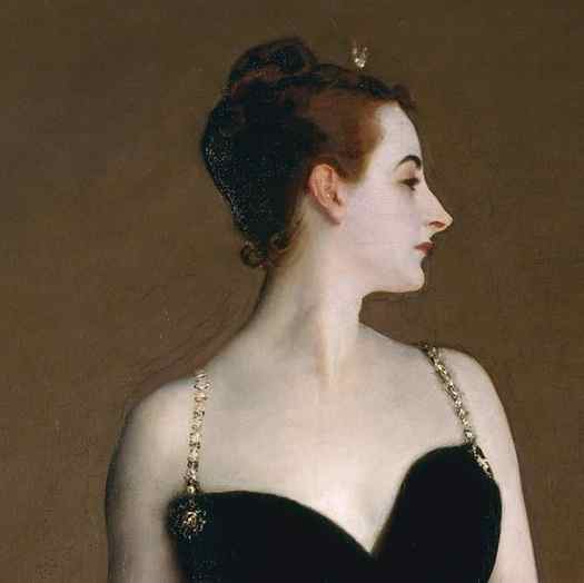
Blending is perfect for capturing delicate skin tone gradations. Take John Singer Sargent’s Portrait of Madame X (below). The colors melt into each other. The smooth and refined color gradations capture her youth and softness. They also contrast nicely against her sharp and intricate facial features, hair, and clothing. Remember, painting is all about contrast.
Instead of blending two colors together, place an intermediate color between them. For example, say you have blue and yellow. A dab of green in between would help smooth the color gradation (green being what you get when you mix blue and yellow). If you have yellow and red, place a dab of orange in between. If you have green and blue, place a dab of greenish-blue in between. You get the idea.
You might use this technique over blending if you prefer a more blocky, broken appearance. Or if the paint has dried on your canvas, making blending impossible.
The technique of the Impressionists. Nicolai Fechin describes it well:
“To avoid murky results, it is necessary to learn how to use the three basic colors and to apply them, layer upon layer, in such a way that the underlying color shows through the next application. For instance, one can use blue paint, apply over it some red in such a manner that the blue and the red are seen simultaneously and thus produce the impression of a violet vibration. If, in the same careful manner, one puts upon his first combination a yellow color, a complete harmonization is reached – the colors are not mixed, but built one upon the other, retaining the full intensity of their vibrations.”
It typically involves painting with small dabs of distinct color. Instead of painting the sky with smooth blue tones, you would use dabs of blue, white, gray, and perhaps a touch of green or purple. The dominant color of an area is the sum of many small dabs of color. (Refer to my post on broken color for more details.)
It’s a rough technique by nature. You won’t get the smooth color gradations of blending. But you do have some control over how rough the gradation is.
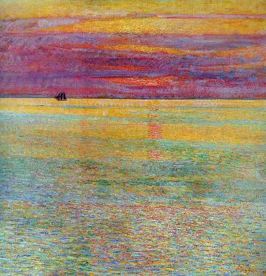
Take Child Hassam’s Sunset at Sea for example (below). The water transitions between areas of blue, green, red, and yellow. Some areas are more distinct than others. Notice how each area contains dabs of color from the surrounding areas. The yellow areas contain dabs of green. The green areas contain dabs of blue and yellow. The red areas contain dabs of yellow and green. These familiar colors help soften the gradation between the areas.
The same goes for the sky, though it has much sharper color gradations.
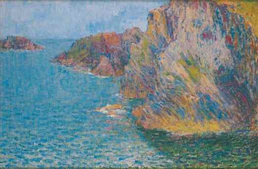
Below is a painting from Claude Monet’s Waterloo Bridge series. Look at the bridge in particular. There’s a relatively smooth color gradation as you go from the bridge, to the bridge’s shadow cast over the water, to the water in light. Blue, to blue-green, to green-blue with dabs of yellow and white.

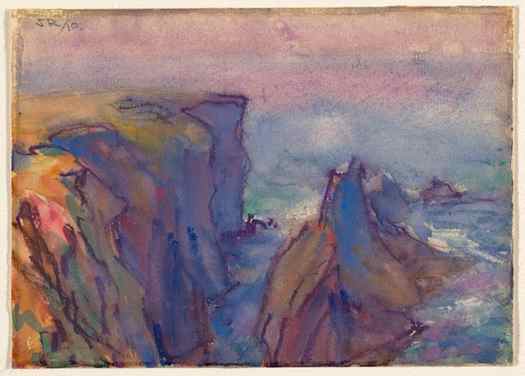
John Russell’s work also comes to mind. It’s similar to that of Claude Monet, but his use of broken color was often more dramatic.
Here’s a closeup I took at the New South Wales Art Gallery. Look at all those wonderful textures and colors. Notice the slight overlap in colors as it goes from light to dark. The more overlap, the softer the color gradation.
Hatching is a shading technique where you draw parallel lines to darken an area. The closer and thicker the lines, the darker the result. But we can also use it to soften color gradations.
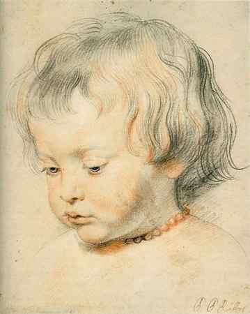
Say you want to soften the gradation between a light and dark area. You could use dark hatching to push into the light area, or light hatching to push into the dark area, or both. Steve Huston does this often in his paintings. Peter Paul Rubens as well. Refer to one of his sketches below. He used hatching to transition between light and dark areas. The hatch lines also reiterate the structure and form.
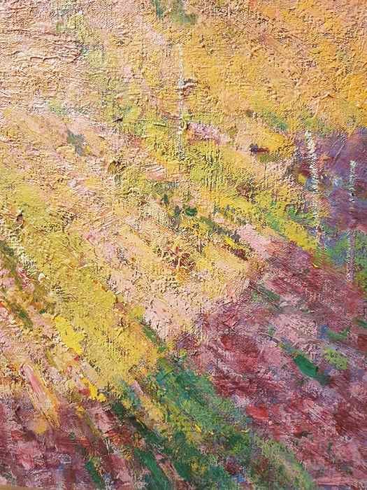
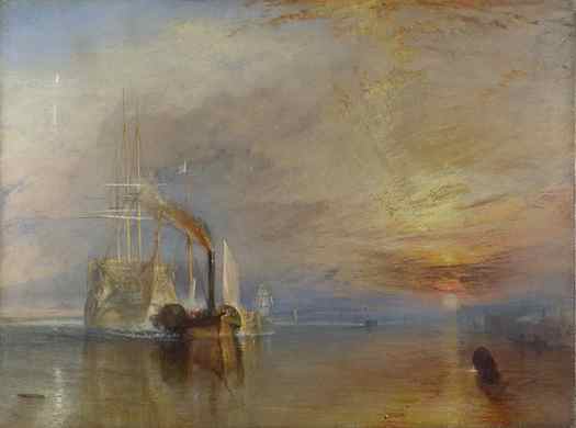
Layering involves painting a thin, partially translucent layer of paint over another layer. It can produce fine, almost ethereal color gradations. Joseph William Turner’s The Fighting Temeraire is a great example. Thin washes of color contrast against the impasto brushwork.
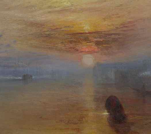
Below is a closeup. Notice how effortless some of those color gradations appear.
Layering is particularly suited to watercolors. As an example, refer to Edward Compton’s painting below, particularly around the shadows.

You can create color gradation by varying the density of color either by using more strokes, more pressure, or thicker paint.
For example, if you paint a thin wash of color over a white surface, some of that white surface will show through. As you continue to build up paint in an area, the color will get stronger, resulting in a gradation from weak to strong color.
Below is another example. It’s an extract from my sketchbook (thanks to New Masters Academy for reference). Notice how some areas are richer and darker as a result of more strokes and more pressure on the strokes.
A Note on Different Mediums
Your painting medium will somewhat determine the color gradation techniques you use.
Oils: Versatile by nature. Suits any technique.
Watercolors and Gouache: Suits thin washes or intermediate color. Blending is also possible, though the outcome is unpredictable compared to oils.
Acrylics: Suits blending or intermediate color. Layering is not as effective as the paint dries too fast.
Pen and Pencil: Suits hatching, broken color, or density.
Gradient Map
Apply a colorful gradient across your images using a Gradient Map.
Gradient mapping analyses the highlights, midtones and shadows of an image. It then replaces (maps) these with the colors found in a new gradient.
Tap Adjustments > Gradient Map to enter the Gradient Map interface.
Interface
Use preset Gradient Palettes to assign a Gradient Map to you image. Or, build your own custom Gradient Palette to create impactful images.

Gradient Library
The Gradient Library contains eight preset Gradient Palettes assignable to your image — Mystic, Breeze, Instant, Venice, Blaze, Neon, Noir and Mocha. Tap a Gradient Palette to assign it to your image. Or, slide the Gradient Palettes left or right to view the various preset Gradient Maps cycle through your image.
Touch and Hold a preset Gradient Pallet to Delete or Duplicate it. Touch, Hold and Drag a preset Gradient Pallet to reorder it in your Gradient Library. To restore your Gradient Library’s default gradients, Touch and Hold the + symbol at the top of your Gradient Library panel. Then Tap the Restore defaults button.


