See the dichromacy images below – about half of people with anomalous trichromacy will see the world in a similar way to those with dichromacy but their ability to perceive colours may improve in good light and deteriorate in poor light. Often their colour perception can be as poor as it is for those with dichromacy. Many other people with anomalous dichromacy (those with mild colour vision deficiency) will have less problems discriminating between colours.
Magenta: The Color That Doesn’t Exist And Why
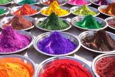
I’m sure you recognize magenta — it’s that color that’s a mix between purple and red. It’s sort of pinkish-purple, and looks something like this:
This would be well and good, except there’s a little problem with the statement above: on the spectrum of light, the color(s) between purple and red are as follows: yellow, green, blue, orange… etc. Instead, magenta manifests itself on the aptly-named color wheel, which illustrates colors fading into one another. Red and purple are the two ends of the spectrum, so on the color wheel, they naturally fade into one another.
So if it doesn’t exist, why can we see it? Again, on the spectrum of elements, all visible colors (and non-visible rays) have specific wavelengths which distinguish them from the other colors on the color wheel. Magenta, because it doesn’t exist on the light spectrum, doesn’t have one. Rather, it’s something our brain creates to fill in space in a way that makes sense.
Usually, when trying to determine color, the brain simply averages the colors to come up with an outcome. If you mix green and red light, you’ll end up with a yellow light because the brain has averaged it. When you mix red and purple light, your brain averages them. Ultimately, this would reasonably come out to green — that’s the average wavelength — but because your brain wants the outcome to make logical sense, it mixes the colors and you get magenta.
This is how we view most colors: as averages of three main colors. So which three? As it turns out, the brain only has three photoreceptors, and because of this, the three colors we can technically see are as follows:
This is why when you see colors labeled, you’ll often have a number that looks something like (r, g, b) (255, 0, 255) — this is actually the number for Magenta — which defines what amounts of each of the main colors go into the making of the end color. On this R, G, B spectrum, the maximum amount of any color is 225.
We use a subset of all colors to create a smaller color palette for generating color schemes, also available as Sass variables and a Sass map in Bootstrap’s scss/_variables.scss file.
Primary
Secondary
Success
Danger
Warning
Info
Light
Dark
All these colors are available as a Sass map, $theme-colors .
$theme-colors: ( "primary": $primary, "secondary": $secondary, "success": $success, "info": $info, "warning": $warning, "danger": $danger, "light": $light, "dark": $dark ); Check out our Sass maps and loops docs for how to modify these colors.
All colors
All Bootstrap colors are available as Sass variables and a Sass map in scss/_variables.scss file. To avoid increased file sizes, we don’t create text or background color classes for each of these variables. Instead, we choose a subset of these colors for a theme palette.
Be sure to monitor contrast ratios as you customize colors. As shown below, we’ve added three contrast ratios to each of the main colors—one for the swatch’s current colors, one for against white, and one for against black.
$blue #0d6efd
$blue-100
$blue-200
$blue-300
$blue-400
$blue-500
$blue-600
$blue-700
$blue-800
$blue-900
$indigo #6610f2
$indigo-100
$indigo-200
$indigo-300
$indigo-400
$indigo-500
$indigo-600
$indigo-700
$indigo-800
$indigo-900
$purple #6f42c1
$purple-100
$purple-200
$purple-300
$purple-400
$purple-500
$purple-600
$purple-700
$purple-800
$purple-900
$pink #d63384
$pink-100
$pink-200
$pink-300
$pink-400
$pink-500
$pink-600
$pink-700
$pink-800
$pink-900
$red #dc3545
$red-100
$red-200
$red-300
$red-400
$red-500
$red-600
$red-700
$red-800
$red-900
$orange #fd7e14
$orange-100
$orange-200
$orange-300
$orange-400
$orange-500
$orange-600
$orange-700
$orange-800
$orange-900
$yellow #ffc107
$yellow-100
$yellow-200
$yellow-300
$yellow-400
$yellow-500
$yellow-600
$yellow-700
$yellow-800
$yellow-900
$green #198754
$green-100
$green-200
$green-300
$green-400
$green-500
$green-600
$green-700
$green-800
$green-900
$teal #20c997
$teal-100
$teal-200
$teal-300
$teal-400
$teal-500
$teal-600
$teal-700
$teal-800
$teal-900
$cyan #0dcaf0
$cyan-100
$cyan-200
$cyan-300
$cyan-400
$cyan-500
$cyan-600
$cyan-700
$cyan-800
$cyan-900
$gray-500 #adb5bd
$gray-100
$gray-200
$gray-300
$gray-400
$gray-500
$gray-600
$gray-700
$gray-800
$gray-900
$black #000
$white #fff
Notes on Sass
Sass cannot programmatically generate variables, so we manually created variables for every tint and shade ourselves. We specify the midpoint value (e.g., $blue-500 ) and use custom color functions to tint (lighten) or shade (darken) our colors via Sass’s mix() color function.
Using mix() is not the same as lighten() and darken() —the former blends the specified color with white or black, while the latter only adjusts the lightness value of each color. The result is a much more complete suite of colors, as shown in this CodePen demo.
Our tint-color() and shade-color() functions use mix() alongside our $theme-color-interval variable, which specifies a stepped percentage value for each mixed color we produce. See the scss/_functions.scss and scss/_variables.scss files for the full source code.
Bootstrap’s source Sass files include three maps to help you quickly and easily loop over a list of colors and their hex values.
- $colors lists all our available base ( 500 ) colors
- $theme-colors lists all semantically named theme colors (shown below)
- $grays lists all tints and shades of gray
Within scss/_variables.scss , you’ll find Bootstrap’s color variables and Sass map. Here’s an example of the $colors Sass map:
$colors: ( "blue": $blue, "indigo": $indigo, "purple": $purple, "pink": $pink, "red": $red, "orange": $orange, "yellow": $yellow, "green": $green, "teal": $teal, "cyan": $cyan, "black": $black, "white": $white, "gray": $gray-600, "gray-dark": $gray-800 ); Add, remove, or modify values within the map to update how they’re used in many other components. Unfortunately at this time, not every component utilizes this Sass map. Future updates will strive to improve upon this. Until then, plan on making use of the $ variables and this Sass map.
Example
Here’s how you can use these in your Sass:
.alpha color: $purple; > .beta color: $yellow-300; background-color: $indigo-900; > Color and background utility classes are also available for setting color and background-color using the 500 color values.
Added in v5.1.0
Bootstrap doesn’t include color and background-color utilities for every color variable, but you can generate these yourself with our utility API and our extended Sass maps added in v5.1.0.
- To start, make sure you’ve imported our functions, variables, mixins, and utilities.
- Use our map-merge-multiple() function to quickly merge multiple Sass maps together in a new map.
- Merge this new combined map to extend any utility with a – class name.
Here’s an example that generates text color utilities (e.g., .text-purple-500 ) using the above steps.
@import "bootstrap/scss/functions"; @import "bootstrap/scss/variables"; @import "bootstrap/scss/maps"; @import "bootstrap/scss/mixins"; @import "bootstrap/scss/utilities"; $all-colors: map-merge-multiple($blues, $indigos, $purples, $pinks, $reds, $oranges, $yellows, $greens, $teals, $cyans); $utilities: map-merge( $utilities, ( "color": map-merge( map-get($utilities, "color"), ( values: map-merge( map-get(map-get($utilities, "color"), "values"), ( $all-colors ), ), ), ), ) ); @import "bootstrap/scss/utilities/api"; This will generate new .text– utilities for every color and level. You can do the same for any other utility and property as well.
- Designed and built with all the love in the world by the Bootstrap team with the help of our contributors.
- Code licensed MIT, docs CC BY 3.0.
- Currently v5.2.3.
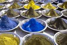
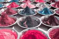
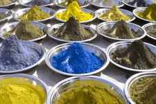
Dichromacy

Normal Vision
Protanopia
Tritanopia
Deuteranopia
People with dichromatic colour vision have only two types of cone cells which are able to perceive colour i.e. they have a total absence of function of one cone cell type , resulting in a specific section of the light spectrum which can’t be perceived at all. For convenience we call these areas of the light spectrum ‘red’, ‘green’ or ‘blue’. The sections of the light spectrum which the ‘red’ and ‘green’ cone cells would normally perceive overlap significantly, so people with red and green types of colour blindness experience many similar colour confusions. This is why red and green colour vision deficiencies are often known as red/green colour blindness and why people with red and green deficiencies often see the world in a similar way.
People with protanopia are unable to perceive any ‘red’ light, those with deuteranopia are unable to perceive ‘green’ light and those with tritanopia are unable to perceive ‘blue’ light.
People with both red and green deficiencies live in a world of murky greens where blues and yellows stand out. Browns, oranges, shades of red and green are easily confused and people with both types will also confuse some blues with some purples and struggle to identify pale shades of most colours.
However, there are some specific differences between the two types of red/green deficiencies.
Protanopia
Protanopes are more likely to confuse:-
1. Black with many shades of red
2. Dark brown with dark green, dark orange, dark red, dark blue/purple and black
3. Some blues with some reds, purples and dark pinks
4. Mid-greens with some oranges
Deuteranopes
Deuteranopes are more likely to confuse:-
1. Mid-reds with mid-greens
2. Blue-greens with grey and mid-pinks
3. Bright greens with yellows
4. Pale pinks with light grey/white
5. Mid-reds with mid-brown
6. Light blues with lilac
Tritanopes
The most common colour confusions for tritanopes are light blues with greys, dark purples with black, mid-greens with blues and oranges with reds.
The images above show how the beautiful colours of the pigments are lost to people with each type of dichromatic vision.
Monochromacy (achromatopsia)
Normal Vision
Monochromacy
People with monochromatic vision can see no colour at all and their world consists of different shades of grey ranging from black to white, rather like seeing the world on an old black and white television set. Achromatopsia is a specific eye condition in which people see in greyscale. We do not specifically support achromatopsia because of its additional symptoms. Achromatopsia is extremely rare, occuring only in approximately 1 person in 33,000 and its symptoms can make life very difficult. Usually someone with achromatopsia will need to wear dark glasses inside in normal light conditions.
We occasionally have had very concerned people contact us because they or their children have been diagnosed by their optician with ‘total colour blindness’. Although we are unable to advise on the diagnosis of specific cases we have undertaken further research to try and understand why so many people are being told they are totally colour blind when in reality they are much more likely to have a severe form of red-green colour blindness. Our research has revealed that in many cases optometrists receive only very basic training on colour vision deficiency and some may therefore be incorrectly interpreting the results of the Ishihara tests. The Ishihara test cannot diagnose either blue/yellow or ‘greyscale’ vision. If you/your child has been diagnosed only using the Ishihara test please seek a second opinion, ideally at a specialist colour vision clinic.
If you have been diagnosed as ‘totally’ colour blind please visit www.achromatopsia.org for further information. If you think you do have the symptoms of achromatopsia ask your optician to refer you to a specialist who can confirm your condition.
Statistics
There is general agreement that worldwide 8% of men and 0.5% of women have a red/green type of colour vision deficiency. These figures rise in areas where there is a greater number of white (Caucasian) people per head of population, so in Scandinavia the figures increase to approximately 10-11% of men. By contrast, in sub-Saharan Africa there are few colour blind people. Countries such as India and Brazil have a relatively high incidence of CVD’s because of the large numbers of people with mixed race genes in their genetic history.
The 8% of colour blind men with inherited colour blindness can be divided approximately into 1% deuteranopes, 1% protanopes, 1% protanomalous and 5% deuteranomalous. Approximately half of colour blind people will have a mild anomalous deficiency, the other 50% have moderate or severe anomalous conditions.
Numbers of tritanopes/tritanomalous people and achromats is very small, perhaps 1 in 30-50,000 people.
Reliable statistics for people with an acquired form of colour vision deficiency are difficult to find but as many as 3% of the population could be affected because age-related deficiency is relatively common in the over 65s and therefore on the increase in the UK due to the rising numbers of elderly people per capita.
To put these statistics in context, an all-boys school in the Home Counties of England with 1000 pupils would have approximately 80-85 colour deficient students. 11-13 would be deuteranopes, 11-13 would be protanopes, 11-13 would have a form of protanomaly and 62 would have a form of deuteranomaly. About half of those with an anomalous condition would have a moderate to severe form of deficiency.


