- Blue + Red light –> Magenta
- Red + Green light –> Yellow
- Green + Blue light –> Cyan
Hue, Value, Saturation
In short, color is the visual byproduct of the spectrum of light as it is either transmitted through a transparent medium, or as it is absorbed and reflected off a surface. Color is the light wavelengths that the human eye receives and processes from a reflected source.
For the physics behind color, see the Primary Color Models page. This will REALLY help you understand how color works!
Color consists of three main integral parts:
- hue
- value
- saturation (also called “chroma”)
Let’s start with “hue“
Hue is more specifically described by the dominant wavelength and is the first item we refer to (i.e. “yellow”) when adding in the three components of a color. Hue is also a term which describes a dimension of color we readily experience when we look at color, or its purest form; it essentially refers to a color having full saturation, as follows:
When discussing “pigment primaries” (CMY), no white, black, or gray is added when 100% pure. (Full desaturation is equivalent to a muddy dark grey, as true black is not usually possible in the CMY combination.)
When discussing spectral “light primaries” (RGB), a pure hue equivalent to full saturation is determined by the ratio of the dominant wavelength to other wavelengths in the color.
Next, let’s look at the “value“
As is discussed on the “Elements: Value” page, value refers to the lightness or darkness of a color. It indicates the quantity of light reflected. When referring to pigments, dark values with black added are called “shades” of the given hue name. Light values with white pigment added are called “tints” of the hue name.
Lastly, let’s look at “saturation,” or “chroma“
Saturation defines the brilliance and intensity of a color. When a pigment hue is “toned,” both white and black (grey) are added to the color to reduce the color’s saturation. In terms of the “additive” light color model, though, saturation works on a scale based on how much or how little other hues are represented in the color.
(NOTE: In the simple scale diagrams below, the first model indicates amount of black, white, or grey pigment added to the hue. The second model illustrates the same scale but explains the phenomenon based on light [spectral] properties.)
The HSV Color Scale
The scales above illustrate the value and saturation changes of a hue in the same way visually, although they explain what’s happening differently based on how pigment works vs. how light works. This is a fairly simple way of looking at it, but it still might not be completely clear. There is a more complex, 3-dimensional scale that allows us to look at how hue, saturation, and value intersect to create colors: the “HSV Scale.”
The HSV scale clearly stands for “Hue, Saturation, Value.” It does a better job at visually explaining the concept of light, and it is a very useful one to comprehend, as it is what most sophisticated digital color pickers are based on (including all Adobe software). Not only do graphic designers need to understand this color construct, but fine artists do as well since digital art and rendering has become such an integral part of art processes.
All Color Starts With Light
Regardless of the two Additive and Subtractive color models, all color is a result of how our eyes physically process light waves. So let’s start with the light Additive model to see how it filters into the Subtractive model and to see how hues, values and saturation interact to produce unique colors.
Hues
The three primary hues in light are red, green, and blue. Thus, that is why televisions, computer monitors, and other full-range, electronic color visual displays use a triad of red, green, and blue phosphors to produce all electronically communicated color.
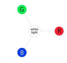
As we mentioned before, in light, all three of these wavelengths added together at full strength produces pure white light. The absence of all three of these colors produces complete darkness, or black.
Mixing Adjacent Primaries = Secondary Hues
Making Cyan, Magenta, and Yellow
Although additive and subtractive color models are considered their own unique entities for screen vs. print purposes, the hues CMY do not exist in a vacuum. They are produced as secondary colors when RGB light hues are mixed, as follows:
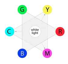
- Blue + Red light –> Magenta
- Red + Green light –> Yellow
- Green + Blue light –> Cyan
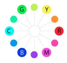
Overview of Hues
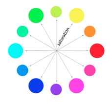
The colors on the outermost perimeter of the color circle are the”hues,” which are colors in their purest form. This process can continue filling in colors around the wheel. The next level colors, the tertiary colors, are those colors between the secondary and primary colors.
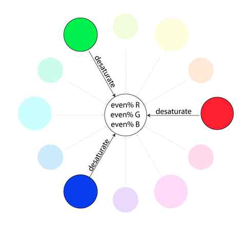
Saturation
Saturation is also referred to as “intensity” and “chroma.” It refers to the dominance of hue in the color. On the outer edge of the hue wheel are the ‘pure’ hues. As you move into the center of the wheel, the hue we are using to describe the color dominates less and less. When you reach the center of the wheel, no hue dominates. These colors directly on the central axis are considered desaturated.
Naturally, the opposite of the image above is to saturate color. The first example below describes the general direction color must move on the color circle to become more saturated (towards the outside). The second example depicts how a single color looks completely saturated, having no other hues present in the color.

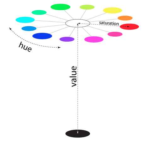
Value
Now let’s add “value” to the HSV scale. Value is the dimension of lightness/darkness. In terms of a spectral definition of color, value describes the overall intensity or strength of the light. If hue can be thought of as a dimension going around a wheel, then value is a linear axis running through the middle of the wheel, as seen below:
To better visualize even more, look at the example below showing a full color range for a single hue:
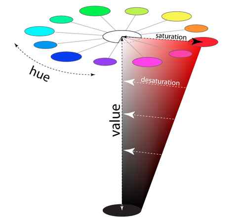
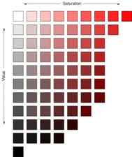
Now, if you imagine that each hue was also represented as a slice like the one above, we would have a solid, upside-down cone of colors. The example above can be considered a slice of the cone. Notice how the right-most edge of this cone slice shows the greatest amount of the dominant red hue (least amount of other competing hues), and how as you go down vertically, it gets darker in “value.” Also notice that as we travel from right to left in the cone, the hue becomes less dominant and eventually becomes completely desaturated along the vertical center of the cone. This vertical center axis of complete desaturation is referred to as grayscale . See how this slice below translates into some isolated color swatches:
Color Pickers
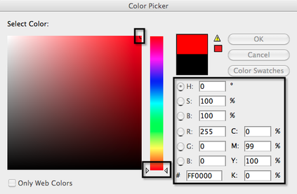
With this explanation, it might be much easier to then understand how modern color pickers work. There are many types of color pickers, but this example will focus on the common Adobe software interface picker, continuing to use the red hue as the example below. By the way, relate the similarity of our cone-shaped red slice above to the “Select Color” window below to better visualize how this works.
In Figure-1 below, first notice the center vertical slider. This is where we select the hue. It is currently set to the lowest selection and corresponds to the “H:0” radio button value on the right. The “H” indicates “Hue,” and the zero value describes which numerical hue assignment we have selected. Below it, you will see that “Red” is set to “255,” or the fullest level of light represented on a computer (0 = lowest). Notice that Blue and Green are set to zero, indicating that Red is at its fullest level of saturation.
Next, notice where the picker circle is in the “Select Color” window. It is located at the top-right, indicating where on the scale you want the saturation to fall. As we said, the sample is equivalent to the purest red hue with full saturation, and it corresponds to the outermost edge of the color wheel. The “S:100%” on the right describes the level of saturation in the color we have selected, and the “B:100%” corresponds to the brightness, or value.
As a side note, notice that under the CMYK levels that Yellow and Magenta are basically equally represented at their fullest capacities. This supports how in the Subtractive Color Model, red is a secondary color of yellow and magenta.
Now, as a means of comparison, look at the next model. Do you see the difference?
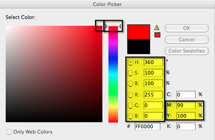
In case you don’t see the difference, it is in the Hue number setting and where the slider is located. This is essentially the same hue as in the previous Figure-1, except that the setting has gone from 0 to 360. This is because we are basing it on the HSV cone model as illustrated earlier, and the hues at the top of the upside-down cone are in a full 360-degree circle. Thus, we have completed the circle by starting at the zero-level red and moving through the full visible spectrum to the same 360-level red.
To get a more complete picture of how this works, lets look at the RGB equivalent of “cyan”, which is directly across from it on the color wheel, and is thus red’s complementary hue.
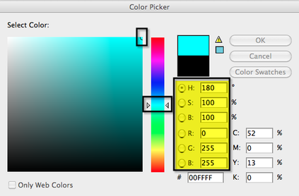
Notice that in Figure-3 that the hue setting is “180,” or located at 180-degrees on the color circle, half of 360. This is what numerically indicates the cyan is red’s complement. Also, you’ll notice that it is the secondary RGB color produced by mixing equal parts Blue and Green, where Blue=255, and Green=255. As a quick reminder of the basic color wheel to help you visualize, here is how cyan relates to red:
Change color saturation or hue
Do one of the following:
- Choose Enhance > Adjust Color > Adjust Hue/Saturation.
- Choose Layer > New Adjustment Layer > Hue/Saturation, or open an existing Hue/Saturation adjustment layer.
- The two color bars in the dialog box represent the colors in their order on the color wheel. The upper bar shows the color before the adjustment; the lower bar shows how the adjustment affects all hues at full saturation.
In the Edit drop-down menu, choose which colors to adjust:
- Choose Master to adjust all colors at once.
- Choose one of the other preset color ranges listed for the color you want to adjust. An adjustment slider appears between the color bars, which you can use to edit any range of hues.
For Hue, enter a value or drag the slider until the colors appear as you want.
The values displayed in the text box reflect the number of degrees of rotation around the color wheel from the pixel’s original color. A positive value indicates clockwise rotation, a negative value counterclockwise rotation. Values range from –180 to +180.
For Saturation, enter a value or drag the slider to the right to increase the saturation or to the left to decrease it. Values range from –100 to +100.
For Lightness, enter a value or drag the slider to the right to increase the lightness or to the left to decrease it. Values range from –100 to +100. Be careful when using this slider on an entire image. It will reduce the tonal range of the overall image.
Click OK. Or, to cancel your changes and start over, hold down Alt (Option in Mac OS), and click Reset.
Modify the range of Hue/Saturation sliders
Do one of the following:
- Choose Enhance > Adjust Color > Adjust Hue/Saturation.
- Choose Layer > New Adjustment Layer > Hue/Saturation, or open an existing Hue/Saturation adjustment layer.
Choose an individual color from the Edit menu.
Do any of the following to the adjustment slider:
- Drag one of the triangles to adjust the amount of color fall-off without affecting the range.
- Drag one of the gray bars to adjust the range without affecting the amount of color fall-off.
- Drag the gray center part to move the entire adjustment slider, selecting a different color area.
- Drag one of the vertical white bars next to the dark gray center part to adjust the range of the color component. Increasing the range decreases the color fall-off, and vice versa.
- To move the color bar and the adjustment slider bar together, Ctrl-drag (Command-drag in Mac OS) the color bar.

A. Adjusts color fall-off without affecting range B. Adjusts range without affecting color fall-off C. Adjusts the range of color component D. Moves entire slider
- If you modify the adjustment slider so that it falls into a different color range, the name changes to reflect this. For example, if you choose Yellow and alter its range so that it falls in the red part of the color bar, the name changes to Red 2. You can convert up to six of the individual color ranges to varieties of the same color range (for example, Red 1 through Red 6).
Note:
By default, the color range selected when you choose a color component is 30° wide, with 30° color fall-off on either side. Setting the fall-off too low can produce banding in the image.
To edit the range by choosing colors from the image, select the color picker, and click the image. Use the color picker + tool to add to the range; use the color picker – tool to subtract from the range.
While the color picker tool is selected, you can also press Shift to add to the range or press Alt (Option in Mac OS) to subtract from it.
Adjust the color of skin tone
The Adjust Color For Skin Tone command adjusts the overall color in a photo to bring out more natural skin tones. When you click an area of skin in the photo, Photoshop Elements adjusts the skin tone—as well as all other colors in the photo. You can manually adjust the brown and red colors separately to achieve the final color you want.

Open the photo and select the layer that needs correction.
Choose Enhance > Adjust Color > Adjust Color For Skin Tone.
Click an area of skin.
Photoshop Elements automatically adjusts the colors in the image. Changes might be subtle.
Note:
Make sure Preview is selected so that you can see the color changes as they occur.
(Optional) Drag any of the following sliders to fine-tune the correction:
Increases or decreases the level of brown in skin tones.
Blush
Increases or decreases the level of red in skin tones.
Temperature
Changes the overall color of skin tones.
When you’re finished, click OK. Or, to cancel your changes and start over, click Reset.