Triangulum Color Picker is an open source project I’ve just launched. Its usability can be improved on various fronts. If you have feature requests and bug reports, don’t hesitate to create a new issue on its GitHub repo.
Pick color by chroma with Triangulum Color Picker
NOTE: This article is written as a help document for Triangulum Color Picker.
Chroma is a measure of colorfulness. Briggs (2016) provides the best account of it I’ve ever seen:
“… for an object to have high chroma it must reflect [or] transmit saturated light in relatively large amounts” — David Briggs
Contents
In this quote, “saturated light” means colored light (red light, blue light, etc.) as oppose to white light.
Chroma vs. Saturation
Chroma and saturation are often used interchangeably. Technically speaking, however, these two terms refer to different concepts.
Saturation refers to the absence of white light, while chroma concerns the presence of colored light.
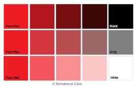
- Dark red, for example, is highly saturated when white light is absent in it (R1 in the figure below). Its chroma is low, however, because the amount of red light is small. The following figure illustrates the chroma and saturation of several shades of red:
Measuring chroma
As far as I know, there is no consensus on how to measure chroma. The most convincing in my view is how Sweden’s Natural Colour System (see MacEvoy 2005 for detail) measures what they call “chromaticness”:
But they don’t publish how to calculate it from RGB values. We need to figure out an alternative way to measure chroma.
Triangulum Color Picker measures the chroma of a color as the percentage of a pure hue in the mix of light to generate the color in question.
- A pure hue is the color that appears at the top-right corner of standard color pickers:
Chroma is calculated as follows, with Twitter’s brand color as an example:
- According to BrandColors, the Hex code of the Twitter blue is #1da1f2, which means the amount of red light is 29, green 161, and blue 242 (out of the range from 0 to 255).
- The Twitter blue can be seen as the mixture of 83.53% pure blue (red:0, green:15, blue:255) and 16.47% medium gray (red:176, green:176, blue:176):
- Red light is 29 because 0 x 0.8353 + 176 x 0.1647 = 29.
- Green light is 161 because 15 x 0.8353 + 176 x 0.1647 = 161.
- Blue light is 242 because 255 x 0.8353 + 176 x 0.1647 = 242
The percentage given to the pure hue (83.53% in the above example) is what Triangulum Color Picker calls chroma.
The extremely short version
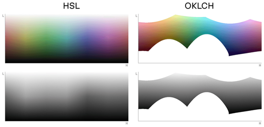
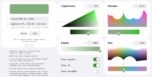
oklch() is a new way to define CSS colors. In oklch(L C H) or oklch(L C H / a) each item corresponds as follows:
- L is perceived lightness ( 0% – 100% ). “Perceived” means that it has consistent lightness for our eyes, unlike L in hsl() .
- C is chroma, from gray to the most saturated color.
- H is the hue angle ( 0 – 360 ).
- a is opacity ( 0 – 1 or 0 – 100% ).
a:hover background: oklch(45% 0.26 264); /* blue */ color: oklch(100% 0 0); /* white */ color: oklch(0% 0 0 / 50%); /* black with 50% opacity */ >The benefits of OKLCH:
- OKLCH frees designers from the need to manually choose every color. They can define a formula, choose a few colors, and an entire design system palette is automatically generated.
- OKLCH can be used for wide-gamut P3 colors. For instance, new devices (like those from Apple) can display more colors than old sRGB monitors, and we can use OKLCH to specify these new colors.
- Unlike hsl() , OKLCH is better for color modifications and palette generation. It uses perceptual lightness, so no more unexpected results, like we had with darken() in Sass.
- Further, with its predictable lightness, OKLCH provides better a11y.
- Unlike rgb() or hex ( #ca0000 ), OKLCH is human readable. You can quickly and easily know which color an OKLCH value represents simply by looking at the numbers. OKLCH works like HSL, but it encodes lightness better than HSL.
Read how we’re helping develop the OKLCH ecosystem:
OK, OKLCH: a color picker made to help think perceptively
February 7, 2023
Read also
But, that being said, alongside OKLCH comes two challenges:
- With OKLCH and LCH, not all combinations of L , C , and H will result in colors that are supported by every monitor. Although browsers will try to find the closest supported color, it’s still safer to check colors using our color picker.
- OKLCH is a new color space. At the time of this writing in 2023, its ecosystem is still limited, but we already have a palette generator, color picker, and many converters.
So, that’s the short version, but if you want the whole story, let’s start from the beginning in the next section.
Table of contents:
- How CSS colors have changed
- Comparing OKLCH with other CSS color formats
- How OKLCH works
- How to add OKLCH to your project
- Summing up the results
How CSS colors have changed
CSS Colors Module 4
A little recent history: the CSS Color Module Level 4 specification become a candidate recommendation on July 5, 2022.
It added new syntactic sugar to color functions, which we will use in this article:
.old color: rgb(51, 170, 51); color: rgba(51, 170, 51, 0.5); > .new color: rgb(51 170 51); color: rgb(51 170 51 / 50%); >But more importantly, CSS Color 4 also added 14 new ways to define colors—and these are not just syntactic sugar. These new color-writing methods (like oklch() ) improve code readability, a11y, and have the potential to add new features to your website.
P3 Colors
Modern displays can’t actually display all the colors which are visible to the human eye. The current standard color subset is called sRGB and it can render only 35% of them.
New screens fix this a bit, since they add 30% more new colors; this set of colors is called P3 (also known as wide-gamut). In terms of adoption, all modern Apple devices and many OLED screens have P3 color support. So, this isn’t something from the distant future—this is happening now.
You can find and support OKLCH Color Picker with your votes and comments on Product Hunt!
This additional 30% of color can be very useful for designers:
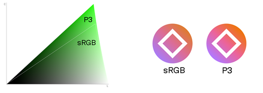
- Some of these new colors are more saturated. Thus, you can produce more eye-catching landing pages.
- The additional colors give your designers more flexibility with palette generation for their design systems.
So, we have P3 colors! That’s great and all, but to actually use them, we’ll need to find a color format in order to support P3. rgb() , hsl() , or hex formats can’t be used to specify P3 colors. We could, however, use the new color(display-p3 1 0 0) , but it still shares the readability problems of the RGB format.
Luckily, OKLCH has a good readability, supports P3 and beyond, as well as any color visible to the human eye.
CSS Native Color Manipulations
While it’s true that CSS Color 4 is a big step forward, the upcoming CSS Color 5 will be even more useful; it will finally give us native color manipulation in CSS.
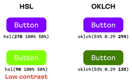
/* These examples use hsl() for illustration. Don't use it in real code since hsl() format has bad a11y. */ :root --accent: hsl(63 61% 40%); > .error /* Red version of accent color */ background: hsl(from var(--accent) 20 s l); > .button:hover /* 10% lighter version */ background: hsl(from var(--accent) h s calc(l + 10%)); >With this new syntax, you can take one color (for instance, from a custom property) and change the individual components of the color format.
Still, as mentioned, there is a drawback to this approach since using the hsl() format is bad for a11y. Results will have unpredictable lightness because the l values are different for different hues.
A familiar refrain emerges: we need a color space where color manipulations produce expected results. Like, for instance, OKLCH.
:root --accent: oklch(70% 0.14 113); > .error /* Red version of accent color */ background: oklch(from var(--accent) l c 15); > .button:hover /* 10% lighter version */ background: oklch(from var(--accent) calc(l + 10%) c h); >Note: You don’t need to use OKLCH to input the –accent colors of oklch(from …) , but using a consistent format is better for code readability.
Chroma
Chroma is the attribute that expresses the purity of a color. Mixing a pure hue with black, white, gray, or any other color reduces its purity and lowers its chroma.
Chroma, intensity, and saturation mean slightly different things. The human eye does not easily detect the differences, so these terms are all ways of describing the same characteristic of color. In fact, you rarely hear the word chroma outside of a discussion of color theory.
Most people use other terms to communicate a color’s chroma. The words clear, brilliant, bright, vibrant, bold, intense, saturated, or vivid describe hues that are pure or close to pure. Toned-down, soft, muted, subtle, misty, dull, drab, grayed, or dusty explains lower chroma colors. Adding terms to represent the purity of color to your vocabulary gives you an additional way to fine-tune your color descriptions.

In the diagram below, red, green, and gray are all the same value and so that you can see both changes in chroma and value.
Between red and green, nine squares are a mix of the two colors. The first square to the right of pure red is made to appear about 90% red and 10% green. The addition of green has reduced the purity of the red and thus lowered its chroma. It is still quite red but no longer 100% red.
As you move to the right, the amount of red continues to decrease until you reach the middle where the color looks more brown than red. From that point, the green takes over and continues to increase as you move closer to pure green.

Now, I want you to slow down enough to think about what happens when both the chroma and value of a color change. It is not a difficult concept, but one that many people find difficult to wrap their mind around because it is challenging to think about these two dimensions of color at once.
Go back to the column on the far left and look at the squares above the red hue. Each square shows red blended with white. As the squares move from red towards white, they become lighter in value. The square also becomes lower in chroma.
Next, look at the squares below pure red. Each square is red mixed with black. As the squares move towards black, they become darker in value. They also become lower in chroma.
Chroma and value are independent of one another. The value of a color can increase as the chroma decreases. In this case, as you add more and more white to pure red, the resulting colors are lighter and less saturated.
Going in the other direction, as you add more and more black to pure red, the resulting colors are darker and less saturated.
All of the other colors you see in the grid have a lower chroma than the squares of pure red and pure green. The colors below have a lower (darker) value and lower chroma; the colors above have a higher (lighter) value and lower chroma.
When you mix white, black, gray, or any color into a hue, you reduce its chroma.
When you mix white or black with a hue, you change its value making it lighter or darker. When you combine gray or any other color with a hue, the value changes most of the time.
On the chroma value chart above, you can see that in each horizontal row of squares chroma changes in chroma, but the value of all squares in the row remains the same because the two original colors were of equal value.
What is a Pure Hue?
A pure hue is one that is unmixed with another hue, color, or neutral. Think of the purity of color in the same way you would with gold. 24 karat gold is 100% pure gold. 18 karat is 18 parts gold and six parts of another metal. It is still called gold, but some types are purer than others.
The same applies to color. Pure red is 100% red, and pure blue is 100% blue and so on. Mix any pure colors with any other hue, and it lowers the chroma of the color.
For example, If you mix pure red with a tiny amount of gray, it would be difficult to see the color change, but the red would no longer be pure. It could be 97% red and 3% gray, for example. Continue adding gray, and the amount of redness continues to diminish. As red becomes a smaller percentage of the whole, the color is less red and is less saturated (lower chroma) than pure red.
What is the difference between chroma and value?
Chroma is the attribute of color that expresses its purity. Value is the lightness or darkness of a color and defines a color in terms of how close it is to white or black. Chroma and value are independent characteristics of color. For example, a color with a low chroma can have a light value while another low chroma color can have a dark value.
The closer to pure red, the higher the chroma: the closer to black, white or gray, the lower the chroma
Mixing a pure hue with black, white, gray, or any other color reduces its chroma and lowers the strength of the original hue. The higher the chroma, the more pure the color. The lower the chroma, the less pure the color.
The color in the square next to white is high value (light) and low chroma (it does not contain very much pure red). The color in the square next to black is also low chroma but is very dark giving it a low value.
Key Points to Remember: Hue Value Chroma
- Learn to identify the hue, value, and chroma of any color. Understanding these dimensions of color will let you recognize what it is that makes each hue unique. The more you know about each color, the easier it is to find compatible colors.
- Don’t allow the simplicity of the definition of value –the lightness or darkness — to keep you from seeing its complexity and importance. Pay attention to value. The correct values can make all the difference in creating your best designs and artwork.
- When it comes to color, even when you aren’t familiar with a color term, I bet you are familiar with what it means. You have been experiencing colors for years and “know more than you think you know.” An example of this is “chroma,” which expresses the purity of a color. You may think it is an entirely new concept, but you are already familiar with chroma. It is that you use other words to communicate this characteristic of color. Don’t let color terminology intimidate you. You have seen these characteristics for your whole life. Now you are just learning the proper terms. You’ve got this!
Did You Find this Lesson Helpful? Do You Still Have Questions About Hue Value Chroma?
Leave a comment below to let me know. I want this website to be a resource that helps you to understand and love color as much as I do. Your comments help me to know if I am reaching that goal.
Color Theory Tutorial
You are currently on Lesson 1: Hue Value Chroma Explained
Jump to Lesson 3: Creating Color Harmony
Skip Ahead to Lesson 5: How to Identify Undertones