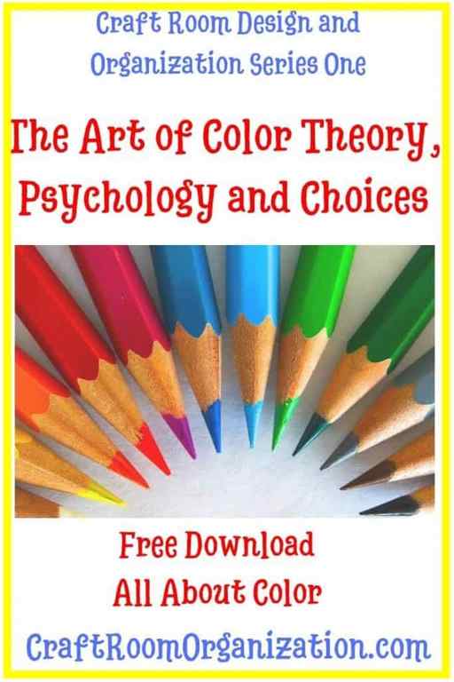
Check out the Series Here:
Purple | Color Word Activities | The Color Purple Crafts & Printables
Great activities to learn color words. Students were engaged and became masters at reading, writing and spelling the word “purple”!
— Colleen L.
Rated 5 out of 5
It didn’t take much time to prepare this resource. I used to during our color days at the start of the school year. It was really great and quick too to prepare.
— Mara I.
Rated 5 out of 5
See all reviews
Also included in

Are you looking for a fun and unique way to introduce and practice beginning reading and writing skills with your Kindergarten students? This Colors Unit is perfect for Back to School or anytime. Your students will practice their fine motor and writing skills as they trace and write 11 color words.
Products
$14.00 Price $14.00 $25.00 Original Price $25.00 Save $11.00
View Bundle

Description
Are you looking for a fun and unique way to introduce and practice beginning reading and writing skills with your Kindergarten students? Use the familiar concept of COLORS. This color purple set is perfect for Back to School or anytime. Your students will practice their fine motor and writing skills as they trace and write and explore the color word purple. Included is a color purple emergent reader booklet that incorporates Kindergarten sight words so students get that benefit of learning and reading both color words and high frequency words. The color purple posters are great to introduce the color as a real world concept. Teachers love the NO Prep printables included in this color purple activity set. Students will love all of the color word activities as they sort colors, color, cut, paste, paint, interact with the color poetry centers, read, write, and create a color purple crown and color purple craft. So many fun and hands-on activities are included in this color unit set!
⭐️⭐️Make sure you check out and Try RED for FREE!⭐️⭐️
✅ The following activities are included to help you teach the color purple concept and color word purple:
- 2 Color Posters
- Emergent Reader with Kindergarten Sight Words
- Color Sorting Pocket Activity
- Color Poetry Center
- Torn Paper Craft
- Color Crown
- Fine Motor Activity
- and 4 other no-prep printables
❤️ ❤️ ❤️ BUT WAIT – Be sure to grab the BUNDLE at a discount if you’d like to continue your work with the following 11 colors and color words.
Colors and the Psychology they evoke
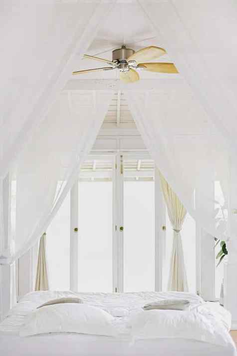
White – A sense of purity. White brightens and creates a sense of space. It evokes cleanliness, freshness and simplicity.

Red – If you want energy in your room then paint it red. Red evokes a spike in adrenaline due to its intense color. It is a warm color associated with warmth and comfort.

Yellow – The use of yellow brings happiness and uplifting feelings. It is also a warm color. Yellow is the most fatiguing color to the eye due to the high amount of light reflected.

Blue – Calmness, relaxing and serenity. It brings about feelings of peace, tranquility, security and order. Blue is used in craft room as studies have shown that you are more productive in blue rooms.
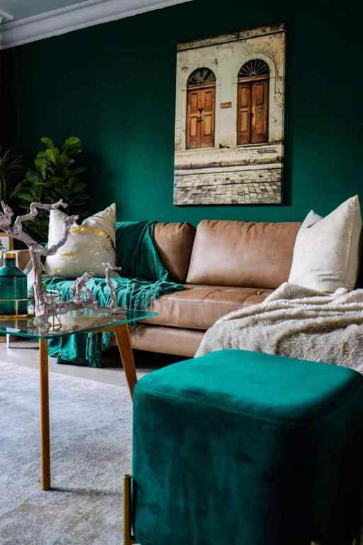
Green – The use of green can be for any room in the house as it is considered the most restful color. It is thought to relieve stress.

Purple – For a dramatic and sophisticated look use dark values of purple and soft purples of bedrooms. It is also a soothing color.

Orange – For energy and excitement use orange in rooms such as an exercise room or craft room.

Pink – Creative and artistic is used to describe pink. It is vibrant and refreshing and evokes feelings of joy and happiness. Photo by Stefen Tan on Unsplash
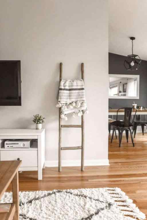
Neutrals – The basic theme for when you want flexibility. You can use any color as an accent and change out as fashion trends change. You can liven up a room or calm it down just by changing the accent colors.
Once you’ve decided on a color for your walls it’s important to then choose your accent color or colors. For that task I recommend reviewing the basics of the color wheel. The color wheel provides you with the visualization of complimentary color schemes making it easier for you to choose your accent color or colors.
Get this handy Color Guide for FREE. Laminate it and take it with you when you shop for colors so you can easily pick the right ones!
The Color Wheel
This color wheel is a very good reference to understand the basics of color. Kathryn Costa designed this wheel to use to create her beautiful and colorful Mandalas. You can visit her site at www.100mandalas.com
Primary colors are Yellow, Red, and Blue. These three colors cannot be made by mixing other colors. From those three colors, we get the Complimentary, Secondary and Tertiary by mixing. As you can see in the color chart.
Complimentary colors are the direct opposite color on the wheel. Orange, Purple, Green are made by mixing primary colors together. The complimentary colors are usually used in the background to emphasize the color used in the foreground.
Tertiary colors are the six shades that can be made by mixing the primary and secondary colors together.
Analogous scheme are the colors on either side of the base color. They are harmonious and often found in nature. They are pleasing to the eye. Using these colors create comforting design.
Triadic scheme uses an equilateral triangle to determine the three colors. This scheme is considered to be the best for design by using one color for the background and the other two for accents.
Two handy tools to preview colors together before you buy
Material Palette You pick 2 colors and it auto generates a color palette for you. They are identified as primary, light primary, dark primary, divider, accent, primary text, secondary text, and text/icons.
You pick 2 colors and it auto generates a color palette for you. They are identified as primary, light primary, dark primary, divider, accent, primary text, secondary text, and text/icons.
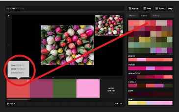
Colourlovers.com You have to sign up and login to create a palette. Once you are there you will see several different ways to find color. If you have an inspiration photo you can upload it (see below how to do that) and it will generate all the colors from that photo and give you different palettes along with the color codes.


When using these types of tools you will see that there are different versions of the color.
Colour Palettes
When we are making works of art or craft, the colours we choose for a piece are called the colour palette. Even if we are choosing colours just because we like them, or because they are the colours found in nature, we can analyse the colour palette in our work to see how colour theory applies.
The pictures of the watercolour painting and the quilt below show the colour palette used in each design.
The painting has a colour palette that has been inspired by nature – fall leaves and fish in a stream, but when we analyse the palette, we can see that it uses the complementary colours blue and orange, and colours analogous to them.
When we analyse the colour palette of the quilt, we see that it has been made with colours that are analogous to purple – blue and pink. We also see that a small amount of yellow, the complementary colour of purple has also been used to create bright spots.


Try analysing the colour palettes you have used in your work. You might be surprised at how much you already know about how to use colour.
Colour Saturation
The colour palettes in the pictures above also illustrate colour saturation. The quilt uses saturated colours, colours that are very deep. If you were painting or dyeing something to get those colours, you would have to use a lot of pigment.
The watercolour painting uses less saturated colours. There is very little pigment in the paint and the colours are faint when compared to the quilt.
A Note about RGB Colour
When mixing light to create colour, like your computer screen does, the colours used are red, green and blue. With RGB Colour, all colours mix to make white, and black results from the absence of colour.
- How Tos
- How to Make a Grass Basket
- How to Make Sealskin Boots
- How to Photograph Your Crafts
- How We Did It: The Traditional Skills Network
- How We Organized a Craft Workshop in Our Community
- Working with Colour
- Composition
- Chap. 1 : Elements of Design
- Chap. 2 : Putting Things Together
- Chap. 3 : Different Approaches


