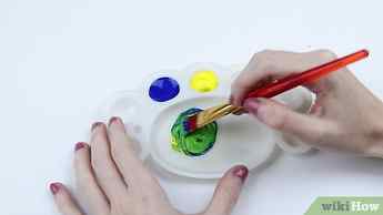
I ran into the same problem with New Gamboge PY153. I tried a couple colors. Originally I put a blob of each color on paper. I mixed in Pyrrol Orange into Lemon Yellow gradually. I had some PY153 to compare it to. I only needed a touch of Orange to change the Yellow. I kept the sheet of paper as an example. Since then I had to mix up a batch to fill my paint well in my palette. Worked great. If I would have needed more, I would have squeezed a length out of the tubes, then measured alongside the length squeezed out and see how much was needed after testing periodically little test stripes to see if the color was right. Easier to use Virgil’s advise if the color advised works for you.
How can I mix colors to achieve indigo?

I ran into the same problem with New Gamboge PY153. I tried a couple colors. Originally I put a blob of each color on paper. I mixed in Pyrrol Orange into Lemon Yellow gradually. I had some PY153 to compare it to. I only needed a touch of Orange to change the Yellow. I kept the sheet of paper as an example. Since then I had to mix up a batch to fill my paint well in my palette. Worked great. If I would have needed more, I would have squeezed a length out of the tubes, then measured alongside the length squeezed out and see how much was needed after testing periodically little test stripes to see if the color was right. Easier to use Virgil’s advise if the color advised works for you.
June 9, 2016 at 1:02 am #1252826
Default
I really like Daniel Smith’s PrimaTek Sodalite Genuine:
http://www.danielsmith.com/Item–i-284-600-179 It is granulating, but a beautiful dark blue and mixes very well with greens. Jan
June 9, 2016 at 2:36 am #1252816
Default
If I mix my own how can I measure and come up with a mix that
would be consistent each time? How would you measure amounts…
just guess, mix and test, or is there a better process.
Is there a better way to test yourself and try as?
How would you like to know your colors otherwise? Ernst
Meine Seiten – My website
Malen ist nicht alles im Leben – aber ohne Malen ist alles nichts!
Painting is not everything in life – but without painting everything is nothing!
June 9, 2016 at 4:58 am #1252834
I mixed an indigo with ultramarine and burnt sienna recently and have used a lot of it. It would be nice to have a premixed indigo but the ones I have Daniel Smith and Winsor Newton contain black. They are nice colors, but I would like something that would work with greens without making them look so dead. If I mix my own how can I measure and come up with a mix that would be consistent each time? How would you measure amounts…just guess, mix and test, or is there a better process. Thanks for your expert help!
I had a similar problem and I mixed my own indigo hue with Phthalo Green PG7 and Quin. Violet PV19. I ended up with this combination of colours because the real Indigo is purplish in its mass tone and turns greenish when diluted.
Most of indigo hues ( because all Indigos are hues) are a mix of blue and black, or a mix of blue and violet. But the other blues contain other kind of pigments.
@ Virgil I’ve tried the combination you use too but didn’t give me the proper results. The original Indigo has indeed a purplish hue in its mass tone and a greenish hue when it is diluted. The combination though of Prussian with Quin. Rose ( PV19 – not the Violet that has the same number) gives either a brighter Prussian that looks more like a Phthalo Blue or a purple. In both versions the final result is missing the neutral more muted hue that real Indigo has and so the final mix, though it might give interesting results when mixed with other colours, will not work that good as a darkener, ( which has to be rather neutral). The only disadvantage that I have seen in the combination of Phthalo with Quin. Violet, is that needs a bit of attention during the mixing in order to achieve the proper ratio among the two colours. I have made swatches to have a sample on how I want it to look like, and then I mix the two colours by adding little by little the two colours until I get the proper hue that matches with my swatches. I have no way to count how much of each colour is needed.. It goes the mix and test way.:)
Matisse Indigo | Matisse acrylic paint

Matisse Indigo is pure PB60 which is commonly called Indanthrone Blue which is a little confusing because the pigment is actually described as an anthraquinone. It is a vat pigment of very great lightfastness and has a reputation for being one of the most permanent organic pigments available. Even in very light tints it should not fade. In many ways it is a good cousin to Phthalo Blue for while they are not related chemically both have the very dark color that artists need when painting but while Phthalo Blue is a greenish blue and is therefore cool, Matisse Indigo is a reddish Blue and therefore a warm blue. This means that for the first time in history artists have both warm and cool versions of a very deep dark blue of great lightfastness.
Matisse Indigo, as its name suggests is an color like indigo but it does not have the great problem that natural Indigo suffers from – the older color fades relatively quickly. Watercolors done in the great age of English watercolor landscapes more than 100 years ago commonly have a pinkish or ochre colored sky. This is not because the artist made the sky that color but because of the common practice in those days of painting skies with a mixture of natural indigo with a red or yellow ochre. With time the indigo has faded until there is now zero of the color left, while the ochre has survived changing the appearance of the skies. Had those artists had Matisse Indigo available to them their skies would be as blue today as the day they were painted.
Because it is such a warm blue Matisse Inigo works hand in hand with Ultramarine Blue with the darkness of Matisse Indigo able to mix imperceptibly with the Ultramarine taking into shadows and getting close to black. Adding a touch of Transparent Venetian Red to that mix will produce the blackish blue color for the deepest shadows b ut will do it in a way that makes the change in tone without changing the character of the blue. This is a very powerful advantage for the artist.
Like Ultramarine Blue, Matisse Indigo is just made for making violets, but with the difference that they can be deeper, darker, and more intense. Depending on the red chosen to mix with the violets range from rich imperious purples to heavenly dark violets. Matisse Rose Madder works well for more reddish purples but Magenta Quin Violet is a better choice for true violets. The two colors produce exquisite violets with a magenta undertone. The clarity of the mixtures are revealed when reduced with white making very beautiful clean pastel tints. These colors are significantly more light fast than violet tints made using Dioxazine Purple and should be the first choice for artworks exposed to outside light or intended to last for centuries.
Sometimes experimentation produces special surprises. Mixing Matisse Indigo with the metallic colors has some real treasures. For example, mixing Matisse Indigo with Metallic Copper gives a wonderful bronzing effect that only has parallels in nature in the feathers of iridescent birds and yet in imaginative artworks, especially abstracts the colors made from this mixture are distinctive and quite beautiful.
Matisse Indigo is an excellent choice when making greens. Mixed with Matisse Emerald it makes the sort of transparent dark bottle green that is perfect for literally painting dark green bottles. It doesn’t take many still life paintings to discover that dark green glass is relatively common in art. Getting outside into nature brings up another strength of Matisse Indigo. Mix it with Unbleached Titanium to get the sort of greenish grays commonly found in eucalyptus leaves, while mixing with Raw Sienna dark greenish gray that is perfect for the shadowing on those same leaves
Natural indigo was used from at least the earliest days of ancient Egypt all the way to the late 18th century because even though it was known to fade, artists still found that a very dark blue was an essential on the palette. Today we are very fortunate to have the PB60 pigment which is in Matisse Indigo. It made be a little more expensive than some other colors but it is worth every penny for its many excellent qualities. It is permanent, a beautiful dark blue color and a superb color for mixing the blues, violets, and greens we need to paint.
Why Kobo?
With over 6 million of the world’s best eBooks to choose from, Kobo offers you a whole world of reading. Go shelf-less with your library and enjoy reward points with every purchase.
Continue to kobo.com Cancel
PROMOTION DETAILS
*Valid October 2, 2023 – November 15, 2023 at Canadian stores and at indigo.ca, while quantities last, with $50.00 or more pre-tax purchase of eligible product(s), after discounts and plum points redemptions. Minimum purchase amount excludes gift cards, plum PLUS memberships, Love of Reading products/donations, and shipping costs. Selection may vary between stores and online.
- Help
- Black Friday Canada
- Shipping & Returns
- Find a store
- Events
- Frequently Asked Questions
- Careers
- Give Us Feedback
- Thoughtfull.co
- Sustainability
- Diversity, Equity & Inclusion
- Indigo Love of Reading Foundation
- Our Company
- Vendors & Authors
- Corporate Sales
- Store Listings
- Product Recalls


