
Do you mix your own black watercolor? If so, I’d love, love, love to know what pigments you use. Leave me a comment so I can experiment with those also. And happy mixing!
How to Mix Black Watercolor

I once thought the watercolor palette revolved around Ivory black.

Many artists recommend the standard primary mix for black: Yellow+Blue+Red. However, I prefer a two color mix because it’s easier to achieve consistent mixes with only two colors than with three or more.
I did a bit of research and found several, common ways to mix a two-color black. So I began a fun experiment, and here’s what I discovered.
[Links are to the pigment and brand I used. Some are affiliates — thanks!]
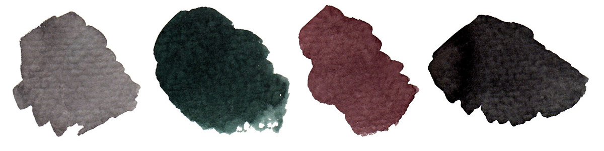
Red + Green
Many artists use Alizarin crimson (PR264) and Phthalo green (PG7) to make black, but these colors are too finicky for my tastes. When mixing them, I could achieve a very strong black, but it took a lot of effort. These colors are so dominant that I felt as if they were constantly at war with each other, like two siblings who were trying their best to one-up each other. Even when adding tiny dabs of pigment, it was too easy to overshoot black and head into dark green or purple.
This constant tweaking often caused me to mix more paint than needed. I didn’t like this waste. And I also didn’t like that I wouldn’t be able to adjust or scrub out mistakes with these highly staining colors.
Still, green and red are used by many artists to create black, so it may be worth it to experiment more with this combo. However, avoid convenience greens when trying to make black. Mixing a convenience green (and sometimes even a single-pigment green) with red usually results in brown or olive, which is obviously not black.
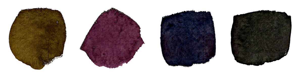
Blue + Orange / Violet + Yellow
I was a little wary about these suggestions. I know from experience that many orange pigments turn purple when mixed with blue. Yellow often goes green when mixed with violet.
Also, many of the colors one might use in these mixes, like PO62 or PO48 (orange), PY35 (yellow), and PV23 (purple), are often staining, granulating, and/or opaque. I struggled with some of these issues throughout the Crimson/Phthalo experiment and preferred to avoid pigments with these attributes.

Last but not least, I don’t keep orange or violet in my palette. Meaning I would have to mix it first. Meaning that any black I produced with these mixes would be more than two pigments. This nullified these suggestions, at least for me.
However, I recognize (and applaud) that all sketchers are not the same. Though these mixes wouldn’t work for me, they may work for you, so I was willing to give them a try.
The outcome was less than ideal, at least in regards to black. I was able to mix a lovely range of grays, some mighty fine violets, a beautiful brown or two, but rarely a black. As far as I can tell, getting a decent black from a blue/orange or violet/yellow blend relies on a very specific pigment combination.
That’s great if you have those specific pigments with you at all times. Otherwise, it’s not so great, at least in regards to black.
Making a Chromatic Black and more…
When it comes to color, more is not always better. More tubes of paint, more choices, more ways to go wrong. If you work with a limited palette and you get into trouble with color, then the number of ways to correct the painting is limited.
Claude Monet used a limited palette of only six to nine colors. And by 1886 had dropped black from his palette completely, preferring to create a chromatic black with alizarin crimson and viridian green. I’m a big proponent of mixing a black (chromatic black) rather than using a pre-mixed black from a tube. A chromatic black is richer and more complex than a pre-mixed black. The greys and neutrals that result from mixing a chromatic black with the other colors on your palette will also have greater depth and vibrancy.
Mixing a Chromatic Black

First, check to make sure that there is no black in any of the colors you are using. How to do that? Check the label for the pigment code. Most paint manufacturers list the pigment code on the label. If the paint you’re using doesn’t list the pigment code, then you are probably using a student grade paint without much pigment in it. Switch to professional grade paint, and you will get better results in your color mixing.
Here are a couple of my favorite recipes for mixing a chromatic black:
Basic Complementary Colors: Using your darkest green and your darkest red. Check the labels to make sure there isn’t any black in the color. My preferred mixture is Golden Quinacridone Crimson and Sap Green.
Purple Black: This is one of my favorite mixtures for landscape painting. And as the Impressionists believed that there was no black in the shadows this color would have worked well on their palette. Mix your darkest blue and your darkest red. My favorite mixture is Golden Ultramarine Blue and Alizarin Crimson Hue. This mixture will visually appear black in mass tone and will look more purple in a glaze mixture.
Earth Color Black: Mix Golden Ultramarine Blue and Raw Umber. This mixture will be warmer than the purple-black mixture above.
Modern Primary Black: My color mixing video on Youtube shows how to make black with three modern primaries. Go to timestamp 27:00 to see the chromatic black mixture. One I use a lot.
Whenever you mix a chromatic black, it is helpful to make a few tint mixtures with Titanium White to get a feel for the tones of the mixture. It’s also useful to mix a bit of the chromatic black into the other colors on your palette to get a broad range of shades of color that will harmonize in the painting.
No matter how you use color remember – less is more.
More color resources:
EFGS Computer Lab. An in-depth color compendium. Information on all aspects of color. You can really nerd out at this site.
Thinning Out
Modernist Mark Rothko famously layered colors in his nonrepresentational paintings. Even if you love to put objects and forms to your work, there’s much to learn about his use of blacks, burgundies, deep greens and dark shades.
If working in oils, thin your blacks waaaaay down with turpentine to let colors under the stroke to peek through.
If black is what you are trying to cover or mask, layer on straight-from-the-tube pigments.
Winning Art Hack
Every month we feature an art hack submitted by our readers. This winner is from Candy Mayer!
“I do my finishing work—signing and matting prints, etc.—in the family room in front of the TV. I was always making trips to the studio to get supplies, so I bought a rolling cart with drawers. Now, in only one trip, I take everything where I’m working, and the cart keeps my supplies organized.”
For a chance to win art swag for your art hacks, email your favorite art hack to info@ artistsmagazine.com with this subject line: “Art Hacks.”
Exploring Color
Color is powerful, expressive and many an artist’s greatest joy. Explore exercises, lessons and and step-by-step demonstrations in the 30th Anniversary Edition of Exploring Color Workshop now!
Register or login to share thoughts or upload a photo of your latest creation.


