If you don’t use black whilst mixing colours, you could be missing a trick.
Plaster coloring: Which colorants and pigments to use. How to do it properly
The applications of plaster for decoration, jewelry making or art per se indicate that in some cases the material, i.e. plaster, needs to be dyed a color different from its natural hue. In addition, some methods of plaster dyeing also give it useful properties.
One method of plaster coloring is called bulk coloring. This means that before turning the plaster powder into a malleable paste, a pigment or colorant is added to it.
A pigment is a water-insoluble coloring powder. It is opaque, i.e. it can completely cover the surface in an even-colored layer, but it has low tinting properties and fades to a lighter shade after drying. However, it has high lightfastness properties, i.e. it retains color for a very long time. The pigment also strengthens the material.
Pigments can be natural (divided into organic and inorganic) and artificial. When working with plaster, artificial or natural inorganic (mineral) pigments are used. The former are more expensive since they are chemically manufactured, but they are brighter and more resistant to moisture and sunlight.
A dye (colorant) is a dissolving substance, which means it will completely mix with plaster and give a richer color.
Bulk coloring is good for its speed and the penetration of color into the product, which can be useful when coloring decorative artificial stone: a chip or crack will not interfere with the color scheme.
Plaster paints
Of course, you can usually do with painting the plaster surface, especially since this method allows you to mix colors or add patterns more efficiently. For surface painting, you can use a brush or special tools: an airbrush, a paint-spraying machine, a spray gun.
Acrylic paint works best, as it has the highest level of adherence to the plaster surface and additionally protects the material from moisture. Emulsion and limewash paints are also often used.
Acrylic paint creates a smooth shiny surface, a water-emulsion compound is suitable if you want to achieve a matte surface effect, limewash paint also perfectly adheres to the surface and protects it from moisture, but is available only in lighter shades.
Surface painting allows you to get a wide variety of colors and their shades, while using a spray gun or airbrush will allow you to create an even layer and experiment with color gradients.
How to achieve the desired color of a plaster product
When coloring in bulk, you need to measure out the amount of pigment or colorant to be added to the plaster:
Pigment – depending on the desired color, the amount of the coloring agent is selected, added to the dry plaster mix and mixed until smooth and homogeneous
Colorant – depending on the desired color, the amount is selected and poured into the plaster mortar when mixing.
When working with paint, the desired color is mixed in advance. It is also necessary to choose the consistency of the paint: if it is too liquid, it will be runny and cover the surface in a thin layer, making the color lose its vibrancy; if it is too thick, a larger amount will be needed and the layer will be thick. In the second case, you can use water (added at the rate of 10% water to 90% paint) or solvent (about 5% of the total volume).
Examples of ways to achieve the desired color:
White + add Blue and a drop of Black
How to Mix & Correct Black In Watercolor Using 2 or 3 Colors
What Colors Make Black?
There are lots of different color combinations that make black but whatever combination of colors you choose, you need the three primaries blue, red, and yellow to be included in your mix. This is the same regardless of whether you are using watercolor or other types of paint like oil or acrylic. The challenge for us artists is that the blue, yellow, and red advice is too simplistic. Our colors are rarely pure and we often need or even want that bias in our work. This complicates things a bit. . We either want our mix warm or cool or slightly purple or brown, etc. When we mix our colors they don’t always work as expected due to this bias.
Example: using blue red and yellow watercolors to make black The aim here is not to say use a certain color to make black, but to give you a range of options and methods for you to be able to use the colors from your own palette. By understanding what makes black, why it does and when it does not, and how to correct that you can then take your own colors and create your own unique rich range of blacks. Everyone uses different brands and different countries have different names for colors so it’s no good just saying use a certain color if you do not have it available.
Don’t worry if you don’t have these exact colors just use the ones you have.
Use A Selection of Your 6 Core Colors to Make Black – Blue, Red & Yellow Make Black
Most artists will have one warm and one cool of each of the primary colors. As black absorbs all colors using the 3 primaries works well for mixing black. This gives a very strong “pure” black. Many of the other options give variations of black. Lighter blues I find don’t work as well. The difficulty is getting the right amounts of each color. You can see from the two examples below that the mixed color varies.
Use A 3 Colour Mix to Make Black
- Row 1 above, Scarlet Lake (Cadmium Red Hue), ultramarine blue, and Lemon Yellow.
- Row 2 I have swapped ultramarine blue for Intense Blue (Phthalo Blue or Winsor Blue (Green Shade))
The two examples above make different blacks just by swapping out the blue or the yellow.
Tip: Try to use the colors to make black you are already using in your picture to create more harmony and avoid too many colors.
Three Color Mixing & Color Correcting To Make Black In Watercolor
Below are two sets of black mixes the only change I have made is to change the blue.
- I have used lemon yellow, scarlet red (cad red), and ultramarine blue in Group 1.
- In group two I have used the same red and yellow and changed the blue to intense blue (phthalo blue)
This shows just how different your mixes can be even with slight changes to the colors or the quantity of a specific color.
It also shows that even with different colors if you follow some simple guidelines you can easily mix rich blacks that match your pictures with most reds, yellows, and blues you have in your palette.
Tip: I find the easiest way to make black with 3 colors is to mix two of the 3 colors together to make either orange, green, or purple then add its complementary color in small amounts rather than trying to mix all three colors together.
- (red and yellow) orange + blue
- (blue and yellow) green + red
- (red and blue) purple + yellow
With watercolor, you have the added color of white in the paper itself. If you want a strong black keep your paint as undiluted as possible or your paint will end up either being gray or weak purple or brown, etc.
Group 1 Example, Black Mix Using Lemon Yellow, Ultramarine Blue, and Scarlet Red
Row 1 Mix together an even mix of the lemon yellow and scarlet lake (cadmium red) to make orange. To that add the same amount of the complement to orange in this case ultramarine blue. You can see here that doesn’t quite make black so add smaller amounts of blue until it darkens down. This color is near to black but with a slight blown bias. If you want a warmer black simply switch out the lemon yellow for Hansa/cadmium yellow.
Row 2 Add an even mix of yellow and blue to make green then add slightly more blue then the complementary color to green which is red to make a clean black.
Row 3 Mix the yellow and the red together this time use more yellow than red to make orange as a touch of blue you get brown, increase the blue and you get a really lovely neutral black.
When you consider that all three of these mixes are with the same colors it’s surprising how mixing them slightly differently can make a huge difference to the outcome. This also applies if you use different colors because of their color bias.
Below I have done the same with Group 2 the only change is the blue.
Group 2 Example – Mix Black Watercolors With Lemon Yellow, Scarlet Red, and Intense Blue
Row 1 Is an even as possible mix of all 3 colors (lemon yellow, Scarlet Lake (Cad Red), and intense blue. This produces a nice dark clean even black.
Row 2 is a mix of 2 x lemon yellow to Intense blue to create a dark green then add a touch of its complementary color red (cad red/scarlet lake). This gives a good black. If you add too much red it starts to tip to brown as you can see in the 3rd color. It’s better to add small amounts of red and increase it to get your color.
Row 3– a) I have added more yellow than red to create the orange (lemon yellow + scarlet lake/cad red). b) Then added the compliment, blue but a lot less blue than before (Row 1) to the orange. This creates a blue-green. To correct this increase the red. This then turns the 2nd color black. Increase this in small amounts or you will end up with too much red.
Tip: Allow for the color to be lighter when dry and also I have mixed intense colors here as it is often difficult to get the image to transfer cleanly when photographing it. If you mix watercolor you will likely start with a much lighter thinner mix than shown here.
How to Mix Black Watercolors With Only 2 Colors
With the two-color mixes, some of the work has been done for you. But this can cause issues as the colors are not always what they seem. To create black with only 2 colors take whatever color you are using and add its complement to the color wheel.
- orange + blue
- green + red
- purple + yellow
Green and Red
- Viridian Green and Alizarin Crimson
Oranges and Blue Make Black
Cadmium Orange and ultramarine blue mixed together make a good black. If you have other oranges you may find that you don’t always get black. If so the next section on correcting your blacks may help.
Mix Purple and Yellow To Make Black
This looks better on screen than off. This is a mix of mauve and Hansa yellow. This color is almost black but not quite. If you are having issues getting black the next part of my article will help.
Why Doesn’t Orange & Blue and Purple and Yellow (Always) Make Black?
According to color theory and a lot of artists. Orange and blue and purple and yellow also make black. They should, they have all three colors in them. But they don’t always. It is possible to have the same issue with the other colors and it will depend on what is on your palette as to the results but these often don’t act as they are supposed to, at least for me.
Should I use black paint to start with?
In how to choose a basic acrylic paint palette, I don’t initially recommend a black because with the Ultramarine Blue and Burnt Umber, you can have the flexibility of creating a tone very close to black, which can be tweaked to both a warm and a cool black.
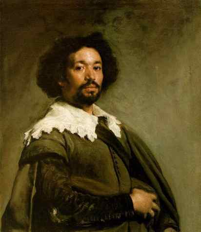
This technique was used by many a portrait painter, notably Velázquez, who always had both a warm brown-black and a cool blue-black on his palette.
After studying Velázquez’s paintings in the Prado, Harold Speed, author of ‘The Science and Practice of Oil Painting’, came to the conclusion that the artist used black to control the intensity and saturation of colours, particularly in his skin tones.
Speed mixed the closest combination of modern-day pigments to create an interpretation of Velázquez’s two blacks, one warm and one cool.
- Ivory Black mixed with a little BurntSsienna to create his own variation of bone brown (warm black)
- Blue-black, to which he added a little Cobalt Blue (cool black)
“In the first sitting I imagine he rubbed-in the head with very simple colours, little more than his two blacks; and concentrated his chief attention on placing the main masses of his light-on-dark scheme in the handsomest possible manner, and getting that basis of fine drawing on which the whole thing rests. All this being done in a fairly light key, and with very little paint everywhere except in the lights, which while not loaded were solidly painted. In the next sitting this was scumbled with negro hueso (bone brown) and a yellow that Velázquez used.”
Harold Speed – Author & Painter, The Science and Practice of Oil Painting, 1924
Mixing your own black
Depending on the pigments you are using, you can often make a very nice black from a combination of primary colours or existing pigments.
Using the basic acrylic paint palette colours, Ultramarine Blue & Burnt Umber can make a very dark hue.
This mixture of a blue and a brown can be enhanced further if you use a darker blue, say
Prussian Blue (which is often a mix of Phthalo Blue and black) with Burnt Umber.
If you don’t have a Burnt Umber, you could use a Burnt Sienna or Raw Umber. However, the Raw Umber won’t give you the flexibility of warming up and cooling down a colour due to its bias towards more of a green-brown.
In the video below, I demonstrate some of these mixes.
What is Chromatic Black?
Chromatic black is a black made of a ‘chroma’ or colour rather than containing any specific black pigment. ( You can check this on the paint tube by looking for a PBk pigment – which indicates black)
For example, Gamblin’s chromatic black is made from Phthalo Green and Quinacridone Red.
If you don’t have these colours, you can make a close Phthalo Green by mixing:
Phthalo Blue ( green shade) + Hansa Yellow ( medium ideally, if not light) mixed with Quinacridone Red.
Why Use Chromatic Black?
Chromatic black can give a subtle tint than a premixed opaque black, such as Mars Black; it also can have less of an effect on colour shift when mixing, producing more neutral tints.
Gamblin Chromatic black for oil paint
“The overuse of traditional black pigments color mixing can be a problem.
Color mixtures can easily become “dirty” looking. I believe that this is not caused by the use of black itself in colour mixing but because of the relatively large pigment particle size of both Ivory Black and Mars Black.Chromatic Black solves this problem since it is made from modern organic pigments that are both tiny in size and transparent. Colours are greyed without being made to look “dirty.” This also points to a limitation of Chromatic Black: while it is a fabulous mixing black it is not as good as Ivory or Mars or Black Spinel when a true black is needed in a painting.”
Gamblin Technical notes on Chromatic Black
Chromatic Black paint recipes
Start by mixing in equal proportions, but be sure to also try mixes that aren’t equal, so you have a ‘black’ leaning towards a colour. You’ll see in the video below the colour bias they can give depending on the mix of colours.
- Complementary Colours: Blue and orange or dark green and dark red (yellow and purple don’t work as well)
- Dark purple: Ultramarine Blue + Cadmium Red Deep or Naphthol Red
- Quinacridone Red + Phthalo Green
- Ultramarine Blue + Earth Colour (Burnt Umber, Burnt Sienna)
- Prussian Blue + Alizarin Crimson + tiny amount yellow (Hansa) – not strictly a chromatic black as Prussian Blue has a tiny bit of black in it but a useful black nevertheless.
Add a touch of white to your black mixtures to see the colour bias.
Farrow & Ball
I’m a huge fan of these paints and the subtle, muted tones. Our gallery front was painted in Lichen, a lovely dull green/ grey; however, when colour matching interior paints for shop displays, we used more affordable paints and just added black acrylic paint. This was usually fluid acrylic, so the mixture was smoother, and it always produces a lovely muted colour.
Sometimes the beauty of colour is a juxtaposition of bright shades with muted tones.
‘Better gray than garish’
Jean Auguste-Dominique Ingres
You might also like:


