Recently the World Color Survey, a large-scale replication of Berlin and Kay’s experiments for which data has been collected from 110 pre-industrial societies, has reconfirmed the universal character of color categories (Kay & Regier, 2003; Kay et al., 2003; Regier, Kay, & Cook, 2005).In summary, the centres of color categories of most cultures tend to fall in approximately the same positions; these are the positions known in English by the basic color terms black, white, red, yellow, blue, green and so forth.A straightforward explanation for this universal character is that color categories are innate.They are in a certain sense “hard wired” in the human brain. One view is that the categories are directly genetically encoded, and that every human being possesses a fully fledged repertoire of color categories, even though not all categories might be lexicalized (Rosch-Heider, 1972).More subtle innatist accounts argue that certain neurophysical structures might be responsible for universal color categories.Indeed, humans are a trichromatic species, meaning that anyone with normal color vision has the same three types of color-sensitive receptors in the retina.Or, humans invariably process color in an opponent manner, placing white against black, blue against yellow and green against red. These shared neurophysical properties of color perception could possibly explain the shared categorization of color.Source: Adaptive Behavior | First Published December 1, 2005 | Tony Belpaeme and Joris Bleys
BASIC COLOR THEORY
We’ve been around color our entire life, but do we really understand basic color theory? Whether you are reading a magazine or following directions on the subway, color plays a major part in all of our daily activities. As designers this is a way we can express emotion, feelings or make things stand out. There are a multitude of applications that explain basic color theories but today we will look at two. The Color Wheel and Color Harmony.
The Color wheel is exactly what it sounds like, a circle of colors. The traditional color wheel is based on red, yellow and blue (the primary colors we were taught in grade school). However any color circle with a logically arranged pattern of colors can be considered a “Color Wheel”. Let’s look at three different variations of the color wheel.
Primary Color Wheel
The three primary colors are red, yellow and blue. In traditional color theory these are the 3 colors that cannot be formed by mixing any combinations or other colors. All other colors are derived from mixing these three colors.

Secondary Color Wheel
Secondary colors form the next most basic of the standard color wheels. Mixing the three primary colors with each other forms these colors. For example yellow mixed with blue makes green or yellow mixed with red makes orange.

Tertiary Colors
This is where things start getting a little more interesting! Mixing a primary color with a secondary color forms a tertiary color. A tertiary color is a new hue that is expressed as a two-word name. For example, blue (primary) + green (secondary) = blue-green.

Now that we understand the most basic forms of colors, lets look at how those colors work together.
COLOR HARMONY
Although we might not be aware of it, things that are in harmony with each other constantly surround us. The way your car motor flawlessly runs or the way you mix ingredients in your favorite cookies. This is all a form of harmony. Merriam-Webster describes harmony as: a pleasing combination or arrangement of different things.
In the case of design, harmony is found when we organize colors in a way that is pleasing to our audience. Similar to the case of Goldilocks and the Three Bears, when we design something too boring (not enough color) or too loud (too much color) we can lose our audience. This is because the brain either becomes bored or is over stimulated to the point it can’t process. The goal is to utilize colors to make a piece that is both visually appealing and stimulating in a way that the brain can process. This is the “Just Right” area of color harmony. Lets take a look at colors that create a harmony.
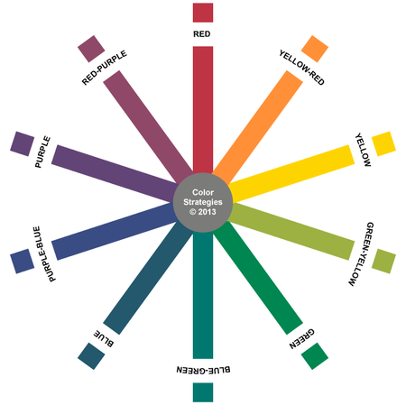
Analogous Colors
Analogous colors are any three colors organized by each other on a 12-color wheel. These colors usually work well together because of their similar hues. Many times in design we know a certain color we may want to work with. Analogous colors allow us to have variations of that color to create more visual interest.

Complimentary Colors
Complimentary colors are any two colors that are directly opposite from each other on a 12-color wheel. In this case for example, purple & yellow, blue & orange, and red & green are all complimentary colors. These colors are often utilized when there needs to be a stark contrast within your design. Many sporting teams utilize complimentary colors for this reason.

Natural Colors
The colors we find in nature might not always fit into a technical version of a 12-color wheel but they are harmonious nonetheless. In the example below we can see how the green from the trees, provides a beautiful contrast from the blue water. While the orange we find in the flowers provides a pop of color.

Let us hear about your favorite color combination or palette.
What are Basic Color Names
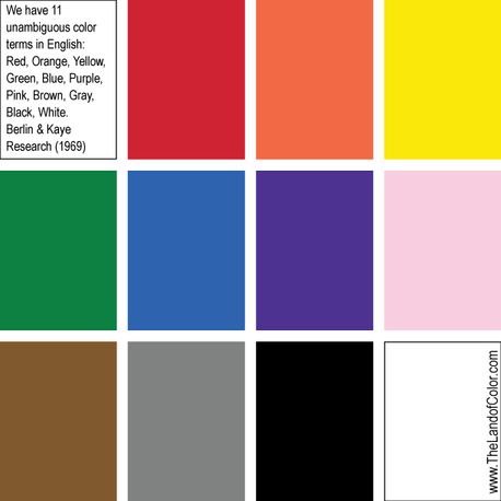
This concept has been debated many times by a boatload of very smart people since 1969 and was revisited by the World Color Survey:
Recently the World Color Survey, a large-scale replication of Berlin and Kay’s experiments for which data has been collected from 110 pre-industrial societies, has reconfirmed the universal character of color categories (Kay & Regier, 2003; Kay et al., 2003; Regier, Kay, & Cook, 2005).
In summary, the centres of color categories of most cultures tend to fall in approximately the same positions; these are the positions known in English by the basic color terms black, white, red, yellow, blue, green and so forth.
A straightforward explanation for this universal character is that color categories are innate.
They are in a certain sense “hard wired” in the human brain. One view is that the categories are directly genetically encoded, and that every human being possesses a fully fledged repertoire of color categories, even though not all categories might be lexicalized (Rosch-Heider, 1972).
More subtle innatist accounts argue that certain neurophysical structures might be responsible for universal color categories.
Indeed, humans are a trichromatic species, meaning that anyone with normal color vision has the same three types of color-sensitive receptors in the retina.
Or, humans invariably process color in an opponent manner, placing white against black, blue against yellow and green against red. These shared neurophysical properties of color perception could possibly explain the shared categorization of color.
Source: Adaptive Behavior | First Published December 1, 2005 | Tony Belpaeme and Joris Bleys
I agree we all came pre-programmed (if you will) with an innate color sense and are naturally compelled to name and order color.
Without an established color order system, it is my opinion that once you get past a basic set of color terms, it becomes a hot mess of arbitrary, inconsistent, fussy and nonsensical color names.
Which is why I find words like beige, greige, khaki, putty, and sometimes even gray loosely descriptive – at best.
Unlike “pink” and “brown”, for example, they don’t say anything specific about color properties or what color sensation it is the person using those types of color names is experiencing.
In general, pink associates with light red and brown associates with dark orange and/or a mixture of hues. Known general color associations generally do a good job communicating the idea of a color to most people. . . in general.
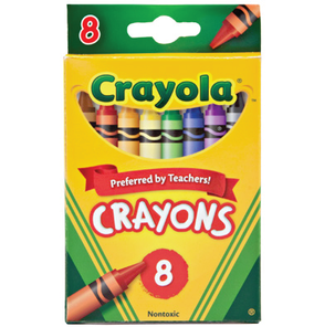
Think about a box of crayons. While all the colors in the big box of 64 are fun, the basic eight are easier and more concise; I wonder if that’s why they are teacher preferred?
As a color consultant, when the loosely descriptive color names start to fly, I have to amp up the listening skills in order to hone in on what it is exactly the person means when, for example, they use the word “beige”.
Because unlike pink or brown, beige is all over the place and can mean pretty much anything. But, hey, that’s my job.
I’m the color expert and I’m supposed to know the difference between arbitrary color names and the orderliness of color systems. And it is indeed a stark comparison between arbitrary color names and ordered color systems and their identified hue families.
Each color order system identifies its own core hue families. The International Standards Organization recognizes four order systems: Munsell, NCS (Natural Color System), DIN 6164-2, and OSA-UCS.
I’m most familiar with Munsell and NCS and it’s interesting how their core hue family names align with Berlin and Kaye’s 11 color terms:

Both Munsell and NCS are based on human percepts of color but they differ. I teach you all about color systems like Munsell and NCS in my Camp Chroma Color Training program. Click here to learn more about becoming a certified Color Strategist.
2 thoughts on “What are Basic Color Names”
Jane F
I think color terminology, while great for pros, is very tough for most people. Over time, the thing I’ve found easiest in terms of communicating for my blog — though certainly not very accurate for your purposes especially given the differences in perception — is, odd as it may sound, food colors. If you say strawberry red, that’s clear within a certain parameter. Blueberry. Lemon vs saffron yellow. The beiges and grays are tough. And people don’t understand gray at all. I don’t envy the task when you don’t have a client who can’t “see” something. But they do need you!
House Painter
Nice article about color names. As a local house painter myself, I did not realize I needed this refresher for mysef.
Primary Colors in Famous Paintings
While you will be hard-pressed to find all three bright primary colors used by the great masters, they did incorporate the colors into a lot of their paintings. Van Gogh in particular loved the brownish-yellow colors that can be seen in a lot of his paintings. Another painter by the name of Piet Mondrian used primary colors to create drama in his masterpieces.
The Bedroom in Arles (1888) by Vincent van Gogh
| Artist | Vincent van Gogh (1853 -1890) |
| Date Completed | 1888 |
| Medium | Oil on canvas |
| Location | Van Gogh Museum, Amsterdam, Netherlands |
A few of Vincent van Gogh’s paintings, such as The Bedroom in Arles (1888), are characterized by the use of primary colors as well as secondary colors. In this painting, Van Gogh used pale lemon greens and blood reds. Van Gogh loved the more subtle hues of the yellow color. He stated that he wanted to express his state of rest and peace by using primary colors.
Evening: Red Tree (1911) by Pieter Cornelius Mondriaan
| Artist | Pet Mondrian (1872 – 1944) |
| Date Completed | 1908 – 1910 |
| Medium | Oil on canvas |
| Location | Gemeentemuseum Den Haag, the Hague, Netherlands |
One of the world’s greatest 20th-century artists, Pieter Cornelius Mondriaan, was of Dutch descent and an art theoretician. Commonly known as Piet Mondrian, he used primary colors in most of his art pieces. Evening: Red Tree which was completed in 1910, has a beautiful blue background that enhances the detail of the bright red tree in the foreground.
Interesting Facts About Primary Colors
You would be forgiven for thinking that primary colors are boring or less interesting than secondary and tertiary colors, however, there are many interesting things to learn about them which prove that primary colors are quite interesting after all!
There Were Once More Than Three Primary Colors
It was believed that there are, in fact, four primary colors, and these four colors represented the four elements: fire, air, water, and earth.
A Peculiar but Fun Fact About the Color Wheel
Did you know that if you spin the color wheel because all the colors blend with the spin, the human eye will not see color but will only pick up the color white?
There Were Once Fewer Colors in the Rainbow
Did you know that the rainbow you see in the sky after rainfall used to have only five colors that were identified? In 1704, Sir Isaac Newton proved that the color orange and indigo also formed part of the rainbow colors.
If You Study a Rainbow More Carefully, It Does Not Have Pure Colors
Rather the colors blend into each other in one spectrum. The three primary colors do belong in the rainbow, and the seven rainbow colors are red, yellow, green, orange, blue, indigo, and violet.
Primary Colors Are the Beginning of Every Color
As mentioned before, the primary colors are red, blue, and then yellow. We call these colors “primary colors” because they are the basis of all other colors. So, primary colors could be considered the main source of all different colors.
The First Color Ever Used May Surprise You
Perhaps you will be surprised to learn that the very first color that was used in art was the color red or ochre. It was used in cave art and can be dated back to at least eighty thousand years ago.
Who would have thought that three humble colors, red, yellow, and blue, would play such a vital role in our lives? They are indeed the most important colors, in fact so important that they even received the title of being known as primary colors. Having learned more about the three primary colors and how they can be mixed and manipulated into making other colors opens up our world of exploration. If you take time to think about it, without these primary colors, we wouldn’t enjoy the warm feelings that color can give us. Primary colors certainly do not get the recognition and accolades that they should, and they are often taken for granted, but when artists pick up their brush to paint and start mixing colors to create masterpieces, we just know that the primary colors are uppermost in their mind and for that we celebrate.
Frequently Asked Questions
What Are Primary Colors?
Red, blue, and yellow are the three colors that we know as primary colors. They are red, yellow, and blue. If you start mixing the primary colors, you land up with three secondary colors, which are orange, green, and violet, and from there, you will get what we call tertiary colors, which are red-orange, yellow-orange, yellow-green, blue-green, blue-violet, red-violet colors. You can create these tertiary colors when we combine one primary color with a secondary color.
What Is the Primary Colors Definition?
Primary colors of red, yellow and blue cannot be mixed with any other color. They are the starting point where mixing colors will commence. Primary colors consist of colorants that are incorporated in various amounts to produce what we call a gamut of colors.
How Many Primary Colors Are There?
There are only three primary colors, and these are red, yellow, and blue. As they are mixed, secondary colors will be made, and if the secondary colors are mixed, then tertiary colors are made. All the colors in the world that you see all around you start from three colors.
Are Primary Colors Also Main Colors?
Primary colors can be considered as main colors because you cannot mix another color to get a primary color. Secondary colors are mixed when you mix two primary colors, but your main colors, red, blue, and green, are considered to be the most essential colors on the color wheel.
Duncan van der Merwe ( Color Theory Expert, Video Editor )
Duncan graduated with a diploma in Film and TV production from CityVarsity in 2018, after which he continued pursuing film while taking on a keen interest in writing along the way. Since having graduated, he began working as a freelance videographer, filming a variety of music videos, fashion and short films, adverts, weddings and more. Throughout this, he’s won a number of awards from various film festivals that are both locally and internationally recognized. However, Duncan still enjoys writing articles in between his filming ventures, appreciating the peace and clarity that comes with it.
His articles focus primarily around helping up-and-coming artists explore the basics of certain colors, how these colors can be paired with other shades, as well as what colors are created when you mix one with another. All while relating these shades to historically significant paintings that have incorporated them into their color palette. As a lover of the arts himself, he takes great interest in the Renaissance era of paintings, an era that has directly inspired many of his favorite films.
Learn more about Duncan van der Merwe and about us.


