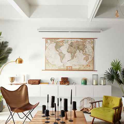
White and green. If you want to highlight freshness and vitality in your bedroom, creating a relaxing and natural space, then mixing white and green is an excellent option.
Blue and Brown Make What Color When Mixed

Welcome to a color adventure like no other. Today, we’re mixing blue and brown to discover the incredible shades they create together.
You may be wondering, “Blue and brown make what color?” Well, this might seem like an odd pairing, but it’s full of surprises. Join us as we reveal the secrets behind this unique color combination.
As we explore, you’ll see how blending these two colors brings you on an exciting journey through a new world of shades.

By mixing blue and brown, you can create a range of colors, from soft and soothing to bold and dynamic. With every twist and turn, you’ll be amazed by the possibilities that open up.
Get ready to change the way you see blue and brown and uncover the beauty of the colors they make together in these unexpected combinations. Let’s begin.
Basic Color Theory

Color theory is a fundamental concept in the world of art and design. It allows artists to understand how colors interact and create harmony, contrast, and visual interest.
How to Avoid Muddy Colors Acrylic P.
Please enable JavaScript

Please enable JavaScript

We will discuss primary, secondary, and tertiary colors, as well as complementary colors and the role of warm and cool colors in mixing.
Primary, secondary, and tertiary colors
- Primary colors: Primary colors are the three basic colors that cannot be created by mixing any other colors. They are the building blocks of all other colors in the color spectrum. The primary colors are red, blue, and yellow. These colors can be mixed in different combinations to create a wide array of secondary and tertiary colors.
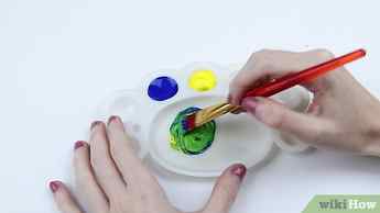
- Secondary colors: Secondary colors are created by mixing equal parts of two primary colors. There are three secondary colors: green (blue + yellow), orange (red + yellow), and purple (red + blue). These colors are positioned between the primary colors on the color wheel and play a crucial role in creating color harmony and contrast in art.
- Tertiary colors: Tertiary colors are created by mixing equal parts of a primary color and its adjacent secondary color. There are six tertiary colors: red-orange, yellow-orange, yellow-green, blue-green, blue-purple, and red-purple. These colors add further variety to the color palette and can be used to create more subtle and nuanced color schemes.
Complementary colors
Complementary colors are pairs of colors that are opposite each other on the color wheel.
When placed next to each other, complementary colors create a strong visual contrast, making them a powerful tool for artists and designers.
- Examples of complementary colors: Some common examples of complementary color pairs include red and green, yellow and purple and blue and orange color. These pairs can be used in art and design to create striking contrasts and draw attention to specific elements within a composition.
- Using complementary colors: When using complementary colors, it’s essential to balance their intensity and saturation. Overusing complementary colors can result in visual clutter and disharmony. By carefully controlling the proportions of each color, artists can achieve a visually pleasing balance between contrast and harmony.
The role of warm and cool colors in mixing
- Warm and cool colors: Colors can be classified as either warm or cool based on their perceived temperature. Warm colors, such as red, orange, and yellow, are associated with heat and energy, while cool colors, like blue, green, and purple, evoke feelings of calm and tranquility.
- Mixing warm and cool colors: Mixing warm and cool colors can result in a variety of outcomes depending on the specific hues and proportions used. For example, mixing a warm color red and a cool blue can create a balanced and harmonious purple, while mixing a cool yellow-green with a warm red-orange can result in a more muted and subdued color.
- Achieving harmony and contrast: The key to successful color mixing is understanding the relationships between warm and cool colors and using them to create harmony and contrast in a composition. Carefully selecting and mixing colors, artists can create visually appealing color schemes that evoke specific emotions and enhance the overall impact of their work.
Characteristics of Blue and Brown Colors
Understanding the characteristics of blue and brown colors is essential for artists when mixing and creating new shades.
We will explore the various shades and hues of blue and brown and how their unique properties can be used in art.
5 rules to choose the best color palette
These rules will help you to have a base from which to start when mixing colors in your décor.
Choose a neutral base. Neutral colors, such as white, gray and beige, are ideal for providing a background against which other colors can stand out.
Get inspired by nature. Observe how colors combine in natural landscapes and plants. There is no better source of inspiration for the harmonious and combined use of colors.
Use the 60-30-10 rule. This rule will help you find a balance between the different shades you use. Spend 60% on the dominant color, 30% on the secondary one and 10% on details and contrasts.
Take advantage of digital tools. There are apps and websites that allow you to experiment with different color palettes without having to paint a single wall. Take advantage of them to get an idea of what the result will be like.
Color is not everything. Although color is a basic element in décor, you can take advantage of the textures and the furniture to enrich the space without overloading it with more colors. Choose two or three tones at most to give the other elements a voice as well.

WOODFEEL SIENA I METROPOL
Neutral colors that combine well
Neutral colors, such as white, gray and beige, are ideal for creating timeless and elegant environments. In addition, they can easily be combined with other tones. For example, on a neutral base you can add details in pastel tones for a soft and romantic feel or use bright colors to give the space a more energetic touch.

BLEUEMIX GREY CONCEPT I KERABEN
Cool tones: a mix of colors that go together
Cool tones, such as blue, green, and purple, evoke serenity and calm. They are perfect for creating relaxing and sophisticated environments. For example, you can try combining different shades of blue, from navy blue to turquoise, for a cozy and refreshing effect in your home.
BOULEVARD ICE I IBERO
What Color Do Blue and Pink Make in Lights?
By mixing pink and blue light, you produce purple or violet. The color obtained in RGB space differs depending on the colors’ brightness.
- Pink and blue make a pale purple. Its hex code is #8060E5.
- Hot pink and blue produce a bright purple. Its hex code is #8035DA.
Mixing light differs from mixing paint and pigments because they are two different types of mixing. Light uses additive colors, while pigments use subtractive colors.
Mixing Pink and Blue in the RGB Space
When it comes to light, mixing blue and pink results in a slightly different color because it’s a different type of color mixing.
Thus, the RGB color model is an additive model that uses red, green, and blue as primaries, as opposed to the RYB model, which is a subtractive model that uses red, yellow, and blue as primaries.
The RGB model produces colored lights by mixing primary colors at different intensity levels. So the higher the red, green, and blue values, the brighter the resulting color.
- Blue and green make cyan
- Blue and red make magenta
- Red and green make yellow
To make the color pink in RGB, you need to mix red and blue light at high intensity while keeping the green light off or at a low level.
The RGB values for pink vary depending on the specific shade you want to achieve.
Still, generally, a combination of red and blue with no green will result in a shade of pink. For example, hot pink has no green in composition.
Assuming the maximum brightness level for each color is 100%, the brightness percentages for pink could range from around 80% red and 50% blue for light pink, to 100% red and 56% blue for a brighter, more saturated pink.
Thus, the more green you add to the pink composition, the darker the purple resulting from mixing pink and blue will be.
Unlike the mixing of primaries in painting that leads to muddy colors, they produce brighter colors in light. Furthermore, when mixed at maximum intensity, all three colors make white light.
Purple versus Violet
Violet is a spectral color in the visible spectrum, ranging from 380 nm to 450 nm. On the other hand, violet is a non-spectral color resulting from the mixture of various combinations of red and blue.
Furthermore, violet consists of more blue, in contrast to purple, which is an equal mixture of blue and red.
Purple
Hex: #800080
Violet
Hex: #8F00FF
How Do Our Eyes Perceive Purple?
Purple is perceived by the human eye as a color that is intermediate between blue and red. It is a non-spectral color, meaning it cannot be generated by a single wavelength of light.
Instead, purple is perceived when red and blue light are combined, either by mixing colored lights or combining pigments in paint.
Physically, purple is perceived by the human eye through a process called “color vision.” This process involves detecting and interpreting light waves by three types of cells in the retina called cones.
Purple is perceived when light wavelengths from the red and blue parts of the spectrum are mixed together in the eye.
Specifically, when light with a wavelength of around 450-480 nanometers (blue) is combined with light with a wavelength of about 620-740 nanometers (red), the brain perceives the color as purple.
Designing With Purple
Purple is a beloved color in art because it is associated with peace, imagination, fantasy, and magic.
Plenty of colors go with purple, including neutrals (gray, white, and black), yellow, blue, or blue-green.
As a designer, however, you must keep color harmony in mind. So whether you’re working on a website or making a logo, use a complementary scheme if you want a contrasting palette.
The complementary color to purple is yellow. If the shade of purple leans more towards red, then it goes with a light green, like chartreuse. If it leans more towards blue, then it goes with orange.
Last Words on What Color Do Pink and Blue Make
So what do you get if you mix blue and pink? When you mix blue and pink, you’ll get a shade of purple. That’s because pink is a tint of red, and mixing the primary colors red and blue makes the secondary color purple.
Purple is a secondary color on the traditional color wheel and comes in different shades. Moreover, it is generally a cool color, like blue.
So, while blending blue and red results in a perfect purple, blue and pink mixed together make a bluish version of purple or even a light purple.
Mixing pink and blue is like mixing the two primary colors – red and blue, which makes purple.
Blue + Pink pigment yields a shade of purple.
Pink + Blue light yields a rich purple or a purple-pink color.
Based on these conclusions, the resulting shades may vary depending on the colors used in the mixture.
Did you like this article about what color blue and pink make when mixed? Share this article with your friends who might be interested.


