The harmonies basically show you colors that go well with the color you are currently viewing. If you like one of the harmonies, you can directly create a CSS Gradient or CSS Text Shadow from it or view the harmony as a ️ Color Bucket.
Converting Colors
Here you see your color converted to 17 different color formats like RGB, CMYK, HSV, HSL, CIELab, Android, Decimal, and YUV.
| Format | Color |
|---|---|
| Hex | 922B3E |
| Format | Color |
|---|---|
| RYB | 146, 43, 62 |
Are you interested in the nearest colors from our lists for your color? For example, the closest Benjamin Moore, Farrow & Ball, or Sherwin Williams color?
The Hex color 922B3E is a dark color, and the websafe version is hex 993333, and the color name is red-violet (color wheel). A complement of this color would be 2B927F, and the grayscale version is 4C4C4C.
A 20% lighter version of the original color is CC606D, and 590014 is the 20% darker color. If you saturate the color by 10%, you get 921C32, and if you desaturate by 10%, it is 923A4A.
Distribution
RGB Color Distribution The distribution of the RGB values, red, green and blue. Red The Perecentage of Red in the Color. Green The Perecentage of Green in the Color. Blue The Perecentage of Blue in the Color.
- Red (57%)
- Green (17%)
- Blue (24%)
RYB Color Distribution The distribution of the RYB values, red, yellow and blue. Red The Perecentage of Red in the Color. Yellow The Perecentage of Yellow in the Color. Blue The Perecentage of Blue in the Color.
- Red (57%)
- Yellow (17%)
- Blue (24%)
CMYK Color Distribution The distribution of the CMYK values, Cyan, Magenta, Yellow and Black. Cyan The Perecentage of Cyan in the Color. Magenta The Perecentage of Magenta in the Color. Yellow The Perecentage of Yellow in the Color. Black The Perecentage of Black in the Color.
- Cyan (0%)
- Magenta (71%)
- Yellow (58%)
- Black (43%)
CMY Color Distribution The distribution of the CMY values, Cyan, Magenta, Yellow. Cyan The Perecentage of Cyan in the Color. Magenta The Perecentage of Magenta in the Color. Yellow The Perecentage of Yellow in the Color.
- Cyan (43%)
- Magenta (83%)
- Yellow (76%)
Brightness & Saturation Gradients
These gradients show how the Hex color 922B3E changes by changing the brightness by 10 percent. The first figure shows a shift by +10% for each color and the second figure -10%.
Similar to the brightness gradients but the following saturation gradients show a change of the Hex color 922B3E by changing the saturation by 10% instead.
View as
View as
View as
View as
Harmonies
What is Color Theory?
According to the Interaction Design Foundation, “Color theory is the collection of rules and guidelines which designers use to communicate with users through appealing color schemes in visual interfaces. To pick the best colors every time, designers use a color wheel and refer to extensive collected knowledge about human optical ability, psychology, culture and more.” The color wheel is comprised of 3 components: Primary colors (Red, Yellow, & Blue), Secondary Colors (Green, Violet, & Orange), and Tertiary colors (Blue-green, blue-violet, red-orange, red-violet, yellow-orange, & yellow-green).
These are the most successful uses of the color wheel:
Monochromatic – Use one hue, create a palette from different shades and tints of it.
Analogous – Use three colors located beside one another, like violet, red-violet, and red.
Complementary – Use “opposite color” pairs, such as blue and orange.
Split-Complementary (or Compound Harmony) – Use colors from either side of your complementary color pair to soften contrast, like orange, blue-violet, and blue-green.
Triadic – Use three colors which are equally distant on the color, such as blue, red, and yellow.
Tetradic – Use four colors that are two sets of complementary pairs like orange, yellow, blue, violet and choosing one dominant color.
Square – Use four colors evenly spaced on the color wheel.
What colors are known to be the most affective?
The key component when it comes to color is evaluating the brand’s attributes and through color conveying what the brands wants to say without using words. These colors should be representational of the brand and their ideologies, and then reinforced through packaging and social media. This sets the brand up for a strong sense of recognition amongst its consumers. So, how does color communicate? There have been studies done that test which associations are linked to each color. So, in a sense, it is not so much which color is the most affective, but instead, what does your brand want to say, and which color is best known for communicating that.
Here are a few examples of color associations and the brands/companies that use them :
- Red is viewed as a color that causes hunger and increases appetite. This can be seen within many fast-food chains’ branding colors, such as McDonalds, Wendy’s, and Chik-fil-a. Red also creates a sense of urgency, communicating a sense of high energy, or a call-to-action.
- Blue is often associated with trust and security. It gives viewers a sense of calmness and tranquility. Insurance companies, like Allstate, Geico, and Progressive are often users of the color blue.
- Green represents nature and provides a sense of tranquility. It has been known to stimulate a feeling of harmony in the brain. It is often used by brands to represent themselves as natural and organic. Green can be seen in brands like Whole Foods, Tropicana, and Seventh Generation.
These are just a few examples of how major companies and brands use color to speak for their brand without using words, communicating instant emotions, feelings, and sensations to the consumer that they may not even be aware of.
How should graphic designers apply this to their work?
Designers should hold color and color theory to the utmost importance because it communicates so much that the brand cannot say with words. The designer should begin by evaluating the brand attributes and seeing which colors are representational of these attributes. After choosing the most representational color (or colors), the designer needs to take two components into consideration when creating the branding:
Readability & ADA Compliance:
Color pairings must be easily readable, color combinations such as bright yellow text on a white background confuses the eyes of the viewer and does not communicate well. In order to be ADA-compliant, the contrast of colors must be to specific minimums and maximums when paired together. This ensures that they will be legible to all that view.
Aesthetics:
After breaking down the attributes of the brand through color and ensuring that the color combinations have enough contrast to be easily legible, the fun part of this process is being creative and combining all of this to create something aesthetically pleasing. This could be muting the colors and creating a monochromatic color palette or using a bold tetradic palette that stands out amongst the rest. Ultimately the creative choice is up to the designer and which method they think would represent the brand best.
Shades
Sounds like something evil. Or a window treatment. Or, sunglasses?
Jokes aside, all of these “shades” connote blocking out the light, which is very much related to its color theory definition.
In color theory, a shade is created when you take a color from the color wheel (also called a hue) and add black to it. Shades can range from as light as the original hue down to a dark almost-black.
So, shades are the same hue as their original un-shaded color, just a darker version.
Here’s an example, starting with the color Red-Violet from the color wheel:
On the left is the original color from the color wheel. Moving towards the right, larger and larger amounts of black are added to the Red-Violet to create shades of Red-Violet.
Arrangements made with shades of a color are truly monochromatic.
These arrangements can be high-contrast and striking if they use shades that are far apart from each other in value…
…or low-contrast and subtle if they use shades that are close to each other in value.
Here’s a more flowery example:

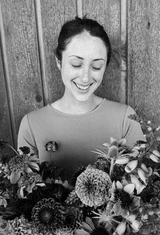
I sifted through the farm to select these flowers, keeping my selections to a very narrow set of shades of Red-Violet.
These blooms range from fully Red-Violet zinnias on the left, to darker lisianthus and snapdragons in the middle, to very dark strawflower and dahlias on the right.
Then, of course, I made something with these shady blooms!


Using shades in this bouquet allowed me to achieve a juicy, saturated look–one that feels “colorful” without feeling disorganized.
Using shades is a great way to showcase a color or flower you love! Those Red-Violet zinnias really pop when placed next to their darker shade dahlias.


Of course, you can’t talk about shades without also talking about tints! So, I guess you know what to look forward to next time on Flower Color Theory
Samantha is the owner of Sea Change Farm & Flower.


