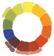
We know that light blue is made up of different colours, but what about dark blue? While there are only two main colours for light blue, there are three options for dark blue. Whether you want a dark, muted blue, a warm dark blue, or a cool dark blue, you can use different colours to achieve the desired effect.
Making Blue & Creating Different Shades
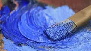
The colour blue was first created by the ancient Egyptians who discovered how to create a permanent pigment that they used for embellished arts. The colour blue continued to evolve for a further 5,000 years, and certain pigments were even used by the world’s greatest artists to create some of the most famous works of art. Blue is a primary colour that is often used by painters. It appears on the palette more frequently than many other colours, so it’s important to learn how to mix different shades of blue. This article will help you better understand the colour blue and will hopefully help and inspire you in your own creative journey.
One of the most common associations with blue shades is that of peace and tranquility. Throughout history, humans have been associating blue hues with positive and relaxed mental states. In fact, many scientific studies have shown that this association is wired into our brains. Scans show that simply looking at a cool blue shade can encourage the production of various chemicals that promote relaxation and rest. As part of this relaxation process, blue shades can also suppress the appetite and slow the metabolism.
What Colours Make Blue?
You may be wondering what two colours make blue. The answer is blue is a primary colour, so there is no need to mix any two colours to make blue. However, we are able to create numerous shades of blue through colour mixing. Grab your paint supplies and keep reading to find out more!
Creating a Cool Blue
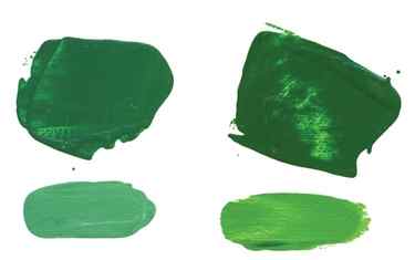
The trick to making a cool blue is by simply adding a splash of green. The particular shade of green you use will determine your final cool blue hue. The two best green shades for cooling down blues are veronese green and cadmium green.
Firstly, veronese green is an ideal colour for creating cool blue hues, as it has a bright, cool green tone that naturally leans towards light blue. Mixing veronese green with ultramarine blue will result in a very cool, slightly darker blue shade. For a light and bright cool blue, try mixing veronese green with cobalt blue. Secondly, cadmium green is a little warmer than veronese green because it contains a touch of red. This makes it a great choice for painting scenes with a warm, sunny atmosphere.
The Purple Cabbage


PG7 and PV23 Mixing blue from green and violet
This spring and summer, I’ve been busy with two things, gardening and The Daily Leaf. A little while ago, I decided to paint a cabbage leaf from my garden for my Daily Leaf project. The young outer leaves of my purple cabbages are a beautiful iridescent steel blue. Depending on angle and lighting, different parts of the leaf can appear purple, deep blue or green.
I took several days to staring cabbage leaves, trying to figure out how to paint them. Clearly, I lead a very action-packed, exciting life.
Many artists would start with a blue base for this mostly-blue subject, with areas of purple and green. This was my first impulse about how to approach this leaf. However, this posed a different set of challenges. Most blue paints are quite vibrant, so I would need to find a way to tone down my blue paint to the steely blue of the leaf.
Luckily, I remembered that many green and violets are great for mixing blue. Mixed blues are usually more muted and steely than single pigment blue paints. Using green and purple pigments to mix blues would also make it simpler to create the subtle colour transitions of this leaf. By varying the ratios of my green and purple paints, I could create areas of different colours that still blended together cohesively.
Finally, I could show a practical use for mixing blue from secondary colours!
Choosing a Palette for Mixing Blue

Colour Palette for Purple Cabbage
Once I figured out my basic strategy, I just had to choose the specific colour palette I would use for painting my blue cabbage leaf.
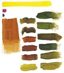
First, I chose a green and violet to make up the main body of the leaf. I started with the bright saturated duo of Winsor Green Blue Shade (PG7) and Winsor Violet (PV23). On their own, these two paints are very saturated and bright. However, together, they mix a range of slightly muted yet deep and interesting blue, teal and violet colours. The vibrancy of this duo breathes life into the finished painting – areas of brighter colour keep mostly muted colour from looking dull.
My main two colours are deep enough in masstone that I could have used them for shadows as well. However, I also included a more muted and even deeper green/violet duo to add depth to the deepest shadows. For shadow colours I chose Perylene Green(PBk31) and Perylene Violet (PV29).
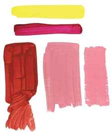
I chose a brighter magenta paint (Purple Magenta PR122) for the contrasting veins. I also used a touch of magenta in some areas of the body of the leaf to add a touch of warmth to some of the blue-violet areas.
Finally, I added the tiniest splash of my favourite yellow pigment, Nickel Azo Yellow (PY150) to my palette. I added this to some of my mixes to create the warmer green around the edges of the leaf. As Nickel Azo Yellow and Phthalo Green create garishly bright neon greens, I actually mixed the yellow with my mixed blues (green+violet) rather than any green alone.
In the mixing page below, you can see some of the mixes that are possible with this palette
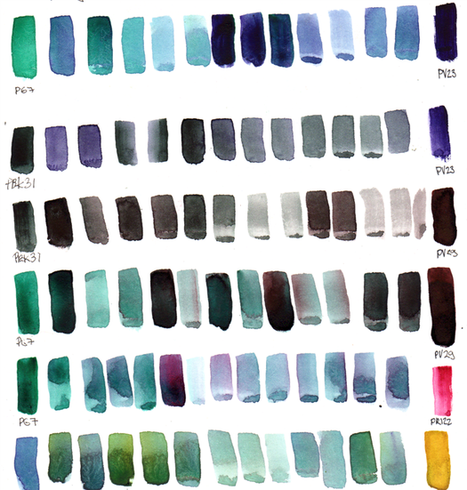
Mixing blues from green and violet + other mixes used in blue cabbage leaf watercolour painting
The Finished Product
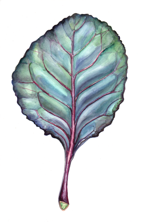
Daily Leaf 178: Purple Cabbage Leaf (Brassica Oleracea) in watercolour
Using only green, violet, magenta and yellow paints, I was able to create this painting of a mostly-blue cabbage leaf (Brassica oleracea). I mixed and layered different ratios of greens and violets. This created the iridescent blue effect of the finished piece. By adding a few areas of warmer green and deep dark mixed blacks, the main colours of the leaf popped out even more.
Will you try mixing blues from secondary colours?
Share this:
- Click to print (Opens in new window)
- Click to share on Facebook (Opens in new window)
- Click to share on Reddit (Opens in new window)
- Click to share on Twitter (Opens in new window)
- Click to share on Pinterest (Opens in new window)
- More
- Click to share on LinkedIn (Opens in new window)
- Click to share on Tumblr (Opens in new window)
- Click to share on Pocket (Opens in new window)
- Click to share on Telegram (Opens in new window)
- Click to share on WhatsApp (Opens in new window)
Color Mixing…You can’t get it unless you do it!
I had been given what to me seemed like the daunting task of writing an article on color mixing and to introduce the new Modern Theory Color Mixing Set. I was more than slightly astonished that I was the designated writer! We have an amazing number of wonderful painters working for Golden Artist Colors, many in highly technical capacities, and several who taught color at prestigious Universities. Coupled with that, these artists work with pigments using scales (for precision mixing ratios), spectrophotometers (for measuring color), special lighting, light boxes, and some truly amazing computer programs! My approach to color as an artist has always been to just play and you’ll discover. No theory substitutes for actually using the paint, but I’ve taught long enough to know that knowledge, even at a basic level, will reverse a lot of wasted effort and a good deal of wasted paint!
There are probably as many theories of the correct color mixing palette for artists as there are artists that promote them. However, each of these concepts, whether historical, contemporary or genre specific, create a starting point that is extremely helpful for the artist beginning to assemble their own aesthetic approach to painting. The concept around the new Modern Theory Color Mixing Set is to provide just one of those vantage points. This singular position is to create within a reasonably small selection of colors, the potential to mix the widest range of unique colors. A more classical approach would attempt to create a palette with historically significant colors. While this will produce a color gamut quite comfortable to many artists, the range of hues and chroma (color intensity) is significantly reduced. The modern mix of pigments in this new set will create very high chroma, bright mixtures that a historical palette cannot achieve.
The Modern Theory Color Mixing Set includes just seven colors plus Titanium White. Not only does this allow the artist to produce the widest color range with the fewest number of colors, it also provides mixtures of remarkably clean, intense color blends that retain their brilliance even in the thinnest wash or glaze. For this set we chose only organic colors (plus Titanium White), providing a warm and cool selection of pigments for each hue space other than green.
- Hansa Yellow Light
The cool yellow - Hansa Yellow Medium
The warm yellow - Naphthol Red Light
The bright, warm red - Quinacridone Magenta
The cool red for pinks and violets - Anthraquinone Blue
The warm blue - Phthalo Blue (Green Shade)
The cool blue - Phthalo Green (Blue Shade)
The cool green - Titanium White
The tinter
Why Only Organic Pigments in the Modern Theory Color Mixing Set?
Let’s go back a minute to a quick review of the organic and inorganic properties of pigments. We typically use nicknames: Modern (organic pigments) and Mineral (inorganic pigments). The broad generalization is that Mineral pigments (inorganic) are typically mined from the earth such as the umbers, siennas and ochres. These pigments were augmented at the beginning of the industrial age with the advent of industrially produced mixed metal colors, such as cobalts, cadmiums, zinc and a wide range of manufactured oxide pigments. These pigments are typically more opaque and when mixed together, yield a lower chroma mixture. The Modern (organic) pigments (Quinacridrones, Phthalos and Hansas) are more transparent, have higher chroma and most importantly, when mixed together create incredibly clean mixtures. This is probably the greatest difference between this Modern Theory Color Mixing Set and a classical set. Although a range of Cadmiums in the yellows, oranges and reds will get you incredibly intense and brilliant opaque colors, they tend to mix towards much more muted tones and continued mixing with these colors tends to go towards mud very quickly. 1 A classical set, while muted in its range and reach, allows an artist to mix a wheel of colors typically found in nature.
The choice of all Modern organic pigments allows us to create a wide range of colors that fill a much broader area of color space. This set provides one of the most complete resources to begin to understand the uniqueness of pigments and their mixtures.
Although there are many ways to slice and dice how to go about describing this set, I will be looking at the selection from my vantage point, outside the lab! I, like all of you, am very particular and exclusive about why I like certain pigments. We tend to keep to our typical choices. So consider this set an opportunity to play with some new pigments; you might be surprised to find a few colors that you didn’t even realize were missing from your palette.
Mixing Within the Colors for the Modern Set
There is no better way to understand the vast potential of possibilities than by simply playing around. I do not personally have the temperament for the scientific way of looking at color mixing. Over the years of attempting to find “fun” and “compelling” ways to teach color mixing, I have developed a very loose color wheel exercise.
Before jumping into using the Modern Color Mixing Guide (included in the set), I wanted to begin with some basic color comparisons. To do this, I work only with mixtures from two colors before I begin the more complex mixtures. I fall back on my simple color mixing test, creating a color wheel using three primaries that fall somewhere in the red, yellow and blue range. This continuing study allows me to approach the mixing of color simply to explore. I don’t hold to exact mixtures, as long as they fit into the color wheel progression. I found this to be an easy way to contrast the differences between the cool and warm yellows, blues and reds.
Three Primary Color Mixing
In my workshops I teach many artists, from novices to experienced painters who have never taken a color theory class and are simply afraid of the rigor and discipline that is associated with it. Rather than focusing on theories, my approach is simply all about mixing and discovery. To accomplish this, I very loosely use the idea of the three primaries. I needed this rather simple approach because I wanted to know more about two or three of the basic pigments that the kit contains since I don’t typically use Hansa Yellow Light, Phthalo Blue (Green Shade) or Anthraquinone Blue on my own palette.
By utilizing the color wheel form for this exercise I began to compare duo mixtures from colors included in the Modern Theory Color Mixing Set.
The Yellows: Hansa Yellow Light / Hansa Yellow Medium
Hansa Yellow Light is often described as acidic, almost fluorescence, with a slight greenish cast. It is the coolest yellow. It creates brighter and cooler leaning colors as it.s mixed to the greens with Phthalo Blue (Green Shade) or Anthraquinone Blue. To my eye, it almost looks like a bit of white has been added, giving a visually perceived opacity. (I believe this is due to its high reflectivity.)
Switching these mixtures to Hansa Yellow Medium provides a warmer mixture with a higher saturation.
When used with Phthalo Green (Blue Shade), Hansa Yellow Light adds a “minty coolness”, especially noticeable when tinted with the Titanium White.
When mixed with Quinacridone Magenta, the Hansa Yellow Light adds an underlying luminosity, almost fluorescence to the oranges.
When Hansa Yellow Light is mixed with the Naphthol Red Light the difference is a more subtle warmth as it appears to .flatten. the color.
Switching to Hansa Yellow Medium, the differences are fairly subtle; visually, a slight warmness is added with a bright translucency.
When working with the Hansa Yellows, you may have immediately noticed that they have a “low tinting strength” or that it takes proportionately more of the Hansas to create a change in the mixed color. A great resource for discovering more properties of a particular pigment is to use the GOLDEN Pigment Identification Chart;http://www.goldenpaints.com/technicaldata/pigment.php. You can learn about Pigment ID names, if a pigment is organic or inorganic, if a color is a blend of pigments, and its lightfastness rating and opacity or transparency as well.
The Reds: Naphthol Red Light / Quinacridone Magenta
Naphthol Red Light is bright, opaque fire engine red, much warmer and earthier than Quinacridone Magenta. Quinacridone Magenta is bright, cool and almost fluorescent. At first glance, it seems an unlikely choice for mixing any color that needs a red.
You can’t beat Quinacridone Magenta (mixed with either of the Hansa Yellows) for creating clear, clean, bright oranges, with a beautiful transparency perfect for glazing. For your coolest orange, use Quinacridone Magenta and Hansa Yellow Light. Quinacridone Magenta is actually one of the most versatile and cleanest reds for color mixing. Naphthol Red Light yields more opaque, dark, dense and warm oranges.
The Blues: Anthraquinone Blue / Phthalo Blue (Green Shade)
Anthraquinone Blue (Indanthrone) was added to the kit to balance out the cool arctic coldness of the Phthalo Blue (Green Shade). When used directly out of the tube, this pigment is almost black. You can see how very different this pigment is from all other blues by mixing it with Titanium White. This is the only blue pigment that gives you the classic “Navy Blue Suit” color. It has almost a blackish tint, beautiful for glazes, shadows and stormy skies. It creates a certain earthiness when compared to the same mixtures with Phthalo Blue (Green Shade). The Anthraquinone fills the same color space as the much more well known Ultramarine Blue, yet is deeper in value and more transparent with higher chroma. It allows not only for cleaner mixing, but a greater extension in the red / blue range, giving the artist the ability to discover a secondary color and tertiary color as well. All by itself, it is an incredibly intense and clean glazing color. Phthalo Blue (Green Shade) is the cool blue; the pigment essential for greens, violets and an amazing range of blues.
Anthraquinone or Phthalo Blue mixed with Naphthol Red Light creates very dense and earthy (muddy) violets. The Phthalo mixtures are brighter. These violet mixtures are quite dark, and to get a better feel for the richness of these mixtures, use Titanium White to tint. You can also scrape away a bit of the paint to reveal what we call an “undertone,” which reveals what the mixture would look like in a glaze. Naphthol Red Light for the violet mixtures, whether with Anthraquinone Blue or Phthalo Blue (Green Shade), will create some very dark earthy, moody colors (near a Red Oxide).
When each blue is mixed with Quinacridone Magenta, you immediately arrive at a range of stunningly deep, rich, brilliant violets that you might expect are only available with Dioxazine Purple. (You will find that Anthraquinone Blue is used for more of the blue mixtures and violets on the Guide.)
Clearly the Phthalo Blues are incredibly intense tinting colors. This intensity can become unwieldy, especially in their pure state. But even as cool as this blue is, when it is mixed with Quinacridone Magenta, it still produces a wide swath of beautiful violets.
Anthraquinone when mixed with Hansa Yellow Light adds the possibility for a wide range of earthy greens, which gives a lovely warmth compared to crisp cool spring greens from the Phthalo Blue (Green Shade). Anthraquinone Blue with Hansa Yellow Medium is my favorite range of classic greens.
A green with more Anthraquinone Blue and less Hansa Yellow Light has a grimier turquoise undertone, and when tinted with Titanium White, you will see how the Anthraquinone Blue grays down the mixed green. Anthraquinone Blue is definitely the choice for the earthy green mixtures that are closer to the Hookers Green Hue on the Modern Color Mixing Guide. Any of the yellows mixed with the Phthalo Blue (Green Shade) will produce incredibly intense greens.
In its glaze capacity, Phthalo Green (Blue Shade) is like the greens of early spring, where all the new shoots of color are practically fluorescent. Phthalo Green (Blue Shade) straight out of the tube is almost an unusable color at full strength. As a base for mixing a beautiful range of greens, it is indispensable. It is needed for mixing rich earth colors, olive greens, a beautiful black on the chart and quite surprisingly, rich violets. This pigment is so strong, that the cautionary, “a little dab will do you” is eminently true.
The Green: Phthalo Green (Blue Shade)
Phthalo Green (Blue Shade) mixes with Hansa Yellow Light and Hansa Yellow Medium, for a range of greens, which are all bright spring green, but you’ll notice that the Hansa Yellow Light mixtures have that characteristic “chalky” tint to them.
Mixing the Phthalo Green with the Naphthol Red will produce some very mineral like browns, colors close to Red Oxides. When the proportion moves to more Phthalo, less red, you get a deep dark earth violet.
Mix the Phthalo Green with the bright Quinacridone Magenta and it produces very clean, high chroma violets, similar to the mixtures with Phthalo Blue (Green Shade), but when the proportion of Phthalo Blue (Green Shade) is higher, it yields a beautiful turquoise mixture. Phthalo Green (Blue Shade) mixed with Phthalo Blue (Green Shade) creates our standard Turquois (Phthalo).
After I spent a great deal of time systematically comparing duo mixtures from all the pigments in the kit, I began to create mixtures using the Modern Color Mixing Guide. If you are new to color mixing, I would recommend following the same process.
Modern Color Mixing Guide
Click here to see the chart.
The new mixing set is accompanied by a robust mixing guide, offering a broad range of mixing suggestions. This is a great resource showing the wide range of mixtures that can be created using only these eight pigments, with an easy visual to demonstrate proportions. The numerical ratios are there for you number oriented painters too!
This mixing guide is designed visually to work in conjunction with the Tint & Glaze Poster. The focus of the set is to review mixtures of pigments, but if used alongside the Tint & Glaze Poster as an addition tool, the two together provide a guide for delving more deeply into the expanding possibilities of glazes and tints. To learn more about the Tint & Glaze Poster, go to http://www.goldenpaints.com/products/promotional/tintandglazeposter/.
When using this reference tool for mixing color, think of it as an adventure or a time to discover. In my experience, attempting to match a color exactly is tricky and time consuming. For example, we have a mixture on the guide that is named Nickel Azo Gold indicating that if you mix the three pigments shown in the correct proportion, you will achieve something close to our Quinacridone / Nickel Azo Gold. While you will get a valuable approximation to this color, it certainly will not have all the attributes of the true Quinacridone / Nickel Azo Gold in its undertone and glow. So, rather than getting obsessed about the perfect copy, I would recommend simply playing with the proportions. My first mixtures were wildly off proportionately, but through that effort, I discovered a range of beautiful olive hues. (I’m keeping my slightly “off” formula for the future with too much Anthraquinone Blue and too much Hansa Yellow Medium.)Using the Modern Color Mixing Guide
When mixing from this guide, I actually dispensed the paint in long horizontal strips, making it easier to see the ratios. One other tip: for any Phthalo, start with a smaller portion than you think you see! You can always add more, but once you have a mixture obliterated by a powerful Phthalo, you generally need to start’ over!
Another interesting experiment is to mix the color designated as Quinacridone Red Light (one of my favorite pigments) by using Hansa Yellow Light and Quinacridone Magenta. When placed next to the original Quinacridone Red Light, you can definitely see a difference. The Hansa Yellow Light adds a slight salmon undertone to the mixture. I tested the mixed Quinacridone Red Light against the .real. Quinacridone Red Light (PR 207), by mixing both with Titanium White. The mixed Quinacridone Red Light does not have the ability to mix to the incredibly bright pink that the single pigment will give you. This example doesn’t detract from the guide, but helps us to appreciate all the nuances of a pure pigment, and the range of color that can be achieved by subtle mixtures of numerous pigments. Many painters come to know intimately how these unique single pigments will behave, and have need for that.
Modern Color Mixing Guide Mixes
While I was exploring several other mixtures on the guide, more discoveries evolved. Take a look at the second yellow-orange on the guide (next to Indian Yellow Hue). It contains 30 parts Hansa Yellow Medium and 3 parts Naphthol Red Light.
Find the next yellow-orange, which is made of Hansa Yellow Light and 1 part Quinacridone Magenta. When each of these mixtures is tinted with Titanium White, you can see obvious warmth in the mixture that comes from the Hansa Yellow Medium. You can also detect that cool salmon tint from the Hansa Yellow Light. Observing the same comparison in a glaze or undertone reveals that a brighter, richer tone comes with the Hansa Yellow Medium.
Range of Skin Tones
The new Modern Theory Color Mixing Set was developed as a starting point for creating a range of color for all types of painters, including more traditional painting styles, such as portraiture and landscape. Portraiture in particular demands a wide range of color to create the gamut needed to achieve an international range of flesh tones and shadows. If you research “achieving flesh tones,” you will find a plethora of ideas, but generally artists work with a palette of yellow, blue, red, umber and white.
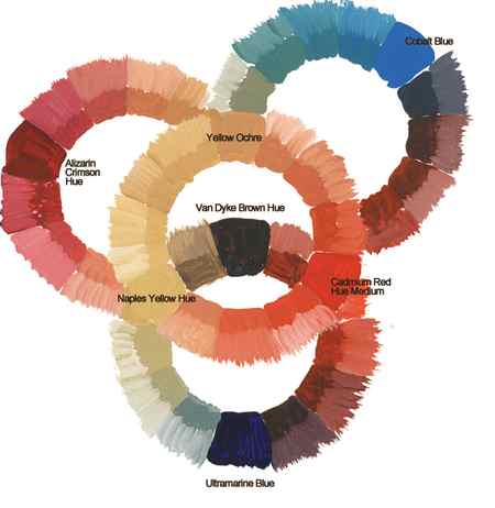
To demonstrate the range of more traditional colors possible, I expanded my color wheel to overlapped wheels. I premixed a basic set of colors using the guide: Cobalt Blue, Alizarin Crimson Hue, Yellow Ochre, Van Dyke Brown Hue, Cadmium Red Medium Hue, Naples Yellow Hue, and Ultramarine Blue. For each mixture, I also added Titanium White. I created 32 mixtures and this, of course, is only the beginning of the possibilities.Overlapped Color Wheels
Without a single inorganic (mineral) pigment, (except white) an artist can create a complete and complex range of flesh tones. Then, just for fun, I used the same format but switched placement of certain mixed colors and changed out Van Dyke Brown Hue for Burnt Umber, Cobalt Blue for Paynes Gray, and Naples Yellow Hue for Nickel Azo Yellow. Yes, there are endless possibilities!
The Modern Color Mixing Guide is definitely a great roadmap to allow you to begin finding the unique properties of these individual pigments. As I’ve demonstrated, there’s no substitute for playing and discovery, but this guide will be your salvation if you find that you have run out of a particular color that you need right now! Using this tool, you will be able to create a reasonable substitute and if you are on a budget, this grouping of pigments will allow you to create a very complete palette of colors to work with and explore the possibilities of color.
[1] Some of these very clear pigment distinctions have changed over the years with modern chemistry. For an in-depth study please see Sarah Sands’ article, “The Subtleties of Color” in Just Paint #21.


