Color Theory: Complementary colors are more than appealing, they’re used to maximize visibility.
Complementary colors are designed to look good together but they’re also very practical because they maximize visibility.
Think of road signs, they use the colors that are opposite each other on the color wheel to make sure they’re seen. A stop sign in America is red and white for this reason. A yield sign is yellow and black.
Road signs are designed to be seen from a distance and in all kinds of weather so they use the most visible color combinations.
This also applies to website design and other areas where you want your text or product to stand out. If you have a light background, using a dark color for your text will make it easier to read. The same is true if you have a dark background and use a light color for your text.
There are other benefits to using complementary colors. They can create a sense of harmony and balance in your design. They can also make a bold statement or add intrigue.
Example of Complementary Color Combinations
Blue and orange
Yellow and purple
Those are the common complementary color combinations, the foundational combinations, but you can create your own by using any two colors that are opposite each other on the color wheel.
Brands
Complementary colors can be used in many different ways to create contrast and really make something pop. Examples are found in big names brands like McDonald’s and Starbucks.
McDonald’s uses red and yellow as their complementary colors because they’re both very visible and create a sense of energy and excitement. This is an effective strategy for a fast-food restaurant because they want you to feel like you’re in and out quickly.
Starbucks uses green and white as their complementary colors. This creates a feeling of relaxation and peace. This is an effective strategy for…
Which colors complement purple the most?
Last month I touched base on analogous colors . Today I’m looking at complementary colors. This isn’t a technical color post but rather my observation of complementary colors in my world.
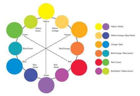
Complementary colors are any two colors that fall directly opposite of each other on the color wheel. The most basic complementary color pairs are red and green, orange and blue, and yellow and purple. Shift a step on the wheel and you get combinations like lime green and red-violet, aqua and red-orange, yellow-orange and indigo. Complementary colors naturally create contrast because they oppose each other on the color wheel. This can be used quite effectively to create very dynamic color compositions in graphics and quilts.
Tis the perfect season for spotting complementary colors since red and green play such a dominant role in Christmas decor. I love decorating with red and green for Christmas.


Of course red and green aren’t just seen during the holidays. This dynamic combination occurs year round if you look for it. All types of reds. All types of greens.


Here’s a little red and green from my stash . . .

The complementary colors of blue and orange are abundant here in Colorado since they happen to be the Denver Bronco colors (our NFL football team for those of you outside the USA). It’s actually a bit overwhelming to walk into a store and be confronted with this much bright, bright orange.


Nature always comes through with beautiful color combinations . . .



I also found a fair share of blue and orange combinations in my stash . . .


Purple and yellow seemed to be the hardest to find examples of. This combination occurs in nature but it’s winter here so the flowers are sleeping. I did have these photos from the Botanical Gardens.


And I found these graphic purple and yellow mugs in Anthropologie . . .

I’ve always wanted to make a quilt with this fabric group . . .

Or how about this nice complementary purple and yellow bee block I made for Cindy . . .

Using equal amounts of complementary colors can be overwhelming. When both colors occur in the same amounts they compete with one another. One great way to use complementary colors is to vary the amounts. Use one color as the dominant hue and add just a pop of the opposite color. This technique is often used in interior design by using an accent color to punch up the space. I like this use of complimentary colors because it really calls attention to the smallest detail and can be very dynamic. These leaves are a perfect example . . . rather than noticing the green leaves, you really see the red veins.
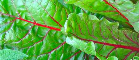

You can also vary the level of contrast between complementary colors by playing with value. For example, pairing a strong pure hue with a lighter value of it’s complement can soften the contrast. The soft pink flowers bring the level of contrast down a notch in this image.

What I learned while looking for complimentary colors is that I don’t use them very often. I usually lean toward analogous color schemes. But complementary colors make dynamic quilts so you can bet I’ll be exploring this combination more in 2016. I already have one in mind with some great Amy Butler fabrics I’ve been collecting.
Here are two quilts I made using complementary combinations. This yellow Kaffe quilt with purple accents made from my Cascade pattern . . .

And of course the best example so far would be my latest finish. The Drunkard’s Path QAL Christmas quilt . . . love this one and am so happy to have it hanging on the wall for the holidays.

How about you?
Can you find complimentary colors in your home or your wardrobe?
Do you use complimentary colors in your quilts?
Why not make a quilt with complementary colors in 2016?
I’ll leave you with Opal seen here modeling some complementary colors when we first got her three years ago this month . . .

As with my single color stories, my intention here is to look for these color combinations in my own personal world. To see the colors around me in my house, my environment and my experiences. For that reason I’ve chosen to use my own photos rather than rely on the abundance of beautiful photos and color schemes available through sites like Pinterest and Design Seeds. These sites are wonderful places for inspiration on color but I want my series to be personal . . . representative of the color I see around me.
You can see all my other color stories under the Color Inspiration tab at the top of my blog. If you’d like to see additional beautiful color images, you can follow my Pinterest color boards here. I’ve also added a board on complementary colors here. Do check it out. There are some fabulous photos.
