Each recipe in this post includes a color sample with three swatches. The first swatch is the darkest black that I could achieve. I then dilute some of the black with water and paint a wash of gray next to it. The third swatch is the black mixed with white. If there is any color bias in the black it will show up in the gray swatches.
How to Make Black Paint: A Complete Guide
Black paint is a staple in the artist’s toolbox. It can be used to create many different effects, depending on the medium you want to use it with.
How do I make black paint? This is a question that many people ask when they are trying to find the perfect color for their project. The answer is surprisingly easy: mix any other colors together!


There are plenty of ways to mix paints and as long as you have the right combinations, you can create nearly any color imaginable. In this article, we will discuss how to mix different colors of paint so that you can learn how to mix paint to make black with ease.
A Study of the Color Black
Before we get into the different techniques for mixing colors, it’s helpful to know a little bit about black paint.
Black is a very common color, found everywhere from dark woods like ebony (which gets its name from the dense black wood it comes from) to mundane objects such as marker pens or felt-tip pens. It’s also an important color because of how many other hues can be mixed with it; by starting off with black paint you can mix your own versions of reds, greens, blues, and more!

Black pigments can come from many sources but most commonly they are derived from tar or waxes such as carbon black or lampblack which contain mostly hydrocarbons.
The way these particles work makes them especially good pigment choices because they have strong absorption qualities without being too transparent. This makes them ideal for adding depth and richness to the colors used in artwork.
Why Is Black Not Considered to Be a Color?
Black is not actually a color in itself; it is an absence of light that causes certain wavelengths of visible light to be absorbed instead. This means that if you shine white light (which contains all visible frequencies) at something and there are no reflected particles in this wavelength, then what you will see when looking at this object is its complementary color: black.
Why Artists Like to Make Their Own Black Paint
With so many options for pre-made black paint, why would you want to create your own? There are plenty of reasons that having a homemade version is beneficial.
- First, there’s the cost factor: making black yourself can save you money because it means not having to pay someone else for something that takes little skill or effort on your part. If you’re able to buy some tubes and add them together then this will be even more affordable!
- Another reason is quality; while pre-mixed paints may work well enough at first glance, they often lack depth and richness in their tones compared to what can be achieved when mixing by hand. This becomes especially noticeable after aging and weathering effects have been applied which further darken these colors. Even if you don’t plan on aging your artwork, the richness of color that can be achieved by mixing paints yourself is enough to make it worthwhile!
- One final reason for making black paint at home is customization; there are some colors that cannot be made simply by adding together various pigments, but this doesn’t mean they aren’t worth having anyway. If all you want is a different shade or opacity of black (such as in cases where you might need gray instead) then creating this effect will take no effort whatsoever beyond buying tubes and combining them together!
You might also be interested in our article about How to Blend Acrylic Paint.
How to Make Black Color Without Black Paint?
The best way to make black paint is by mixing the primary colors together.
In this case, that means red, blue, and yellow which can then be mixed into a dark tone of gray or brown depending on how much each color was used in comparison with the others.
When these three pigments are combined evenly you will produce rich tones of pure black whereas any one pigment alone will create a shade somewhere between its own hue and a deep version of itself (such as when making green paint from emerald green rather than grass green). This process works for all hues so feel free to mix whatever shades suit your project!
How to Make Different Shades of Black
If you want a black paint color that has more of a blue tone then use ultramarine or indigo as the primary pigment. This will produce a good shade for painting shadows on top of your artwork which is great for creating depth in space scenes!
A redder approach can be used to create brighter tones by mixing crimson, carmine, alizarin crimson, rose madder, or permanent rose.
You might also consider using burnt umber instead if you prefer the way it mixes compared to its pinkish counterpart from above.
The Benefits of Mixing Your Own Black
Chromatic Black Is Less Likely to Dull Colors
When you mix black from other colors it’s often referred to as chromatic black. Chromatic black has different characteristics than black pigment.
Adding black pigments, such as Ivory Black, to a color mixture has a way of making the colors appear less vibrant. Artists often advise beginners to not use black in their paintings because it may cause the colors to become “muddy.”
I wouldn’t go as far to say you shouldn’t use black in your paintings. You can, it just takes some experience to get it right. Another way to prevent black from overpowering your colors is to mix your own black and use that instead.
The colors that you use to make black can have an influence on the appearance of the dark areas in your paintings. For example, if you use transparent colors to mix black, then the black will also be transparent.
You Can Mix Your Own Transparent Black
When you mix black from two transparent colors, the resulting black will also have transparent qualities.
You can dilute it with water and use it in washes in a manner similar to transparent drawing ink. All of the photos below include a wash of gray in the middle. Notice how these gray washes have a warm appearance similar to drawing ink.
Adding white to black has a tendency to make a “cool” gray. It loses the warmth and it has a flat, uniform appearance.
Transparent black is also useful when glazing, you can darken a color while maintaining the transparency of it.
Chromatic Black Can Be Darker Than Regular Black Pigments
Something that I notice when I mix my own black is that it often turns out darker than the black pigments that I have in my studio.
In my acrylic color matching video below, I demonstrate how to mix black. The result is darker than the Ivory Black that I’m trying to match. I actually have to add white to it to make it match the paint sample.
Some tubes of black are more like dark grays. A darker black will allow you to create more contrast in your paintings. This is something you can use to your advantage.
Another point to keep in mind is that matte black will look lighter than a gloss black. So, if you want to achieve very dark black you will have better luck with a gloss black than a matte black. I believe it’s the matting agents that make it appear lighter.
Use Chromatic Black to Create Lively Shadows
The tube of black that you buy from the art supply store is rather neutral. This may be what you’re looking for. However, some of the colors that you think are dark black actually have subtle colors in them.
If you mix your own black then you can add a hint of color to it. This will help you to create interesting dark shadow areas in your paintings. For example, a blueish black will create a different mood in your painting than a flat neutral black.
You can also alternate blueish black with a reddish black to create subtle contrasts. This is much more interesting than using straight black from a tube.
One Less Color to Buy
When you can confidently mix black from a variety of different colors, you can eliminate black and free up a spot on your palette. That’s one less color to buy and store with your supplies.
This is a benefit for plein air painters who want to travel light. If you’re trying to reduce the amount of supplies that you have to carry, try using a limited palette of three primaries and a tube of white. It’s lighter and takes up less space than a full palette of colors.
Use Mixing Complements as a Limited Palette
Mixing complements are two colors that create a neutral when you mix them. Many artists use mixing complements along with white as a limited palette.
It’s is not as limiting as you imagine.
A common example of a limited palette made up of mixing complements is Burnt Sienna, Ultramarine Blue, and Titanium White. You can create a painting with just these colors. Aside from being able to mix warm and cool colors, you can mix a variety of neutrals too.
This approach can greatly simplify the color mixing you have to do in a painting because there are only three variables. It’s much simpler than working with a larger palette of 10 or more colors.
You can use mixing complements to create gradients that transition from a warm color, to gray, and then to a cool color. It will look as though there are three colors, when it only requires two. The gray in the middle is the natural result of combining two mixing complements.
Recipes for Mixing Your Own Black
Below are the recipes I use for mixing black from different colors. I’m sure there are more. The limit I set for myself was to only use the colors that I have in my studio. If you have some recipes of your own for mixing black that you would like to share, feel free to add them to the comments.
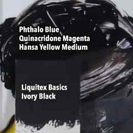
Phthalo Blue, Quinacridone Magenta, and Hansa Yellow Medium
These three colors are what I consider to be the primary colors. They’re very close to the printing primaries. I demonstrate how to mix black from these colors in the video below. It should start playing at the section where I demonstrate how to mix black. If you want to skip watching the video, the basic instructions are below.
The way that I mix black from these three colors is to start with a blob of Phthalo Blue and mix in some Quinacridone Magenta until I get a blue purple.
The next step is to add a little bit of Hansa Yellow Medium to neutralize it. Yellow is the mixing complement of blue purple. I start by adding a small amount of yellow. Then I spread it out on the palette to see if it needs more. When you use the palette knife to drag out a thin layer of paint, you can get a better sense of what color it is. For example, in the video I notice it has a blue tint when I spread a thin layer of it across the white palette.
If it looks too purple, then add more yellow.
You can achieve a perfectly neutral black or gray with these three colors. In the video, I add red to the mixture. This was a shortcut that I used in place of adding more magenta and yellow. Contrary to popular opinion, you can mix your own red.
Since this recipe includes three colors, it takes a little more fine tuning because of the extra color. In other words, you have to adjust of the proportions of three colors instead of just two. Most of the other recipes below only require two colors so it’s easier to achieve a neutral with them.
Phthalo Blue and Van Dyke Red
Since Phthalo Blue is such a potent color, you may be afraid to use it because it can quickly overpower your painting. One strategy you can use is to learn how to neutralize Phthalo Blue with a complementary color.
Van Dyke Red is the perfect color for this. You can use it to make a darker and duller version of Phthalo Blue. If you continue to add more Van Dyke Red, it makes a dark black.
I’ve only found Van Dyke Red in the Liquitex line of heavy body acrylics. Vat Orange and Pyrrole Orange will also work, but the results are slightly different. I think that the Van Dyke Red works best with Phthalo Blue. The other oranges create a black that’s not as dark. It may have a slightly brown appearance to it too.
Phthalo Blue and Vat Orange
Vat Orange works as a mixing complement of Phthalo Blue but the black that it makes isn’t quite as dark and it has a slightly brown appearance. It’s made by Golden but you can also try Pyrrole Orange as shown below.
Pyrrole Orange and Phthalo Blue
Pyrrole Orange will also neutralize Phthalo Blue. The black is also somewhat brownish. Mixing Phthalo Blue with a warm color can create interesting gradients that contain a neutral color in the middle.
Ultramarine Blue and Burnt Umber
This is probably the most popular set of mixing complements that painters use. You can also use Burnt Sienna in place of the Burnt Umber.
Most artists have Ultramarine Blue and an earth color on their palette so that’s part of what makes this a popular formula. The other reason is that it creates a dark black and the grays are neutral.
Ultramarine Blue and Burnt Sienna
The benefit of using Burnt Sienna in place of Burnt Umber is it has a much stronger orange appearance. The Burnt Sienna has a much warmer appearance than Burnt Umber. It’s more like a muted orange, and it creates a nice contrast against the blue. Try using Ultramarine Blue, Burnt Sienna, and Titanium White as a limited palette.
Dioxazine Purple and Light Green Permanent
It may surprise you that green and purple are mixing complements. The traditional color wheel has yellow as the complement of Purple. However, the placements of complements on the color wheel aren’t based upon mixing complements.
These are interesting complements to use in a painting of purple flowers. You can use them along with white to make a variety of greens, purples and neutrals. They also make a relatively decent black.
Phthalo Green and Naphthol Red Light
Phthalo Green is a very potent and transparent color. You can neutralize it with Naphthol Red Light or Quinacridone Red.
Phthalo Green and Quinacridone Red
These are the two colors that Gamblin uses to make their Chromatic Black. They’re both transparent colors but it’s difficult to achieve a perfectly neutral gray with them. If you’re looking for a very dark transparent black, then try mixing Phthalo Blue, Quinacridone Magenta, and Hansa Yellow Medium.
Ultramarine Blue, Pyrrole Red, and Hansa Yellow Medium
You can mix all three colors to achieve a black. I start by mixing the Ultramarine Blue with Pyrrole Red. If you’re expecting a clean purple you may be surprised that it makes a very dull purple.
Use the Hansa Yellow Medium to neutralize it. Try adding a small touch of the yellow to gauge how much of it you need to add to neutralize the purple.
Ultramarine Blue, Pyrrole Red, and Cadmium Yellow light
These are the three pigments that you can use as the red, yellow, and blue primary colors. There are some limitations in using these colors as the primaries. Basically, this color palette is missing magenta and cyan. So, you won’t be able to mix brilliant pinks, purples, or greens. I discuss this at length in The 7 Colors You Need to Start Painting with Acrylics.
This is the same mixture as the one above, except I use Cadmium Yellow Light for the yellow. It produces a lighter black because of the opacity of the yellow. Use Hansa Yellow Medium if you want to achieve a dark black. It will neutralize the blue purple without making it lighter.
The benefit of Cadmium Yellow Light as a primary yellow is that it’s very opaque. You can use it to cover over mistakes, whereas the Hansa Yellow Medium is too transparent.
Final Thoughts
Eleven recipes for mixing black may seem a little excessive, but my goal was to demonstrate that there’s more than one way to mix a color.
I also wanted to give you the opportunity to experiment with mixing black without having to go to the store to buy more colors. It’s very likely that you’ll have some of these colors on hand.
Once you become familiar with how to mix your own black, start using this technique when you’re painting. When you need to darken a color, figure out which color you can use to make it darker instead of reaching for the tube of black.
Chris Breier
I’m an artist from Buffalo, NY and I enjoy painting with watercolors and acrylics. I have a BFA from the University at Buffalo. My artwork has been featured in The Artist’s Magazine and in books such as the Splash watercolor series and Acrylic Works.
Use complementary colours when you mix black and dark paints:
Imagine you paint a red rose. You know the complementary colours of red is green. To support the red rose and to make it stand out I would need to work with some green and this combination red and green works best. But I want to have a dark background so what to do, how to mix dark colours using the complementary colours?
For the background I would create a mix of Phthalo Green and Anthraquinoid Red and maybe a touch of my blue to create a non-glowing black colour mix. Phthalo Green and Anthraquinoid Red creates a black together. If you then favor the colour green in this mix you would create a green dark mix which supports your main subject, which is red.
If your main subject would maybe an orange rose then I would use the same colours mentioned above (Red, Green and Blue) and favor then the Blue. Doing it this way I would create a blue dark mix which supports my orange main subject. Just have in mind that blue is the complementary colour of orange.
It is in your hands how to mix black colours and darks to create a powerful painting.
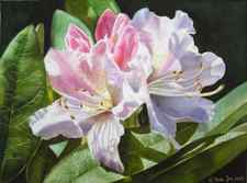
Let’s have a look at the painting of the Rhododendron above. You will see that I created a dark background.
I created the darks in this painting with the same mixes of red, green and blue.
- Darks are not only black. You can create dark browns, dark greens, dark blues etc.
- Darks don’t have to be boring or colourless.
- Darks are colours, too!
- Darks can be colourful and don’t need to be lifeless.
- Darks are the opposite from lights.
More colour recipes for mixing dark and black paints:
You can create beautiful dark colours with mixing:
- Anthraquinoid Red or Alizarin Crimson mixed with Phthalo Green or Winsor Green
- Burnt Sienna mixed with Ultramarine Blue
- Ultramarine Blue mixed with Cadmium Red or maybe Scarlet Red
- Translucent Orange mixed with Cobalt Blue and maybe Anthraquinoid Red
- Sap Green mixed with Scarlet Red
- Aureolin mixed with Anthraquinoid Red and Winsor Green
Try the mixes above by yourself and find out which kind of dark you will get (a black one? or a brown one?)
TIP on how to mix dark colours:
Vary your darks by changing the ratio. As excample: If you use the mix of Alizarin Crimson & Phthalo Green then add a bit more of the red – this creates a warmer black. If you use more green than you will get a cooler black. Try it also out with adding some of your blue to this mix.
But what is the case with Ivory Black out of the Tube?
Ivory Black
I too have used Ivory Black several times – but I never use it alone. I always mix it with one of my reds, blues, greens or yellows. This mix also helps you to create a very dark red or blue or green etc.
If Ivory Black is too dark for you then try using Paynes Grey Bluish mixed with Sap Green, it creates some wonderful dark greens, too.
Make your darks in your watercolors powerful and colourful and you will love the result.
Darks are not only blacks, create dark blues, purples or clean browns to enliven your paintings.
If the pure black of a tube is overused your darks will become dull and muddy. If you mix it by your own you will see the colors dancing before your eyes.
Happy Painting


