Learn more about Larissa Meyer and about us.
What Colors Make Gray? – How to Make Gray Paint Yourself

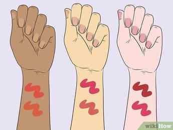
T here is no gray area when it comes to the color gray, and there is no escaping it, either! It has popularized most fashion styles because it has a remarkable ability to pair well with almost every other color. Not only that, but it is what defines definition in terms of shading. Many people love using the color gray inside their homes because it is just so incredibly versatile and goes with just about anything! This tutorial will cover everything there is to understand about the color gray. We will include what colors make gray, as well as how to make gray paint including all the variations of gray color shades, even the ones that you may not have thought were technically a gray color.
Table of Contents
- 1 The Analysis of Gray
- 1.1 The Significance of Gray
- 1.2 Gray Inspired Impressions
- 1.2.1 A Shade of Sophistication
- 1.2.2 Strength and Fortitude in a Shade
- 2.1 The Influence of Color Bias
- 2.1.1 Why Is Color Bias So Important?
- 2.2.1 Disadvantages of This Method
- 2.3.1 What Colors Make Gray Warm?
- 2.3.2 What Colors Make Gray Cool?
- 3.1 Gray color
- 3.2 Uses
- 3.3 HEX code
- 3.4 RGB code
- 3.5 Gray Shade
- 4.1 Is There More Than One Shade of Grey?
- 4.2 Which Two Colors Make Gray?
The Analysis of Gray
When you look upon the color gray, what feeling is aroused inside you? Most people would say it inspires feelings of low vibrational, dispirited natures. But this does not have to be the case, it can mean so much more than melancholy. If you were to open your mind, and somehow detach from your idea of what gray means to you, it could invoke a whole lot more. Remember, when paired with almost every color, grey can be livened up so much and makes a far better background than white, especially when it comes to the colors of the walls inside your home.
Contents
You could be painting a scene in a dense jungle, where dark grayish purple would add real depth into the jumble of branches and shrubbery, bringing out a sense of adventure that is lurking in you. You might also be painting a scene in a city somewhere and even though it is raining, a little girl is jumping in puddles, again making use of the dark graying purple, or even a greenish-gray color, and you can not help but smile.
So, what two colors make gray? That might seem like a silly and tedious question but it is still an important one. Where would we be without our foundations, right? And that is especially true when it comes to color! The basic, flat-out answer would be black and white, of course. But, what ratio you choose defines how light or dark the shade of grey you create will be, and adding any other colors to the mix will also change it immensely, even though it might still be considered gray.
Gray is so much more than what meets the eye!
The Significance of Gray
Gandhi was always right, yin yang is always around us, and it is especially noticeable with colors that surround us daily. As we said before, that there is no escaping the color gray, and we meant it. Without the color gray, other colors seem far too intense, and shading just would not make sense! Think about it! Neutral colors are significant for blending and bringing a natural element to our painting. So, learning how to make gray paint is important, and learning how to create each tone equally so.

Black is a powerful pigment and you would only need a small amount to make a typical medium shade gray. If you want a darker shade, naturally, you must add more black. If you are trying to achieve a blueish gray, then mixing in a little bit of blue will be the obvious choice, and a dark purplish gray would then need a hint of red added to the mix to create the perfect shade.
Gray Inspired Impressions
The beauty of gray is that it can be manipulated to fit whatever style you are painting in and it can be used to convey an unlimited amount of meanings and significances, it all depends on your choice of additional colors to make gray variations.
So, let us take a look at some of the different impressions that gray can give off, to give you a better idea of what we mean.
A Shade of Sophistication
The typical feeling and impression that gray inspires are impressions of serious natures. City scenes, minimal home decor, office attire, formal clothing, and so on. It embodies a professional feel because it is a neutral color that can be paired with both warm and with cool colors. This usually involves all of the lighter shades.

Strength and Fortitude in a Shade
Some people might find it off to have such a feeling inspired by the color gray, but some revel in it. Strength, or might, can be represented in big ominous thunder clouds that threaten impressive lighting and thunderstorms – that is powerful!
Fortitude is made possible by the gray stones of a castle, or possibly the cliff faces from a mountainside or the glaciers in Antarctica.
What Other Colors Make the Color Gray?
If you did not know what two colors make gray, they are black and white, and it is up to you on the choice of ratio and shade. It is a real blessing to be able to make any shade of color you wish, but sometimes what seems to be the most obvious color to mix, can also be the most complicated. So, in order to get the perfect shade for whatever you are creating, it is important to know the different methods, of which there are three. The first is simply mixing white and black, the second is mixing the primary colors in, and the third is making use of the complementary colors. Now, let us take a look at the different variations of gray.

The Influence of Color Bias
Have you ever heard of the words, color bias? This is used when classifying a color as warm or cool. Warm colors will be those that spark warmth like yellow, orange, and red. Cool colors are blue, green, and purple. This is very important to understand when understanding how to make gray paint, and learning what colors make gray, at least the gray that you intend for your artwork.
Now, let us work with dark grayish purple, seeing as we have used it so many times as an example. According to the color bias, a dark and graying purple is considered to be a cool color which is because it has blue in the mix, making the purple effect.
Why Is Color Bias So Important?
No matter what color you may be mixing up, be it a bright shade of pink or a cool blue, the color bias is important because it helps to categorize the colors that can be mixed, and the colors that can not be mixed for fear of making that horrible, sludgy brown color which is not ideal if you are going for a smooth and sleek gray color!
If you would like to convert the dark purplish gray into a more muddy gray, your mixture would look something like this:
The yellow is what would usually make the color more brown and dull, but in this case, you are only adding a small amount and it turns the color into that gloriously accurate muddy color.
First Method: Making Gray With Black and White
Of all three methods we will mention in this section, we feel that this is the simplest of all the methods. The only colors that are required are simply white and black. So, this makes your most standard Greif added in equal parts. If you add more white to the mix you will get a lighter shade. Therefore, you can expect a darker shade if you add more black and less white. It is advisable to add only a fraction of black each time so that you do not add too much by mistake and waste paint. Black is a very potent pigment, so it takes over other colors easily.

Disadvantages of This Method
This method is limiting because you will only get one type of gray color and a different lightness of it. There will be no color variations because there is no color added to the mix. It will only be good for grayscale or black and white styled art. These days black is not always as black as it seems.
Some of the black paints that are sold in stores have a base in certain colors, and the more white you add to it, the more of that base color shines through.
Second Method: Making Gray Paint With Complementary Colors
If you enjoy a good neutral version of any color, then this will be the technique you use a lot when mixing a gray tone. This method is done by adding complementary colors because they almost cancel each other out. This will help when painting nature scenes as you are focusing on a point in the background of the scene in marshland or a forest of some sort. Let us take a look at some of the combinations.

What Colors Make Gray Warm?
A warmer shade of gray would be adding colors that are of a warm bias. At least two colors would make a beautiful hue that is specifically blended for the style you are going for. Some of the colors that can be added are flax yellow or mauve purple.
These colors are already very neutral and they do lean towards the gray side of the color wheel but this is ideal.
It allows the blend to work perfectly and the result is a stunning muted color that looks like the looming clouds of a storm in the distance or the lazy smoke off a fire drifting into the twilight sky. If you would like a gray color that is a bit darker, but still warm in bias, then you can add some golden yellow and mulberry purple.
What Colors Make Gray Cool?
Maybe you are after a more solemn vibe in your artwork or the more neat urban feel or maybe even a cool, simple, and minimalistic swirl of colors. Whatever it is you are after, the key here is to experiment! Experimentation will be your best friend when it comes to investigating color blends, no matter what color you may be mixing up, but we will speak about what happens when you mix certain blue colors to orange. You can start with adding cobalt blue, phthalo blue, and ultramarine blue to a cadmium orange and the result will be a darker gray color that is muted but cool in bias.
The second grouping of colors that will make a cool gray is mixing phthalo green with naphthol crimson and cadmium red. Both of these color combinations make a darker shade of cool grey but of course, white can be added to lighten the color if you wish.
Third Method: Making Gray With the Primary Colors
Our third and final method involves using primary colors. Remember, Primary colors are an important part of color blending and mixing. Blue and yellow will make green colors, red and blue will make purple. But, if you add all three of the primary colors in equal parts, then the result is a muddy grey. There are different variations of the primary colors that will make the perfect gray. When creating gray with primary colors, we prefer to use yellow ochre, alizarin crimson, and ultramarine blue.

You can manipulate the bias of the gray color you create by adjusting the amount of red or blue you add. The more red you add, the warmer it will be, and the more blue you add, the cooler it will be. The star of the gray show in a primary color gray-mix is yellow. This is what makes the clash of colors and the result is gray.
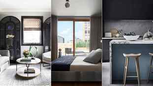
What colors go with dark gray? 7 ways to successfully pair this popular color
Functional, quiet, cool and undemanding: gray, the perfect neutral tone that is neither black nor white, ensures this utilitarian and serviceable color is extremely useful in interior design.
Tasteful, timeless and chic, gray, particularly dark grey, invites an air of sophistication when used in interior design. But does this brooding tone suit a particular room? What other colors complement and work well when decorating with gray?
A modern and versatile color, gray can be perfectly and beautifully paired with a whole host of other shades on the color wheel. To help you turn the gray rooms in your home into a space to cherish, we have asked a collection of interior design experts for their favorite accent colors for gray – so you can create a stand-out color scheme.
What colors go with dark gray?
Gray interiors are popular in design and although it is considered a refined color, it could also be thought of as dull and bland if not used with thought. However, in design circles, it is a popular and flexible neutral tone that is used to present warmth and coolness and is at ease both in a contemporary or traditional setting.
‘Gray is everywhere, dark, and moody or light and uplifting. In a kitchen, it creates a calming air and can be a lovely backdrop for adding a splash of color,’ says Helen Parker, creative director of deVOL.
When it comes to color combinations for rooms the options are endless. As gray pairs well with nearly every color, this shade makes a fantastic choice for walls and floors, serving as a popular room color idea and a sophisticated alternative to white for those looking to stamp their personality on a space with colorful furniture, fabrics, and artwork. Here’s how the experts get it right.
1. Pair dark gray with yellow for a statement color contrast
‘It’s so easy to get gray right,’ says Helen Parker, creative director of deVOL. ‘In a kitchen, it creates a calming air, I love it with yellow, fresh, and a little retro. If you pair it with terracotta, you create an industrial look with a soft unexpected Mediterranean twist. Add some white stone countertops, and suddenly, it’s classic, clean, and crisp.’
‘I hope gray is here to stay, it’s the basis for so many good-looking kitchens,’ she says. ‘It is strange that it was once considered dull and lacking inspiration, but now it’s chic, industrial, and classic.’
In this gray kitchen, the soft, dark gray is simply tied to the dark gray floor tiles, this calming style is lifted immediately with the addition of floor tiles, which work beautifully with the mustard yellow tones from the window frame behind, the brass hardware brings out the yellow and pulls the entire room together. The black countertop fits perfectly with these tones and the white sink adds a clean look.
2. Use light gray and black alongside dark gray for a calming feel
Lee Broom, founder of Lee Broom, agrees that gray is an easy and adaptable color to work with in interior design. Here, Lee has used gray as a neutral tone in a bedroom, adding darker greys and blacks alongside metal and wood to deliver a chic and smart zen-like space that is conducive to sleep.
He explains: ‘Dark gray is a versatile neutral that works well in any room and creates a calming and contemporary background that is easy to pair with all styles of furniture and decor. Incorporating warmer tones through natural materials like wood flooring or an oversized rug balances out the cooler tones from the gray and creates a cohesive design scheme.’
3. Prioritize sophistication with a rich color pairing
Gray is the color of conformity, architecture, dignity, wisdom, and industry, according to color psychologists on dark gray. But, this tone will also elicit a feeling of mystery and used as a pure backdrop will create grownup, stylish, drama.
‘Gray has been a ‘go-to’ interior color for centuries, working equally effectively in classic and traditional or modernist settings often as a backdrop for decoration rather than the highlight itself,’ says, Ruth Mottershead, creative director at Little Greene.
In this dark living room, elegant gray pairs effortlessly with the rich ochre seats, and the dark and light veins in the marble fireplace surround seamlessly join these two rich colors together to create a sophisticated room.
4. Mix light, mid and dark grays for a tranquil aesthetic
Using one color, in varying hues, is a wonderful way to curate a color scheme that is guaranteed to work. Here, Malka Helft, principal at Think Chic Interiors, selected a kaleidoscope of grays to produce this refined gray living room. Black cabinets and the brass detailing on the seating elevate this gray color scheme to the next level of elegance. A softer gentler gray is used on the walls with richer gray tones heightening the theme from the textiles chosen for the sofa, cushions, chairs, carpet, and blinds to produce a rich tapestry of grays.
5. Choose colors from the post-modernist period
Post-modern, industrial decor takes its cue from the distinct look and feel of factories, warehouses and manufacturing structures of the 20th century. As globalization has changed the way we lived and worked, materials and objects were produced elsewhere in the world, and major cities such as New York, London and Berlin were left with vast abandoned warehouses and factories – these old technical buildings informed the foundation of this particular school of design.
In this space by King Living, the look is perfected using a rich array of dark gray tones, which are the epitome of industrial chic. The concrete floors, walls and ceiling provide this gray industrial form, which is softened through the sofa and rug, all selected in softer gray tones to accentuate the industrial tone but ensure it is comfortable.
6. Go for a dark and dramatic feel
Small bathrooms and powder rooms make excellent environments to use dark, rich, gray tones if you feel too shy to take this style into a larger living space. A bathroom or cabinet can make an excellent starting point to embrace dark tones. The neutral aspect of this tone allows it to pair simply with a huge array of bathroom colors and contemporary materials.
In this modern powder room, designed by Kitesgrove, a deep, dark gray is beautifully paired with the natural grey veins found in slabs of Italian marble. The wooden beam above unites the dark tones, with the brass details from the taps and hardware.
7. Take a cool approach by teaming dark gray with blue
A hugely versatile, primary color, blue can be perfectly paired with dark gray for a cool color scheme to be admired.
With many of us moving away from the color trend of decorating a room head to toe in dark gray, uniting this popular neutral with the vibrancy of blue can establish a more modern take on neutral room ideas.
Blue is one of the most popular and enduring colors to decorate within interior design, so it pays to know that this universally-loved shade works well with most other colors too.
FAQs
What warm colors go with gray?
Warm color schemes can bring a cozy, enveloping sense of well-being and energy to your home décor ideas, so it is no surprise that more and more people are searching for ways to warm up a dark gray room.
If you’re looking to take the room temperature up a notch in a cool gray room, try decorating with red, or go for an orange decorating scheme for an instant impression of warmth.
Sign up to the Homes & Gardens newsletter
Decor Ideas. Project Inspiration. Expert Advice. Delivered to your inbox.
By submitting your information you agree to the Terms & Conditions and Privacy Policy and are aged 16 or over.

Freelance writer
Hannah Newton is a lifestyle, interiors, travel and design journalist and editor who has been writing for the past two decades, she has written for national newspapers including The Times, The Telegraph, The Guardian and The Observer as well as interiors titles Elle Decoration and Architectural Digest in the UK and across Europe, South Africa and Australia.
Latest
6 simple ways to make a bathroom look more luxurious Transform a functional bathroom into a more luxurious, spa-like space rich with style and character using these 6 simple design tips favored by designers By Zara Stacey Published 7 November 23
I’m a shopping writer – these are the best early Black Friday deals at Walmart Walmart is offering deep discounts on home tech, cookware, and small appliances, only to Walmart+ members. These are the best deals from our tests and research. By Emilia Hitching Published 7 November 23
How do you mix colors to create gray?
To mix colors to create gray, you can start by mixing black and white together. You can also mix complementary colors together in equal parts. For example, mixing blue and orange, red and green or purple and yellow. You can also mix a primary color (red, blue, or yellow) with its complementary color (green, orange, or purple) in equal amounts.
What are the primary colors used to make gray?
The primary colors used to make gray are red, blue, and yellow. These colors can be mixed together in varying ratios to create different shades of gray.
Can you make gray using only primary colors?
Gray can be made using only primary colors by mixing equal parts of two primary colors together which are opposite to each other on the color wheel, for example red and green, blue and orange, or yellow and purple.
How do you achieve different shades of gray?
Different shades of gray can be achieved by adjusting the ratio of colors used to make the gray. For example, using more black than white will create a darker shade of gray, while using more white than black will create a lighter shade of gray. Additionally, mixing colors in different ratios can also create different shades of gray.
What are secondary and tertiary colors and how do they affect the color gray?
Secondary colors are colors that are created by mixing two primary colors together. They include orange, green, and purple. Tertiary colors are colors that are created by mixing a primary color with a secondary color. These colors can be used to create different shades of gray by adjusting the ratio of colors used.
How does the ratio of colors affect the shade of gray?
The ratio of colors used to create gray can greatly affect the shade of gray. Using more black than white will create a darker shade of gray, while using more white than black will create a lighter shade of gray. Additionally, mixing colors in different ratios can also create different shades of gray.
Can you mix gray using only cool or warm colors?
Gray can be made using cool colors like blue, green, and purple and warm colors like red, orange, and yellow. Cool colors will give a more subdued and muted gray, while warm colors will give a more vibrant and lively gray.
How can I use gray in my painting or design projects?
Gray can be used in painting and design projects in many ways. It can be used as a neutral background color, as a shading color, to create depth and contrast, and to tone down bold colors. It can also be used to create a monochromatic color scheme.
Some common mistakes people make when mixing colors to create gray include not using the right ratio of colors, not using enough black or white, and not using complementary colors. Additionally, not understanding the undertone of the gray created can also be a mistake, as it can affect the overall look and feel of the final piece.
Can you mix gray using only cool colors or only warm colors?
Yes, gray can be made using cool colors like blue, green, and purple and warm colors like red, orange, and yellow. However, using a mix of cool and warm colors can create a more balanced and harmonious gray.
Can you make gray using only acrylic or oil paint?
Yes, gray can be made using both acrylic and oil paint. However, the process of mixing colors may be slightly different depending on the type of paint being used.
Can you mix gray using colored pencils?
Yes, gray can be made using colored pencils by layering different colors on top of each other and blending them together.
Can you mix gray using watercolors?
Yes, gray can be made using watercolors by mixing cool and warm colors together or by diluting a darker color with water.
How does lighting affect the appearance of gray?
Lighting can greatly affect the appearance of gray. In natural light, gray may appear cooler or warmer depending on the time of day and weather conditions. Under artificial light, gray may appear to take on different undertones.
How can you use gray in interior design?
Gray can be used in interior design as a neutral background color, as an accent color, or as a color for furniture and decor. It can also be used to create a soothing and calming atmosphere in a room.
Is gray a good color for a bedroom?
Gray can be a good color for a bedroom as it is a neutral color that can create a soothing and calming atmosphere. However, it is important to choose the right shade of gray and to incorporate other colors and textures to make the room feel warm and inviting.
Final Thoughts
Gray is a versatile color that can be mixed using a variety of different methods and materials. It can be created using cool or warm colors, and can be used in a variety of different settings, such as in art, interior design, and fashion.
Understanding how to mix gray and how different factors, such as lighting and materials, can affect its appearance can help you to create the perfect shade for your project. As it is a neutral color, it can be paired with almost any other color to create a variety of different looks, making it a popular choice among designers and artists.
Understanding the questions asked about gray is crucial to have a good grasp on how to use it in different settings and mediums.