Thanks for joining us and we hope that you can use this new knowledge for your next art project.
Red and White Mixed! What Color Do Red and White Make? (Updated 2023)
Are you wondering what will happen if you mix red and white paint?
When you imagine combining these two colors, you likely realize that white lightens the color red which in turn becomes less warm.
Today, we are going to take a closer look at what happens when we mix white and red. Additionally, we are going to discuss how colors interact with one another and find out the result of the color combination.
Colors are important visual elements that affect a person’s mood, feelings, emotions, and state of mind. Can you picture a world without colors?
Everything would look dull and devoid of life; thus, colors truly play an important role in society.
Flashy and vibrant colors can make things exciting for people, while neutral colors can provide a sense of style, fashion, and way of life that some people enjoy.
The colors red and white are both integral colors. Red, for instance, is a primary color, which helps create other colors. When mixed with other hues you can get secondary and tertiary colors using red as a base.

Basics of Color Theory
For us to get a full background on what color can be created when red and white are mixed, we should first look at how colors operate.
The entire spectrum of hues can be found on the color wheel—an illustrative organization of colors that shows the relationships of hues.
The diagram below shows that red, a warm color, is placed side-by-side with colors such as orange, yellow, pink, and maroon. Meanwhile, white can be found at the center of the color wheel, together with gray, indicating the mixture of distinct wavelengths of light.
Since we are talking about red and white, let us look closely at their role in the color wheel and the existence of newly formed colors.
Warm and Cool Colors
Generally, warm colors are those which evoke warmth, colors that represent the sun or fire. Red is obviously a warm color.
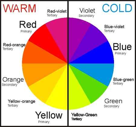
White is neither warm nor cool; it is neutral.
In science, white contains all wavelengths of visible light. But in art, white is the absence of color, a pigment that depicts a harmony of silence, much like gray and black.
Knowing the difference between warm, cool, and neutral colors gives you an idea of what will happen if you mix these pigments. In the case of white and red, you can imagine how red will be affected by the color white.
Understanding Color Mixture
Colors are created by mixing or combining two or more hues. The primary colors red, blue, and yellow can be mixed together to form secondary colors.
Then, if you mix primary and secondary hues, you can get tertiary colors red-orange, yellow-orange, yellow-green, blue-green, blue-violet, and red-violet.
You can also mix neutral colors to create more color variations within the same family. By adding white, you are making colors lighter than normal, and adding black can make these pigments darker than usual.
In interior design jargon, these are known as tints, shades, and tones.
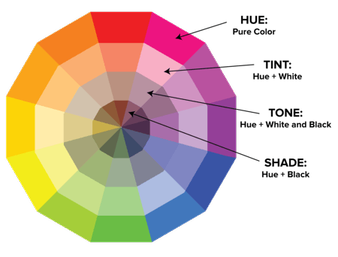
- Tint: Adding white to make the color lighter.
- Shade: Act of darkening a color by adding black.
- Tone: Making colors slightly darker using gray.
As an artist, it is part of your duties to find out the exact shades, tints, and tones of colors you want to use in a specific work of art. By experimenting with color mixing, you can eventually come up with the perfect colors to use for aesthetic purposes.
What Color Does Red and White Make
Now that we have a good background and foundation on the color theory, we can move on to what color red and white make.

The answer is pink.
Get the shade of pink you are looking for by adding a lesser or greater quantity of white paint to the red. The combination will give you more color variations, depending on how you mix the two colors.
Experimentation will help you discover more variations to use in your art.
Pink In Design
Pink is considered a warm color because it is within the red family. In design, it acts as an accent color, adding life to a particular space. This color is linked to youth, fun, and also to romance.
The color is playful and soft, mostly used to give a touch of a feminine vibe.
What Color Do Red and White Make in Paint?
If you mix red and white paint, you’ll get pink . Pink is a delicate color that many people associate with beauty, making it much different than the colors that create it. Unlike pink, red is related to energy and strength, while white is a symbol of cleanliness and perfection.
Altering the amount of red and white you use in the mixture can change the type of pink you get. Using more red will create bold, more vibrant pinks, while more white will make the color paler.
Understanding the RYB Color Model
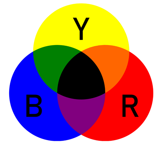
RYB is the color model that most people have heard of because it’s taught in early art classes. It’s most commonly associated with paint, but if you’re mixing with other physical art mediums, those will also follow this chart. RYB is a subtractive form of mixing, meaning that when colors are combined, wavelengths are removed.
In this color model, the primary colors are red, yellow, and blue. Combinations of the primary colors will result in the secondary colors, which are orange, green, and purple. Pink isn’t one of the main colors on the diagram because it’s a tint of red.
Making Pink Lighter or Darker
If you mix an equal amount of red and white, you’ll make a basic pink, but that might not be the type of pink you’re looking for. Luckily, you can create shades and tints of that color to make it fit your design better.
Mixing Tints
A tint occurs when a color is mixed with white to make it lighter. So, pink is already a tint of red, but if you want to make it even lighter, you can add more white to it. However, adding too much white will make the pink look very pale.
Mixing Shades
A shade is the opposite of a tint. You need to mix black with a color to make it darker. Black paint can easily overpower other colors, so only use it in small amounts when creating a shade. Add a touch of black to pink to make it darker. If you want to make it a little dimmer while keeping it vibrant, you can add more red instead.
Pink Color Meaning

Pink is a symbol of compassion, love, and playfulness. It can have sympathizing, calming, and nurturing effects, which is why it’s often included in pleasant designs.
Some other positive pink characteristics include kindness, warmth, and romance. Yet, it could also have negative attributes like timid, immature, and unconfident. These connotations greatly vary based on the context you use the color in.
Can You Make White and Red Paint?
There’s no need to panic if you run out of certain paints because most colors can be made by mixing other colors. So, can you create red and white paint on your own?
Red is a little tricky because it’s a primary color, so the RYB color model doesn’t show a way to create it. Yet, if you look at CMYK, which is a subtractive color model used for printing, red can be made using magenta and yellow. Since magenta isn’t a common paint color, you might be better off buying more red paint instead.
Unfortunately, there’s no way to create white using other paints. In subtractive color models, white is the absence of all wavelengths. Mixing any two colors together will result in at least one wavelength, making it not pure white. You might be able to create white paint using other household materials, but you can’t mix it using other paints.
What Color Do Red and White Make in Lights?

When you mix the three primary colors for lights, you get white. If you mix red with white , there will be more red than the other two primary colors. So, the mixture will end up being a lighter red, close to pink . This is the same result as in the RYB color model, but not all color combinations will be the same in lights and paint.
Understanding the RGB Color Model
The RGB color model is an additive color model, which means when colors are mixed, wavelengths are added to create a new color. RGB is used for mixing in lights and digital displays, which is why it’s so different than the color model used for physical art mediums.
Red, green, and blue are the primary colors of RGB. Combinations of those colors can make cyan, magenta, and yellow, which are the secondary colors. Some tertiary colors include purple and orange, which are secondary colors in painting. Color mixtures on this color model can vary in appearance based on the brightness of each light.
CMYK is another color model, and people often assume it’s similar to RGB. That’s because the primary colors of CMYK are cyan, magenta, and yellow, while the secondary colors are red, green, and blue. Thus, the primary and secondary colors are swapped. CMYK is very different because it’s a subtractive color model used for printing. All three primary colors make black instead of white.
How Do You Mix Colored Lights?

Mixing lights is much different than mixing paint. If you have red and white lights, all you have to do is shine one on top of the other to create a new color. However, all colors in lights can be made by shining red, green, and blue on top of each other using different brightnesses.
For example, a way to make pink is to have red at 90% brightness, blue at about 50%, and green at 40%. Using less green can make the pink even brighter. If you put red at full brightness, blue at about 90%, and green at around 30%, you’ll get a pink-purple color.
Mixing with lights involves a lot of trial and error. So, explore different color combinations to see what lights you can create. In many instances, the easiest way to make a new color is by using red, green, and blue.
How Do Our Eyes Perceive Color?
Thanks to receptors in our eyes and context from our brains, we can see all the colors around us. When light shines on an object, some wavelengths are absorbed into it while others bounce off it. Those wavelengths are what help our eyes interpret colors since each color on the visible spectrum has a unique wavelength.
On the spectrum, red has the longest, most stretched-out wavelengths. Then, violet has the shortest, most frequent wavelengths. So, if light shines on a red apple, only the longest wavelengths would reflect off it while all the shorter wavelengths, such as violet, blue, and green, are absorbed. Thus, red is the only color reflecting back toward us, which is why the apple appears red.
Inside our eyes, we have photosensors called cone and rod cells. Cone cells are concentrated in the center of our retinas, and they allow us to see colors in bright lights. The rods are a little more sensitive, so they see colors best in dim lights. Together, these cells help us see colors at all times.
Designing with Red, White, and Pink

Red, white, and pink can all go together in a design. These three colors usually make people feel warm and joyful. That’s why they are the colors of Valentine’s Day. If you want the design to be more calming, consider using more white or lighter shades of pink.
If you use red and white without pink, the design will have a more serious tone, but it works best with at least one more color. Some colors to consider adding are black, navy, or gold. Using blue with red and white will make the theme look patriotic. You could also consider adding green if you’re making a Christmas pattern. The combination of green, white, and red is also used to celebrate the Cinco de Mayo holiday.
Red, white, and pink can all create unique patterns if used separately too. White is a neutral color that goes well with almost any combination. It works with neutral colors like gray and brown, but also vibrant colors like blue, yellow, or purple. Red goes best with orange, purple, brown, or dark blue. Pink is often used with blue, purple, green, yellow, or gray.