Beverlie
To live a creative life, we must lose our fear of being wrong –Joseph Chilton Pearce
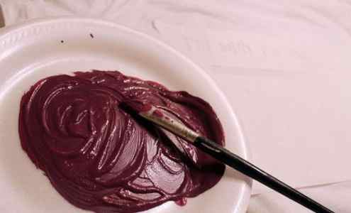
How to Make Maroon: 8 Steps

Maroon is a deep, rich shade of red that can be used in a variety of artistic projects and designs. Whether you’re painting your house or creating a beautiful piece of art, there might come a time when you need to create a maroon color. Here, we’ll break down the process into eight easy steps.
1. Gather Your Materials
To create maroon, you’ll need primary colors (red, blue, and yellow) as well as white and black paint. Acrylic or oil paints work best for this tutorial, but the principles apply to watercolors as well. You’ll also need a palette, a clean brush, and some disposable gloves if desired.
2. Start with Red
Squeeze out a generous amount of red paint onto your palette. Since maroon is primarily red, the bulk of your color mixing will involve combining shades of red to achieve the desired hue.
3. Add Blue
Slowly add blue paint to the red paint on your palette, mixing cautiously as you go. Adding too much blue paint will result in a more purple hue rather than maroon, so it’s important to take this step slowly.
4. Add Yellow
To achieve that rich maroon color we’re going for, add just a touch of yellow to your mixture. This helps warm up the color and give it depth.
Use your clean brush and mix all three primary colors together until they’re fully incorporated. If needed, adjust the amounts of each color until you’re satisfied with the hue.
5. Add White Paint (Optional)
If your maroon looks too dark or intense for your needs, lighten it up by adding small amounts of white paint into the mixture. Be sure not to use too much white paint as it can dilute the richness of the maroon.
6. Add Black Paint (Optional)
If your maroon color appears too light or vibrant, darken it by adding a small amount of black paint to the mixture. Once again, add in small increments as black paint can quickly overpower the color.
7. Test Your Color
Before using your maroon paint, test it on a disposable surface or small, inconspicuous area to make sure it’s the shade you want. If necessary, make any adjustments to the mixture until you’re satisfied with your maroon hue.
By following these eight steps, you’ve now successfully created your very own maroon color! Whether you’re using it for painting, crafting, or design work, this rich shade will undoubtedly enhance your creations and bring a touch of sophistication and depth.
How To Make Maroon, Burgundy, And Other Deep Red Colored Icing and Frosting
There is no doubt about it — getting the perfect red icing color is a total pain. Not like “Giving birth to triplets in the jungle while simultaneously blowing bubbles to distract a nearby crocodile” pain. But definitely somewhere between “Stepping on Legos in the nighttime” and “Brushing your teeth with hand soap” kind of pain.
AND. it’s compounded by the illusion that we all identify colors by the same name.
Take for example. maroon and burgundy.
These are quite possibly the most mixed up colors by name in the history of ever. They are OFTEN confused for each other. Sometimes even in very official settings. Do you know which one is which?
Maroon comes from the French “le marron” which means — CHESTNUT or BROWN.
Burgundy refers to the color of BURGUNDY WINE — which has a purple tint to it.
But here’s the thing — it just doesn’t matter which one is RIGHT. What matters — is what color your customer is asking for. and mixing it as accurately as possible. And that’s where I come in.
Whether it’s burgundy, maroon, crimson, brick red, garnet, cherry, currant.
When a client asks for a specific color of darkish red — BY NAME — I strongly recommend that you show them my numbered chart at the top of this post. Ask them which color is closest to what they are thinking. And then come back here and make that exact color!! Easy peasy.
Side note: If your client uses the words “I don’t know,” “maybe,” or “probably” when choosing one of these colors, it’s safe to assume that close enough is good enough. Don’t stress over getting it exactly perfect. On the flip side, if a client responds by sending you a more precise example of the color they are hoping for. you will need to be aware that exact colors are important to your client. It might be best to assure them you’ll do your best, but some color differences might occur. Make sure they are okay with that before proceeding if you’re not confident you can achieve an exact color match.
I used Chefmaster brand food coloring for all of these formulas.
If you’re not sure what the “parts” mean, or how to use these formulas, check out THIS POST for detailed step-by-step photos!
ALL of these colors will deepen after 24 hours and then just a little more as they dry on the cookie. When making the darkest versions of these colors, stop just before it’s as dark as you want it to be. If at all possible, make the icing 1-2 days in advance so you have time to add just a little more food coloring if you need to. It will help you use the least amount of food coloring to get those deep dark colors you are looking for. (And keep your icing tasting sweet instead of bitter!)
See more of my color palettes and formulas HERE!
Recipe for making maroon paint
Judith, you’re right, it’s beautiful!
I just started using it a few weeks ago and I’m finding myself actually looking for places to put it in my paintings. It’s such a warm color, and very versatile- not starkly RED like some, or pink like others. I’m not sure yet, but it may be my favorite red of all time. Kind of like the perfect red nail polish that goes with everything! (being a nail technician, I always catch myself thinking in terms of polish)
Beverlie
To live a creative life, we must lose our fear of being wrong –Joseph Chilton Pearce
January 3, 2007 at 8:51 pm #1079510
Default
ME TOO. Cherryl Meggs first told me about this color. WOW is it pretty.
[FONT=”System”]www.celestemccall.net
January 5, 2007 at 1:47 am #1079508
Default
I am experimenting with W&N perylene maroon.
But it leaves a hole in the purple side of a color wheel, so I need to add a purple to my palette.
It darken all greens, and darkens any green blue.
It is also vey close to burnt madder on the warmer side.
And close to Cap Mortum on the cool side , and outragous opaque granulating pigment that is good for rocks and dark stone.
I think perylene maroon might be too much work to have on a palette.
But it is red, who needs red on a palette anyhow. I am trying perylene maroon, inderthern blue, and gold ochre as a triad.
Handprint’s favorite new paints…. So if you have how to mix perylene maroon, please explain. Neeman
January 6, 2007 at 2:50 am #1079527
Default
I would love some hints on mixing this color. I have the Winsor Newton Perylene Maroon (similar to DS, according to handprint), but I’ve only just started painting this week and the one time I used some it totally looked like blood to me and made me sort of ill. I mixed it a little bit but couldn’t get over the bloodbath feel and finally just stopped. If I’m ever painting hemoglobin I’ll know just what tube to pick up. In the meantime, however, what pigments do y’all like to mix with it? jenney
jenney
January 6, 2007 at 11:05 am #1079515
Default
So if you have how to mix perylene maroon, please explain.
If I’m ever painting hemoglobin I’ll know just what tube to pick up. In the meantime, however, what pigments do y’all like to mix with it?
I read at handprint.com that the Daniel Smith version is not as saturated as the WN version, so I guess that means you’d use less in mixes, if you’re using Winsor Newton. That probably explains why I’m not seeing “blood” with mine. Just thin it a bit, as the pigment is the same. I mix my DS perylene maroon with: Thalo green – gives a really nice dark. A little of it in the thalo can also make the green less harsh and more realistic. FUB – makes a nice warm purple. Yellows – a great warm orangish red. Prussian Blue – a great dark for shadows. And by itself, very diluted, it makes a lovely wash. Judith
My website: http://www.judithfields.com
January 6, 2007 at 1:51 pm #1079521
Default
Stop it!! Stop it now. I have a bag Full of paints and I told myself NO NEW PAINTS, til I paint more. ohhhh:evil: this color & undersea green are calling my name…… HELP……………………………..
January 6, 2007 at 9:00 pm #1079506
Default
Liz, I totally empathize. I do have undersea green and LOVE it! I’m thinking that perylene maroon will be beautiful in my florals… sheesh… According to Handprint, it’s pretty lightfast, too…
Char — CharMing Art — “Where the spirit does not work with the hand, there is no art.” Leonardo DaVinci
January 6, 2007 at 9:54 pm #1079516
Default
Okay…you’ve got me convinced to go try Undersea Green.:D And I promise if you try DS Perylene Maroon, you will not be disappointed. Char, I can just see it in florals…not just in the flowers, but the leaves as well. Right now I am using it in a architectural landscape with an old brick building. It’s just a luscious color.:) Judith
My website: http://www.judithfields.com
January 6, 2007 at 10:21 pm #1079522
Default
SOLD:p Well at least seriously thinking about it. That 3 deal is the breaker for me (D.S. buff, maroon & undersea – what a deal!!):lol:
January 7, 2007 at 6:20 am #1079524
Default
Liz, I totally understand your predicament!
I’m always having to talk myself out of buying new paints too… cuz they’re all so pretty!! Not sure I ever met a paint I didn’t like. :confused: Tell you what though, I just bought 28 tubes from Daniel Smith right before Christmas… (:music:Merry Christmas too me. music:) and of all of them I have 3 or 4 favorites that have now cropped up in EVERY painting…. Perylene Maroon
Undersea Green
Naples Yellow
Quin Gold You will love the Undersea Green- I think it’s the only green I’ve ever found that looks perfect strait out of the tube for grasses and leaves and such…
and Judith is right, Perylene Maroon is Wonderful in leaves too!
I’m working on a full sheet beach scene right now- lots of grasses and Fireweed and other sorts of beach ‘weeds’, and the two colors I’ve used most are the Undersea Green and Perylene Maroon. And I’m not sure yet, but this could be the coolest thing I’ve ever done!:o
I’ll post it in the gallery soon, so if you want you can see what those colors look like in a painting. Jenney- I wish I could tell you what to mix with yours… I soooo suck at the whole color mixing game. I can and do mix colors to my hearts content, and I come up with some pretty amazing things, but I have NO CLUE how I get there. I mix paint like I cook, never follow a recipe or do anything the same way twice… it’s just sort of an instinctual process for me I guess.. a little dab of this, a pinch of that… hmmm, what else have I got in the cupboard?? Oh, Old Bay Seasoning?? In Pie?? Sure why not. Okay, just teasing about the Old Bay- I would never actually put it in pie. I did put it in Split Pea soup once though and it was wonderful!
I really should start writing down what I do and making samples of the outcome, because then I’d be able to do the same exact thing twice! Like a little recipe book for paints- Man, that’s a great idea actually… maybe I’ll make a little book today……
Oh, I was going to tell you, https://www.wetcanvas.com/forums/showthread.php?t=291955
Go there and scroll down to Color Theory, color mixing.. there’s a lot of information there on mixing colors.
Beverlie… who now has a new project for the day;)
Beverlie
To live a creative life, we must lose our fear of being wrong –Joseph Chilton Pearce
January 7, 2007 at 2:45 pm #1079520
Default
i have painted with both d.s. and w&n perylene maroon. they seemed very similar to me, so i gave the d.s. tube away for someone who wanted to try it. perylene maroon is a great neutraliser for bluish greens which tend to be too intensive otherwise. i’ve also used bruce macevoy’s recipe for a black that is darker than most lamp or ivory blacks: mix perylene maroon with pthalo green (blue shade) 5:1. simple but it works.
January 7, 2007 at 3:27 pm #1079513
Default
I love DS Perylene Maroon, y’all! I bought a tube back in 2003 when I was looking for a lightfast warm dark red that looked beautiful out of the tube as accents in florals…used it in my first piece to win an award since college! I have not used it with pthtalo green BS as a dark…I plan to check out that action, since I usually stick with blue/earth mixes for my darks. Nothing like a new color to get out of a rut…albeit an expensive one! Thanks for the thread…inspired me to pull PM back out! Carry on!
[FONT=Palatino Linotype]Shannon
My Blog: http://fatamorgana9.blogspot.com/


