Next page
How Colors Advance and Recede in Art
Can colors be used to suggest depth in painting? The idea might sound absurd seeing how a painting is a two-dimensional entity. But it is quite widely known that red will appear to advance and blue will appear to recede. But there is more to it than this simple rule. How can colors be used to suggest proximity in a painting?
Why Blue Recedes
A misty day will make certain objects take on particular hues according to distance. Mountains a few miles away may appear blue, violet or such cool hues due to atmospheric particles reflecting the color of the blue sky.
A clear sky itself brings about a feeling of depth, of eternity. By association, blue pigments will suggest distance, and therefore will appear to recede from the viewer in a painting. Blue colors such as ultramarine, pthalo blue, manganese blue, cobalt, cyan and cerulean produce short wave lengths on the visual spectrum. The color with the shortest visual wavelength of all is violet. Beyond this lies ultraviolet.
Warm Colors and Cool Colors
Light Colors and Dark Colors
But it is not merely whether a color is warm or cool that brings about the suggestion of proximity, but also tonality. A dark color will appear to advance where a pale color will appear to recede. Place pale red next to dark red and the dark red will appear to advance. Place neat ultramarine next to a pale ultramarine and the darker color will appear closer to the viewer than the paler color. So in general, a wishy-washy color will appear to recede; a punchy color will appear to advance.
Neutrality of a Color
Cool colors in general will appear to recede, where warm colors will appear to advance. Warm colors include reds, oranges, maroons and pinks. Warm colors are located on the opposite region of the color spectrum to blues, as their visual wavelengths are by comparison long. Red emits the longest visual wavelength of all. Beyond this lies infrared which is not visible. As warm colors and cool colors are located on opposing sides of the color spectrum, they will appear to clash when placed side by side. Place a cool color next to a warm color and the effect of colors receding or advancing is more pronounced. Colors in Context
But there is more to color behavior than this, for a warm color placed next to an even warmer color will itself appear to recede as it appears cooler in context. Permanent rose although a warm color by itself will appear to possess a violet-blue cast when placed next to cadmium orange. These two colors placed side by side will bring out their inherent color temperatures.
External Articles on Art Practices
Another factor that affects our perception of color and distance is saturation. Color saturation is how bright or pure a color appears. A dazzling color will appear to advance. Mix a little earth color or an opposing color into this bright color and its increased neutrality will make it appear to recede. So muted colors will appear to recede; pure colors will appear to advance. Painting Detail and Harsh Edges
Colors that possess crisp edges will appear closer to the viewer than colors with blurred edges. Similarly, an object with high detail will draw the eye and feel ‘closer’ to the viewer than an object that possesses little detail or that which suggests detail. Monet’s impressionist sunsets due to suggestive brushwork feels far away. If an object of high detail were placed within the painting, in the style of Canaletto, the object possessing the high, crisp detail will feel closer to the viewer.
Color Manipulation in Painting
So a combination of the described factors in color behavior can be used in the same painting to suggest depth or draw the eye. Cool colors will appear to recede; warm colors will appear to advance. The same applies to pale and dark colors, as to how pure a color appears. High detail will appear closer to the viewer than blurred detail. But colors in context is also a factor, as a warm color in isolation could appear cool when placed next to an even warmer color.
Purple And Blue Background
Download Purple And Blue Background photos for any device and screen size. High quality Purple And Blue Background and photos! Customize your desktop, mobile phone and tablet with our wide variety of cool and interesting Purple And Blue Background in just a few clicks.

- Backgrounds


Scroll to continue with content


Scroll to continue with content


Scroll to continue with content


Применение изменений к определенным цветам фотографии в приложении «Фото» на Mac
Вы можете настроить определенные цвета на фотографии при помощи коррекции определяемого цвета. Например, если на фотографии изображен танцующий человек на фоне цветной стены, Вы можете использовать коррекцию выборочного цвета, чтобы изменить цвет стены.
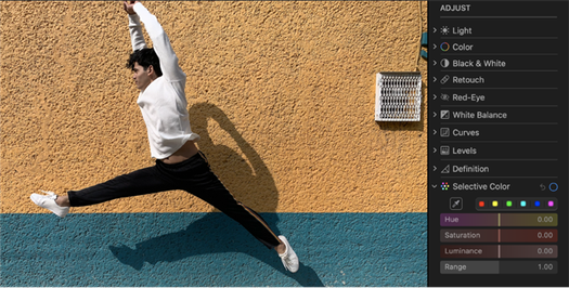
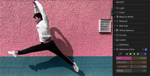
Вы можете выбрать и изменить оттенок, насыщенность и яркость для максимум шести различных цветов на фотографии.
- В приложении «Фото» на Mac дважды нажмите фотографию, затем нажмите «Редактировать» в панели инструментов.
- Нажмите «Корректировка» в панели инструментов.
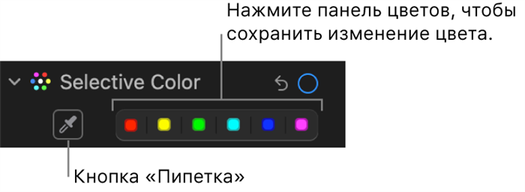
- В панели «Корректировка» нажмите стрелку рядом с пунктом «Выборочный цвет».
- Нажмите область цвета, в которую хотите сохранить измененный цвет, нажмите кнопку «Пипетка» , затем нажмите цвет на фотографии, который хотите изменить.
- Пока выбран цвет, перетяните бегунки для настройки цвета.
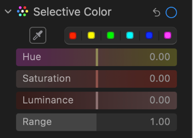
- Тон. Данный параметр позволяет настроить оттенок выбранного цвета. Например, можно превратить зеленый оттенок в синий.
- Насыщенность. Данный параметр позволяет увеличить или уменьшить интенсивность выбранного цвета. Например, уменьшив насыщенность яркого розового цвета, его можно превратить в бледный или почти серый оттенок розового.
- Яркость. Данный параметр позволяет настроить яркость (степень освещенности или количество света, отраженного от поверхности) выбранного цвета.
- Диапазон. Данный параметр позволяет настроить диапазон цветов, изменяемых на основе выбранного Вами цвета. Изменив диапазон, Вы можете увеличить или уменьшить количество похожих цветов на фотографии, которые будут затронуты в результате коррекции. Например, если увеличить диапазон выбранного синего цвета, изменение затронет все оттенки синего на небе, а если уменьшить диапазон, изменение ограничится конкретным синим объектом.


