By Huntress ™
What color is indigo?
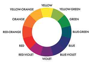
Labeled a secondary color on the color wheel, indigo is formed from mixing primary colors blue and red, creating a beautiful, rich shade. As indigo is mixed, there are many different shades available, sometimes causing confusion over what the ‘true’ color is meant to be.
Pantone have selected their color of 2022 as ‘17-3938 Very Peri’ which is described by Leatrice Eiseman, Executive Director of the Pantone Color Institute, very similarly to what makes an indigo shade, ‘encompassing the qualities of the blues’ with a ‘violet red undertone’. Eiseman goes on to say the color, ‘displays a spritely, joyous attitude and dynamic presence that encourages courageous creativity and imaginative expressions’. 7-3938 Very Peri marks how we will be seeing this color palette used across the design world this year to create uplifting, inviting spaces.
When choosing room color ideas, indigo is a timeless and versatile shade to use in an interior space. Patrick O’Donnell, Farrow & Ball Brand Ambassador, states, ‘indigo can create a very regal backdrop for an elegant sitting room when teamed with a clean white trim – or it can play to the ‘Pop Art’ characteristics when teamed with a bright and clean yellow’. We now explore some of the common questions asked when researching, what color is indigo?
Is indigo considered purple or blue?
Whether you are decorating with blue or decorating with purple, you may be wondering which category indigo falls into.
With there being many different shades of indigo available, there can sometimes be confusion over whether indigo is considered purple or blue. Indigo sits between blue and purple (violet) in the color wheel, so it can be considered as a mix of both. Patrick O’Donnell from Farrow & Ball states, ‘indigo is perceived mainly as blue with an underlying violet note. It can sometimes be a hard color to truly classify, as some ‘indigo’ colors can read closer to purple’.
What color is closest to indigo?
The closest color to indigo according to the color spectrum is blue. As discussed, indigo sits between blue and purple (violet) on the color wheel, violet sits halfway between blue and purple, so the indigo shade is technically closest to blue.
As indigo is a mixture of primary colors, there are many contrasting shades out there, which adds to the debate of what color indigo is meant to be. It is close to the shade of purple but sits independently within the color spectrum.
Colors and emotions: a quick guide —
Happy colors—yellow, orange, pink, red, peach, light pink and lilac
Happy colors are usually thought to be bright, warm shades, like yellow, orange, pink and red, or pastels, like peach, light pink and lilac. The brighter and lighter the color, the happier and more optimistic it can make you feel. Combining lots of colors together can feel joyful and exuberant, like the Holi festival, or maybe a little chaotic and overwhelming, like an overcrowded city street.
Sad colors—gray, brown, beige and dark blue
Sad colors are usually dark, muted and neutral, such as gray, brown, beige and certain shades of blue and green. In Western cultures, black is often considered the color of mourning, whereas in some East Asian countries, it’s white.

Sad colors. Illustration by Znik.
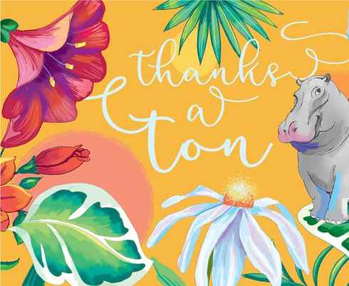
Happy colors. Illustration by Daria V.
Calming colors—blue, green, baby blue, lilac, mint, white and gray
Want to chill out? Turn to cool colors, like blue and green, cool-toned pastels like baby blue, lilac and mint, and neutral tones, like white and gray. Pared-back designs that use fewer colors tend to be more calming.
Energizing colors—bright red, yellow, neon green, turquoise, magenta and emerald green
Want to get fired up? Strong, bright, highly pigmented and neon colors can have an energizing effect on our emotions. They’re bold and stand out from their surroundings, which is why they can make us feel that way too.

Calming colors. Illustration by Marrieta.

Energizing colors. Illustration by Daria V.
How different colors make us feel —
Let’s dive into the colors and emotions.
Red—passionate, energetic, angry, dangerous, lucky
Red makes you feel passionate and energized. It’s often associated with passion and love, as well as anger and danger (there’s a thin line between love and hate, after all). In China and other East Asian cultures, red is associated with joy and good luck, which is why it’s the color of the Lunar New Year.

By AnaMaria.Design

By Unigram
Orange—energetic, enthusiastic, lively, happy
Orange is an energetic attention-grabber, like red, but isn’t as overpowering. It’s inviting and cheerful, and a popular option for brands asking their audience to take action—like “buy this product!” or “sign up for this newsletter!”—but in a fun, friendly way.
By EWMDesigns

By Paula Ambrosio
Yellow—happy, spontaneous, cheerful, optimistic
Yellow is reminiscent of sunshine and smiley faces and is often used to make people feel positive. It’s flamboyant and joyful. Think twice about using too much yellow in your design because it reflects a lot of light and can be a bit hard on the eyes.

By solvi_designs

By austinminded
Green—fresh, balanced, calm
Green can make you feel optimistic, refreshed or relaxed, probably because of its association with nature. Green is easy on the eyes and can be used to create balance in a design. It’s a great color for brands that want to depict growth (in the US, especially, where money is green), security or inspire possibility (i.e., you’ve got the green light to go!).

By Wooden Horse
![illustration of a pan with the text on top for kitchen brand]](/images/10/what-does-dark-8FBB6.jpeg)
By Project 4
Blue—secure, relaxed, spiritual, calm, cold
Blue is the “king of colors,” as we’ve mentioned in our article “Logo colors: what’s best for your brand?” It evokes feelings of calm and trustworthiness, which is why it’s a favorite with big corporations (Twitter, Facebook and LinkedIn, to name a few). It also appears in more than half of all logo designs.
Dark blue is popular with corporations because it feels so safe and professional. But using too much blue can feel cold and disengaged. Light blues are considered more relaxing and friendly.

By Mj.vass

By vitalfuerze
Purple—creative, mysterious, royal, luxurious
Purple is associated with mystery, creativity, royalty and wealth, a combination that might explain its popularity in the cryptocurrency industry. Lighter shades of purple are often used to soothe or calm, so it’s a favorite with health and beauty brands.

By gatta™

By vitalfuerze
Pink—playful, romantic, tender, cute, fun
Traditionally, pink evokes romance, sweetness and tenderness. It can often make us feel playful or romantic. But pink can also be modern, like millennial pink, or outrageous, showy and even rebellious, like hot pink.

By reza ernanda

By Dan Newman
Brown—warm, grounded, practical, comforted
Brown creates a sense of stability, comfort and support (much like your morning coffee). It’s warm and friendly, practical and dependable, and can also represent the old-fashioned, vintage or well-established.
![ceramic vase with a lizard logo for ceramic and pottery brand]](/images/10/what-does-dark-BCA59.jpeg)
By《•ckmr•》
By Inky Jar
Black—sophisticated, classic, serious
Black evokes power, luxury and elegance, but can also stand for professionalism, neutrality and simplicity, like Steve Jobs’ ever-present black turtleneck or the “little black dress.” It can feel bold, powerful and mysterious, like “black magic,” Darth Vader’s all-black ensemble or the black robes of a Japanese ninja (at least in popular media). In certain contexts and cultures, the color black can also refer to mourning or sadness.

By Henning Bo

By 《•ckmr•》
White—simple, peaceful, elegant, cold
Using a lot of white in design creates a minimalist aesthetic—fresh and comforting in its simplicity. In many cultures, white refers to innocence or peacefulness (think baby clothes and white doves). Too much white can feel cold, impersonal and overly sanitized, like a blindingly white hospital ward. In Eastern cultures, white is worn at funerals.

By Huntress ™

By Ian Douglas
Gray—serious, professional, reliable
Gray can be seen as a mature, responsible or neutral color, which is why you might feel super-professional and reliable wearing a gray suit to work instead of bright orange. Gray is sometimes seen as a lighter, less formal alternative to black. On the other hand, it can also be seen as indecisive, conventional and (alas) boring.

By Dori

By solvi_designs
Colors and emotions are inextricably linked —
Whether you’re designing a logo, building a brand, or putting together the perfect revenge outfit for your school reunion, remember that colors can change how you feel and how others perceive you. Colors can be subjective, too: a neon yellow logo that makes one person happy might give another person a headache. So choose carefully, and always ask for help from an expert if you need it!
Need an email, website or infographic designed?
Our designers can help you create just about anything.
This article was originally written by Allison S. Gremillion and published in 2019. It has been updated with new examples and information.

