Thank you for the magnificent walk through these paintings. I learned more in this half-hour than I have in hours of class. I am especially interested in the Bierstadt, as they are so refined as to resemble photographs. As for hanging in my home, I’d choose the van Gogh’s or the Steppes sunrise! Who wouldn’t! Reply
are you lacking confidence in your artwork?
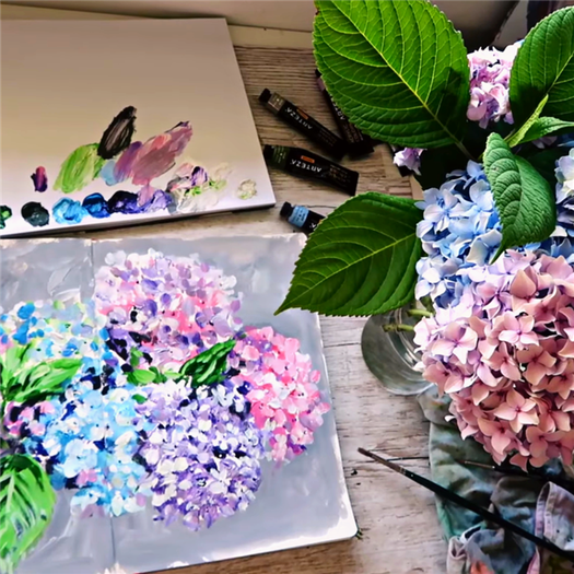
Posts tagged acrylic painting
![Acrylic Painting Tutorial [Fall/Autumn Scene] Step by Step for Beginners](/images/79/step-by-step-guide-for-B40CB.png)

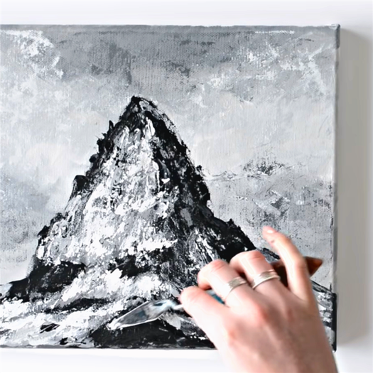
Painting Tutorial Katie Jobling November 10, 2022 mountain painting, acrylic painting Comment
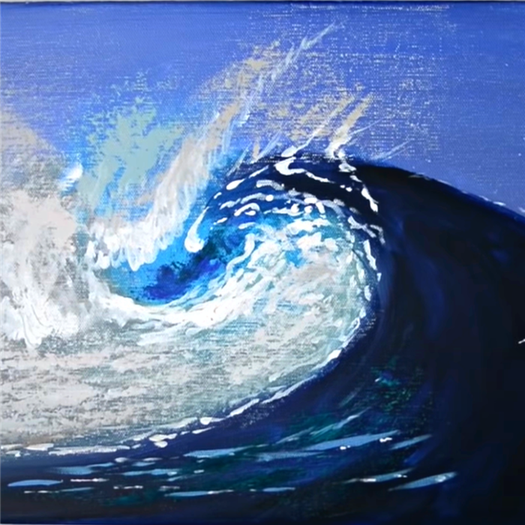
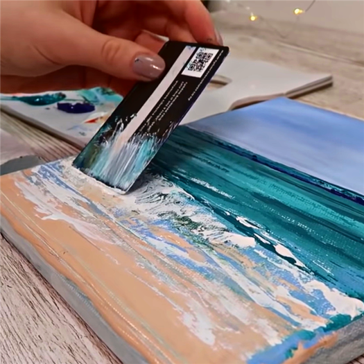
Painting Tutorial Katie Jobling November 8, 2022 ocean artwork, acrylic painting Comment
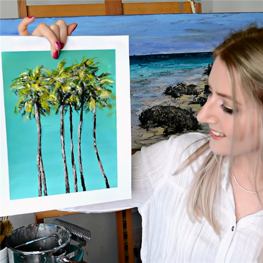
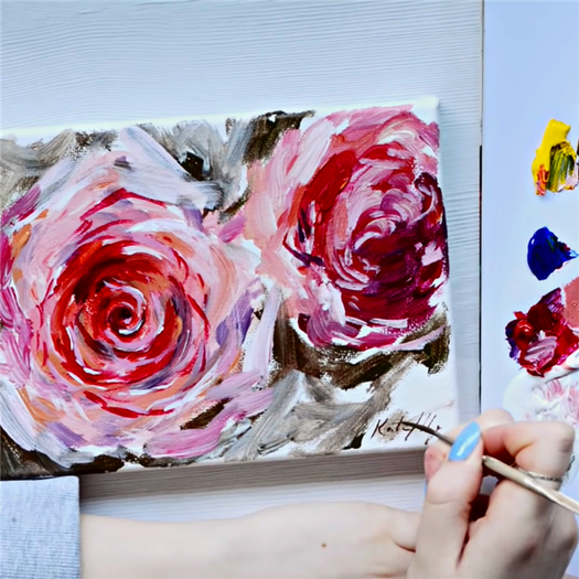
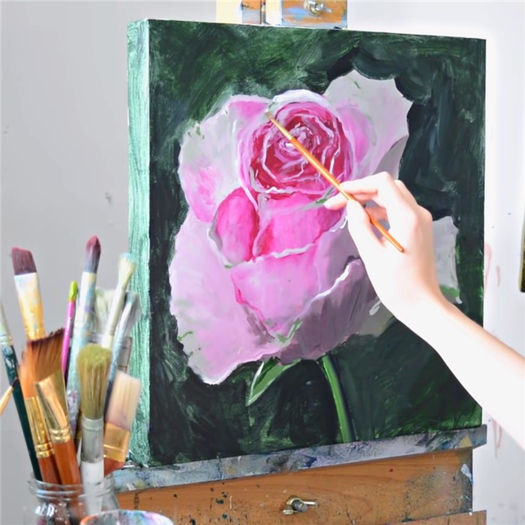
Painting Tutorial Katie Jobling November 3, 2022 acrylic painting, tropical Comment
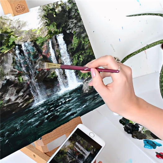
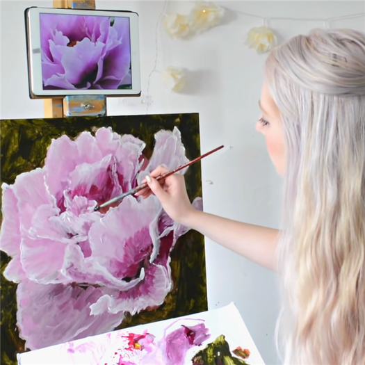
Painting Tutorial Katie Jobling November 1, 2022 waterfall painting, acrylic painting Comment
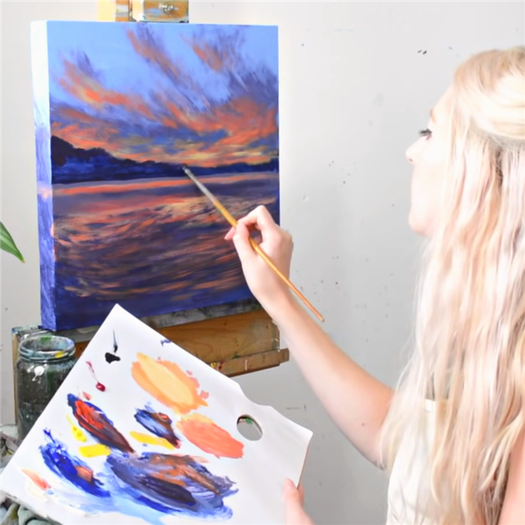
Step 1 – Observe the Light Source
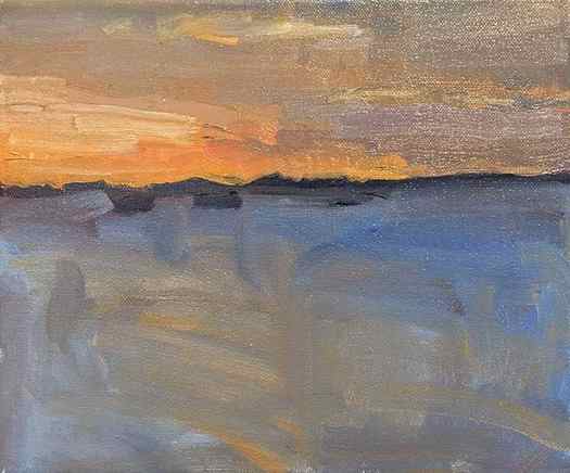
The first step in creating a beautiful sunset painting is observation. In particular, you need to determine the lighting situation.
- Where is the light coming from (where is the sun positioned)?
- How much direct sunlight is there?
- How much reflective light is there (light bouncing around in your scene)?
- Are there any clouds (which might diffuse the light)?
Every sunset will be slightly different depending on the conditions, so you need to observe all the elements and try not to make assumptions. For example, generally, the color temperature in a sunset is warm, however, perhaps it is a stormy day and clouds are diffusing all the light, creating an overall cool temperature.
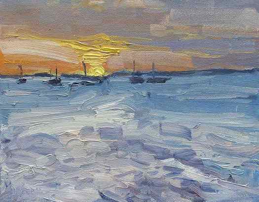
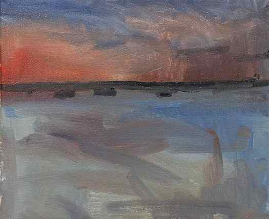
In the reference photo below, the light is coming directly at us and is very low on the horizon. This creates silhouettes of any objects (the boats and land). The clouds diffuse much of the light and spread it generally across the scene.

Step 2 – Create a Solid Foundation for Your Highlights
The next step in creating a visually stunning sunset painting is to build a solid foundation so that you can really show off the highlights (usually the vivid sunlight).
Why is this so important?
Because you are not able to actually paint light. This is sadly one of the limitations of paint. However, with the clever use of the elements available to us, we are able to create a fairly accurate illusion of light.
It is all about relativity.
Because we are not able to hit the vividness of sunlight, we may need to accentuate the dullness and darkness of the surrounding environment. By doing this, we can add power to the sunlight in our painting.
This is why it is so important to build a solid foundation for the highlights in sunset paintings. Without a solid foundation, you will never be able to faithfully represent the sunlight you are trying to paint. It will always look weak and lifeless.
I heard an artist once say…..
I am not sure who said it but I will give credit if I find out.
Step 3 – Add the Vivid Highlights
In my opinion, one of the most fascinating parts of painting sunsets is the challenge of capturing the elusive light with the same level of vividness and brilliance. In a way, this is something that I could never fully achieve. But we can come pretty close if we lay down a solid base of darks and mid-tones.
A few tips for the highlights:
- Brighter is often more powerful than lighter. Be careful with how much white you are adding to your highlights. The more white you add, the less saturated your colors will be.
- Try using a palette knife to apply the highlights in an impasto fashion. This can contrast nicely against a soft foundation of darks and mid-tones.
- Sometimes less is more with the highlights. The most appropriate highlights could be nothing more than a thin streak of orange to indicate light peeking through clouds.