Which of the warm blues should go with a cool primary blue? Should we use it in addition to both of our warmer blues? Does this mean we should only use a true primary blue? Can we mix a primary blue from ultramarine and pthalo? Short answer to all of these questions? Yes. Ultimately there’s no wrong way to make art. You can choose a blue based on intuition alone and a lot of us do with great success, but that’s not why you’re here reading about color theory is it? And I don’t want to leave you with more questions than you came in with.
Defining Warm and Cool Colors: It’s All Relative
The concept of warm and cool colors has been written about for hundreds of years. Most theories start with the classic six point color wheel (three primary colors and three secondary colors). A dividing line splits the wheel into warm and cool. The line location varies based upon the reasoning of the theorist. Regardless, the general idea is the warm colors are Red, Orange and Yellow; and the cool colors are Green, Blue and Magenta (Figure 2).

Compare “yellow” to “blue” and it’s easy to see yellow is warm and blue is cool. Comparing “red” to “magenta” might be less obvious since they are next to each other. But if you identify and compare the “color temperatures”, a bluish red (magenta) is cooler than a yellowish red (Figure 3). Describing how a color leans towards another primary or secondary is also referred to as its“bias.” A red, as we can see, can have a yellow or a blue bias.

Color temperature is also important during paint mixing. In order to make clean mixtures use colors with similar color qualities. For example, mixing a yellowish red with reddish yellow yields bright secondary oranges (Figure 4). In describing a color to someone, we often refer to color “bias”. A red can have a yellow bias or it can have a blue bias.

To identify color temperature you’ll need to learn how to see and identify warm and cool colors. Some colors are easy to discern, but looking at our 108 colors in our Heavy Body Acrylics line, “color temperature” gets tricky. In the world of paint colors, there are warm AND cool greens, blues, red, yellows, earth colors, blacks and whites. Comparing a warm red to a cool red and then compare those to a third color, you should be able to see if it’s yellower, bluer, or in between the first two reds. Once you begin to “see” the differences it becomes easy to identify any color.
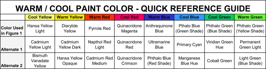
To make this as easy as possible, stretch out the color wheel to eight primary colors (Figure 1). The colors are on a grid. Yellow is at the top, with the left example being a cool yellow because it has a green bias, thus we describe this as a “Greenish Yellow”. The yellow to the right is a “Reddish Yellow” and identifies as a warm yellow (Figure 5).

Clockwise, we move toward reds. The top red is a “Yellowish Red” because it has a yellow bias. Not by accident, the Yellowish Red is in the same quadrant as the Reddish Yellow. Mixed together the resulting orange is “clean” (Figure 4). Clean color refers to having no biasness resulting in a duller or “muddy” color.
The lower red has a blue bias. Having the two reds next to each other makes it easier to identify the color temperature. Our “Bluish Red” mixes very cleanly with our “Reddish Blue” at the bottom right, resulting in vibrant purples and violets. Mixing the Yellowish Red with the Reddish Blue would make a dull maroon (Figure 6).

Each quadrant lines up similarly. The “Greenish Blue” or cool blue mixes cleanly with the cool “Bluish Green”. The “Yellowish Green” is warm and creates vibrant bright greens when mixed with its quadrant companion “Greenish Yellow” (Figure 7).

Color temperature doesn’t line up neatly when mixing colors. By chance the warm Reddish Yellow and warm Yellowish Red work together, but the warm Yellowish Green mixes best with the cool Greenish Yellow. What’s more important is that you can identify the color temperature and its dominant bias so you can choose the best mixing color based on your needs and paint colors you have on hand.
Below is a table that identifies the colors used to create this chart and additional examples of similar temperature colors (Table 1).
For a full listing of the GOLDEN Heavy Body Colors, arranged from Cool to Warm by color families, please see the following PDF:
About Michael Townsend
Michael has worked at GAC since 1989, starting in Quality Control, progressing to R&D, Custom Lab work, Applications Testing and investigating the properties of the vast array of pigment and binder. Currently a Materials Specialist focusing on consulting with artists worldwide on their artistic endeavors. A painter, writer, and father to 3 boys who remind him daily to enjoy and appreciate life.
Subscribe to the newsletter today!
We don’t talk about Blue: A Comprehensive Look at Color
Blue was in short supply and used sparingly in art throughout the 18-1900s. As times have changed and color science evolves, we exist in a time overwhelmed with a wide variety of blues: ultramarine, pthalo, cerulean, cyan, indigo, cobalt, navy, azure, cornflower, and so many more!
While this is something artists should celebrate as we have more options today for creative expression than ever before, it comes at a cost. Artists face decision fatigue whenever they visit the paint store or their palette.
This brings us to some pretty big questions: which blue should you choose? is there a right and wrong shade of blue? and how can we apply it to our art?
Which Blue to Choose:
To mix a wide variety of colors using the traditional primaries, you need a warm and cool version of each. For red and yellow these are easy to identify. Alizarin crimson and rose lake madder lean toward purple which makes them cool, while cadmium red and vermillion hues lean closer to orange which makes them warm. For yellow, an electric lemon yellow pushes toward cool green, while a dandelion or school bus yellow leans toward a warm orange. But for blue? Cue one of the biggest debates in color theory history.
Artists argue whether ultramarine blue or pthalo blue is warm or cool. Ultramarine blue leans toward indigo and deep violet and pthalo leans toward teal and green. If we continue further on the color wheel, ultramarine is closer to red than pthalo blue so clearly, that’s the warmer blue, right? Well if we continue farther along the color wheel in the opposite direction we find that pthalo blue is closer to yellow than ultramarine. Which is also a warm color.
After extensive research, I’ve come to the conclusion: functionally, ultramarine and pthalo blue are both warm blues. Out of the three primaries, blue is the only cool hue. Either direction you take it will push it toward a warmer tone. The only actual cool blue would be a true primary or cobalt blue.