Medium is used to liquefy the powdered colors. Usual mix is 1 part medium to 1 part powder. Color should self-level. Colors may be thinned further with more medium and/or water for watercolor effects or mixed a bit thicker for use in Decorator Bottles. Also used in the MUD techniques to dress Margot’s Miracle Brush or to thin MUD if desired.
Fusing Unique Glass Colors
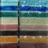
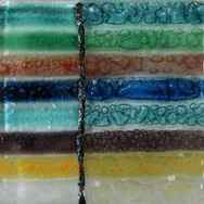
Unique Glass Colors products will allow you to create beautiful works of art, both kiln fired and non-fired, on many different surfaces. UGC currently has six kiln fired color lines – D-Series, NT, Artisan, Detail, Accent and Sparkle – that are for commercial applications, hobbyists and artisans. The colors kiln fire in the 1425F to 1550F firing range depending on the surface on which they are applied. Surfaces include – float glass, porcelain, terra cotta, recycled glass, specialty glass, pre-fired pottery and most any glass that can fire within that range. The colors can fire to much hotter temperatures when used on surfaces other than glass.
NT Color Line
The NT color line is the most popular line of kiln fired glass color for many reasons. They come in powder form and are all non-toxic, food-safe, and safe for the environment. Even the metallic colors are safe. The NTs fire to rich, glossy, vibrant color, semi-opaque to opaque.
The NT line is mixed with UGC Medium to the consistency of melted ice cream and fire semi-opaque to opaque when mixed on a 1:1 ration with UGC Medium. They can also be used in their dry form for stenciling or sifting techniques. For more detailed information on all our products and what they can do, please click on Basic Glass Information
NT�s can be used on a wide variety of glass from COE 83-96 and our firing range is 1425F-1550F. These colors were developed to be used on the top layer of glass but work very well when capped.
Tomato – 11002
Brite Pink – 11003
1 oz
3.4 oz
Pumpkin – 11004
Vanilla – 11016
1 oz
3.4 oz
16 oz
Dark Grape – 11018
Periwinkle – 11019
Kit contains 1 ounce jars of many of our best selling NT Colors, also includes earth tones as well:
| 1951 Brite White 1956 Dark Blue 1958 Turquoise 1961 Dark Green 1963 Tulip Yellow 1966 Warm Brown 1969 Gloss Black |
1997 Leaf Green 11002 Tomato 11003 Brite Pink 11004 Pumpkin 11021 Purple 11022 Sea Green |
Plus (2) 8 oz bottles of Medium, Basic Instructions for UGC products, Color Chart and a fired color sample chip (pictured) of the colors in the kit.
Kit contains 1 ounce jars of many of our best selling NT Colors, also includes earth tones as well:
| 1957 Sky Blue 1959 Teal Blue 1962 Mint Green 1976 Rose Pink 1977 Jade 1994 Baby Blue 1995 Apple Green |
1998 Golden Orange 11006 Rust 11008 Burgundy 11016 Vanilla 11019 Periwinkle 11020 Violet |
Plus (2) 8 oz bottles of Medium, Basic Instructions for UGC products, Color Chart and a fired color sample chip (pictured) of the colors in the kit.
Kit contains 3.4 ounce jars of popular colors used in Pouring Enamels Techniques
| 1951 Brite White 1956 Dark Blue 972D Lite Red 975D Brite Yellow |
Plus (2) 8 oz bottles of Layering Mix, Step-by-Step Instructions with color photos and Basic Pouring Instructions.
Kit contains 3.4 ounce jars of popular colors used in Pouring Enamels Techniques
| 1951 Brite White 1956 Dark Blue 1956 Turquoise 1962 Mint Green 1998 Golden Orange |
Plus (2) 8 oz bottles of Layering Mix, Step-by-Step Instructions with color photos and Basic Pouring Instructions.
Kit contains popular colors used in Pouring Enamels Techniques
| 1951 Brite White – 3.4 oz jar 11016 Vanilla – 3.4 oz jar 1963 Tulip Yellow – 1 oz jar 1967 Dark Brown – 1 oz jar 1997 Leaf Green – 1 oz jar 11003 Brite Pink – 1 oz jar 11008 Burgundy – 1 oz jar |
Plus (2) 8 oz bottles of Layering Mix, Step-by-Step Instructions with color photos and Basic Pouring Instructions.
Kit contains 1 ounce jars of the following colors:
| 11017 Silver Sheen – 1 oz jar 11013 Copper Glow- 1 oz jar 11011 White Diamonds – 1 oz jar 11012 Gold Dust – 1 oz jar 111016 Vanilla – 1 oz jar |
Plus an 8 ounce Medium, basic UGC instructions for use, and a fused color sample chip (pictured above) of the kit colors.
Artisan Color Line
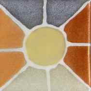
This lead-free color line works well in conjunction with the NT Color Line. The colors come in powder form and need to be mixed with the UGC Medium. These colors are transparent/ translucent and bubble when kiln fired between layers of glass and are textured, opaque and glossy when fired on the top layer of glass. By using specific placement techniques, you can actually control your bubbles! Experiment with different types of glass to see what interesting effects you can achieve. For more information on all our products and what they can do, please download this PDF on Basic Glass Information.
On each of the pictures below, the upper left corner is what the color looks like when fired on the top layer of glass. On the lower right, it shows the color applied solidly on the bottom layer of glass and the two remaining sections show the color applied with a 10/0 script liner to form fine, controlled lines of bubbles. The secret to the controlled lines is — don’t let them touch!
White Glo – 615
1 oz
3.4 oz
Contains 1 oz jars each of the following Artisan Colors:
| 600 Azure 603 Royal Blue 604 Teal Green 606 Solar Flare |
610 Deep Pink 611 Charcoal 612 Melon 613 Plum |
Contains 1 oz jars each of the following Artisan Colors:
| 601 Glacier 602 Green 605 Sienna 607 Mystic Blue |
608 Teal Blue 609 Wine 614 Yellow-Orange 615 White Glo |
The colors in the “D” series are manufactured in a powder form and the “D” indicates that these colors contain cadmium.
The colors in the “D” series are manufactured in a powder form and the “D” indicates that these colors contain cadmium.
Sparkle colors are high pigment content powders that also contain mica to create the SPARKLE!
Glass Medium
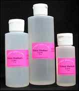
Medium is used to liquefy the powdered colors. Usual mix is 1 part medium to 1 part powder. Color should self-level. Colors may be thinned further with more medium and/or water for watercolor effects or mixed a bit thicker for use in Decorator Bottles. Also used in the MUD techniques to dress Margot’s Miracle Brush or to thin MUD if desired.
2 oz. Bottle
8 oz. Bottle
Layering Mix
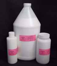
Layering Mix is a liquid that when added to powdered color lines will allow you to turn any enamel colors (that do not contain bits of grit) into Outline Colors. It will give texture and dimension to any of the powdered colors. It will allow multiple layers of color to be added to a project without the need of firing between layers. Mix with frit and let dry to create designs with varying heights of texture that are then able to be decorated with liquid colors without the frit moving. Frit mixed with Layering Mix can be stored for later use as long as it is kept damp in an airtight container.
8 oz. Bottle
16 oz. Bottle
1 Gallon Jug
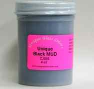
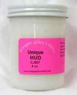
UGC White and Black MUD are a texture product that can be applied to most surfaces with great adhesion by just air-drying and can also be kiln fired up to 1550F.
White 4 oz. Bottle
Black 4 oz. Bottle
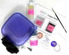
MUD Kit
MUD Kit contains the following items:
1 White MUD 4 oz
1 Margot’s Miracle Brush
1 Stainless Steel Writing Tip
1 Pastry Coupler
2 Pastry Bags
Rubber Bands
Storage Container w/Sponge
2 oz Medium
Basic Instruction with step-by-step color worksheets for creating leaves and flowers.
Practice cardstock and photos of some of the many creations that can be made with MUD.
Bubble Powder
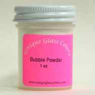
Create a bubble effect in your paint! Must be used between layers of glass. For actual bubble placement, place small pea size amount in a triangular formation. The smaller the formation the smaller the bubble! The bigger the formation the bigger the bubble! Can also be added to NT Colors to create all over random bubbles. Mix a 1/4 tsp. of Bubble Powder to 1/2 oz. of any NT Color. Not recommended to be used with any of the “D” Series Colors.
Margot Miracle Brush
This brush was specially designed for Margot! It is what she uses for all her MUD Floral designs and to apply washes of color. The best quality sable – approximately a 3.5 round size.
SITE INDEX | PRIVACY | RETURNS | SHIPPING | CONTACT US | CALL US (800) 462-1209
10 Ways to Make Grey and Black
Some backstory and notes – Kusakabe is a Japanese brand of professional quality watercolors. I purchased them from Sekaido Art Store in Tokyo, Japan. It was an enormous store that I could literally spend hours and hours browsing. I loved it. The internet says it’s indeed the largest art supplies store in the world. Not surprised – it was 5 or 6 floors and it had an incredible assortment of art supplies and stationery. Highly recommend. The Kusakabe brand is interesting. A number of the colors in the set I got were opaque or semi-opaque. I also got some individual colors like Lavender (also opaque). I thought all colors had a very good vibrancy.
White Nights by Nevskaya Palitra are a Russian brand of artist grade watercolors. They hold a special place in my heart as they were the first professional quality watercolors I purchased when I was first starting on my watercolor journey. I even remember where I got them from – Jacksons Art Supplies in London. Amazing store with a huge product offering. The paints are very vibrant and excellent quality overall.
Holbein watercolors are a Japanese brand of professional grade paints. They were my second set of watercolors with the largest color selection (60 colors). Otherwise, they offer a maximum of 108 different colors and you can get that in a set too.
French Ultramarine by Schmincke is a highly granulating color. One of my favorite. You can see a little bit of that in the final grey color.
Indian Yellow is a beautiful color by Schmincke.
Not pictured here is a mix of Burnt Sienna + Ultramarine Blue which makes a beautiful grey. It’s a quite popular mix and Daniel Smith (American brand of professional paints) even has it as a ready made color called Jane’s Grey (named after Jane Blundell who does a ton of color swatching and mixing). I have that color and use it all the time. It’s quite versatile and saves you the time to mix it manually. John Cogley (owner of Daniel Smith brand) explained that the ready made mix is different from mixing the colors yourself because it contains only 1 part of the gum arabic binder (vs 2 parts that would’ve come with the individual colors if you mix them yourself). Either way, it’s a great color and very useful for mixes.
Contact
You can write me at:
James Gurney
PO Box 693
Rhinebeck, NY 12572
or by email:
gurneyjourney (at) gmail.com
Sorry, I can’t give personal art advice or portfolio reviews. If you can, it’s best to ask art questions in the blog comments.
Permissions
All images and text are copyright 2020 James Gurney and/or their respective owners. Dinotopia is a registered trademark of James Gurney. For use of text or images in traditional print media or for any commercial licensing rights, please email me for permission.
However, you can quote images or text without asking permission on your educational or non-commercial blog, website, or Facebook page as long as you give me credit and provide a link back. Students and teachers can also quote images or text for their non-commercial school activity. It’s also OK to do an artistic copy of my paintings as a study exercise without asking permission.
Friday, December 27, 2013
Questions about Black, Part 1 of 4
 |
| Nikolai Yaroshenko (1846-1898) The Student |
Blog reader Kostas Kiriakakis asks:
“Is black part of your palette when mixing colors? Many artists state that they never use black but I don’t understand if they mean that they don’t like using it straight out of the tube on to the canvas or if they banned it even as a mixing component from their palette altogether.”
Good question and comment. Let me try answering them, and I’ll ask a few more questions. I will do this as a three-part series.
Can you use black to darken a color?
Black is a very useful color. However many artists will tell you that if it is used to darken all the colors, it can “muddy” a color scheme. They are right. That’s because black pigment will reduce chroma too quickly as it darkens or “tones” a color. Rather than looking like a darker version of the color, a color mixed with black will be both darker and a lot grayer, which can give the picture an unpleasant dullness. Another problem with black in mixtures is that it will often shift a hue toward another hue. For example, yellow turns green when mixed with black.

David Briggs explains these phenomena on his excellent website HueValueChroma. In this diagram from his page on mixing with black, he compares how a mixture of permanent alizarin and white (A) changes as it is darkened by black, compared to a line of uniform saturation (B). The pigment mixtures are plotted using software from the website couleur.org.
How do you darken a color without using black?
To avoid that problem, painters use a variety of colors to darken or tone other colors. Usually these toning colors are pigments that appear dark right out of the tube, often because they are transparent. Ultramarine, the phthalo blues and greens, burnt umber, and permanent alizarin crimson can all be useful for toning other colors. By using these colors to darken your mixtures, you can control the chroma and, if you need to, pull it away from dullness, or just give it more interesting variations of chroma as the colors get darker, so that the dark realms of your colors aren’t all monochromatic.
What are the uses for black?
Despite its tendency to be a color-mixing crutch for beginners, black has its uses. I love black pigment. I have a tube of black in all the media I paint with: oil, casein, gouache, and watercolor. I use black pigment most often when I’m painting in grisaille with just black and white, or in a super-limited palette of black, white, and another color. I also use it if I want an accent of the darkest possible value (more about that on Sunday).
Are all black pigments the same?
No. In watercolor, it’s fun to experiment with different kinds of black: bone black, lamp black, Mars black. The pigment called “ivory black” used to be made from elephant ivory. Since that is now unavailable, some paint makers create ivory black by burning and grinding up fragments of mammoth ivory from Russia, which is legal to use. Each kind of black has different qualities of texture and chroma. If you get a couple of different blacks, you can play with them and compare them by painting them in a thin glaze, tinting them with white, and mixing them with other colors.
“Questions about Black” Series
Posted by James Gurney at Friday, December 27, 2013
Labels: Color
15 comments:
Anonymous said.
Thanks so much for this one, Mr. Gurney! As a relatively new artist playing with core concepts, this is a great subject.
Recently my go-to “black” has been Walnut Brown (a very dark, almost black-brown) mixed with a dash of Sapphire Blue, I call it “Corporea Black” after the username of the person I stole it from. Please excuse the hobby paint names, I paint with Reaper Master Series acrylics. Here is a study in moonlight (after much study of your study of moonlight in Color & Light):
(Scale is about an inch tall)
bill said.
Will you also be addressing the difference in blacks according to manufacturer? There are some great discoveries to be made. And of course, medium to medium blacks can do very different things.
pierangelo boog said.
I remember that Vincent Van Gogh speaks of six ore seven diferent blacks that he has found on paintings of Velazquez (in letters to his Brother Theo ?) !
SE said.
A teacher of mine once worked under another artist for an outside mural. The artist never used straight out-of-the can black, he always mixed his own dark colors. Even when my teacher thought the artist got the dark colors right, the artist would find some way to change the pigment, and make it better. Apparently the mural was too realistic, because a car drove right into it (probably a good time to say the subject was a one point perspective of a road).
Juan Carlos Barquet said.
I’ve heard before from teachers or fellow artists that ‘pure black doesn’t exist in nature’ and therefore it should be avoided. I wonder how much truth (or relevance) is in this statement, because I believe there’s definitely a place for black in a picture if it’s understood and done right. Thanks James, I look forward to reading the next two posts.
Connie Nobbe said.
Gamblin has a new black oil color called “Chromatic black” which is a mixture of quinacridone red and thalo emerald. I’ve bought a tube, but I have yet to try it out.
jeff jordan said.
I never use tube black oils–they’re neutral dead. Sometimes I want a bluish black, sometimes greenish, sometimes purplish. It depends on the needs of the painting.
One time I was working on a local movie set for a film that’s better left unnamed, and hanging out with guys painting signs for the movie. They went to a local paint store and ordered Black, and were really surprised. “I never knew black could be a custom color,” said the main guy.
More to black than meets the eye.
Jason Peck said.
Wonderful topic. I always have black on my palette and use it often. I like mixing white, red, and Ivory Black for low chroma violets. I also use it for mixing beautiful low chroma greens. Here is a link to one of my paintings, where all of the greens are mixtures of white, yellow ochre pale, and ivory black.
Joel Wetzel said.
Greetings, Mr. Gurney, and thank you for your inspirational postings. Would you share ideas about when to use what brushes? I noticed a flat made short work of geometric shapes and that was a revelation. Now I’m hungry for more. Again, thank you.
David Briggs said.
I agree with Juan Carlos Barquet that there’s definitely a place for black paint, it’s just a matter of understanding its behaviour and knowing how to adjust for it. In particular, there’s nothing wrong with using black as a darkener, as long as you know how to correct for its unwanted effects, as I explain in the passage on my website that James linked to. It’s generally a matter of adding some extra colourant to restore the excess loss of chroma, and perhaps a trace of a corrective colourant to reverse any shift in hue caused by the black paint. It sometimes releases quite a mix of emotions when students see their “don’t use black as a darkener” rule demolished in front of their eyes!
An actual problem however is that, in a manner of speaking, ‘pure black doesn’t exist on the palette’, in the sense that all our black paints reflect a few percent of the white light that falls on them. You can demonstrate this for yourself by painting the inside of a small box black, and then closing the box and cutting a narrow slit in it; the slit will be distinctly darker than any black paint you paint beside it. This is why, in that diagram of mine that James posted, black paint lies above the point of zero light energy, which where the theoretical shading series of any colour (B, the line of uniform saturation in the diagram) is headed. This means that the desired shading series for coloured objects misses black paint by a margin, which is quite large for strongly coloured objects. For the latter you may need to make the darkest values as strongly coloured as you can make them; pure black paint by itself just isn’t right. James has already said something similar to this in his post on the separateness of black:
K_tigress said.
Thanks for posting this. Very interesting. Eventually the mammoth tusk will run out. Its inevitable. So could you basically have another alternative? Something more common like tusks from other living animals like a boar or is it just not the same quality?
Jerry Boucher said.
There’s also perylene black, which is greenish.
S. Stipick said.
If the use of ivory black is an issue due to the sourcing of the pigment, I would suggest considering Bone Black from Vasari. I have a tube that sits along side of my other blacks and I enjoy using it to the chagrin of my other tubes (if tubes had feelings).
S. Stipick said.
Bone Black is not an exact and perfect replacement but it does have similar transparent properties.
In my case this does not effect me too much as I rarely (almost never) use black unadulterated. In most cases I will neutralize the black to a munsell neutral (or very close) and mix a string of grays out of that to use as my control.
Which brings up the topic of darkeners and neutralizers. I’ll probably create small post regarding that later today.
With Mr. Gurney’s permission of course
James Gurney said.
Shaun, permission granted, of course. Send a link when you put up the post.


