To make the color darker, you can also use darker shades of blue and purple, or you can add a little black to the mixture.
How to Mix Color without as Much Guesswork
How to mix color. It’s one of the first things we learn as kids. Blue and yellow makes green. Red and blue makes purple. Red and yellow makes orange. Back in the day, when Crayola had a much more limited color selection, those were pretty reliable formulas.
But as the color selection grew, blue and yellow makes green didn’t always hold true.
To figure this mystery out, we have to delve into color theory.
The one class I didn’t take in university and I wish I had. I had to learn the hard way, through trial and error. The color mixing rules we learned as kids involved primary colors. Primary colors are red, blue, and yellow. These are the only colors that cannot be created by combining any other colors.
The combining of primary colors produces secondary colors…green, orange, and purple. Combining secondary colors with primaries creates tertiary colors…blue-green, red-orange, yellow-green, red-violet (purple), yellow-orange, and blue-violet.
On top of that, if you start incorporating black, white, and grey, which creates tints, tones, and shades, the combinations become endless. And art companies literally bank on that. The more combinations that they can create for you, the better. But how do you know which to combine?
Let’s reel it back a bit.
Primaries are red, blue, and yellow in their purest forms. A primary blue is just blue. If, for example, there’s even the tiniest amount of red added, it makes that blue lean more towards a warmer blue than a true primary blue. Even just a touch of another color means that blue is no longer pure.
So, if we take our last example with the warm blue and we try to mix it with yellow to get green, you’ll find that the resulting green won’t be a nice vibrant green. Instead, you’ll get a brownish green. Blue and yellow no longer make green.
Because you’re not just mixing blue and yellow anymore. You’re mixing blue, yellow, and a touch of red. Even though the blue is still visually blue and not purple yet, any amount of another color will throw off your attempts to mix colors. Blue and red are the makings of purple. Add yellow to purple and you get a funky brown. However, if you mix blue with a tiny bit of green in it and yellow, you’d end up with a very vibrant green.
Understanding Blue and Purple As Colors
There is more than one color model that you can use to mix colors, and we will touch on three of them. The most well-known one is the RYB color system, which most of us learned at school. This is used to mix pigments and paint colors and involves a subtractive method of creating colors. This means that you begin with a white surface like paper, and you begin with mixing colors. Each color added will absorb certain colors and reflect others. The primary colors in this model are red, yellow as well as blue.
When mixing these colors, for example, red with blue, you create purple. Red and yellow make orange, and blue and yellow make green. These are all secondary colors.
A color wheel is there to help you visualize all the colors and to help you work out how they all interrelate with one another. When looking at a color wheel, you will notice that the greens, blues, and purples are positioned more on one side, while the reds, oranges, and yellows are on the other side. The first group of colors is cool and calming, while the second group is warm and energizing. So, now we know that blue and purple are both cool colors and that blue is named one of the primary colors, while purple is a secondary color. Before going further, let us see what the meanings of both blue and purple are.

| Shade | Hex Code | CMYK Color Code (%) | RGB Color Code | Color |
| Blue | #0000ff | 100, 100, 0, 0 | 0, 0, 255 | |
| Purple | #800080 | 0, 100, 0, 50 | 128, 0, 128 | |
| Violet | #ee82ee | 0, 45, 0, 7 | 238, 130, 238 | |
| Blue-Purple (violet) | #8a2be2 | 39, 81, 0, 11 | 138, 43, 226 | |
| Lavender | #967bb6 | 18, 32, 0, 29 | 150, 123, 182 | |
| Indigo | #4b0082 | 42, 100, 0, 49 | 75, 0, 130 | |
| Lilac | #c8a2c8 | 0, 19, 0, 22 | 200, 162, 200 |
Meaning of Blue
Blue is one of the most popular colors and is often used in art and design projects. It is also the color of the oceans and the wide-open skies, making it a relaxing and soothing hue. Blue is also a trustworthy, reliable, supportive, confident, and stable color. The color blue can even produce physical effects, such as reducing blood pressure or slowing down respiration rates. Blue is also great for improving memory, and blue light has even been proven to kill certain bacteria.
However, there are also certain negative effects. Overusing the color can make it seem impersonal, cold, depressing, and predictable.

Meaning of Purple
Purple has strong connections with royalty, luxury, nobility, and spirituality. The color purple is also associated with ambition, wisdom, power, and creativity. It is an inspirational color that can inspire, encourage, uplift, and even enlighten. The color also evokes mystery, imagination, and magic.
But it can also be proud, and extravagant, and can seem immature and emotional if used too much.
What Color Does Blue and Purple Make?
We now know about the primary and secondary colors. If you bring together a primary color and a secondary color, a tertiary or intermediate color is created. So, blue mixed with purple will give you one of these colors, which is a blue-purple. Other tertiary colors include yellow-green, yellow-orange, red-orange, red-purple, and blue-green. This color is also sometimes called blue-violet, and you can get a variety of different shades by using different color ratios. For example, violet, lavender, indigo, lilac, plum, and periwinkle.
Blue-purple is the best descriptive name for the tertiary color, as it has equal amounts of blue and purple.

Something else that might be confusing is that purple is also sometimes referred to as violet on certain types of color wheels. We have already determined that blue and purple are on the same side of the color wheel. Blue-purple is right in the middle of these two colors and is a bright combination of both these colors. All these hues form a certain color combination when known as analogous colors, which are formed by pairing neighboring colors.
Creating Lighter and Darker Shades
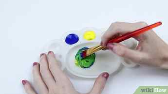
Once blue and purple are mixed together, you can adjust it to make something more unique. You can effortlessly alter the appearance of color by making it lighter or darker. To make it lighter, simply add some white until you get the color you are going for. You can also use different types of blue and purple, for example, a lighter shade of both will create a lighter and brighter blue-purple.
To make the color darker, you can also use darker shades of blue and purple, or you can add a little black to the mixture.

Instead of black, you can also try navy blue, which will not be as intense as black and will produce a deeper shade of blue-purple. However, blue-purple is made from blue and purple, so you already have blue in the mixture. What if you add too much extra blue? If you do need to add more blue, consider adding more purple instead. This will keep it more of an even blue-purple color.
Meaning of Blue-Purple
When combining blue and purple, you get something from both colors. So, blue-purple can also be mysterious, luxurious, creative, confident, and inspiring. It is a captivating color that can also be whimsical and feminine. The color can also represent freedom, ambition, integrity, as well as dedication, and can symbolize strong beliefs.
Understanding Blue and Purple Within Other Color Models
We have just dealt with the RYB color model, let us now consider the RGB color model. This is used to create colorful images on your computer and television screen. Instead of pigments, you now deal with light. This is also an additive color model that when all the colors are combined, creates white light. The primary colors are different and include red, green, and blue. The secondary hues are magenta, cyan, and yellow.
The tertiary color includes green-yellow, red-magenta, green-cyan, blue-cyan, blue-magenta, and red-yellow. The tertiary color blue-magenta is also known as violet.

So, if you then combine blue and violet, it will produce something close to blue violet, which can also be seen as blue-purple. Violet and purple are sometimes used as the same color; however, they are slightly different. Purple is a blend of 50 percent blue and 50 percent red, while violet tends to lean a little more toward red. You can observe the difference in the table. You will also find a few variations on the blue-purple color. Each color is identified by its hex code, and you will also notice the various color codes as well.
Printing Color Model
The other color system is known as CMYK and is what is used when printing with ink. It has cyan, magenta, and yellow as primary hues, while the secondary hues are red, green, and blue, the same as the previous color model. So, again, it will make a blue-violet combination.
What Color Does Blue and Purple Make?
Now, with us finally circling back to the question that brought us here in the first place, what color does blue and purple make? Their union sets ablaze a mesmerizing transformation, unveiling a color that exudes an undeniable allure. It is a hue that transcends the boundaries of its predecessors, captivating the imagination with its enigmatic charm. With blue and purple mixed together, the offspring of this magical fusion comes to us emanating an aura of mystique and fascination, violet. Violet, the offspring of this magical fusion, is a color that elicits a sense of wonder, drawing us into its embrace with a magnetic pull.
In its presence, we are transported to a realm where dreams and reality intertwine, where the ordinary becomes extraordinary and the mundane is cloaked in an ethereal splendor.
Violet dances delicately on the palette of emotions, evoking a range of sentiments as vast as the hues within its spectrum. It possesses the calming essence of blue, instilling a serene tranquility that soothes the soul and invites introspection. Yet, it is also imbued with the passionate spirit of purple. Igniting a fire within, fueling creativity, and inspiring us to embrace our innermost desires. As we seek to understand the color born from having blue mixed with purple, we unravel the tapestry of its significance.

| Violet Color Names | Violet Hex Codes | Violet RGB | CMYK Color Code (%) | Shades of Violet |
| Violet | #7f00ff | 127, 0, 255 | 50, 100, 0, 0 | |
| Blue Violet | #8a2be2 | 138, 43, 226 | 39, 81, 0, 11 | |
| Dark Violet | #9400d3 | 148, 0, 211 | 30, 100, 0, 17 | |
| Indigo | #4b0082 | 75, 0, 130 | 42, 100, 0, 49 | |
| Eminence | #6c3082 | 108, 48, 130 | 17, 63, 0, 49 | |
| Russian Violet | #32174d | 50, 23, 77 | 35, 70, 0, 70 |
Violet symbolizes harmony and balance, merging the stability of blue with the vibrancy of purple. It is a hue that bridges the gap between introspection and expression, inviting us to find solace in our inner worlds while embracing the beauty of external manifestations. The allure of violet extends beyond the realm of aesthetics, permeating the realms of spirituality and imagination. It is the color of intuition and introspection, guiding us on a journey of self-discovery and unveiling the hidden truths that lie not only within this particular shade, but within ourselves.
Violet sparks the flame of inspiration, opening the doors to boundless creativity and encouraging us to explore uncharted territories.
Using Violet in Art and Design
With its charm and versatile allure, violet weaves its way into the fabric of artistic expression, leaving an indelible mark on the canvas of imagination. Violet, the ethereal offspring of blue and purple, possesses a captivating presence that draws the eye and stirs the soul. It carries within it the harmonious balance of tranquility and passion, inviting artists and designers to explore its multifaceted nature. From the delicate whispers of lavender to the deep and velvety richness of amethyst, violet offers a myriad of shades to play with, each evoking a distinct mood and narrative. In the hands of artists, violet becomes a tool of storytelling, infusing their creations with a sense of mystery and enchantment.
It can convey a dreamlike atmosphere, casting a veil of ethereal beauty over a painting or sculpture. The delicate strokes of violet hues can transport the viewer to realms beyond the physical, allowing them to escape into a world of imagination and wonder.
Violet’s versatility is equally prominent in the realm of design. From the interior spaces to fashion and graphic design, this captivating hue adds a touch of sophistication and depth to any aesthetic. In interior design, violet can create an atmosphere of serene elegance, transforming a room into a sanctuary of tranquility. Whether used in soft accents or as a dominant color scheme, violet infuses spaces with a sense of refinement and artistic flair. In fashion, violet takes center stage as a symbol of creativity and individuality, its presence in clothing and accessories speaks of a person who embraces their unique sense of style and dares to stand out from the crowd. Whether used in bold and vibrant hues or in subtle and muted shades, violet adds a touch of whimsy and sophistication to any wardrobe, capturing attention and leaving a lasting impression.

Graphic designers harness the power of violet to create striking visual compositions. Its presence in logos, branding materials, and digital artwork can evoke a sense of luxury and exclusivity. Violet, with its regal connotations, can elevate a design, lending an air of sophistication and elegance. It captivates the viewer’s gaze, commanding attention and leaving a lasting imprint in their memory. Beyond its aesthetic appeal, violet holds symbolic significance in art and design. With its associations with spirituality, creativity, and introspection, artists and designers often utilize violet to express profound emotions or to represent abstract concepts. It serves as a bridge between the tangible and the intangible, inviting viewers and users to delve deeper into the layers of meaning embedded within the design.
In color psychology, violet is believed to stimulate imagination and encourage contemplation. It is a color that sparks inspiration and invites introspection.

Designers can strategically incorporate violet to create environments that foster creativity and encourage individuals to explore their inner worlds. From workspaces to educational settings, the presence of violet can evoke a sense of calm and inspire innovative thinking. In the hands of skilled artists and designers, violet becomes a transformative force, breathing life and depth into their creations. It invites viewers and users to embark on a journey of discovery, where the boundaries of reality blur, and the extraordinary becomes intangible. Whether it adorns a canvas, fills a room, or graces a digital interface, violet leaves an indelible impression, capturing the imagination and instilling a sense of wonder.
So, let the captivating hue of violet guide your artistic endeavors and design explorations. Embrace its mystical charm, its versatility, and its ability to evoke emotions and tell stories. Allow violet to be your creative companion, weaving its enchanting presence into your art and design, and elevating your work to new heights of beauty and meaning!
Frequently Asked Questions
What Color Does Blue and Purple Make?
When you have blue mixed with purple in equal quantities on your mixing tray, you will find that once you have reached a consistent shade within your paint, you are left with a violet hue.
What Is the Meaning of the Color Violet?
While the terms violet and purple are used interchangeably, there is a subtle distinction between them. Violet is considered to be a bluish-purple color, leaning more towards the blue end of the spectrum, while purple is a broader term encompassing a range of shades between blue and red.
Duncan van der Merwe ( Color Theory Expert, Video Editor )
Duncan graduated with a diploma in Film and TV production from CityVarsity in 2018, after which he continued pursuing film while taking on a keen interest in writing along the way. Since having graduated, he began working as a freelance videographer, filming a variety of music videos, fashion and short films, adverts, weddings and more. Throughout this, he’s won a number of awards from various film festivals that are both locally and internationally recognized. However, Duncan still enjoys writing articles in between his filming ventures, appreciating the peace and clarity that comes with it.
His articles focus primarily around helping up-and-coming artists explore the basics of certain colors, how these colors can be paired with other shades, as well as what colors are created when you mix one with another. All while relating these shades to historically significant paintings that have incorporated them into their color palette. As a lover of the arts himself, he takes great interest in the Renaissance era of paintings, an era that has directly inspired many of his favorite films.
Learn more about Duncan van der Merwe and about us.


