Using options from the subtractive color model, you can pair turquoise with both magenta and yellow. Of course, these two options still don’t create what would be considered a “conservative” color model by any means. To create a more conservative look using turquoise, you can opt to combine this cyan tone with darker shades of blue. Turquoise combined with dark, royal blues will create a very rich, layered look. Another way to make turquoise “pop” while still being conservative is to combine it will cool grays. This keeps the palette light while also adding some depth to a canvas or space. Lastly, turquoise can look very airy and beachy when paired with white. This can be a great combination when painting waves with white sand, creating a colorful background wall behind white cabinets or styling a turquoise dress shirt with white khakis. In fact, white and turquoise is a timeless combination that summons breezy, island-inspired vibes.
What Colors Make Turquoise and How Do You Mix Different Shades of Cyan?

Considered a healing stone, natural turquoise is a calming blue with unique striations and variances. What makes turquoise especially versatile is that it falls somewhere between green and blue. This gives it a natural, earthy look that invites the eyes to make a spiritual connection with whatever object is shaded in turquoise.
The color turquoise is associated with calmness, growth and positivity. Its similarity to the aquamarine that paints the world’s oceans a signature blue-green color also creates visual associations with soothing waves and natural movements. Many people experience a sense of emotional balance when gazing at turquoise. It’s easy to see why turquoise is an attractive choice for creating a mood that is upbeat, serene, powerful and connected to nature.
You may be wondering what colors make turquoise and how you create your own shade of turquoise from scratch. Is it as easy as mixing different shades of cyan until you arrive at a stone-inspired shade of natural blue? Not exactly! There are actually two specific formulas for creating turquoise to choose from.
What Colors Make Turquoise?

Creating a pale, genuine shade of turquoise can be achieved by using a formula of Blue + Green + White . When the blue and green are mixed, you should have a nice shade of cyan. You can then blend in small amounts of white until you reach your desired level of turquoise. Generally, you’ll want to start your turquoise formula with a 2:1 ratio of blue to green. It’s easy to add more intensity to your blue-heavy turquoise using this method.
The second formula for making custom turquoise is Blue + Yellow . With this formula, you’re adding just a touch of yellow to an existing blue paint. Try to aim for a ratio of 1:6 for white to blue to get the most vibrant and realistic turquoise.
The Art of Mixing Different Shades of Cyan
Cyan is one of the most valuable shades that artists can use for developing colorful worlds. Cyan is created by the removal of red from white light. A greenish-blue color, cyan can easily be lightened or intensified to create different shades within the green and blue families. Colors in the cyan range include turquoise, teal, aquamarine and electric blue. Here’s a look at how to create them:
Turquoise : Blue + Green + White
Teal : Cyan + Yellow + White
Aquamarine : Blue + Yellow + White
Electric Blue : Cyan + White
Colors in the cyan family are some of the easiest to tweak. Generally, a dot of white can greatly sway a cyan shade lighter or darker. In addition, this is one color group where intensity matters a lot. Combinations of green and blue can create vastly different results depending on which color comprises of the majority of the mix.
How Do You Mix Turquoise?

A few of you have asked me, “How do you mix turquoise?” Even though I include many blues in my paintings, I don’t think I have consciously mixed turquoise. Curiosity got the best of me.
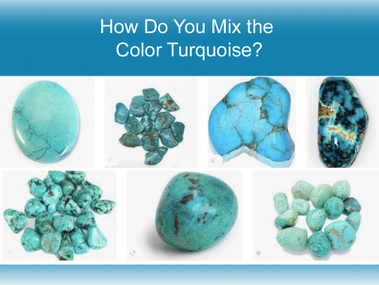
When we think of turquoise, many of us probably think of the stone. As you can see here, there is a fairly large range of hues.This got me thinking. What is the difference between aqua, turquoise and teal? Google did not disappoint. Here is one photo my researched revealed. I find it interesting because I have probably referred to all three of these hues as “turquoise” as some time or another . How about you?

Here is One Approach to How to Mix Turquoise?
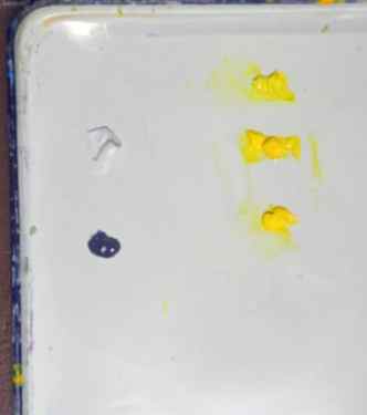
I did a little experimenting and determined the three main tube colors needed for mixing turquoise are: blue, white and yellow . The next questions are: which blues and which yellows? Intuitively, I made an assumption that my blue would be a green-blue and my yellow would be a green-yellow. However, after further thought, I decided I needed to include a red-blue and an orange-yellow to see what would happen. I wanted to see if I would be surprised.
For my green-blues, I chose cerulean, cyan and phthalo. I also included ultramarine and cobalt. Please notice that I label each of my blues with their brands. The hue of a tube color can differ from brand to brand as well as from medium to medium. For example, cerulean varies significantly, particularly in value, from brand to brand. You may have two different cerulean blues to explore.

My yellows are lemon, yellow light and Hansa yellow. There is no correct selection of tube colors. As I state often, be aware of the color bias of your primary paints and label their names and brands on your chart!
Below – and I apologize for the blurry photo – I show how I set up my palette. I squirted out a pile of white and then lined up the three yellows on the right. Then I squirted out one blue. After I had mixed my various colors with the one blue, I then wiped off the palette and moved onto the next blue.
Watercolorists: Since you rarely use white, this is one situation where you might want to try it.
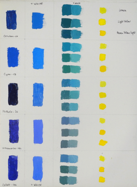
If you look at this cropped section of my completed chart, you can see that I painted a swatch of the tube blue, then I mixed it with white and applied that color to the chart.
To mix my hues of turquoise, I gradually added just a touch of yellow paint – one yellow at a time – to the blue and white mixture. As you know, the ratios you use will achieve slightly different results. Beware: it is easy to add too much yellow , which will give you green. There is no right or wrong to this sequence. For example, you may prefer to start out with a pile of white and gradually add your blue to it or some variation.
Below is my completed chart. Love these blues! You will notice that once I achieved my turquoise/aqua/teal hues and applied them to the chart, I then added more white. I could have continued to add white for paler shades.
As predicted, I was surprised by the results. Now I am motivated to try a few of these in a painting. Will you do the same?
Please send me any variations you may have for creating this color chart. Being aware of how to mix turquoise has been useful and fun to add to my color mixing arsenal. Thank you to those you who asked me. BTW, last year I was asked to explain how to mix sage green and my approach can be found in this blog.
I continued my turquoise research to read about its impact and meaning. Here is one person’s interpretation.
Turquoise is widely considered a calming color. Use it in paintings for a soothing effect.
A far cry from ordinary, the color turquoise is one of the more interesting shades on the color spectrum. Exuding both favorable and questionable attributes, turquoise embodies stability, open-mindedness, and relaxation. It also exemplifies uncertainty, emotional impulsivity, and immaturity. Overall, turquoise is a mind-blowing yet mysterious hue.
Are you going to experiment with how to mix turquoise? During this pandemic, creating color charts is one art making activity I highly recommend. It is meditative as well as a great learning tool.
Colorfully and gratefully yours,
Carol
PS if you have an artist friend who might benefit from this blog post please forward it along to them
Related Posts
- Mary Ann Lowrance says November 23, 2020 at 6:58 am
Hi Carol, I had the same question a short time ago. I mixed Cerulean and Veridian plus a bit of Yellow Ochre. It made a lovely Turquoise. I’m very pleased with it. I plan to try your 5 blues and see what I can come up with. I think it is always good to know how to coax the colors we want out of primaries. Being new to watercolor I have amassed a “large” collections of paints. Expensive mistake … to some extent. There are Daniel Smith colors I could never mix such as Trans. Pyrrol Orange and it is one of my favorite colors. Thank you so much for taking the time to post this info.
Thanks for this post. I can’t wait to try this. Turquoise is a color I have never been able to mix. Your book gave me much more confidence with understanding color.
Thanks Cora and I look forward to seeing your results. So pleased my book has given you more color confidence.
Hi Mary Ann, Interesting mixture. I will give it a try. Yes, there are certain colors — particularly for their characteristics — that one cannot mix. Having a solid foundation, as you know, of color mixing helps on deciding which ones to buy.
Hello Carol – so in the samples that you created, which one do you choose as turquoise?
Thanks – Charlene
That is completely up to you. We all see color differently and as I implied in the article there are many variations.
What Colors Make Turquoise?
A real, light turquoise color may be made by combining blue, green, and white. You should be able to achieve a pleasing cyan by combining the blue and green. Then, keep adding tiny bits of white until you achieve the shade of turquoise you want.
The recommended starting point for creating turquoise is a ratio of 2:1 between blue and green.
Using this procedure, you may easily increase the saturation of your blue-based turquoise.
Another way to create custom turquoise is simply combining the colors blue and yellow. In this method, a small amount of yellow is added to a base color of blue. For the most brilliant and true turquoise, go for a white-to-blue ratio of 1:6.
Popular Cyan Shades
When it comes to creating vibrant worlds, cyan is a must-have hue for any artist. Creating the cyan color requires us to take out red light from white. Cyan, a greenish blue, is easily modified to provide a wide range of tones in the blue and green spaces.
Turquoise, teal, aquamarine, and electric blue are all examples of the cyan color family. Here is how you can create some of the most common cyan shades:
Turquoise
The color turquoise may be thought of as a vivid blue. It’s a combination of green and blue and, therefore, has the same calming effect. Although the two hues share a name, turquoise and aquamarine are actually quite distinct.
While turquoise is a greenish blue, aqua is a bluer shade with green undertones that is frequently used to depict the ocean.
To create turquoise, you need to combine white, green, and blue.
Teal

Like other shades of blue, teal is linked to the sea and the natural world, and is said to promote emotions of serenity and composure. Contrast it with maroon for added contrast, or mix it with other colors of green for a refreshing effect.
To create teal, you need to combine white, yellow, and cyan.
Electric Blue

The English color term “electric blue” dates back to the middle of the 1840s and connotes a lively and dynamic quality. Use this vibrant shade in place of mellower blues for a splash of energy and vitality. In addition to going well with white, this shade also works well with a wide range of other bright colors, notably a fiery orange-red. Naturally, it also complements and combines well with any other tones of blue.
To create electric blue, you need to combine white and cyan.
Blue-Green

Turquoise’s blue-green version, a deeper shade of cyan, is likewise soothing and tranquil. A wide variety of fish and lakes display this color naturally, with the blue-green damselfish being an example. Try mixing blue-green with brighter blues and white for a glacier-inspired color scheme. The hue will pop even more next to oranges and yellows.
To create blue-green, you need to combine blue and green.
In terms of flexibility, colors belonging to the cyan group are towards the top. Generally, a speck of white may substantially influence a cyan tint to become brighter or darker. Moreover, this is a family of colors where intensity is particularly important. For instance, combining blue and green may yield significantly variable results, depending on which hue makes up the larger portion of the color mix.
Using Turquoise
All cyan tones, including turquoise, stand out among specific colors. When incorporating turquoise into a color scheme, you have some flexibility in how you may use it. The complementary color to cyan is red. As a result, if you match red with turquoise, you’ll be impressed by how striking the combination is. The striking effect achieved by combining turquoise with other hues, however, may not be to everyone’s taste.
Subtractive color theory allows for a variety of turquoise and magenta and yellow color combinations. Naturally, these two choices do not provide a color scheme that could be called conservative. When going for a more subdued appearance, try pairing turquoise with deeper blues rather than other cyan tones.
The combination of turquoise and deep royal blue will produce a luxurious, multilayered effect. You can also make turquoise stand out while yet being conservative by pairing it with cool grays. This helps to maintain a bright color scheme while also giving a painting or room a sense of depth.
Finally, when combined with white, turquoise creates a breezy, beach-like aesthetic. Painting waves over white sand, painting a colorful backdrop behind white cabinets, or pairing white khakis with turquoise dress shirts are all excellent examples of where these colors work well together. White and turquoise are a classic color scheme that evokes the carefree spirit of the islands.


