It’s easy to make your home lovely in the eyes of buyers, easy when you know-how. Learn how by downloading my eBook DIY Home Staging Tips to Sell Your Home Fast and for Top Dollar. You are just two clicks away from staging today!
Basic steps for painting roses
Today we’re back in the kitchen to show you how to create a lovely picture of flowers using more paint and vegetables. We’ll make cabbage roses from celery and romaine hearts. Doesn’t it sound romantic?
Here’s what you need:
Pencil
Ruler or T-square
Posterboard to fit a frame you have
Plate covered with saran for palette
Craft paints
Foam brush
Bunch of celery
Head of romaine lettuce
Knife
Plain paper for test-printing
Paper towels to wipe potatoes between color changes
Poster frame and foamcore for backing.
Step two: Prepare to print
Using a pencil, lightly draw a border a few inches inside the poster board outside edge so that your artwork will have some white space around it. Make the border equal on both sides, and slightly wider on the bottom than the top (see photo above).
Place blobs of each of your colors on your palette. Cut the bottom off the celery, about 4 inches from the bottom. You’re using the heart of celery for printing, so push the celery stalks out to make space between them. Slice the lettuce 2 to 3 inches from the bottom.
| If you prefer, use a paper plate instead of a saran-wrapped dish. I used more than one romaine heart to add some variety. They don’t need to be fresh. |
Step three: Paint and print
Using the foam brush, generously cover the cut ends of the celery heart with paint. Place the lighter colors in the outside of the “bloom” and add a dab of the darkest color to the very center. Test what a print will look by pressing this painted end onto the plain paper. Print celery flowers at spaces all over the area inside your pencil lines. Do the same with the romaine.
You don’t need to wash or wipe your brush between colors. They will mix on your brush and on the cut celery and lettuce ends. If you find all the paints on your palette have been mixed into one color, add a small amount of fresh paints to your palette, and continue.
| Press the lettuce heart firmly on the paper, but don’t wiggle it. |
| You can crowd your blossoms tightly together, or not. I like to space them across the paper, reminiscent of old-fashioned wood-blocked wallpaper . |
Step four: Wait and finish
Allow your print to dry thoroughly, probably overnight. Add your signature to the lower right corner, just inside the pencil line, and write the name of your picture in the lower-left corner. Make sure you are signing on the bottom of the print (the one with the wider border). Carefully darken the pencil line if you like its position, and you want to create the illusion of a mat surrounding the rose prints. The best way to do this is to have a T-square, but a good ruler will do if you measure carefully so your corners are square. You can always erase and draw it again.
| Drawing a line around the art is a simple way to upgrade the poster-sized art to look at first glance like it has been matted . |
How to Paint Peach Roses in 5 Steps


What is it about roses that has beguiled artists since the early Blue Bird Fresco created almost 4000 years ago? Why do so many oil painters love to paint roses?
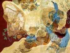
Blue Bird Fresco – About 1550 BC in Knossos
If you feel compelled to craft your own rose masterpiece and some poor misguided soul seeks to dampen your enthusiasm with a statement such as ‘it’s already been done’ – look them in the eye, and with a twinkle in your own, cheerfully proclaim that with tens of thousands of species on this grand planet – not likely!
Ready to get started with the 5 steps to paint peach roses?
5 Steps to Your Own Peach Roses
Step 1

Step 1 – paint peach roses – The background washes were accomplished in two basic steps
The background washes were accomplished in two basic steps – starting with a lighter, cooler layer of blue and tan and then adding some quick free-flowing brushstrokes that mimic leaves and ambiguous distant plants.
The cool blues and greens are a stark contrast to the painting completed several years ago, with the dark warm burnt sienna hues. These new colors and values were an experiment to see if the subtle value differences were enough between the roses and background colors to allow ample separation. My hope was that the harmony of blues and greens to the peach and darker reddish orange hues would achieve that separation of elements.
Step 2
When my background is created with abandon, focusing on fun rhythmic movement of shapes and textures with thinner transparent brush strokes, and meant to be done in one application and then left, I am much more careful with the initial drawing and hesitant to make major changes because of the complexity of recreating the spontaneous feeling that is created in those loose layers.
Unfortunately, this was a case of ‘the best laid plans of mice and men’. I soon realized I had placed the roses too close to the left side which threw off the compositional balance, and would have left an uncomfortable tangent between a future frame and the farthest petal edge of my left-side rose.
So, using my paper towel I said a tearful goodbye to those roses and commenced to move them over to the right a bit.

Step 2 – paint peach roses – my background is created with abandon, focusing on fun rhythmic movement of shapes and textures
Step 3
Fortunately, most of the initial petals are shaped with single manipulated brushstrokes – placing a flower petal or leaf in quickly. I’m concentrating much more on visually exciting shapes than on making stereotypical roses or leaves. Using Flats for my paint brushes allows me to travel from a sharp point on the tip of a leaf to the widened center area and back to the tapered stem in one fluid stroke.
The rose colors are created primarily from a mix of cad yellow medium and quinacridone red in the more saturated darker middle value hues.
Notice at this stage that I am also playing with my darkest accents and my brightest highlights to establish my overall value range. I also begin adding a variety of stems, leaves and branches to increase the visual energy and movement in the painting.

Step 3 – I’m concentrating on visually exciting shapes rather than with making stereotypical roses or leaves
Step 4
Using much thicker paint to increase the textural appeal of the painting, I begin to cut back into and shape the roses to increase the delicate appeal of the petals, and to successfully separate one rose from the other.
One of the obvious and very attractive differences between oil paint and watercolor is the ability to correct mistakes. Oil painting does not require nearly extent of preplanning that watercolor does – it is much easier to follow spur of the moment inspiration and ideas.

Step 4 – Using much thicker paint to increase the textural appeal of the peach roses painting
Step 5
Step 5 is all about the refinements. Once the major shapes and colors are worked out, the rest of the painting is simply a matter of playing with lines, accents and highlights until the entire setting feels natural and engaging.
I love using a small pointed round or the thin edge of a flat brush to draw in wispy stems and tiny accents of strong colors like a splash of crimson to give the painting sparkle and depth.
How much we add or leave out is left up to the instincts and whimsy of the artist – there is no right or wrong – we all have unique personalities and interests. Go with your gut and have fun with it all.
A Roses Oil Painting Sanctuary
Do you ever dream of a summer sanctuary during the frosty winter months – roses cascading over cleverly trellised archways and arbors, fragrantly filling your thoughts with smiles of remembrance? We artists weave magic with our painted tapestries – a magic powerful enough to transport the weary soul to that welcomed sanctuary.
Each of these rose paintings was inspired by roses Kristie and I have grown around our home. Each year we try to plant some new flower that’s a bit different from anything we’ve planted before. One flower remains consistent – roses. I finally purchased some gloves this Spring for pruning those prickly bushes (they’re made of goat skin and are undeniably incredible – I gritted my teeth, grabbed a stem and squeezed as strong as I could – nothing – I can’t believe I went all these years without them).
Sun Kissed 12×16 Oil Painting by Bill Inman

Glowing 8×6 Oil Painting by Bill Inman

Striking 8×10 Oil Painting by Bill Inman

A Dance to Remember 10×8 by Bill Inman
Now let’s see the entire process from start to finish in a fast motion video to bring it all together:
Conclusion
I think it’s safe to say I’m a little bit obsessed with roses, both outside and on the canvas. I know I’m not alone in my passion for this flower, but so many artists still fear painting them. In fact, we recently published a 2.5 hour instructional video featuring these Peach Roses and dozens of artists commented on how grateful they were because they have had such a difficult time mastering this particular flower. Let’s break down the steps and demystify the process a little, and hopefully you’ll feel comfortable creating your own rose masterpiece.
If you’re a current Master Oil Painting Monthly Member you can view the full 2.5 hour art instructional video that shows how to paint peach roses by logging in here:
If you’re not a Monthly Member and would like to view this video, along with the entire monthly training library, you can learn more here:
What’s your favorite flower to paint?
Pastel painting – a bunch of roses
Working with Schmincke’s finest extra-soft pastels leads you back to the origin of colour and is a real painting experience rather than simple drawing. Our step-by-step painting “Roses” varies several soft graduations and is an ideal working example. Enjoy!
- Image as a pattern, e.g. a printed photo
- Painting ground, e.g. cardboard
- Schmincke PRIMAcryl ® finest artists´ acryliccolours Translucent violet (13330)
- Transparent primer (50516)
- Wide hair brush, possibly a small paint roll
- White chalk pen, grease-free, here: Faber-CastellPitt Pastel)
- Schmincke finest extra-soft pastels for thisexample: White 001, Permanent yellow 1 lemon002, Titanium yellow 007, Ochre light 013, Goldochre 014, Pozzuoli earth 021, Olive ochre light028, Olive ochre deep 029, Vandyke brown 036,Walnut brown 038, Permanent red 3 deep 044,Madder lake 045, Carmine red 046, Rose madder047, Leaf green 1 072, May green 077, Neutralgrey 098; all pastels preferably as pure colour (D)as well as in one white graduation (H, M or O).
- Schmincke Pastell Fixative AEROSPRAY (50402)
For a dark coloured ground, apply PRIMAcryl ® Translucent violet with a wide hair brush. To achieve avivid surface, change the thickness of the colour layeras well as the direction of colour application severaltimes. Let the colour dry.
To make the ground suitable for pastel painting, applya layer of the Schmincke Transparent primer (50516). Use a wide brush or a smaller paint roll. Let theprimer dry.
Use the photo as a pattern and make an outline sketch of the roses with the white chalk pen.
Now the pastel work starts. Paint the shapes of the flowers with the lighter rose colours. For a delicate background blur the pastel application slightly with your finger.
Now the flowers will be painted with more intense rose and red shades as well as with the lightest colours and white. Thus, you create shadow and light areas. Flower bottoms and enclosed petals will be pointed out using yellow and ochre colours.
For the background, you can use the colours green, Vandyke brown as well as neutral grey in different graduations. Stalks and deep shadows will be accentuated even more.
Finally use the white pastel stick to underline some last lights.
Important: Pastel paintings always remain sensitive. Therefore, they should only be treated with a special fixative after finishing work. We recommend for example Schmincke Pastel Fixative AEROSPRAY (50402) or Pastel Fixative (50068). Spray from left to right and top to bottom from ca. 30 cm. Make the change in spray direction away from the picture. The intensity of colour might slightly be increased.