How to Paint Watercolor Pine Cones (The Easy Way)
The thing about pine cones is they have a very complicated appearance. For this reason they seem like very tricky subjects to paint.
In this article I’ll show you how to simplify the process of painting pine cones in watercolor.
These prickly little things are a great subject for practicing your painting skills. And where I am at this time of the year there’s an abundance of pine cones. They’re easy to find… My garden is cluttered with them !
So next time you’re out and about try collecting a few to set up your own still life composition. Or if you prefer you can download the worksheet and outline sketch for this exercise and paint your own version using the step by step example below.
Painting Pine Cones in Watercolor
Pine cones can be a daunting subject because they look so complicated.
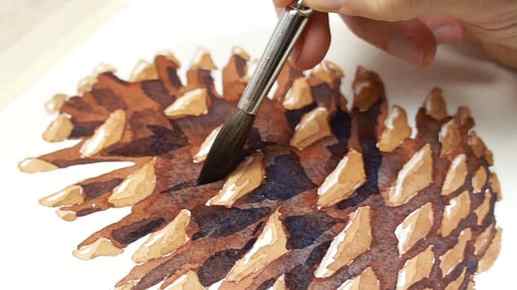
Here’s an example of what I mean. The overall form of the cone is somewhat similar to an egg. But the whole thing is broken down into a multitude of uneven scales (yep… that’s what they’re called apparently).
The best way to simplify complex organic forms like this is to break the subject down into simple big shapes using the main differences in value as a guide.
(As a quick reminder: value in art simply refers to the lightness or darkness of a given hue).

In the case of this pine cone, it’s easy to see that the outer tips of the scales represent the lightest part of the object. These can be grouped into a single set of light valued shapes, which can be isolated and painted first using a light range of colors.


On the other hand, the inside of the scales is in the shade (darkest values). This part of the cone painting can be considered as one large dark shape. So to complete the painting of the cone you can just fill in the shape in between the tips of the scales using a dark toned mix of paint.

And if you want you can then add more depth to the painting by adding some brush strokes of darker paint to the underside of a few scales.
The whole thing can be done in a few layers of watercolor.

Splitting darks and lights into simple groups of shapes like this is an excellent way to organize your painting process and make your watercolor paintings easier to handle.
In art, this is known as defining the “value structure”.

The hard part is training yourself to recognize differences in values. One trick you can try is squinting at the subject to blur the details, and help you to see the big shapes more easily.
Watercolor Pine Cones – Step by Step

Try this painting for yourself ! Click the button below to download the worksheet for this painting.
The colors I used for this painting were as follows (links to Amazon) :
- Burnt umber – Pigment number: PBr7
- Hansa Yellow Deep – Pigment number: PY65
- French ultramarine – Pigment number: PB29
- Paynes Gray – Pigment number: Pb29 PBk9
Start by painting the tips of the cone’s scales using a diluted brown color. As you can see I’m leaving a small part of each shape untouched to represent the highlights. This is a watercolor technique known as “reserving whites“.
When the first layer of paint has dried, you can add some more brush marks to the underside of each tip. Painting successive layers of paint onto a dry surface like this is a method called “glazing“.
This helps give a 3-dimensional feeling to the shapes , with the white highlights suggesting the faces turned up towards the light, and the darker glazed brush marks suggesting the shaded faces turned downwards.
Leave the paint to dry again before moving on to the next stage.
Now you can start filling in the rest of the pine cone shape by painting around the tips with a darker toned brown mixture. Treat the whole of the shaded parts as one big shape and paint everything in one go.
I used a medium reddish brown for this layer of color. Then, before the shape has time to dry, I dropped in some brush marks of darker neutral brown to intensify the shaded centre of the cone.
To make a neutral color like this you can start with a brown paint such as Burnt umber and add some of it’s complementary color – in this case I used French Ultramarine (complementary hues are colors that are opposite each other on a color wheel).
Leave the painting to dry completely before adding the final touches.
To intensify the shadows underneath some of the scales I used a mix of French ultramarine with a small amount of burnt umber. This produces a neutral blue mixture, but because this is applied as a glaze over the top of a red hue, the transparency of watercolors allows the two layers to combine to produce a gray appearance. This is one of the characteristics of glazing in watercolors.
In essence, the successive layers of paint merge to produce a new color appearance.

Finally, if you want to add more depth to your cone painting you can add some cast shadows underneath the pine cone using a diluted mixture of gray. To do this, dampen the surface of the paper first so that the gray paint spreads out to produce a nice diffused edge to the shadows.
Now go grab some pine cones !!
Beginner-friendly instructions for painting a pine tree

When looking through my watercolour journal, I realised two things: trees remain my favourite thing to paint, and the theme so far is somehow season-related. Totally unplanned, but the pages transition from autumn to winter. More on this later.
Since I so love forests and trees, I figured I could show you how I like to paint them. I have three different looks for you today, and the bonus is that all three are beginner friendly.
Before we start though, please check out my watercolour pencil tricks post. This is a great place for beginners to start, and explains some of the techniques I used to paint these trees in more detail. If you’d like to have a look at all of my tutorials so far, this is where you want to click.
The first tree is a slender, graceful autumn coloured specimen. Specimen? Yep. I have no idea what tree this is, sorry. My father-in-law is going to have a thing or two to say about my lack of nature knowledge.
Okay. For this one, I used dark cadmium orange, dark chrome yellow and light green for the leaves, and walnut brown for the base. I kept the walnut brown close for the other tree bases too – it’s such a versatile bark colour.
The first step is to sketch out the trunk and branches with the brown. This particular tree has reaching branches that are all more vertical than horizontal. Think tall. The thinner and finer a line, the farther and smaller it will seem – perfect for those higher reaching branches. On the flipside, thicker, stronger lines make for closer, heavier branches. Keep the trunk thicker and the highest branches slim, and by George, you have a tree.
I left gaps between some of the branches to fill in with leaves later.


Step two, paint the branches with water. Easy peasy. If you’re going to do this with watercolours and not the pencils, just dilute the paint more for the higher, thinner branches, and focus the most pigment around the trunk.


Step three is to add the leaves. I coloured in random patches of green, yellow and orange, keeping the pressure light to medium. With trees, I want more control over where the pigment goes as far as the leaves are concerned, so I always work in at least two layers. The first is just to lay down a base, and the second is to enhance the colours.


So, after placing my colour with the pencils, step four is to add water. I kept the pressure to the paintbrush to a minimum and tried to use swirling and squiggling motions while I painted.
The most important thing here is to keep the outer edge of the tree uneven. Except if you’re painting a perfectly trimmed shrub, of course. Trees in forests usually don’t come with gardeners, so try to keep it organic and a little wild.
Also, don’t be afraid to go over the branches. If the brown pigment bleeds into the leaves, that’s fine. In some places, the leaves may be slightly thicker, so just the silhouette of the branch may be peeking through. A blurred branch will have that effect, while a perfectly crisp line will seem like a branch that is completely visible through a gap in the leaves.


While the first layer was still wet, I added splotches of colour using the wet on wet technique we spoke about in the watercolour pencil tricks post. I told you that one would come in handy.
There’s no science to the colour placement – I took my lead from the first layer and just brightened what was already there, or added random pops of colour where I felt they lacked. Do what instinct dictates, your eye already knows which colour goes where.
I also added some splatter with the yellow and orange pencils, just because I like doing that. It’s soothing, okay?


Congratulations, you’ve painted the first tree!
Next, we’re painting a fir tree. Yes, I actually know the name of this one! It’s my favourite in a forest setting, so I paint it often. It’s also the easiest tree there is to paint – you literally can’t make a mistake with this one.
I used walnut brown for the trunk, and pine green and earth green yellowish for the leaves.
First, I drew a vertical line – this is the guide for the tree’s length. Then I plotted out the general direction of the branches. I don’t usually do this, but hey, it’s a tutorial.


Using the wet on dry technique and the pine green pencil, I started painting the leaves from the top downwards. It’s this simple – keep the lines irregular, at a diagonal angle, and flick every third or so brushstroke upwards.


Keep going until you have a tree.

The same as with the last tree, I went back in for the second layer while the first was still damp, again using the wet on wet technique. I added scattered lines in pine green to add some tonal depth to the tree. Once the darker tones were in place, I repeated the process with the lighter green (earth green yellowish) to add even more tonal depth.


See what a huge difference that second shade of green makes? The tree would have been fine with only one shade, but the second adds a lot of depth and vibrance.
Finally, I added a peek of the trunk at the bottom, and the second tree was done.
Okay, our third tree is similar to the first, except it’s short and stout. My kid has been singing ‘I’m a Little Teapot’ so often lately, I guess that’s what inspired this.
I used five pencils for this one: pine green, leaf green and earth green yellowish for the leaves, and burnt ochre and walnut brown for the branches.

First, using the ochre, I lightly plotted out the shape of the tree. This time, we have fewer branches visible at the top, because we’re painting a summer tree, chock full of leaves.
Second, I added some walnut to the shadowy parts.


Third step – add water.


While the paint was still damp, I added some more walnut brown in swirling and dotting motions, to add that bark texture to the tree. I also darkened the upper branches, since they’ll be in the shade cast by all the leaves.
There’s nothing to this step, it’s random and organic. If you ever feel you’ve added too much pigment, just dilute it with an extra drop of water and let the paint do its thing.

Next, I plotted out the colour and shape of the leaves, like we did with the other trees. The lightest shade of green forms the base colour, the middle shade creates medium shadows, and the darkest shade makes up the deepest shadows. My only tip here is to place the deepest shadows directly next to the medium shadows.


Next, you guessed it, add water. Again, irregular edges are your friends. I added random dots and squiggles to the edges, to imitate single leaves.


As always, while the first layer was still damp, I added leaf green, then pine green with the wet on wet technique to deepen the colours and shadows.


Et voila! You have three watercolour trees.

Easy, charming and such a stress-reliever. I highly recommend taking an afternoon and painting some trees. Your anxiety will thank me for it later, I promise.
Thanks for stopping by!