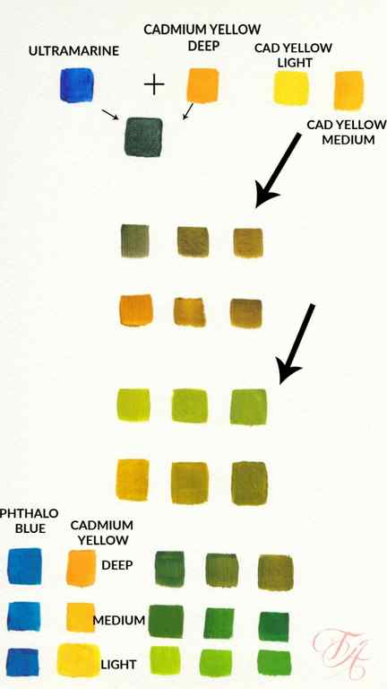
Here is a chart you can use as a guide when mixing some of the blues and yellows to mix green. It may not look exactly like yours due to the differences in computer screens but it will give you a general idea of the hues you will get.
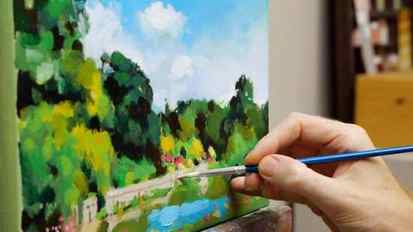
How to Paint Green Summer Trees with Acrylics
Love it or hate it, almost all landscape artists want to paint trees, woods and grass realistically.
But mixing greens can be one of the major issues that can start to throw your landscape painting off-course.
Greens can be an Achilles heel for beginners, and the urge to grab a vivid, bright green from the paintbox can be hard to resist.
In the past, I’ve demonstrated how you can achieve some surprisingly subtle greens by using some seemingly ‘non-green’ colours such and black and brown.
And I advise beginners to throw out their pre-mixed green (usually this is Emerald Green included in starter sets) when they’re first starting, in order to practice colour mixing with acrylics and develop their own mixing skills and gain colour confidence.
Because greens with a high-tinting strength can easily put your colour mixes out.
Tinting strength is how much or how little paint is needed, to alter the colour of white paint.
In acrylics, this can be especially dangerous because you tend to have clean mixes on top of dry paint, so there is nothing underneath to mix in with it to help tone it down – unlike oils where you are usually applying wet-into-wet.
For this Summer Landscape study, I want to show you how to mix naturalistic green using 2 or more colours first – and then as we become more practised, we are going to live life on the edge when I introduce a high tinting pre-mixed green to your palette to speed up your painting process.
Using a pre-mixed green
There is one green that can give you a lot of bang for your buck.
It comes in two different shades, a yellow shade and a blue shade.
The yellow shade brings out the yellows and gives a more vibrant yellow-green; the blue shade goes darker towards the bottle green-blues. I’ve found the yellow shade can work best for greens that are in the sunlight and blue shade when painting greens in the shade.
But they’re very close, so I personally tend to use a Phthalo Green yellow shade, and if I need a darker shadow tone, I add in Phthalo Blue, which I nearly always have on my palette.
Interestingly it’s also used as a key ingredient within many other pre-mixed greens.
Here is a list of paints from Winsor & Newton that contain Phthalo Green:
- Permanent Green
- Cadmium Green
- Emerald Green
- Chrome Green
- Hookers Green
- Sap Green
You can check if a green paint contains Phthalo green by looking at the Colour Index name on the paint tube and is usually only available on artist quality paints (See: The 8 key differences between Artist quality vs Student grade Acrylic paints)
- Phthalo Green (Blue Shade) Color Index Name: PG 7
- Phthalo Green (Yellow Shade) Colour Index Name: PG 36
Pro tip: Winsor & Newton sometimes refer to their Phthalo Green as Winsor Green, they also refer to a Phthalo Blue as Winsor Blue.
How to Lighten Green Paint
The two most common colours you’ll be using for lightening up green are white and yellow.
A white will always flatten the green and send the colour towards a minty green; yellow will always warm a green. You can change the intensity of the yellow you’re using depending on the subject and feel you’re after.
I want a wide bright tonal range in this painting, so I’m using a Cadmium Yellow Light.
Pro tip: An alternative to Cadmium Yellow is Hansa Yellow Medium, I do demonstrate in this demo with a Hansa Yellow Light, which is a greener, lighter, more translucent yellow. Hansa Yellow Medium has a warmer hue and more opacity.
Style of Painting
First you have to decide which style of painting you are doing. Do you want to paint a hyper realistic group of trees, a more painterly style, an abstract tree, a comic book type of tree or something completely your own style. Whatever you decide to paint it’s best to start with a few tips on color mixing your greens.
**This page may contain affiliate links to products I have used or recommend. If you purchase something from this page, I may receive a small percentage of the sale at no extra cost to you. For more information click here.**
Color Mixing for Trees
Your palette for painting trees doesn’t necessarily need to include a tube of green. Most beginner painters have bought a set of paints for beginners such as this one.
The green included in this is not ideal for trees on its own. It needs to be toned down, lightened up a bit to give the necessary highlights and shadows to make your tree more dimensional.
You can mix several shades of green with a palette of blues and yellows to give your scene more interest and give you more flexibility over with colors in your painting.
A good palette to start with would be ultramarine blue or Phthalo blue, cadmium yellow, burnt umber, white and alizeran crimson and a tiny touch of black for painting leaves and trunk.
If you don’t have these exact colors, spend some time playing around with mixing what you have to get the colors you are happy with. Use more than one shade of green for your trees and any foliage around the trees.
Here are some basic mixes with Cadmium Yellow mixed with Ultramarine Blue and Phthalo Blue. There are many, many more combinations you can mix to get almost any color you want. Add more yellow to make them lighter or more blue to make them darker.
Be aware too that the colors may be slightly different on your computer. Also, there may be a difference among the brands of paint. It’s best to make a chart for yourself before you begin painting to see what colors you have and what mixes you can make.
You can also use a bottled green such as sap green or phthalo green and mix it with either a blue or yellow to lighten or darken it.
Not All Trees Are Green
Not all trees have green foliage. Some, like Japanese maples, have dark red or reddish brown leaves.
If you are bored with painting green leaves or just want a pop of color in your landscape you might think about painting a flowering tree or maybe doing a fall picture with all of its colorful yellows and oranges.
Winter scenes can also be interesting and beautiful with ice and snow glistening on bare branches or little bits of evergreen peeping through on branches heavily laden with snow.
You can also do a whimsical painting using one or two of your favorite colors that are not traditionally used in tree. Use various shades of purples and blues for example to render a unique look. It would be a fun exercise in how to understand tones and values in painting.

Don’t Paint Branches Like This!

Paint a vertical line to position the trunk of the tree you’re painting. Then widen it, using lighter and darker tones of your basic bark color to give form to the trunk, to make it appear 3D not flat. Remember to paint some roots too; large trees don’t emerge from the ground in a straight line.
It’s a common mistake to paint branches to the left and right of the trunk, in neatly aligned pairs, as shown in the photo. Trees don’t have branches only on two sides of the trunk, there are branches from all sides.
If you make this mistake when painting a winter tree without leaves, or a small-leafed tree with an open structure, you’ll need to scrape the branches off or paint over them, perhaps even start again. But if you’re painting a tree with lots of dense foliage, you can hide the mistake by painting over it.
of 06
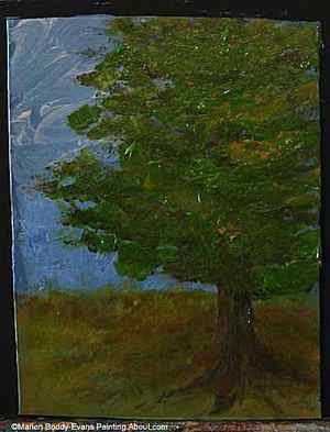
Painting Leaves on the Tree

As I said, if you’re painting a tree which will have lots of green foliage, it doesn’t matter if you’ve painted the branches wrong because you’ll cover over most of them. If you’re wondering why you’d bother to paint the branches at all if they’re going to be hidden, it’s because you still see little bits of a branch between leaves. It’s easier to paint the leaves on top than little bits of the brown branch between leaves. Also, the browns of the branches help create tonal and color variation in the greens if you’re painting wet-on-wet and mix the colors together a bit or using transparent colors.
When painting leaves on a tree, use small short brush strokes. You want to create layers of mark-making which will create a sense of depth, not have large areas of smooth, flat color.
Keep going and soon you’ll have your finished tree painting.
of 06
Finishing the Tree Painting
Keep going, doing more of what you’ve been doing. Add in more brown for branches or blue for the sky if you’ve filled it in too much. Add a touch of yellow on the side the sun is hitting the tree, and a touch of blue to darken the green on the shadow side. Don’t forget to use a little of your leaf colors in the grass below the tree too.