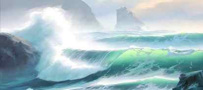
How to Paint a Breaking Ocean Wave
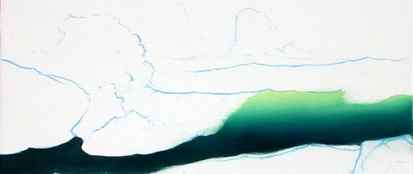
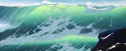
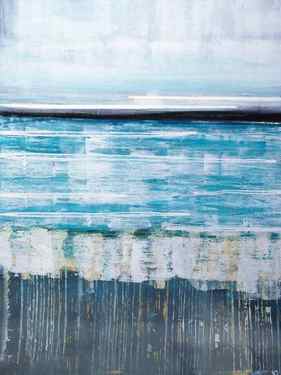
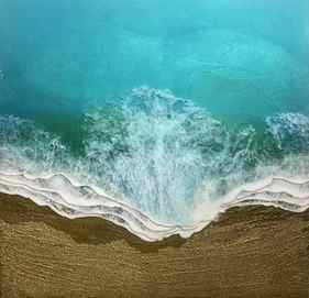
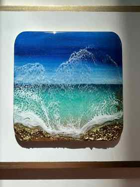
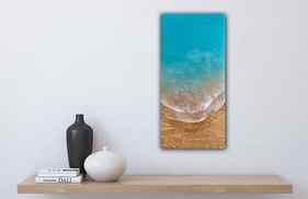
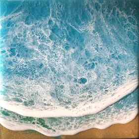
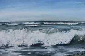
While the images in this are part of a completed painting, this demonstration will center on the structure and contours of the basic breaking wave. The completed wave – including the breakover, transparencies, foam patterns and foamburst – is shown below as a guide to the finished composition.
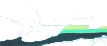
Now that I have my composition in mind, I use a liner brush and any light blue color to sketch the outline of the painting. I’ve found that sketching my idea with as much accuracy as possible will insure the best results. If time permits, I allow the sketch to dry before continuing with the next step. If the sketch is dry, I know that I can always return to it if I lose my original composition (something I seem to do all too often!) Mixing a small amount of thinner with the color will hasten the drying time.
Although there are many ways to begin a painting, I usually start with the center of interest. Establishing a strong “identity” here prevents other areas of the painting from becoming distractions. In this painting, I want to draw the eye to the transparency as the focal point of the painting, so I’ll begin by brushing in the colors on the face of the wave.
With my palette knife, I mix touches of Emerald Green and Lemon Yellow with a small amount of white. Using a flat sable brush, I lay on a thin band of color at the top of the wave. I want the lightest tint at the crest, where the wave is thin and translucent. Adding more Emerald Green to the mixture gives me the second band of color across the center of the wave. The color at the base of the wave is more difficult to achieve. Using Viridian as the base color, I add a touch of Alizarin, a complement, to gray the hue. Alizarin is a much stronger color and will rapidly dominate the mixture. I mix it into the Viridian cautiously, a little at a time, until the color is a balanced gray-green. If the color appears too dark, I add a trace amount of white to dull the intensity. When the color is satisfactory, I use it to fill in the area at the base of the wave. Now it’s time to blend the color bands.

I use a #14 or #16 flat sable for blending the color bands. Laying the brush tip against the canvas as shown in the inset, I lightly brush back and forth across the canvas as if I were painting a board. As I paint, I move the brush up or down slightly to bring the colors together. It takes a little patience to blend the color bands evenly. I’ve found that controlling the pressure of the brush on the canvas is important. A heavy pressure will pick up too much paint on the brush tip and cut the color back to the canvas. A lighter pressure will allow the color to blend evenly. I also try to keep the brush clean and dry. After I’ve made several blending strokes, I wipe the brush tip gently on a dry cloth to remove excess color. The result should be an even blend from the lightest area at the crest to the darker color at the base of the wave.
For the shadowed areas in the foamburst I use Viridian and Alizarin Crimson with white as a base – this time with a touch of blue in the mixture. If the color appears too bright, a small amount of Burnt Sienna may be added to gray the mixture. I use a small filbert to fill in the color at the base of the foamburst and around the rock, leaving areas of canvas for bright and secondary highlights to be added later. I have also added some color at the base of the spill, just above the foamburst. Next, I used the flat sable to paint in the deeper undercolor at the center of the spill. A thin band of the transparency color is painted in at both sides of the spill. Again, the sable brush works well to blend the three areas uniformly.
A thin line of shadowed foam color rolled up the right edge of the spill and across the top of the transparency gives contrast to the break. Next, using the liner brush, I roll in lines of color from the bottom of the spill upwards to the top of the wave. I occasionally wipe the brush gently on a cloth to remove the residue before adding more of the lines. The lines curve as they reach toward the top of the wave, giving an appearance of roundness and depth. After completing several of the full lines, I add shorter strokes to break up the rigidity. Tiny u-shaped cross-strokes on the lines are added to show the fall of the water. Finally, the entire breakover and foamburst are softened with the blending brush.
Water below the foam patterns is roiling from the disturbance of the surge that has passed. As the patterns boil, the surface appears almost white from the aeration. When the water has quieted behind the passing wave, the foam begins to break apart and dissipate.
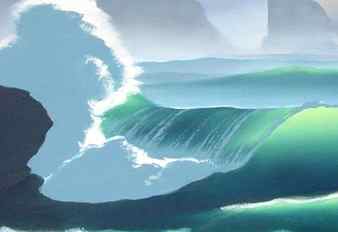
The animated example at left helps too better understand the shapes of the patterns on the breaking wave. The first view in the animation is the edge of the circle seen at eye level. No center color is visible. Likewise, openings in the foam at the base of the wave are not visible because they are less broken and we are viewing them at eye level. Next, the circle turns vertically and some of the color comes into view. The pattern has now become an elipse as the wave face lifts it up and it begins to stretch and break apart. As the circle turns into full view, the pattern would be on the vertical face of the wave. If the wave is breaking, as in the painting, the pattern image reverses and becomes even more broken as it moves up and under the curl.
Perspective is also a consideration in shaping the patterns. In this painting the wave is breaking at a slight angle to the left, allowing us to view the “curl” or “pipeline” under the break. The foam patterns will be stretched vertically to mirror that perspective.
Now for the fun part! Using the liner brush and the shadow-gray, I begin to form the patterns on the face of the wave. The shapes of the patterns used on the breaking wave occur on more complex wave structures as well. Moving swells, crosscurrents, backwash, water breaking over rocks. all have their own dynamics and beauty.
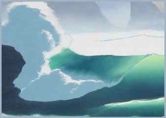
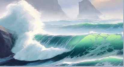
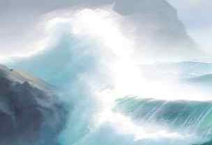
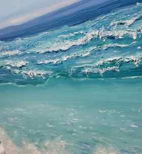
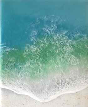
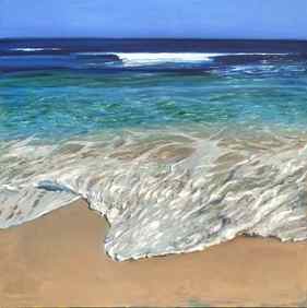
The small images demonstrate some of these dynamics. The shapes of the patterns show the water movement and enhance the depth of the image. The first shows foam patterns on quiet water. They appear to follow the gentle swell. The second image shows deep water off rocky shores. Because of backwash and obstructions, the water is in constant turmoil. In the third image the surf has broken against the headlands and is surging back against an incoming wave. Here the water is compelled by many opposing forces. I try to visualize the action of the water as I work, using the patterns to show direction and movement of the surf.
To finish the white highlight at the top of the wave, I load one side of the brush tip with the white highlight mixture, turning the loaded side of the brush down and holding it at the wave crest. “Squiggling” the brush away from the color and horizontally across the canvas leaves a heavier ridge of paint across the top of the foamburst. A smaller filbert works well for highlighting the foam in front of the break.
Glazing may be used to give depth to color, soften harsh areas of color, change a hue, or even create a different mood in the painting. Glazing is the application of trace amounts of color pigments in a transparent medium. In this I’m using the glazing process to refine and soften the areas of foam. In the areas behind the wave crests and especially around the top of the foam burst, I’ve tinted the glaze with white and worked it into the foamburst with a larger blending brush. Loose, free strokes help to give the illusion of movement. The white has been blended to create the mists left behind the breaking wave, while the burst has sharper strokes left unblended.
Touching the tip of the large sable brush into combinations of pure colors such as Winsor Blue, Viridian, Alizarin, or Burnt Sienna, I mix them with enough of the glazing medium to make the color transparent. Now it can be easily smoothed over the patterns on the front of the wave, allowing the underpainting to show through. “Cutting” some of the glaze back to the undercolor can be an effective way of forming ripples in the water. I dip the tip of the flat sable brush into thinner and touch it lightly to a soft cloth. To create lines of lighter color, I turn the brush on edge, drawing it upwards and across the patterns. Color variations will occur. It may take several tries, but I repeat the process until I’m satisfied with the final image. Adding the background, rocks, and foreground, and it’s finished! Thank you for painting along with me.
“The Breaking Wave”
Oil
12 x 16
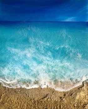
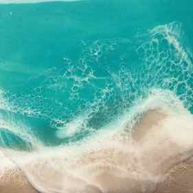
How to Paint a Tropical Ocean Wave with Oil Paints: Step by Step

Learn how to paint a tropical ocean wave with oil paints, step by step in this tutorial. This is a tutorial perfect for intermediate and beginner artists.
Oil paints are perfect for painting seascapes, because they dry slowly. This means you can create soft blended edges in the waves and water textures, giving the painting a realistic impression.
Not too many supplies or colours are needed for this painting tutorial, I used five different colours, two blues, one yellow, white and an earth colour. This allowed me to mix a range of turquoise and marine shades.
If you have acrylic paint instead of oil, you can of course follow along! I would recommend using a medium to make the paint slow drying and runnier in texture.
Disclaimer: Fine Art Tutorials is a reader supported site. When you make purchases through links on this site, we may earn a small commission at no extra cost to you.
Contents hide
How to paint the ocean: video tutorial

Start by mixing the sky gradient. Skies are lighter towards the horizon, so mix a dark shade for the top of the painting and a light shade for the sky horizon. Then mix transitional shades between the darkest and the lightest colours. For the sky, I mixed ultramarine blue, with a tiny amount of burnt umber to neutralise it slightly. Then I increased the proportion of white for each transitional shade. There is quite a contrast between the value of the top of the sky colour and the horizon.
Distant ocean colours

The colour of the sea on the horizon leans more towards green than the colour of the sky. Use phthalocyanine blue, mixed with a small amount of burnt umber, lemon yellow and a touch of white. The mix will be roughly 3 parts blue, 1 part yellow, then a tiny amount of burnt umber and white. Create some lighter, separate shades of this colour by adding some more white. This way, you will have a gradient from the sea horizon to the top of the breaking wave.
Breaking wave colours

The top of the breaking wave lets lots of light through, this is the brightest and most saturated part of the painting. This colour is green in tone, so I’m going to mix roughly two parts cyan blue, one part lemon yellow and white. This makes a really pure, high chroma mix. I added in the tiniest amount of burnt umber to tone it down and desaturate it as the colour in its purest form was quite strong.
Colours beneath the wave and sand

The water is a light green-brown beneath the wave where the tones from the sand are showing through. This mix is lemon yellow, a larger proportion of burnt umber, with a small amount of blue and a large proportion of white. Then the sand is burnt umber, lemon yellow, a touch of ultramarine and white.
Seafoam and highlights
The foam and highlight colours are a high proportion of titanium white and a tiny hint of either one of the green or blue mixes on the palette to tint it. Hardly any colours appear as pure white in real life settings, which is why they should be tinted with one of the other colours on your palette.
You don’t have to be super accurate with colour mixing, as long as you have the right values and neutralise colours properly, you will be on your way to creating realistic mixes.
Step 2: Composition
For this piece, you could plan where you want the horizon line to sit, then optionally draw in the wave and the strip of sand at the bottom. On my panel, the top two thirds is taken up with the sky gradient and the bottom third is the ocean. I made sure my horizon line was straight by drawing it in with a ruler.
Step 3: Paint the sky

Next, I’ll paint a realistic sky gradient. Start with the darkest colour at the top and paint sections of your sky colours. Finish with the lightest colour at the bottom. Use the transitional shades, so that when you come to blend the gradient will look smooth and seamless.
Use a stiff large brush for the first layer of oil paint. This helps with working the paint into the surface. If you prefer your paint on the runny side, add a medium like linseed oil, or add a small amount of solvent to make it dry more quickly.

Line the horizon either with masking tape, or with the edge of a flat brush. When the sky is completely filled with colour, get your soft clean brush and start blending. Wipe away paint residue from the blending brush as you go, to keep the dark sky blue colours from mixing into the light sky blue colours.
Step 4: Paint the sea horizon

The next to do is line the ocean horizon. You can use the edge of a flat brush, or filbert brush, or you can mask it for more precision. I’m using the egbert brush that has long bristles, so it’s great for tasks that require long, accurate unbroken lines.
From the horizon line, paint your lighter shades beneath until you reach the top of the breaking wave.
The distant sea gradient in this image is darker closer to the horizon. In contrast to the sky which is blue-purple in tone, the sea leans towards green-blue. The colours aren’t too different in value, but the slight shift in hue creates a realistic impression.
Step 5: Paint the breaking wave

The very top of the breaking wave is fairly dark in colour, as this is where the tip of the wave is curling over. Here I made a new mix of some of the horizon sea colour and a tiny bit of the lighter shade of the distant sea colour.
Draw in the wave in quite a rough organic way, the shape of it doesn’t have to be perfect. The shape is quite wavy with small peaks and dips. Add some foam to the top of this later when you paint the details, but for now it’s fine to block in the rough shapes.
Just beneath where the wave is curling is where the water is letting through the most light. For this, we’re going to use our saturated green-blue colour.
Step 6: Paint the sand and water below the wave

Next, paint the sand, so that you have an outline that you can fill in with the bottom section of water colour. The section of water closest to the sand is more grey-brown, yellow and light in tone.
Step 7: Make adjustments

To create a more realistic base colour, make adjustments to the colours and values. For example, there are sections of the wave that are lighter and more saturated in appearance. Then there are ripples along the wave that look darker. Sections of the water beneath the wave will be a darker blue-green and some sections will assume the colour of the sand more, where the sand is closer to the surface of the water.
Take an opportunity to analyse the reference to determine how to paint the light, colour and patterns in the water.

Step 8: Paint the details

Use a detail brush for the final layer of the painting. I used my sable rigger brush. You can wait for the previous layers to dry, or paint straight onto the wet layers. If you paint onto the wet layers, the colours will blend into one another, giving a softer appearance.
First, paint the foam at the bottom. The colour of this isn’t pure titanium white, it’s mixed with the tiniest bit of the sky blue, which looks more realistic in value, but also provides contrast against the greenish brown of the water. I’m using this colour for the spray on the top of the waves too.
Then I’m using the same brush to detail distant waves with a colour I’ve mixed on the palette which consists of the light sky blue and some of the lighter saturated colour from the wave.
Detail the foam in the front section of water near the sand. For that I mixed white, with the sandy water colour, with a touch of some of the leftover light sky blue.

I’m using my rigger brush to create quite organic looking lines, the foam points towards the land. Broadly the lines of foam at the bottom make criss-cross patterns. Vary the pressure on the brush to create thicker and thinner lines. If you feel lost with creating these sorts of brush marks, look at the finished painting and use it as a reference to guide you with the mark making.
Supplies needed to paint the ocean with oils

Oil paint
- Ultramarine blue: a deep blue that leans towards purple. This is perfect for sky colours.
- Phthalocyanine blue: this colour, also called cyan or phthalo blue is primary blue. I used this colour to mix pure turquoise.
- Lemon yellow: this is a cool yellow that leans towards green. It mixes with blue to make high chroma greens and turquoise colours.
- Titanium white: this pigment is opaque and tints colours to create highlights.
- Burnt umber: I use this earth colour instead of black to create shadows and neutralise blues. When mixed with ultramarine blue, it creates a deep black.
If you’re interested in learning more about different types of oil paint, our oil paint brand guide reviews 21 different brands.
Surface
Any oil painting surface will do, for example linen or cotton canvas, wooden panel, oil paper or Gessobord.
I’m using a 9×12” smooth primed panel for this painting. These surfaces are great because they have been primed with gesso already and have a wonderful smooth finish. This makes detail painting feel like a breeze as paint is unobscured by the surface texture.
Paint brushes
There are a few types of brushes that will help you with painting scenes like this.
- A flat or filbert medium stiff brush. I use a synthetic brush for blocking in the sky colours. The medium stiff bristles are great for moving thicker paint and blocking in areas of colour quickly.
- Blending brush: I use a goat mop brush, as the bristles are ultra soft and wide. This allows you to blend large areas. However, if you were to use a large soft flat brush, this would work too.
- Sable rigger brush: I use this da Vinci sable rigger for fine details. The long bristles absorb shakes from the hand, making detail drawing more accurate. It has a needle sharp point made for painting the finest details.
- Another brush I use in this tutorial is an egbert brush. This is a mix between a filbert and a rigger. Rosemary brushes produce this shape of brush. It’s wider than a rigger, but because of the long bristles, gives the same precision when drawing lines.
Palette
A regular oil painting palette will do, like a wooden palette, tempered glass or palette sheets. You will also need a palette knife for mixing.
Cleaning materials
To clean up solvent free, use brush soap with a flat razor to scrape dry paint off the palette if you’re using a tempered glass palette. It’s also helpful to have some paper towels to hand to wipe off paint residue from brushes.
I have more seascape oil painting tutorials on the blog too, check out this guide on how to paint an ocean sunset to learn more!
If you’ve found anything on this site especially useful, you can make a donation to me through PayPal. I take a lot of time to research and write each topic, making sure each tutorial is as detailed as possible and I make all my content freely available. Any small donation (even the price of a cup of coffee!) can help me to cover the running costs of the site. Any help from my readers is much appreciated :).
Follow the link in the button below to support this site.
Results for “Ocean Waves” Paintings
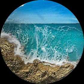
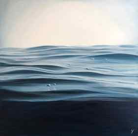
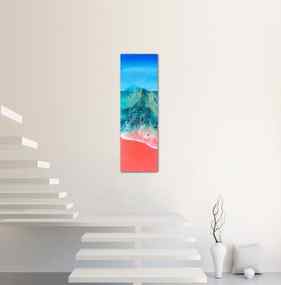
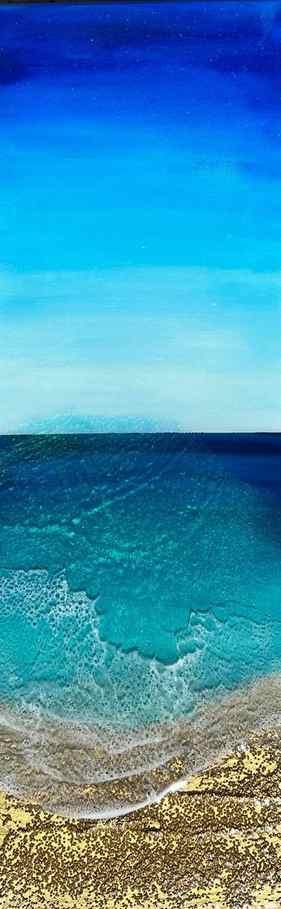
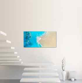
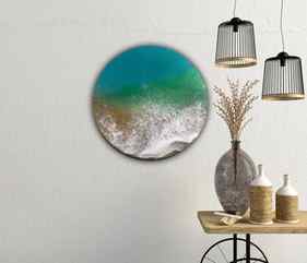
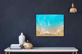
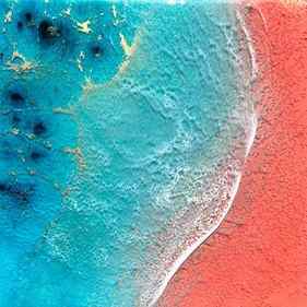
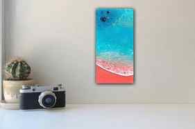


Discover new art and collections added weekly by our curators.
© 2023 Saatchi Art
Leaf Group Commerce All Rights Reserved