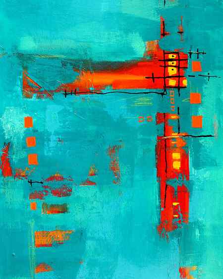
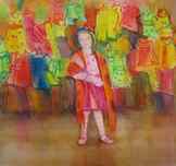
The madrona painting, Paisley Madrona, is a do-over of an on-location painting. I drew it up with watercolor crayon and tried bolder colors.
Painting Drafts
A painting goes off track and I often hear,”How can I fix it.” Sometimes we can. Sometimes, no matter what you do, you have passed a point of no return. It will never be a good painting. People are reluctant to give up because they don’t want to waste all of that time they invested so they keep flailing away, hoping to save the painting. Does this sound familiar?
What I would like to suggest is, when a painting goes off track, stop and study it. Try to figure out why it is no longer working. Often we can’t tell what it SHOULD look like until we try it once on the paper. Then we see …. this should be larger, that should be eliminated; the colors are wrong; or it is simply overworked. Consider it your first draft.
Dare I?
Don’t we do that with writing? We have an important letter or email to write. We write all of our thoughts down, just letting them flow. Then we go off and do something else. Later we come back and read it. The sarcastic line really doesn’t help our cause. This paragraph is muddled. This one has the lead sentence buried three lines down. And so on… We write it again.
We start again on a clean piece of paper and write it clearly and to the point. I could say that you wasted all of that time, writing the first draft. You would argue back that you were just getting your ideas down on paper. I rest my case.
What’s a Girl to Wear
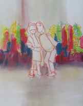
The longer I paint, the more I paint drafts and let the painting lead me to a solution. In What’s a Girl to Wear I tried twice to do it with Callie’s sister in the painting, until I realized that I was doing that because I love them equally but this painting was about Callie’s defiant (and singular) stance.
The painting that was floating in the water for the stretching technique two months ago was the first draft of what became 3 attempts. Each time I drew it up, I changed the proportions. The first try became too dark on the right side and that back building became too dominant. The second one really bombed but led me to what I needed to do. And so I tried it again, determined to keep the left and right sections equally less strong than the center — moving from soft focus to strong and the back to softer. See the painting at the top: Natty Dred’s Love Shack.
The madrona painting, Paisley Madrona, is a do-over of an on-location painting. I drew it up with watercolor crayon and tried bolder colors.
The first draft of The Hammock Beckons came along fine until I painted the rocks. When people saw it they would say,”Good rocks,” while I wanted them to want to lie in the hammock! I had to let go of the reality of the cliff where this hammock truly is. I compressed the rocks so that the hammock could beckon.
The Hammock Beckons
So consider drawing it up again when a painting goes off course. Make note of what you wish to change. See if this time you can’t paint it with a fresher, more spontaneous look, — no matter how long it takes. I think you will be pleased.
There is one more time I recommend drafts — only this time, let’s call it a series. When you are working on a painting and start to veer off your idea, STOP!
Set that painting aside and draw up the new idea. Paint it until the new idea has been developed. Then go back and look at the first one. Maybe now you decided finish it as you originally planned and you have two fine paintings!
I learned this approach when I was painting quite a few years ago (1980) on the Oregon Coast. I had done a detailed pencil drawing of a section of rocks with the surf booming around them at Seal Rock. When I was well into the painting, I notice that in my drawing the rocks seemed to have more thrust. I no longer liked the painting on which I had been working.
only photo I can find – #1 — that is a crease in the photo, upper right
Instead of trying to bend the painting around to my new observation, I drew up a 2nd full sheet with the more dynamic rocks and painting on it until it was finished. I was pleased but now saw things that were good in the first one and went ahead and finished it too.
When talking to a friend a week or so later, I noticed that in both paintings we particularly focused on one section in the middle. So I drew it up again, this time as a full sheet vertical with just the middle section enlarged.
After that painting was finished I felt it was a bit cold. I drew up a similar vertical but this time pushed myself to use warmed colors on the rocks. That painting won an award for me at the next Watercolor Society of Oregon show.
I was done… I nothing more I wished to “say” about those rocks. Today my favorite is the first of the series which hangs in a collection in Montana and is in the black and white photograph.
So remember, drafts or series, you don’t have to try and cram all of your ideas into one painting. I believe there is no such thing as failure. You are just on you way to making a better painting. Enjoy the journey!
©2009, Caroline Buchanan
How to draft for painting
Some of my students have been asking me about my creative process. Since I am about to begin teaching a new online class I thought writing a post about my preliminary procedures would help students of my unique “fearless” methods get started. If you know me, you know that my inspirational techniques begin with an adventurous paint pouring process similar to the techniques used by the artists Helen Frankenthaler or Jackson Pollock.

“Cool Summer” by Helen Frankenthaler ,1962

“Autumn Rhythm # 30” by Jackson Pollock
My creativity begins with a series of adventurous watercolor pours, but my work has entirely different style. In the pouring process that I use, there is a lot of splashing, dribbling and generally making a big fun mess which allows me to mingle colorful washes with passion and imagination resulting in what I call “Fearless” painting.” Some of my work is abstract and some is quite representational.
If you have visited my art galleries you will see that my subject matter is a mixture of inspiration, photography and paint which cause a fusion of representation and abstraction.
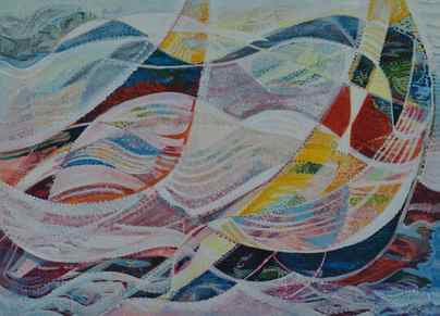
In the artwork shown above, “Reaching for the Wind” © is an abstract painting but with a representational marine themed twist. A lot of my art begins with the photos that I take in my journeys, even if the finished art is somewhat abstract.
In all of my work, I still enjoy beginning with what I call a road map. I like to make as many choices about what and how I am going to paint prior to allowing my paints to hit the surface of my paper or canvas. When I am creating a representational painting, like of the 1952 Caddilac below, I must be very exact as to the placement of subject and background. This requires drawing skills.

These types of realistic works require me to create a complete drawing of the image to be painted. In my work, I project my ideas onto either my watercolor paper or canvas using an opaque projector. I spend a lot of time paying close attention to the details required to make my visual statements and the projection process is just one step of many in the my creative process.
Let’s begin with a little history. There are many different methods of transferring an image to one’s painting surface,using projection is just one that has a long history. We know that as far back as the Renaissance, Artists have used photographic projectors, similar to the one I currently use, like the “Camera Obscura” or “Camara Lucida”. The 15th century German artist Albrecht Durer used a plate of glass and a grid to help him realize the correct lines for perspective drawing, as you can see in the artist’s etching.

In the 19th century the French artist Edgar Degas was both familiar with the early methods of photography but also utilized elements of photography to help him understand the movements of the dancers and race horses that he painted.
There are many other graphic artist tricks of the trade used by artist to facilitate the copying of lines, shapes and forms. One convenient tool is to use a graphite transfer paper. In my copying process , I recommend and use a product called Seral Transfer paper, which is available at most quality art supply retailers.
As a teacher and person who works to inspire others to be fearless artists, I try to simplify my methods so that anyone can enjoy their own creative process. I know that sometimes availability of a product is not possible,therefore adaptation is required. Recently, I created a short video to assist my students with a method of making one’s own copying paper. This method will allow beginner artists to use and copy their favorite photos for their painting inspiration.
For this project the materials that will be used for an 8 x 10 canvas or watercolor paper are:
1 sheet of white 8.5 x 11 paper ( or match the size of your paper to the size you want your painting to be.)
1 soft carbon pencil like a 3B or 4 B
1 photo of choice
1 painting surface such as watercolor paper or a canvas
Now let’s watch a short video:
If the video does not open, please click here to go to my Youtube video about how to make your own transfer copying paper
I hope this short tutorial helps you get started drafting out and creating your own masterpiece. In my next post, I will be sharing a new video and writing about the methods I used in creating the small demo painting ( shown below) done for one of my classes.