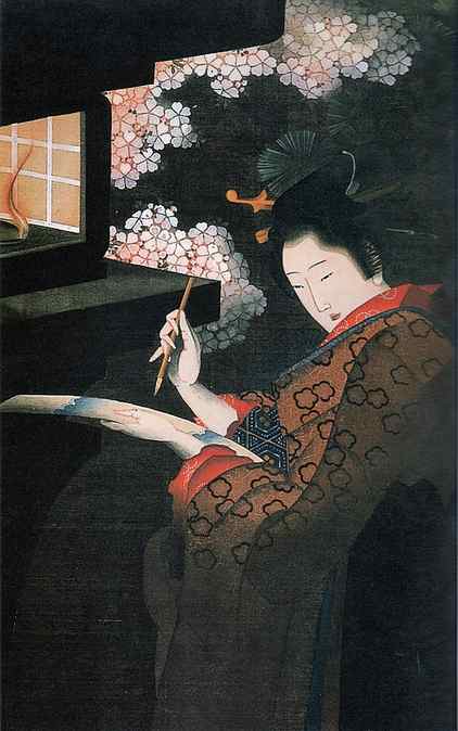
Artwork by @daragh.obrien.art – Colored Pencils on Strathmore 400 Series Toned Gray Paper
7 Painting Rules to Remember When You Are Feeling Stuck
You know that feeling when you have been going over and over the same painting but you just can’t get it to look the way it does in your head? Do you think it would be easier if there were a set of “Painting Rules” you could follow? I know this feeling well and it still happens to me sometimes, even though I have been creating and selling art for over 22 years.
I have found that having a formula, or methodical process to painting can be very helpful for creating realistic works of art. A set of painting rules you can refer to rather than learning by trial and error can save a lot of time and relieve a lot of frustration, even for an experienced artist.
My Painting Rules to Remember
There are a few basic art principles that I learned way back in the beginning of my art journey which I have put together in a list of “painting rules”. I still find these helpful to remember when I am feeling stuck and hopefully they will help you too.
1. The Horizon is Always Horizontal
It doesn’t matter which angle you look at it from, the horizon is always be horizontal. It seems pretty obvious really because it’s right there in the name which should make this rule very easy to remember.
2. The Further Away an Object is the Smaller it Will Appear
The majority of us will already know this rule, however, sometimes we seem to forget, or we underestimate the size difference .
Imagine you are painting a field of flowers. In reality they are all the same size but the ones in the foreground should be painted larger than the ones in the background.
One way to help you get the correct proportion is to add a vanishing point. To do this you draw two faint lines from the top and bottom of your closest flowers (or whatever you are painting) to a point on the horizon. If you are looking directly at the subject the vanishing point will be in the middle of the horizon. Any additional flowers you add to the painting must fit within the height of the two lines
3. Objects appear paler and bluer as they recede into the distance.
An easy way to remember this rule is to think of mountains. When viewed from a distance they always look blue. In fact, in Australia, we have a mountain range called “The Blue Mountains”. It can also be useful to remember this rule when trying to achieve depth in closer objects as well. When painting green leaves on a tree, for example, I start with a layer of blue, then add more layers on top, each one a little bit greener. Sometimes I even finish with a pure yellow, just for the highlights. Make sure to allow some of the underneath layers to show through the top layers so you don’t lose your depth.

4. Identify The Direction of Your Light Source
There only a few instances where light will come from more than one direction. Therefore, at the very beginning of your painting you should decide from which direction the light is coming. Try to imagine where the light will be hitting your subjects and make this the highlight areas. Then identify which areas will be hidden from the light and make this your shadow areas.
5. The Tri-Colour Rule
Everything you paint is made up of at least three colours, even if it is just a flat wall. I like to think of these as the main colour, the highlight and the shadow.
The main colour is the colour you have in your head when you decide to paint an object.
The highlight colour is mostly a lighter version of the main colour, created by adding white. The exception to this is for red, when the highlight colour is created by adding yellow.
The shadow colour is created by adding a complementary colour to the main colour. Complementary colours are as follows:
- red – green
- purple-yellow
- blue-orange
6. Light Against Dark Will Make a Subject Stand Out
Say you are trying to capture really bright sunlight in a painting. You can use the lightest or brightest colours you have but you will never quite achieve that brilliance of sunlight unless your lights are offset against a darker, duller or complementary colour. One little trick I use when painting sunrises is to add a touch of green to the very centre of the sun. This makes it stand out from the rest of the brightly-lit sky.

7. The Sky is Not Always Blue
Even on a clear day the sky is not always blue. Often, In a painting, we are viewing only the very bottom of the sky. When you are outside take a look towards the horizon and you will notice that the lowest part of the sky can be yellow, pink, purple or green. If you are having trouble seeing this then I suggest you take a photo and crop out the top of the sky.
Rules Can Always Be Broken
While the above painting rules can be extremely helpful, they are intended as a guide only. There are always instances when they may not apply. For instance, there can be reflected light which comes from the opposite direction to your light source.
I could not possibly cover all the exceptions to these rules in this article so I am going to leave it there for today. If you have any specific challenges you would like help with please leave a comment, contact me by email or come and join my facebook group “You Can Learn Art” which you can find on the Blue Beach House Art facebook page. I will do my best to help you with your art questions and I will only ever give you honest and constructive feedback.
If you want more free art resources delivered direct to your inbox please join my email list here
Color Psychology – Blue
Color psychology suggests our mood can be impacted by different colors, each supposedly having a unique effect based on an individual’s personal experiences and culture.
Scroll down to enjoy a collection of beautiful work created by different artists on Strathmore papers; each featuring different shades of the color blue.
PSYCHOLOGY OF THE COLOR BLUE:
The color blue is universally favored by people everywhere. Each shade of blue can carry a different meaning and evoke a different type of reaction. Common associations with the color blue include:
-
Calmness and Serenity:
Blue is often found in nature such as a calm sea and clear sky, creating a sense of peace. It can help slow the heart rate and breathing, making it a great color to surround yourself with for meditation and relaxation. Some airports have even started incorporating blue lighting and imagery in their terminals to help promote a sense of calm prior to flying.
Art by @doughtycreartive – Colored Pencil on Strathmore 300 Series Bristol Paper
Artwork by @teganleighdraws – Marker and colored pencil on Strathmore 300 Series Mixed Media paper
The Old Guitarist by Pablo Picasso
How do you feel when you see the color blue?
Take a look at these beautiful pieces created by different artists on Strathmore papers; each featuring different shades of the color blue.
Artwork by @fuyuch7 – Colored Pencils on Strathmore 400 Series Toned Tan Sketchpad
Artwork by @daragh.obrien.art – Colored Pencils on Strathmore 400 Series Toned Gray Paper
Artwork by @gracelu.draws – Colored Pencil on Strathmore 400 Series Toned Tan Sketchpad
Artwork by @angelastaehling – Gouache on Strathmore Hardbound Watercolor Art Journal, 8.5″x5.5″
Artwork by @lenokdih – Soft pastel on Strathmore 400 Series Toned Gray paper
Artwork by @priscillageorgeart – Watercolor, gold leaf and metallic paint on Strathmore Watercolor paper.


