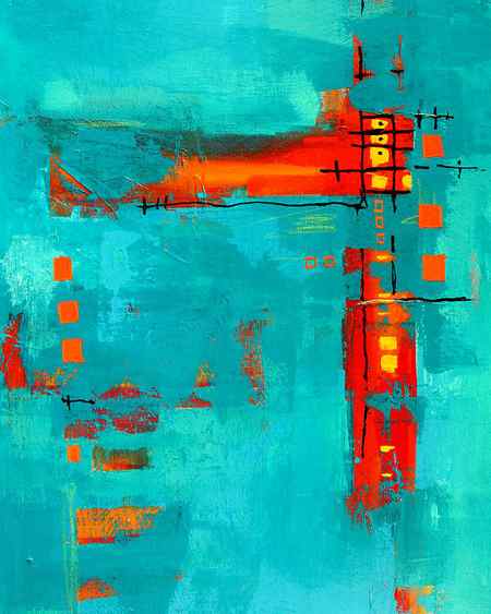
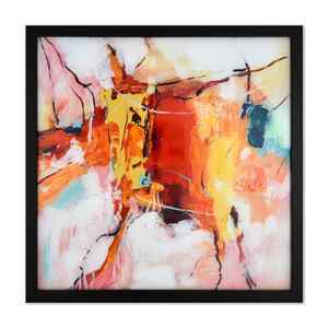
So as you can see, the golden yellows, burgundy reds, and muted oranges of an autumn subject are mostly warm.
Mixing a Fall Color Palette (Keys to Success)

My neighborhood’s autumn colors have inspired me to try out some paint mixes. So I wanted to share some of my favorite color-mixing recipes for fall paintings.
There’s a unique atmosphere at this time of year. The cool, sometimes foggy mornings. The ever-changing colors of the foliage. It even smells differently outdoors these days!
Each season evokes its own emotions. The colors associated with autumn are easily recognizable. Shades of yellow, orange, red, brown, and green. Rusty reds and oranges, subdued yellows, and warm greens. They create beautiful harmonies in a painting and help to conjure up feelings connected to this time of the year.
But how do you create a fall color palette by mixing the small range of pigments in your paint box?
Below I’ll show you a few suggestions and ideas…
Warm fall color palettes

There are a few interesting things to observe about fall color palettes. First, the colors associated with autumn are predominantly warm. And for the most part, they set up an analogous color harmony.
Fall colors naturally work well together because of these characteristics.
Making use of these warm hues in your artwork has a soothing influence. For example, the softly changing colors of a fall scene create a relaxing harmony that is cozy, comforting, and calming.
But why is this so?
Fall colors are analogous.
Colors can suggest different emotional responses. And we evaluate colors in context with other surrounding colors. These relationships can be used to express feelings. In the case of an autumn color palette, the predominant hues are mostly analogous.
Color theory tells us that analogous colors are those which are close to each other on the color wheel. This is a valuable tool to show relationships between hues, especially when mixing paints with a few primary colored pigments.
You could also compare this to how colors are arranged on the color spectrum. Each hue appears to merge naturally into the next.

If you look at the portion of colors we associate with fall, you can see they are closely related. Reds, oranges, and yellows are right next to each other on the color wheel. They are analogous.
Painting Fall Foliage
It may be hard to imagine right now, but soon it will be that time of year– when we are all tempted by the bright colors of fall foliage to throw every high chroma color we can lay our hands on onto a canvas! In many ways, painting this season can be even more daunting than painting the overwhelming green of summer. So put down that cad orange and take a few moments to read these suggestions! Painting autumn colors successfully comes down to paying attention to basics- in this case, value, chroma and temperature.
Value
One of the most difficult notions to overcome is our perception of warm high chroma colors as lighter in value than they actually are. I am not sure why this is, but it does seem to be universally true. When I ask students to identify the values in a painting like this for example…..

they will almost always guess that the lightest foliage areas are a 7 – 8 on the Munsell value scale, rather than a 5-4. Of course we know from our new best friend Carlson that trees are upright planes and therefore the darkest values in the landscape, right? So, intellectually we ought to know that they would carry a darker value. But, nonetheless, when faced with an electric orange or yellow, the guess is always to the lighter side of the scale. One look at the greyscale version of the painting confirms the folly.
One other factor should help us understand, intellectually if not visually, that these colors are indeed in the mid to darker value range, and that is their intensity. As a color is tinted, i.e., made lighter, it also loses chroma. Adding lots of white to a color will inevitably lead to that color being not only lighter, but cooler and less chromatic (duller) than it was before!

Chroma
Chroma refers to how intense or dull a color appears. Colors in nature rarely hit the chroma jackpot in the way manmade colors do. Nature is much greyer and lower in chroma than we often realize. So, careful observation is required to convince our eyes we really are not seeing a color that comes straight off the pop tarts package. This is why in fall, when there actually is some chroma in the landscape, we tend to go overboard and paint it more chromatically and too much of it. Use restraint. That beautiful maple tree will look more fetching against a screen of more neutral trees.

Temperature
Temperature is perhaps the least understood of color attributes. It takes some time to see and understand temperature changes in the landscape and to know where to look for them. But, we can all agree that a fall landscape will have an overwhelmingly warm cast. Overwhelming. So, for that reason, looking for opportunities to introduce some cooler notes into your painting is very important.

So, get out there and paint the fall foliage! If you get the values right, use restraint with chroma, and add some cooler notes for variety, you will have a much better chance of success in the field.
PS Our most popular online class, Drawing & Painting Trees, starts September 11, 2020. Sign up and you will never look at a tree the same way again. Promise! Information and registration is here.
Share this:
- Jay Patel says May 30, 2021 at 12:08 pm
Having just read Painting the Woods (superb) I’m finding these field notes to be an invaluable additional resource. Although painting would be too daunting for me, I love sketching landscapes in graphite and am considering making first tentative steps into colour with pencils. These generous notes are helping to give me a better grounding and are much appreciated. Thank you!