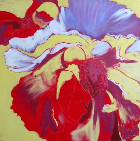
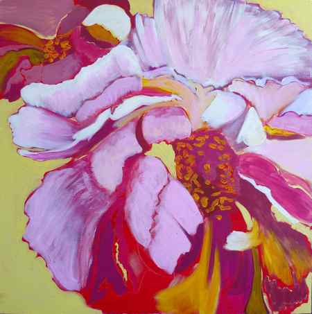
- Create a painting of 1-3 roses.
- Investigate the forms and spaces inside the roses.
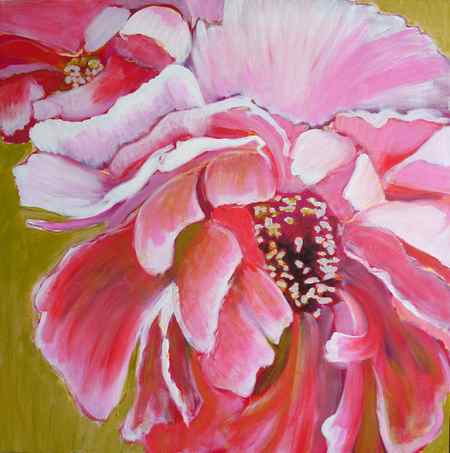
Painting Basics TRACK: Lesson 5, Rose Paintings

- Create a painting of 1-3 roses.
- Investigate the forms and spaces inside the roses.
- To capture the gesture of the rose as if it were a figure.
- Establish a mood for the painting.
- (example: a “sad” rose vs. a “perky” rose)
Reference photos

- Work from life: Purchase rose(s) and watch Kathleen Speranza’s tips on how to set up your rose(s).
- Work from a photo: Use our reference photos of roses here on on Art Prof’s free reference photo collection on Flickr.
- Don’t just pick any random photo, rather choose your photo with intent.
- Think about which photo will more easily emphasize gesture and emotion in your painting.
Recommended media
Any paint medium: watercolor, gouache, acryl gouache, oils, water mixable oils, acrylics. We recommend using the same paint medium for the entire track.

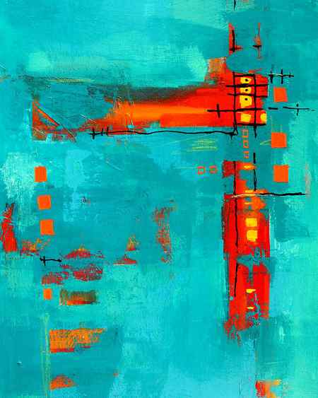
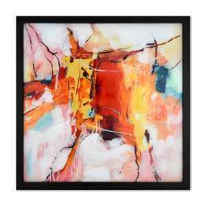
Inspiration
Kathleen Speranza, Adriaen van Utrecht, Jan Davidsz. de Heem, Vincent van Gogh, Rachel Ruysch, Jan Philips van Thielen, John William Waterhouse.
We want to share your progress!

- Did you do this lesson?
- Submit to have your work to be posted here on this page or mentioned in a live stream.
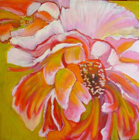
How to mix acrylic and pastel to paint a peony: Peony Exuberance

August 2, 2011
Acrylic paint and pastels are two media that are working very well together, learn how to paint a peony with a few simple steps.
Peony Exuberance : How to paint a peony with acrylic and pastels
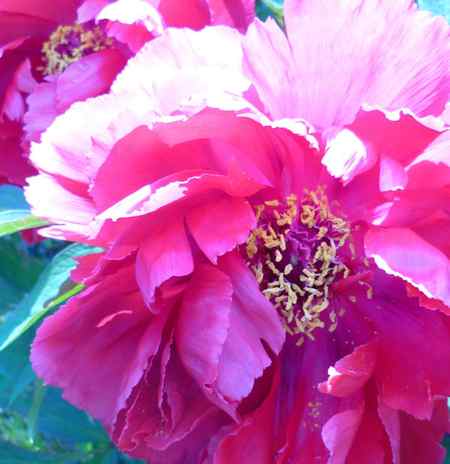
This is the picture I used as a reference, I took it in my front yard. I liked the composition and the shape of the petals but the whole picture was too pink to my taste and a bit too much on the cold side in terms of colors.
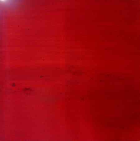
Starting with a flat colored underpainting has many advantages:
- It will unify the colors of the painting by adding a bit of the same underpainting color everywhere
- You don’t start with a scary blank canvas
- Some of that underpainting color will show in places throughput the painting.
Red, orange and blue are commonly chosen colors for underpaintings.
Let this first layer dry completely.
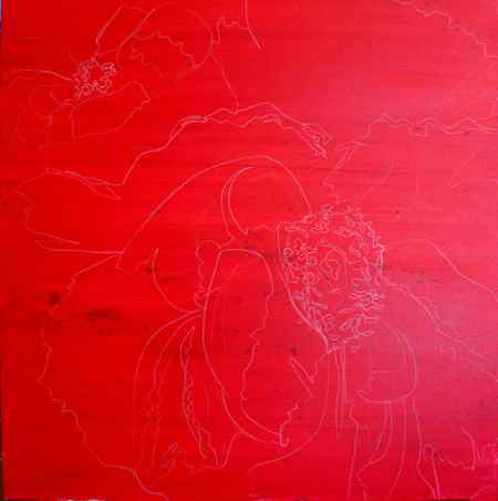
You can start by drawing the outlines of your flower quite loosely the red underpainting with a white china pencil.

Close up of the drawing.
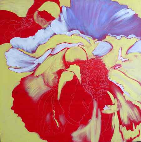
I start applying layers of acrylic, with 3 colors that are corresponding more or less to my mid tones, highlights and dark.
Then I am adding dark purple in the shades.
I am a Blick Art Materials affiliate and I receive a small compensation for sales. That does not effect in any way the cost of the purchaser’s order but it helps me keeping the content of this blog free.
Amsterdam Expert Series Acrylic Sets
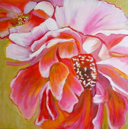
I start to introduce some orange to balance the pink.
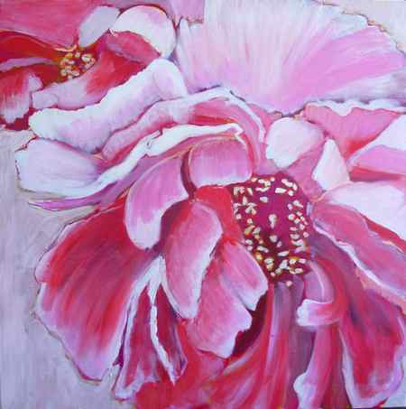
You can add more light with layers of semi transparent white ( white acrylic diluted with medium)
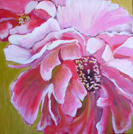
Keep on adding layers, trying to have some of the previous layers show at the edges.
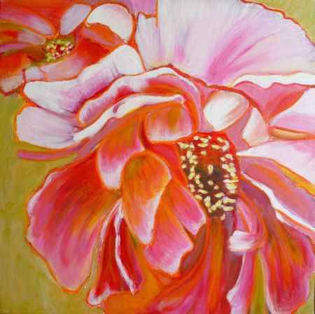
Once the acrylic paint has dried, you can start adding pastels on top of the acrylic, this is a great method to try on some color compositions as you can just wash off the pastels if you don’t like the result. If you like what you did paint with the pastels, fix them with workable fixative so you can keep on adding layers of acrylic or pastel and they won’t smudge.
Keep on adding colors until you are satisfied with the result, alternating layers of acrylic and pastels. Here I added more yellow, orange and green acrylic layers.
Adjust colors until you are satisfied with the result.
5/5 – (2 votes)
You might also be interested in:
Share this post
Sandrine Pelissier
Originally from France, I have been living in North Vancouver, Canada for the past 20 years. My work has been collected and exhibited extensively in Canada and internationally. I am also part of the Art Rentals and sales program of the Vancouver Art Gallery. Many of my paintings have been published in Art books and magazines (Artist Magazine, Watercolor Artist Magazine, Acrylic Magazine, International Artist Magazine). I wrote 2 art instruction books with North Light/F+W Books. I have been writing for the last 5 years for my blog: paintingdemos.com, that has a mailing list of about 10 000 subscribers and about 20 000 visitors per month. I am an active member in the community, as a co-founder of the North Shore Art crawl, a co-founder of a weekly life drawing group, a board member of the North Vancouver Arts Council, and have been invited as a juror for public art, art grants and juried exhibitions. You can read more about my collaborations here.
Poppy Dance: Acrylic and pastels flower painting time lapse video
Through the Rolling Fields, Landscape mixed media painting tutorial
Comments (8)
Diane
Beautiful! I love how you think outside the box and make it work so well. What kind of workable fixative do you recommend that is archival, and also works with oil pastels? I get overwhelmed by the different choices, brands, and formulas. Thanks!
March 15, 2017 at 12:23 pm
Sandrine Pelissier
Thanks Diane
As a fixative I like to use Krylon workable fixative in my mixed media works because it works very well on different media including Watercolor or ink, and you can rework once you sprayed as many times as you want.
Tip #2 Achieving A Seamless Look
Something else I shared when painting the scallops in my kid’s under the closet playroom, is how to avoid any flash marks on the wall. Here’s the trick, don’t repaint over areas that are already starting to dry. Leave that paint alone. Once you start touching up areas is when you get those streak marks. Instead, while you paint try maintaining a wet edge. Meaning you keep painting along in the areas that are still wet. Doing this will help you get the best finish and will look a lot more professional when it’s all done.
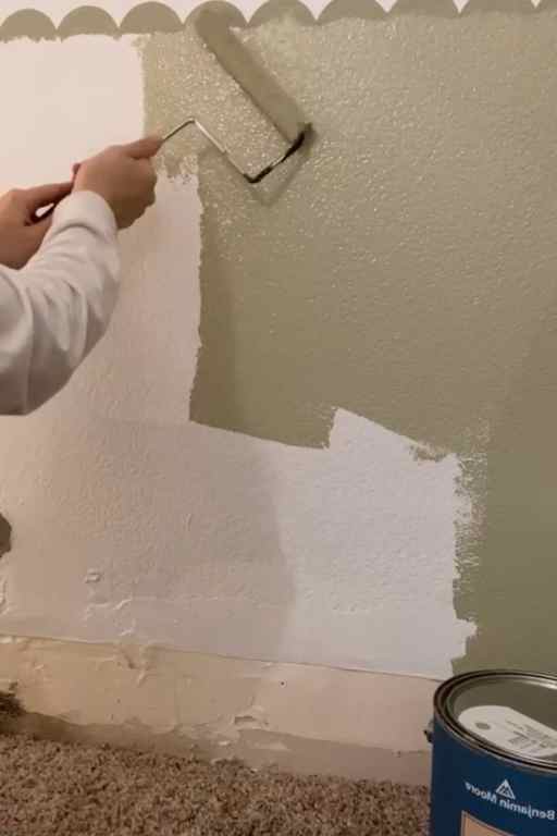
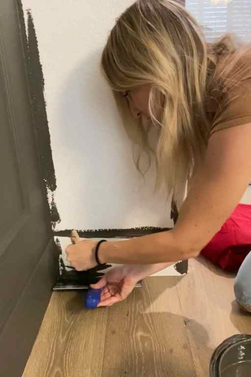
Tip #3 Getting A Straight Edge
I have two tips to share with you here. The first is for all my friends with textured walls. It can be a pain to try and get a straight line on a textured wall (believe me I know). So here’s a tip. Use blue painter’s tape to mark your line. Then before you start painting, use a little bit of caulk and smear it on the edge of the tape to help fill in any cracks. You will have a lot less bleeding and touching up to do if you use this trick. If you’re a visual learner, check out this story highlight .

The last tip I have for you is to use a paint guide . I shared this tip during my Hogwarts Great Hall project , and people were losing their minds over it. But it’s so simple. To use this tool simply place the edge up next to the wall where you’re painting and use an angled brush to get a nice straight line! I’ve used my paint guide a lot for painting baseboards. It makes the line look clean and professional. Here’s a short tutorial here .
Interior Painting Tips That Make Life Easier
There you go! A few interior painting tips to get you started on your next project. I can’t wait to see the magic you create. If you use these tips, don’t forget to let me know over on Instagram . Something I love about DIY is that it’s just a process of problem-solving. Anyone can do it. So, if you’ve been wanting to update your space…Stop pinning. Start doing. You’ve got this!
If you’re new to DIY and want a fun project for your outdoor space, try building this giant planter wall . I made this to cover up the ugly cinderblock view out my front room window. I didn’t realize how much it was bothering me until I built this pretty thing!