These are special pastes used with seals, read more about the types and their usage here. The range includes both pastes presented in ceramic containers and refill packets, and one designer ceramic piece especially designed for seal paste.
Flower Petals – Mustard Seed Garden
You can also see Yun Shou Ping online gallery and poster book on inkston:
Each flower has its own personality. Observing closely, you will find there might be hundreds thousands types of flowers and each one is unique. Therefore, to paint flowers well, it is very important to learn how to set your ‘angle’. Consequently, main principles to bear in mind are that:
• all the flowers can be categorized as ‘open’ and ‘not open yet’.
• all the flowers are unique.
Guided with these two principles, these are a few tips for you to consider:
• Do not look down vertically at the flower, because this angle destroys flower’s delicate and soft feeling.
• Do not paint the flower heading down, because this makes the flower spiritless.
• Do not paint flowers all at the same size or height, because this makes the flowers inert.
• Paint how flowers are leaning on each other to create a natural tension in the painting. Try to create such a nice atmosphere with your brush and paints that it seems flowers are feeling, thinking, communicating with each other.
• Remember to always keep the painting well balanced: flowers shape, size, posture, colours, etc.
• Remember for the same flower, the inside petals are always tighter, heavier, and deeper coloured than outside petals.
To be more specific, tips on the colour flower petals:
• Petal colour should be fade for broken flowers;
• Petal colour should be very fresh and bright for opening flowers;
• Petal colour should be strong and deep for flowers which are about to come out;
• All the petals for the same flower should not have the same colour shade. Some petals must be lighter than others. If it is yellow flower, you can try to use white pigment to create different shades. If it is pink flower, then you can try light green pigment to create different shades. For example, if you use a little bit green on the edge of pink colour petal, then you will notice this technique helps emphasize white parts of the petal, which helps further express the complicated layers of the flower.
• If you paint the flower on silk, you can try to paint with little dots; if you paint on Xuan paper, then you have choose to paint with dots or any other methods. For more techniques on painting flower petals, please study and practice carefully the ‘boneless’ painting technique. Inkston will go into details of this technique in future’s painting guides.
Inkston’s summary: to paint flowers well, you need to observe flowers in daily life and notice how unique each flower is and how the colour develops. When painting flower, please apply paints of different shades to create the vividness of your flower. Also, do not forget that all the elements in your painting shall be connected with each other as if they are talking to each other. All in all, for any painting, the fundamental principle is to keep the whole picture well balanced. Once you understand well these principles, we recommend you to start learning and practicing the famous ‘boneless’ painting skills.
Illustrations from Mustard Seed Garden
Observing these flower examples, how many painting tips mentioned in this article can you find?
This is a video clip on how to paint flower. It is illustrated by Chinese artist Wu Peng 吴蓬, who was born in 1941 and currently researcher of Shanghai Calligraphy and Painting Institute. He is especially famous for calligraphy (Oracle) and flower paintings. He also published a series of tutorials on the Chieh Tzu Yuan Manual of the Mustard Seeds Garden.
This a rather good 49 minute video on flower painting technique. The video is in Chinese but you can see the technique even if you can’t understand chinese well:
Materials
There are quite a few Xuan papers suitable for flower painting. For example, all the Inkston Perfect series papers and Inkston 6575 Xuan Paper are very popular among professionals. If you still are not sure which paper to start with, we would recommend you to try any of these two papers which are made with special inkston recipes for flower and bird paintings. And as mentioned in the article, silk is a very good material for flower and bird paintings.
INKSTON Expert Flower/ Bird 45 Xuan paper contains 33-38% Pteroceltis Tatarinowii tree bark, it is untreated/unsized (raw/uncooked in Chinese) and has a tiny portion of added calcium, which makes the paper very sensitive to express different kinds of inks. Therefore, the paper is specially suitable for paintings of flowers and birds. To make the Expert grade Xuan paper the fibres are steamed/boiled… $ 16.52 – $ 120.70
Brand: inkston
Maker: Inkston
Materials: 棉料 Mian Liao
Recommend to: Advanced Level, Beginners, Medium Level, Professionals
Suitable for: 花鸟画 Flower and Bird painting
Techniques for painting a flower petal
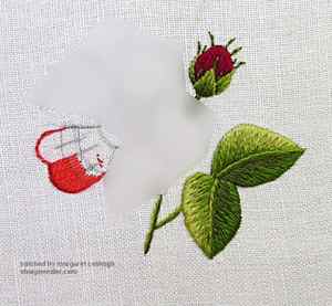
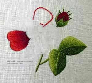
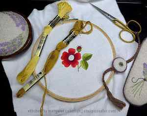
In the final installment of the Red Alpine Rose designed by Trish Burr, we’ll work on the flower, especially the petals. There will be lots of blending practice and I’ll show you a slightly different way of approaching shading.
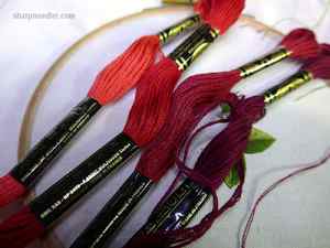
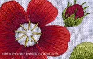
The flower petals are composed of four reds. I think of them as shades 1 through 4 with 1 being the lightest.
Before jumping into stitching the petals, I want to mention the colour selection for this project. It’s deceptively simple and beautifully elegant. Trish Burr is an absolute master at choosing thread colours. She makes it look easy, but it’s not. I see many examples of shading that are lacking because of poor colour selection. There are abrupt jumps in colour and the shades don’t blend very well. You can have great technique, but if the colours don’t work, it doesn’t matter. We should all appreciate Trish’s exquisite colour sense and her ability to do amazing things within the limitations of thread palettes!
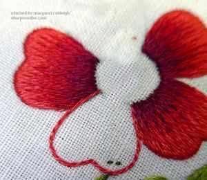
Background Petals
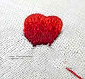
Technically, all of the petals are stitched in the same way. The lightest red (1) is on the outer edge and there’s an orderly progress through the shades (2 through 4) towards the flower centre.
When I look at the reds, I see three shades and a shadow. The darkest red could become quite heavy if there’s too much of it on the petal. So, I will treat the petals as if they are really composed of (mostly) three shades and then add in a little bit of shadow at the end.
One of my rules for blending is that I don’t let non-sequential shades touch each other when I want a smooth blend. So, for example, with the petal reds there are four shades starting with 1 at the edge of the petal and progressing through 2, 3, and 4 towards the centre. I would not let shades 1 and 3 touch each other, 2 would always come in between. This produces smooth well-ordered blending (as long as you have well-chosen colours).
To start, choose a petal that is in the background. I have three petals that are behind and two that are in front or overlapping the background petals in some way. Depending upon how you traced the petals you could have a different layout.
I’ve drawn three blending lines on the petal for the three main reds and the petal will be almost completely filled with those three shades. The shadow colour will be added at the end.
Outline the petal’s edges with split stitch, but only the edges that belong to the petal. Then, start in the middle of petal and work to either side with long and short stitches just like the leaves. Remember, it’s really just a raggedy-edged satin stitch.
Below, I’ve embroidered the first half of the petal and will go back to the middle and stitch the other half. Recall that on the first row, you come up inside the petal and go down over the outside split stitched edge ensuring that the design line is covered. Make sure to place the stitches right next to each other and keep the petal edge as neat as possible.
For subsequent rows you can, again, start in the middle and work to either side blending in the colours. That’s the proper way to shade. If you’re a beginner, you should definitely try this method. However, I’m going to show you how I shade which is a little bit different.
When I blend into subsequent rows, I first scatter a few longish stitches into the previous row. The starting points are staggered. (As usual, I come up in the previous row and go down into the unstitched area of the petal.) The photo below has been enhanced to try to show the scattered stitches. These foundational stitches are used to establish the deep stitches. It helps me not get hung up on long and short or get into too much of a rhythm with the embroidery. I want randomness not automation. It also makes me look at what I’m doing and pay attention to where the colours should go. Once these long stitches are in place I go back and fill in with more stitches in between. I think of this as sketching with thread. Because I jump around with the stitches the back is not necessarily very neat, but the front is what matters!
Below, the second row is complete. Notice that the shape is almost entirely filled with the first two shades. There’s lots of colour to blend into for the next row!
Here’s the third shade. I also used my ‘sketching’ method when adding this row. I’ve left a little bit of space along the edge of the flower centre for the shadow stitches.
Finally, the shadow is added. I try to make sure that there is some shadow colour along the edges where the other petals will eventually overlap. This helps create the illusion that the petals on top are making a shadow on the petal(s) underneath. Don’t overdo the shadow. It can get muddy very quickly.
The other two background petals are worked in the same way as the first. Next, it’s on to the foreground petals.
Contrast
Before filling the foreground petals, let’s discuss a little bit about contrast.
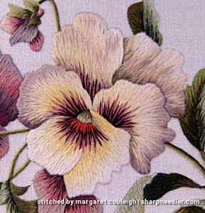
Here is an example of poor contrast. It’s from a Trish Burr design (Pansies) that I did quite a while ago before I really started paying attention to contrast. The lower petal on this pansy is not well executed. There’s no contrast between it and the side petals. They merge into each other in a dark mass of colour. If I was stitching this today I would ensure that the lighter colours of the lower petal were placed along the edges towards the center so you could see the petal edges in comparison to the side petals beneath. The side petals could be improved as well, but at least you can see the (upper) petal edges. It’s low contrast, but there is some contrast.
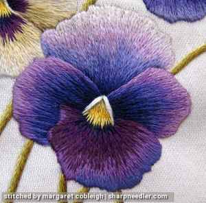
This is an example of better contrast. It is another Trish Burr design (Victorian Pansies) where I focused on contrast. You can clearly see all the petal outlines created by the use of shadows on background petals and lighter colours on foreground edges. (It almost looks like some of the petals are outlined, but there are no dark outlines embroidered on any of the petals. I don’t care for stitched outlines.)
If you are a beginner, don’t overly concern yourself about contrast for now. You have to get the stitch direction and blending working first. Worry about contrast later.
A Lesson in Outlining One Element at a Time
Below, I’m in the process of outlining the first foreground petal. This is a good example of why you don’t outline all elements first and then fill. Notice where I’ve temporarily stopped outlining. If I had outlined this petal before working the petal beneath–where I’ve stopped the outline–it would have been difficult to stitch the background petal without biting into the upper petal’s outline. Also, the background petal isn’t perfectly filled, but I can use the outline to cover that up. It’s much easier to do outlines as you go, rather than all at once at the beginning.
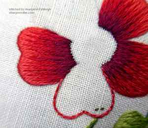
Once the outline is complete you can’t tell that the petal underneath has a bit of a ragged edge. You’ll get a neater finish when you have a clean outline on top. I also didn’t have to try to stitch underneath this outline when filling the background petal which is easier. So, you’ll get better results and it’s easier if you outline elements as you go. That’s a win-win!
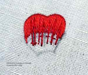
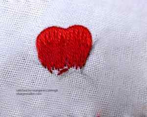
Filling the Foreground Petals The foreground petals are filled with the same four shades of red as the background petals. You can work them the same way as the background petals. However, for extra credit, and if you are comfortable with tackling contrast, stitch lighter edges where the petals overlap the petals underneath.
Here shade 1 has been stitched all the way around the petal. I don’t know that I will keep this much of shade 1 showing, but I have the option to do so.
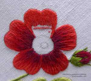
Shade 2 is added:
Shades 3 and 4 complete the petal. I ended up not showing very much of shade 1 around the edges. There was too much contrast with the neighbouring petals. There’s not a lot of contrast on the left side of the petal, but more than the photo indicates! The lower left petal, which is also a foreground petal, has better contrast on the petal edges.
With the petals complete the rose is nearly finished.
Intermission (aka Gratuitous Kitten Picture Time)
You never want to look down and see this when you are stitching:

They are way too interested in something, a scissors fob in this case. Those looks means trouble.
I like them better this way. It’s much safer for my embroidery!

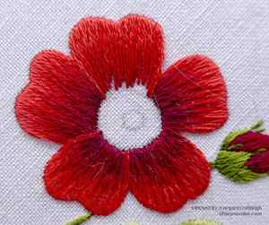
Flower Centre
The flower centre consists of two shades of golden brown:
In the original instructions, the lighter golden brown is straight stitched around the center and the darker shade is used for French knots in the centre and around the edges of the straight stitches. I’m going to do something a bit different by embroidering the straight stitches around the centre with one strand of each colour in the needle. I want to see if it will add a little depth.
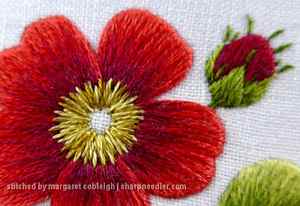
For the French knots, I used two strands and two wraps. The original instructions called for a single strand and two wraps, so my knots are bigger.
There are three possible combinations with two strands and two colours: all light, mixed, all dark. I used all light for a few knots in the centre. I mostly used mixed for the knots in the middle and around the edges. I also used some all dark in the centre and around the edge. I like the results and it looks richer than if I’d only used single shades, but there’s not a lot of contrast and the knots in the middle get a little lost. If I had it to do over, I’d probably use mostly all dark knots in the centre with a few mixed knots. I don’t think I’d change the outer knots.
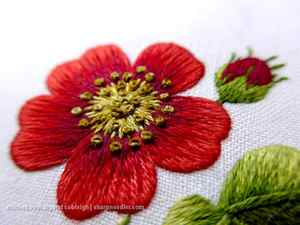
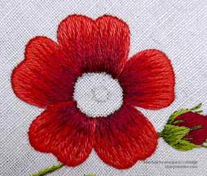
The little rose is complete:
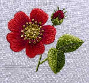
This is a good introductory thread painting design and there are many more in Trish’s book. I hope you have a better feel for shading and that I’ve been able to remove some of the mystery from the technique. It really isn’t difficult, but does require practice.