Ultramarine Blue: This is a rich and deep blue that can be used to create a range of shades and tones. It is often used as the base color for paintings with a cool or watery color scheme.
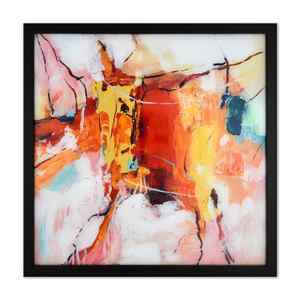
The Importance Of Base Color Painting In Creating Brilliant Paintings
As a colorblind artist I had to learn without any context anything to do with colors so working out what a base color was in painting was crucial for me to progress as a young artist. Base color painting refers to the initial layer of paint that is applied to a surface or canvas as the foundation for a painting. This layer is typically the first layer of color that an artist applies to a painting and provides the starting point for the rest of the painting process.
The purpose of the base color is to establish the overall tone and color scheme of the painting. It can help to create the illusion of depth and dimension and can serve as a guide for subsequent layers of paint.
Depending on the desired outcome and your own personal tastes, the base color can be applied in a bunch of different ways. Some artists prefer to work with a monochromatic base color, such as a single shade of gray or brown, while others may choose a more colorful base to establish a specific color scheme.
All in all, selecting the base color is a crucial step for any painting, as it provides the foundation that can influence the artwork’s look and feel.
What is Base Color Painting?
Base color painting is the initial layer of paint that is applied to a surface or canvas as the foundation for a painting. This layer is usually the first layer of color that an artist applies to a painting and provides the starting point for the rest of the painting process.
The reason we have a base color is to set the overall tone and color scheme of the painting. It can help to create the illusion of depth and dimension and can act as a guide for subsequent layers of paint.
The base color can be applied to the surface in a few ways, depending on the artist’s preferences and the desired effect. Some artists prefer to work with a monochromatic base color, such as a single shade of gray or brown, while others may choose a more colorful base to establish a specific color scheme.
Is Base Color Painting Important?
- It establishes the overall tone and color scheme of the painting. This can help to create a sense of harmony and balance throughout the artwork. Without a well established base color, the painting can feel disjointed and lack cohesion.
- The base color can help to create the illusion of depth and dimension. By establishing a solid foundation of color, an artist can create a sense of space and distance within the painting.
This can be important in landscapes or other scenes where the artist wants to convey a sense of depth and scale.
By establishing the underlying color scheme, as an artist, you can more easily build on that foundation and create a cohesive, balanced, and harmonious painting.
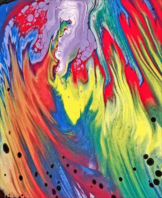
Pour Cups
Layering the pour cups was a simple half ounce of each color, using all colors, and then repeat the sequence of layers. The exact same amount and sequence of layering was used for both pour cups. No silicone was used, and the ratio of Floetrol to paint was 3:1 for Sargent paints. The Liquitex titanium white was a 4:1 ratio.
The white base was created with titanium white over canvas board. I miscalculated a bit and didn’t have quite enough titanium white to fully cover the canvas, so the corners had some leftover cadmium yellow added just to help the pour flow easier over the edges.

This was a simple straight pour, then tilting and a quick torch to catch any potential bubbles lurking under the paint.
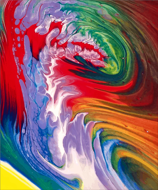
I used the Sargent black paint over canvas board for the black base. The Sargent black is not dense with metal pigments, so there will be a couple of issues I will be discussing later in the comparison talking about inorganic pigments.

Again this was the exact same type of pour; tilting and torching; but as you can see the results are extremely different.
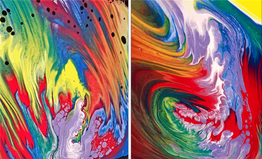
Comparison
Looking at both samples side by side, there are two things that stand out.
Color Variation
When you pour over a titanium white base you will keep the integrity of the colors being poured on top. The white base acts like a mirror to reflect the color, so all your original paint colors will pop off the canvas.
Using a black base will still give you nice color, but they may not be as bright and vibrant as pouring over the white. Each color seems to be a little muted, more subtle than those poured over the titanium white base.
Inorganic Pigments
Here is where we talk about inorganic pigments, in this section we are focusing on “metal” pigments. Most readers understand that using titanium white is the preferred way to obtain cell formation, especially in a flip cup. The reason for this is the metal pigments in titanium white, quite simply (titanium) is a metal. When this is added to the paint, it literally makes the paint heavier.
Take a look at the two sample pours side by side again.
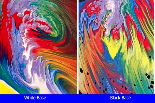
White base : The titanium white base has very distinct — sharp lines, lots of contrast between the colors and no real cells forming. The reason for this is the (titanium) white is on the bottom, so the poured paints simply float on the top.
Black base : Now, look at the Sargent black base which in contrast to the titanium white base, is not dense with those metal pigments. I used the titanium white in the pour cup, so that you can see how the denser metal-pigmented, titanium white sinks into the non-pigmented black paint below forming all those black cells. The lines are not as sharp, due to some paints in the pour cup being denser so they simply slipped under the black base, causing them to blur into each other.
What does this all mean?
The quick fix is when you purchase your black paint or “any paint color” you want to use as a base coat, be sure it has metal-pigment added.
How to know if your paint contains these pigments?
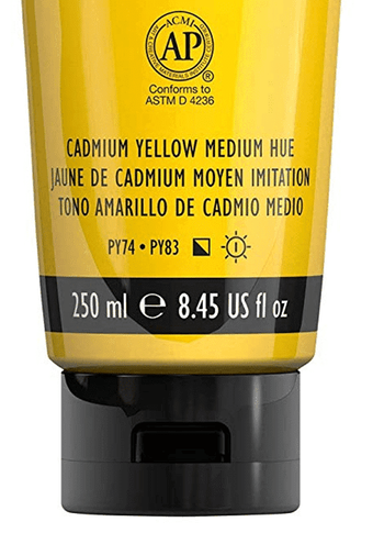
It’s actually very simple, any acrylic paint containing metal pigments will typically say so on the label, or show in the ingredients. Look for the words titanium, titanium dioxide, cadmium or iron oxide .
These are metals that literally make the paint heavier which allows them to sink to the bottom, similar to your tried and true titanium white. Remember, this tip is accurate for any color you want to use as your base coat.
Here is one more final pour where I used a red base coat, just for an additional example using something other than white as a base. You’ll notice all the white areas have a slight pink tint — which is purely from the red base below.

Hopefully this information will allow you to create the pours you desire, using any color you wish as your base. Get your creative on folks by trying different base colors for a whole new look!
Read Next
- Testing Dimethicone For Creating Cells Pt. 1
- Testing Transparency In Your Paints
Since she began creating art in 2007, Tina Swearingen’s focus has evolved from repurposed conceptual art into the creativity and flow of acrylic pouring. Her pours are inspired by the movement and colors of Southern Arizona’s amazing thunderstorms, and the majestic beauty of the Pacific Northwest, which she now calls home.