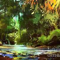
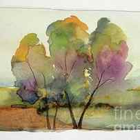
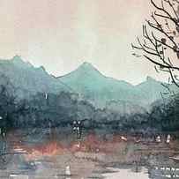
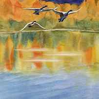
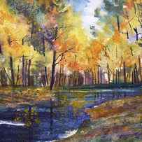
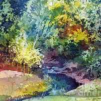
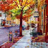
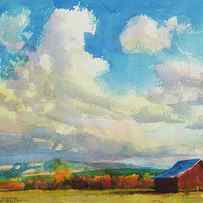
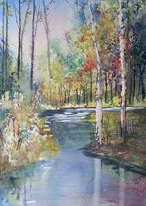
Oh by the way, if you’re interested in purchasing this autumn landscape, it’s currently available in my shop.
6-Color Autumn Palette for Watercolor

Fall is quickly arriving in the mountains where I live. The trees are already changing colors, and I’ve noticed that my landscape sketching has followed autumn’s lead. Reds, golds, and warm greens have begun to take center stage in my paintings, so I decided to put together a simple 6-color autumn palette for seasonal watercolor sketching and painting.
When I first had the fun idea to create an autumn palette, my creative juices began flowing and I was tempted to run out and purchase new paints. So I decided to set a few rules—or maybe a kinder word is boundaries—because I could foresee this idea quickly growing out of hand.
First, the palette had to be limited.
I’m a sucker for watercolor palettes (as you may already know), but fall colors are MY colors. These are the colors that I wear and use to decorate my home. Yep, I’m one of those weird folks who wouldn’t mind an avocado green fridge. So to keep this idea and autumn palette manageable, I decided to limit it to 6 or 8 colors.
Second, it had to be created with watercolors that I already owned.
No popping into the art store to pick up a tube or two. or five. I have plenty of paints so I wanted to avoid blowing my budget for a temporary, seasonal palette. (I totally confess that I almost cheated on this one. I was seriously considering a different warm yellow for this palette, but CJ was out of it. Whew, saved by an empty store shelf!)
Third, I challenged myself to try new shades.
I love my current palette and I’m committed to mostly single-pigment paints, but for this seasonal fall palette, I really wanted to stretch my comfort zone and try out some convenience shades that have been gathering dust in my bin.
After all, what would be the point of fall colors without a bit of fun? So here’s my 6-color autumn palette for watercolor plus a handy little mixing chart. Happy fall, y’all!
6-Color Autumn Palette

The colors* I chose for my autumn palette, pictured above from left to right:
- Quinacridone Gold (PR206/PY42)
- Quinacridone Sienna (PR206/PY97)
- Permanent Alizarin Crimson (PR264)
- Raw Umber Violet (PBr7/PV19)
- Green Gold (PY129)
- Prussian: Green Shade (PB27/PG7)
*Click on the names to see brand used along with current pricing. Article contains affiliates.
The swatch on top is the color, and under it is how the color looks when highly diluted. With a limited palette, it’s important to take full advantage of various tinting strengths. For more about mixes and variations, see this article.
In the photo above, I added the pigment numbers (learn what these mean here) so you can easily create your own fall palette even if you can’t get your hands on these brands. And you don’t have to purchase these exact pigments! Watercolor is very forgiving so you should pick what works for you.
Many of these colors may already be in your palette, but if not, it’s very easy to substitute. Here are a few ideas, and clicking on the links will take you to more information about these colors.
- Instead of Quinacridone Gold (this is a hue/blend anyway since Daniel Smith’s PO49 is gone for good) try a warm yellow like PY65 or PY110, or an earth yellow like Yellow Ochre or Raw Sienna.
- Instead of Quinacridone Sienna, try Quinacridone Orange, Quin Burnt Scarlet, or a PR101.
- Instead of Alizarin Crimson, try Anthraquinoid Red, Perylene Maroon, or Carmine.
- Instead of Raw Umber Violet, try Perylene Violet or WN Caput Mortuum (aka “dead head” and LOVE this one!) or mix your own RUV from Raw Umber and Quin Violet.
- Instead of Green Gold, choose another earthy green like Terre Verte, Chromium Green Oxide, or Serpentine Genuine.
- Prussian Blue Green Shade is simply Prussian mixed with Phthalo Green, but feel free to choose another warm teal like Ultramarine Turquoise or Phthalo Turquoise. Or just use Prussian—a deep, warm blue that’s an excellent mixer.
6-Color Palette Mixes

If you need help reading the mixing chart above or would like to download a blank copy to create your own, see this post.
I originally created an 8-color autumn palette that also included a deep brown and a dark green, but then I realized that I didn’t need them! I’m extremely happy with this 6-color autumn palette and the beautiful colors that I gain from a few, simple mixes.
For example, check out the beautiful range of colors (below) that result from varying the amounts of each color in a mix.

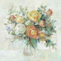
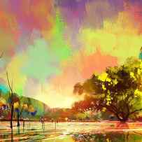
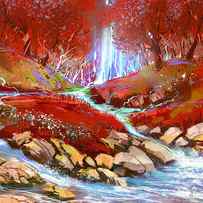
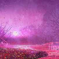
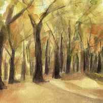
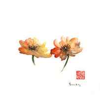
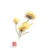
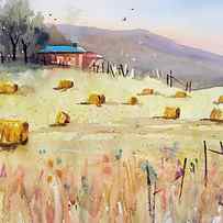
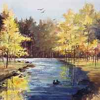
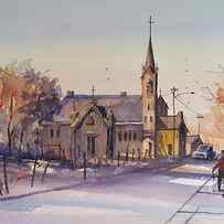
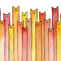
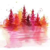
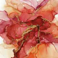
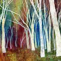
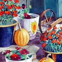
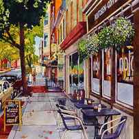
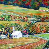
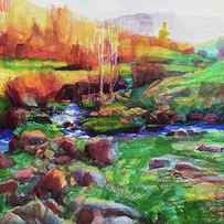
Autumn Watercolor Paintings

Filters
- Men’s T-Shirts
- Men’s Tank Tops
- Women’s T-Shirts
- Women’s Tank Tops
- Long Sleeve T-Shirts
- Sweatshirts
- Kid’s T-Shirts
- Baby Onesies
- Face Masks
- iPhone Cases
- Galaxy Cases
- Portable Battery Chargers
- Yoga Mats
- Tote Bags
- Weekender Tote Bags
- Carry-All Pouches
- Coffee Mugs
- Jigsaw Puzzles
- Beach Towels
- Round Beach Towels
- Weekender Tote Bags
- Carry-All Pouches
- Portable Battery Chargers
- Tote Bags
- Weekender Tote Bags
- Carry-All Pouches
- Original Artwork for Sale
- Gift Certificates
- Sample Kits
- Create Your Own Products

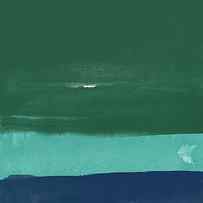
Millenial Trend Watercolor Abstract
Target Threshold Watercolor
Target Threshold: Nature

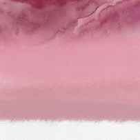
Mariusz Szmerdt – Calligraphy and Ink Painting
Hailey E Herrera


More from This Artist Similar Designs
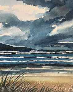
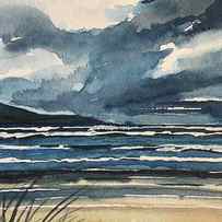
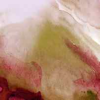
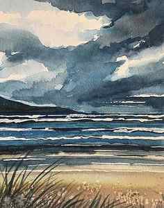
Stormy Beach Carmel. Painting
More from This Artist Similar Designs
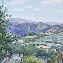
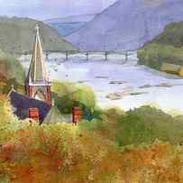
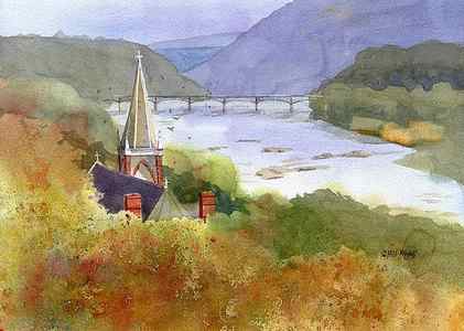
Jeffersons View Painting
More from This Artist Similar Designs
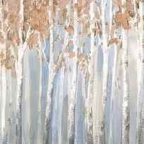
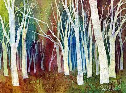
White Forest I Painting
More from This Artist Similar Designs
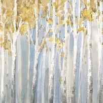
Hartman Creek Birches Painting