5 Tips on How to Use Graham and Brown’s Color of the Year: Epoch
Graham & Brown recently presented its Wallpaper of the Year: Timepiece; and Color of the Year: Epoch. Read about each and how you can best use the new shade within a space.
Launching the 2021 collection from its design headquarters in Blackburn, England, through a digital showcase, wallpaper and paint specialist Graham & Brown recently presented its annual Wallpaper of the Year: Timepiece; and Color of the Year: Epoch.
Drawing upon 75 years of design and manufacturing experience in the field, the in-house design studio identifies key movements in the interiors sector and forecasts the future trends that will shape the Graham & Brown collections for the coming months. (All images courtesy of Graham & Brown)
Timepiece marks the start of the 75th Anniversary celebrations of the brand, which will run throughout 2021. Piecing together fragments from the Graham & Brown archive, Timepiece is an amalgamation of prints dating from 1946 to the present day. The result is a bold, innovative wallpaper that represents the essence of the Graham & Brown design philosophy, according to a press release.
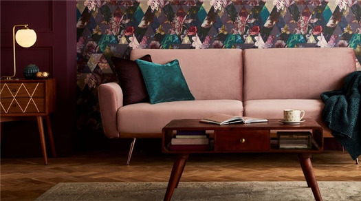
To complement the Timepiece wallpaper design, the Color of the Year for 2021, Epoch, is a directional shade of plum, pinpointing the richest purple tone in the Timepiece wallpaper and amplifying it. A calming, cocooning tone, Epoch echoes a wider interior trend which looks to create restful spaces for healthier, happier homes.
“Time is an overarching theme that winds its way through each thread of our 2021 Trends Forecast,” says Paula Taylor, color and trends specialist at Graham & Brown. “As the world we live in continues to shift and evolve at an ever-increasing rate, we look toward the future through the lens of nostalgia. We’ve explored how the future has been envisioned throughout history and how time is often considered the most precious commodity of all. Both Timepiece and Epoch contemplate on the passing of time and what can be discovered should we embrace the opportunity to recharge, reflect and rediscover our history.”
Epoch is a proud, regal and luxurious tone, as described by Graham & Brown in its press release. For those that prefer a bold style, it can shape dramatic, high-impact interiors, but the shade can also be pared back for those that favor more subdued, soothing schemes.
Abby Hesketh, product manager and paint and color specialist at Graham & Brown, shares her five expert tips for styling Epoch within a residential or commercial space.
1. Tonal pairings are a great way to make use of rich, expressive shades while still keeping things fairly safe, she notes. “Epoch works brilliantly when used as a feature wall partnered with lighter hues of lavender and heather,” she explains. “This will soften the impact of the darker color while ensuring that all walls of the room tie together cohesively.”
2. If drama is your goal, Hesketh suggests pairing Epoch with other equally vivid colors.
“Partnering Epoch with shades of teal will result in an opulent, peacock-inspired look, while adding pops of peach can shape a playful yet sophisticated space,” she adds.
3. Hesketh says that color-blocking is another creative way to incorporate Epoch into a space.
“Here, you’ll see a simple geometric design using just three Graham & Brown paints—Epoch, Spiced Mulberry and Baby Powder; the result is a light and airy feature that would make a fun addition to a kid’s bedroom, playroom or even a lounge.”
4. “A trend we’ve noticed gathering momentum is pale walls paired with skirting boards and doors painted in a darker shade,” she adds. “This is a great way to highlight the architectural features of a room and add a cozy element while still building depth and structure as we head into the autumn and winter months.
Use Epoch across all the woodwork within a room and pair with either a lighter shade of purple for a sophisticated tonal scheme, or with a mid-gray with warm undertones for lightweight feel.”
5. Finally, consider creating a drop ceiling effect by using Epoch on the ceiling and then continuing the color down to picture rail height.
“This is one of my favorite interiors trends and will work well with any of the perfectly partnered Graham & Brown paint shades,” Hesketh says.
Need to catch up on more 2021 color of the year stories? Read more here:
- Immerse Yourself in Color with HGTV Home’s 2021 Color Collection of the Year
- Valspar’s 2021 Colors of the Year Aim to Bring Serenity and Calm into Your Space
- Wellness Inspires 2021 Color Palette of the Year from PPG
The Meaning of Colors

Color influences our life every day. We base opinions and reactions off of emotions that it evokes. Some people even base their careers off of studying the effects that it has on different individuals or groups (Color Theory). There are some basics that can be applied to our everyday life and decisions, be it at home or in the office.
For example, I recently moved into a new house and had the joy (I use that term loosely) of painting all of the rooms again. One of the rooms I assumed, had been done up for a little girl and was the lovely color of Pepto Bismol pink. Every time I even walked by the room I associated it with nausea and looked away. This had to change fast, so a little research was in order. I learned a few interesting facts about the meanings of colors and the effects they have on everyday people.
Red (Primary)
Associated with associated with energy, war, danger, strength, power, determination as well as passion, desire, and love. Brings about a sense of action in people. Promotes quick decisions.
- Light Red represents joy, sexuality, passion, sensitivity, and love.
- Pink signifies romance, love, and friendship. It denotes feminine qualities and passiveness.
- Dark Red is associated with vigor, willpower, rage, anger, leadership, courage, longing, malice, and wrath.
- Brown suggests stability and denotes masculine qualities.
- Reddish-Brown is associated with harvest and fall.
Yellow (Primary)
Associated with sunshine, joy, happiness and energy. Creates a warming and cheerfulness feeling. Also promotes muscle energy.
- Dull (dingy) Yellow represents caution, decay, sickness, and jealousy.
- Light Yellow is associated with intellect, freshness, and joy.
Green (Secondary)
Associated with earth and nature. Promotes growth, harmony, fertility and new beginnings. Is the most restful color to the human eye and can improve vision.
- Dark Green is associated with ambition, greed, and jealousy.
- Yellow-Green can indicate sickness, cowardice, discord, and jealousy.
- Aqua is associated with emotional healing and protection.
- Olive Green is the traditional color of peace.
Blue (Primary)
Associated with depth and stability. Slows human metabolism and produces a calming effect. Can be associated with sadness.
- Light Blue is associated with health, healing, tranquility, understanding, and softness.
- Dark Blue represents knowledge, power, integrity, and seriousness.
Purple (Secondary)
Associated with royalty, wisdom, dignity, independence, creativity and mystery. The most common color pick for pre-adolescent children.
- Light purple evokes romantic and nostalgic feelings.
- Dark purple evokes gloom and sad feelings. It can cause frustration. Can also provoke feelings of luxury and wealth.
Black (Neutral)
Associated with power elegance, formality, evil, death and mystery. Depends greatly on what colors it is paired with. Also can produce a feeling of sophistication. Black tends to brighten other colors.
White (Neutral)
Associated with purity, cleanliness, virtue, simplicity, and innocence. Has a very positive connotation and generally represents all that is good and pure. Will also brighten other colors.
As you can see there is many different meanings and emotions that colors can convey. Thinking of the end game and what other colors it will be near will help to produce a good combination. In the case of the Pepto Bismol room I chose a olive green for one wall and a beige tone for the other three because it was a bedroom and I wanted to play off of the restfulness of the green. In cases such as your logo or office think about what your company represents or would like your customer to feel.
* Holi- Amalgamation of Ayurveda and Naturopathy *
Holi is the festival that falls during the seasonal change and the weather becomes slightly hot after winter our body needs to tune up according to the seasonal change. According to Ayurveda micro organism (germs) is very active in the end of the winter season and the beginning of summer. Due to the effect of cold in the body, there is an excess of phlegm in the body and due to the rise in temperature in the spring, there is a phlegm defect in the action of the phlegm, resulting in cold, cough, respiratory diseases, measles, smallpox, cholera. , High grade fever, diarrhea, jaundice etc. Increased risk of diseases, Spring season causes laziness in the body due to moderate temperature.
In the spring, the effect of shet vata and ama vata makes the body lethargic and prone to infections. The entire body is cleaned with body pack that cleans and open the pore before Holika Dahan, that cleanses the skin of the body as well. Impurities from the body get out through the skin and blood is purified!
At this time, disease causing micro organism grow at a rapid pace. Holikadahan is a collective effort to kill bacteria of these infectious diseases in the atmosphere.
Holika is lit on the same day at night, same time throughout the country, it increases the temperature to about 145 degrees Fahrenheit, which causes the bacteria present in the atmosphere to be incinerated and at the same time there is a tradition to revolve around the burning Holika. By doing this, 180 degree Fahrenheit heat enters the body, after that if the bacteria causing the disease attack us, they do not affect the body but they are destroyed by the heat that has come in our body, as well The burning of a tree burnt in the Holika kills cold, wind and rheumatic diseases!
According to Naturopathy’s colour therapy, colours have an important place for a healthy body, the lack of specific colour in our body gives rise to many diseases and the disease related to the mere supply of that colour to the body is automatic According to the tradition, by showering different colours of on each other and applying abir-gulal, various vibrant colours enter the body with the help of pores and inequality of colours, and people live happily healthy and long life.
Holi is a blesseing of our ancestors who made a festival like Holi millions of years ago from their experience and great far-reaching thinking, we follow the festivals as their blessing.
The synthetic colours available in most of the shops contain:-
Green color – It contains copper sulphate, which causes allergic reactions and blindness in the eye.
Red color- It contains mercury sulfide which causes skin cancer, mental retardation, paralysis and vision defects!
Blue color – It contains Prussian blue, which causes various skin diseases!
Black color- It contains lead oxide which causes fatal diseases like kidney failure.
Silver color – It contains aluminum bromide which causes cancer!
Purple color- It contains chromium iodide which causes diseases like bronchial asthma and allergies;
Therefore, we should avoid these chemical-rich colors because they are harmful to health. We should play Holi by making colors from natural things that keep us healthy as well as provide us health by following the color therapy of natural medicine as our The idea of the ancestors was!
Natural colour making methods –
Soak the flowers of Palash (tesu) (Butea monosperm ) in water in the night in the morning boil it. U.se the palash colourful water. During the holi festival the water is being showered to each other Kapha, Pitta, Leprosy, UTI, Vatta dosha and Blood Dosha are destroyed If the colour falls in the eye while playing with the colour made from the flower of plash, it cures eye diseases, the skin becomes beautiful, the germs of the skin gets destroyed and the blood is purified.
Dry green colour – Mix equal quantity of henna powder and wheat flour to make a dry green color!
Brown colour – made by mixing amla and henna, it is beneficial for skin and hair!
Dry yellow colour- Mix turmeric and gram flour or dry amalas and marigold flowers in shade and grind them to yellow colour!
Wet yellow colour- Boil one spoon of turmeric in two litres of water or soak amlatas and marigold flowers in water at night and boil in the morning!
Red colour- Use red sandalwood powder as a dry red colour, it is beneficial and beautiful for the skin!
Or put two spoons of red sandalwood in one litre of water and boil it and use it.
Purple colour – Grind beetroot and mix it in water!
Black colour – Soak powdered amla overnight in an iron pot!
Green colour- Make a paste of spinach, coriander or mint leaves in water and mix it Or grind green earrings of wheat and mix it in water!
Yellow Gulal – 4 teaspoon gram flour
Wet yellow colour- Boil one spoon of turmeric in two litres of water or soak amlatas and marigold flowers in water at night and boil in the morning!
Red colour- Use red sandalwood powder as a dry red colour, it is beneficial and beautiful for the skin!
Or put two spoons of red sandalwood in one litre of water and boil it and use it.
Purple colour – Grind beetroot and mix it in water!
Black colour – Soak powdered gooseberry overnight in an iron pot!
Green colour- Make a paste of spinach, coriander or mint leaves in water and mix it in Holi. Khele! Or grind green earrings of wheat and mix it in water!
Yellow Gulal – Mix 2 spoons turmeric powder in 4 teaspoons gram flour and apply Gulal.
Lal Gulal-Sukhe Use the powder of red rose flowers!
Dry green gulal- gulmohar or night queen leaves and grind them!
Make a mixture of brown green gulal-mehdi powder with amla powder and celebrate the festival of Holi with pomp!
Food has importance on the festival of Holi, but the use of synthetic colours in them is proving fatal for human health!
The most harmful green colour is muddy green, which is the cause of cancer, the intake of green tubes, namkeen, papad, sweets etc. increases the chances of getting cancer.
Consumption of adulterated milk and its manufactured foods increases the risk of liver damage including stomach diseases.
Aluminum vark is being used in place of silver work on sweets, which increases the chances of memory loss!
Wish you and your family a happy Holi
* Vaid Deepak Kumar *
* Adarsh Ayurvedic Pharmacy *
* Kankhal Hardwar * *[email protected]*


