Yes, epoxy resin can be used to layer gold leaf without any curing issues.
Acrylic Pour Art Technique without Mess for Beginners
This post may contain affiliate links. Please see our full Disclosure Policy for details.
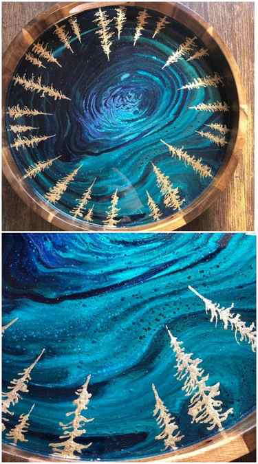
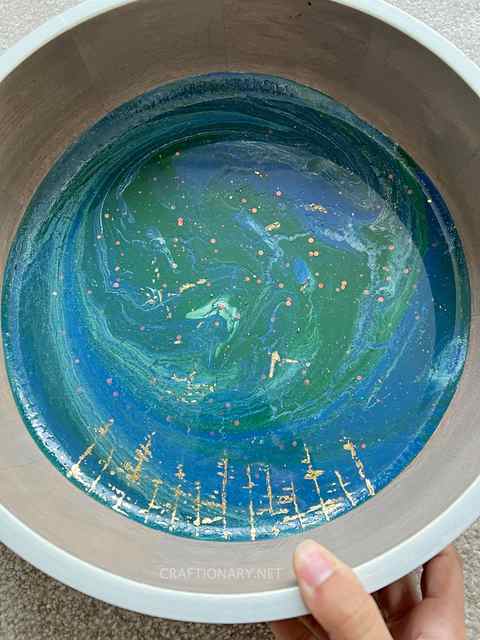
This acrylic pour art technique involves pouring acrylic paints in a wooden bowl to make a beautiful swirl pattern without dripping paint mess for beginners. Add gold leaf details and epoxy resin to seal the beautiful results.
Let’s decorate a wooden bowl with acrylic pour and gilding! This is a beautiful technique that you can use to make endless combinations and designs to decorate almost any surface! You can make projects like acrylic pour wooden bowls, trays, plates, tables, and so much more by filling a hollow surface. You will love these acrylic pour painting ideas if you are interested in making wall art.
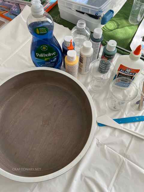
We will need liquid dishwashing detergent, white/school glue, plain water and acrylic paints! For professional results and recommendations based on this experiment continue reading!
How to make acrylic pour art in a bowl?
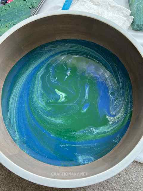
The inspiration for this project comes from the aerial view of the Earth! Therefore, we will need green, blue and white acrylic paints to achieve this look! Check out the video to make acrylic pouring instructions easier to comprehend:
Material:
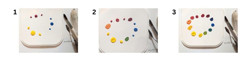
- Acrylic paints in your choice of colors – you can mix as many shades of paint as you like but for start two tones works best. Always use white or black for contrast to make fun patterns visible.
- Elmer’s white glue or any school glue
- Liquid dishwashing detergent
- Water
- Disposable cups
- Craft stir sticks or silicone spatula for mixing
- Wooden bowl or any surface you wish to pour paint inside
- Gold leaf sheets
- Tacky Glue
- Epoxy Resin – check out epoxy resin crafts for more details.
Instructions:
How to mix acrylic pour paint?
Mix equal parts of Elmer’s white glue and acrylic paint in two separate cups (1:2 floetrol and acrylic paint as suggested by Flood brand)! You can experiment with different quantities if you like. Shake the paints well before pouring them into the cups! Make sure to use a silicone stick and move your stick around the surfaces and base of the cup to mix the two thoroughly!
Depending on the thickness of the paint add water to the solution to make it runny enough that it can flow easily but not watery! Add a few drops of liquid detergent to allow patterns to form naturally! This method is for first-timers who want to try acrylic pour without spending on specialty materials!
Substitute for pour medium:
There are other more refined materials you can use for professional results like Floetrol instead of white glue. The suggested ratio is 1-ounce floetrol to 1/2 ounce acrylic paint to get vibrant swirls and cells like Kathryn Beals.
How to make cells in acrylic pour?
Cells are formed when paints have varying densities. There are many ways to create cells in acrylic pouring like using floetrol and liquid detergent that are used in this article. You can use silicone oil, blowing the paint with a blow dryer, or torch to form cells and stop colors from mixing for best results.
How much acrylic paint quantity do I need for my project?
It is also important to keep in mind the quantity of paint you need for the surface area of a pour! A simple rule is to use water to fill your bowl and use it as a measurement for your pour! Divide it into three colors for this project for instance!
According to Paint Pour Academy, a good rule of thumb is to approximately use 1 ounce of paint for 25 square inches of surface area.
How many colors to mix for acrylic pour art?
There is no set rule for the number of colors you can combine for an acrylic pour. Try different shades that match or contrast while using neutrals to make shade variations and fun patterns attractive. Check out fun acrylic pour techniques to try some of them.
How to create acrylic pour in a cup?
Now that our paints are ready it is time to create a pour! We will use white to give contrast to our paints! Take an empty disposable glass and add small quantities of each color substituting between the two colors, while adding white between each layer! Continue adding small amounts till you use it all!
Have your bowl ready, make sure it is clean and dust-free before you start! Now put the bowl upside down on the glass with paints! And apply firm pressure to avoid any space between the two surfaces flip the bowl and cup such that the cup is on top of the bowl! Wait for a while to allow the paints to settle in a downward direction!
Now for the fun part! Flip the cup and remove it! Start moving the bowl around to allow the colors to flow and cover the entire surface or just let it flow naturally! Whatever you do just know that every movement will move the paints and give a pattern! Just move around enough till you are satisfied with the results! You can also use a wooden skewer stick to make spirals and designs that will allow the paints to swirl and make patterns as well! Experiment and have fun!
Now allow it to dry for a day! The glue in the paint helps with the paint flow and makes fun of cracked valleys and islands!
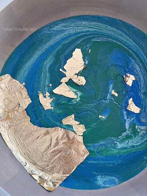
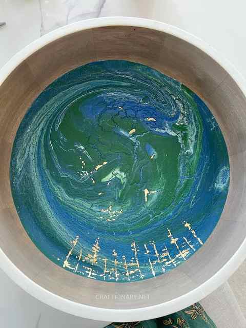
Gold leaf sheet gilding on acrylic pour
How to apply gold leaf to acrylic painting?
Wondering if you can apply gold leaf directly on to acrylic paint? The answer is yes you can do gilding on acrylic pour.
Here again for the purpose of this beginners project we are using tacky glue and gold leaf sheets! For ideal gilding results use pebeo gedeo kit that comes with gilding paste pen and mirror effect gold leaf.
I recommend watching this beautiful art by Mii Paintings that I want to try with golden foil as a substitute for gold leaf sheets which are very delicate to handle.
Can you use Elmer’s glue for gold leaf?
You can use Elmer’s glue but it is very runny and hard to control. A better substitute is tacky glue which is thicker and less watery.
Use a paint brush to carefully draw your pattern of choice with little tacky glue! You can also use a pencil to draw your pattern before applying glue! The purpose is to make the pattern such that when you place gold leaf sheet on top it doesn’t splat between the two surfaces! Once you have applied the pattern with the glue, place the gold leaf sheet on top and smoothly brush it to stick to the glue.
How long to dry glue before removing gold leaf sheets?
Allow it to set for 15-20 mins! Now use a dry paint brush to brush off the gold leaf sheet to reveal the motif! Be gentle when removing the gold leaf sheet! Keep the leftovers in a jar for future projects! I also gave gold leaf details where deep pools are formed! You will also love gold leaf application on laser engraved canvas.
Approaches for forming cells in acrylic pour
In this Acrylic Pour Art Workshop, you will learn from an Abstract fluid artist the knowledge and skills that you need to create beautiful abstract fluid art paintings.
You will learn acrylic pour techniques and work with different colours to create truly unique abstract paintings.
Acrylic pour painting is a unique art form that involves improvisation, being in the moment and following your creative instincts. It is a very calming and therapeutic experience.
If you have always wanted to do something creative while having fun and bond with your family and friends, this workshop is for you! This would also be great as a birthday, thank you or anniversary gift for a loved one.
In a friendly and supportive environment, you will learn:
- The basics of acrylic pour painting
- The tools or supplies that are needed
- Basic colour theory and how to choose colours that will go together
- How to choose paint types that are good for acrylic pouring and methods for mixing paint and pouring medium properly
- Acrylic pour techniques such as ‘Cup Flip’ and ‘Ring Pour’ to create abstract artworks
- Composition and how to avoid overworking your painting
- Recommendations on how to store your painting for drying and how to varnish your painting.
What you will take away from this workshop:
- Two completely unique 20 x 20cm paintings that you have created
- An information sheet (supplies that you will need and tips if you want to do this at home)
- A basic colour wheel
- Simple tools you need to re-create these paintings
- Basic skills for creating abstract acrylic pour painting with different effects (cells and unique patterns)
- Explore and channel your inner creativity into art
- Learn a new skill in a friendly environment
- Have a fun and relaxing time
- A chance to do something creative with friends and family
Beginners are welcomed. No experience is necessary.
*** Small class size to ensure attention can be given to each participant (maximum of 10 people). This class is suitable for adults and kids can join in too.
This is a Studio member-only feature!
Join our Studio membership and save your favourite Painters Online content, from gallery artwork to step-by-step guides, to your own online mood boards. Create your go-to place for inspiration and learning. Plus, members can also enjoy a range of exciting features including monthly art videos and a digital magazine library.
If you are already a Studio member, simply login to your account.
Not a Studio member? Why not try our free 30-day trial – no commitment, no credit card required
Showing page 1 of 3
Author
Message
- New Member
- Last active: 4 months ago
- Posts: 2
Posted 4 Months Ago
Hello, I am planning black/blue as my main colors, and using the dirty pour. I am intending to alternate black and blue with 3 different shades of blue. Example- ultramarine blue / mars black / cobalt blue / mars black / cerulean blue / mars black, repeat. I ordered a sample kit from Arteza, and was using 1 part paint, 3 parts Floetrol as my medium. I felt the paint was a little thick and tough to spread in the first trial, so I added 10% water to thin. I found this to be the consistency I wanted that made tilting easier without running too much. I was able to do one trial with the Arteza paint before my blues ran out, and it came out great. The colors remained well defined, with a bit of cell/lacing. Then I opted to switch to Liquitex Basics since I was able to source it locally at a JoAnns, it was a bit cheaper, and I was able to get some larger tubes. Everything I read online seemed to suggest Liquitex Basics was one of the best options for pouring, and when I compared it, the consistency was very close to Arteza, so I assumed I would be able to swap paints, and keep my Floetral/water ratios the same. Once the paints were mixed up, it did have a very similar consistency, and flowed about the same. The thing I noticed right away was how much more mud I got using Liquitex Basics. Even cutting the water down to 5% still resulted in a lot of mud. So my question is, is it possible that the brand really is the issue? Or is more likely that the colors I am using just are not playing well together? I read a lot about using the color wheel and layering colors in a certain order to avoid mud, but I really did not come across anything indicating blue and black did not play nice. Although I selected similar colors by name (ultramarine blue, cobalt blue, cerulean blue), the colors/shades are not identical from Liquitex and Arteza. So I wonder if it could just be the shades of those colors from Liquitex are more likely to blend with the black than the shades from Arteza. Ive seen a number of videos online of people using Liquitex Basics and using similar blue/black combos, and seemingly having good results. This makes me wonder if there is something else I am missing that is causing my issues. Since I already have plenty of Liquitex Basics, I would like to try to remedy the issue and use it as opposed to spending another $40 bucks to buy more from Arteza. Any thoughts or incites would be greatly appreciated. Thank you!
- Forum Member +
- Last active: 51 minutes ago
- Posts: 83
Posted 4 Months Ago
Colour names are not reliable indicators of the actual hue. It is better to use the pigment codes that are (generally) available on the labels (or online) e.g. Liquitex ultramarine blue is PB29 (at least in the Heavy Body range). Even then, if you want to measure paint differences precisely, you would have to use a spectrophotometer. These tools have come down in price recently but still cost several 100 dollars. I have the Spectro 1 from Variable and have found it really useful for tasks such as identifying precise complementary colours or in predicting the effect of mixing (I recently found I could get a close match to Cobalt Teal — an expensive series 4 paint — using Brilliant Yellow Green and Brilliant Blue, both much cheaper series 1 paints, so it is starting to pay its way 🙂
- Prestige User
- Reputation: 18728
- Last active: 10 hours ago
- Posts: 6611
Posted 4 Months Ago
Hard for me to answer questions about pouring, because I don’t do it (lack of space here would make it likely I’d end up with more paint in my shoes than on the work). However, in general – there can indeed be big differences between colours in different brands of paint – there are some notorious ones: Sap Green, for instance, is a very moveable feast across brands. Cobalts, ultramarine, and cerulean SHOULD be near to each other across brands – but here’s where theory and actuality collide, because – they’re not. Plus – is the Cobalt and Cerulean you were using the same anyway? I don’t use Liquitex Basics, but it would seem likely that in a basic set, they’d use Hue colours; and these are almost invariably variants of Pthalo Blue – a quite different paint, but mixed to look similar (it never, ever does). I also don’t use Arteza – it’s a relatively new paint on the market; but as with all flow paints designed to mix and react together, I would stick to the one brand. If you’re getting muddy colours, there could be two answers; one is the rather heavy use of Mars Black – it’s generally a very good black in both acrylic and oil, but all blacks need care if they’re not to dull other colours. The other is the additional stabilizers mixed with each type of paint: they’re likely to be broadly similar, but if there’s a lot of filler, and it differs chemically even marginally, plus if your colours are not “true” to begin with, e.g. are Hue colours, there’s a great deal of scope for mixing mud.
- Prestige User
- Reputation: 18728
- Last active: 10 hours ago
- Posts: 6611
Posted 4 Months Ago
PS – I concur with Martin Cooke: not that I’d buy a spectrophotometer, although it sounds interesting: just expensive, and expense is something I both want and need to avoid. But about looking for the pigment numbers – if they’re shown. If they’re not, you have very little guidance at all, and just have to learn by experiencing all the colours available. Much better to buy paint where the numbers are clearly indicated – it’s the only reliable way of comparing them unless you have specialized equipment. Though even then – always important to bear in mind that a great deal lies in the mixing, the grinding, the added materials – extenders, stablizers, bulking agents, resins – all of these are likely to vary, if only in proportions, between manufacturers, and all can affect the purity of the colour.
Edited
4 Months Ago by Robert Jones, NAPA
- New Member
- Last active: 4 months ago
- Posts: 2
Posted 4 Months Ago
Thank you Martin and Robert! I was curious how well black actually worked as a neutral color in between the blues, so I appreciate the idea that the high level black could be an issue of dulling others. I did another trial and alternated black and gray between the blues instead of just black, and I did see improvement. I think I will just go ahead and purchase some more paint from Arteza, and continue testing, see if I can really can notice a difference in brands. The Cerulean and Cobalt were actually noticeably different both from Arteza and Liquitex. The Cerulean looked to my eye have a lot more greenish tones in both brands, and the Cobalt seemed to be, for lack of a better term, more true blue. Strangely enough, the Cobalt from Arteza is quite a bit lighter than the Cobalt from Liquitex.
- Forum Expert
- Last active: 2 hours ago
- Posts: 426
Posted 4 Months Ago
The curious thing about spectrophotometers is that they measure the light is absorbed. What you see when you look at a painting is the opposite, the light that is reflected, not absorbed. They are great for identifying the composition of a material. Predicting what you get when you mix two pigments?
- Forum Expert
- Last active: 14 hours ago
- Posts: 173
Posted 4 Months Ago
I did a lot of experiments some years ago with acrylic pours, because I wanted to use as backgrounds. Weight of pigments plays a big role. If there is no variation in your pigment weight the colours mix instead of forming cells. The bigger a difference you can get between the heavy layer and the lighter trapped layers the more success you will have. The heavy weight, mars black or titanium white should be at the bottom of the cup. When the cup is flipped that colour will be at the top and the lighter weight colours will push through it and create cells. You can add water, Floetrol and or silicone to the lighter weight colours, don’t add to the heavy base colour. The paint I used was Winsor & Newton Galeria. No matter what brand use a scale and note the weight for a known volume. Make the lightweights lighter, remember similar weights mix. These are not in my gallery I’ll put some here. 


Edited
4 Months Ago by Collette Hughes
- Prestige User
- Reputation: 18728
- Last active: 10 hours ago
- Posts: 6611
Posted 4 Months Ago
Useful contribution from someone who has actually done this. I have looked at Liquitex Basics in the meantime, and they do indeed use Hue colours in their range, so that what is labelled Cobalt Blue (Hue) has nothing in common with Cobalt Blue, other than an approximation to the shade. The difference between it and genuine Cobalt Blue is likely to be significant – the same is true of the Cadmiums, and Cerulean Blue. This reinforces the point that you should stick to one brand, and preferably a higher specification than the ones you’ve been using to get the best out of this effect. Collette uses or used Galeria – a Winsor and Newton product, which is good paint: it doesn’t suit the way I use acrylics, but should be fine for this approach (as has been shown) and given its quality is reasonably priced. The higher grades of Liquitex, and Golden Acrylics flow formula, should also work well; as should the Daler-Rowney Graduate range, or, higher up the quality scale, System 3. I know very little about Arteza; will endeavour to research it. I must say that it had never occurred to me to weigh pigments – I can see that it would make sense with this technique, though. One learns a little more each day!
- Prestige User
- Reputation: 18728
- Last active: 10 hours ago
- Posts: 6611
Posted 4 Months Ago
Quick look at Arteza – they seem to have a high satisfaction rate, but they’re not of professional quality (which may not matter) and do not identify the pigment number on their tubes – which is a pity, because you don’t know what you’re getting; they don’t even differentiate between single pigment colours and convenience mixes & Hue colours. On the other hand, they do have a range designed for pouring techniques specifically; which most brands don’t, although many can still be used for that purpose. Prices are quite low, but I’m not tempted, because a) I have my favourite and long-established brands, which I trust; and b) if I use ready-flowing acrylic, it’s only because I’ve run out of the heavy-bodied variety. I admire Collette’s work, but have never wanted to try a pouring technique – if that’s the way you want to go right now, Darren, Arteza might be just the brand for you, with Galleria as an alternative.
- Forum Expert
- Last active: 14 hours ago
- Posts: 173
Posted 4 Months Ago
Thanks Robert glad you think it’s useful. I don’t use galeria anymore. This technique you end up pouring half the paint away so it’s a good balance between economy and quality. The 250ml tubs are great value. I didn’t realise how long ago it was I last used them until I looked for photos, I bet they have gone off hard. Darren: You can increase the weight of your heavy layer by adding a bit of gesso to it. Use black gesso if using a Mars black layer. You can also help the paint flow by having a wet white or black layer on the canvas before tipping the cup. I’m glad you posted this question Darren. You’ve made me consider some more experiments. I’m wondering if clear gesso would work as a heavy layer and whether I could combine with a painting underneath the pour rather than painting on top of the pour. If I do I’ll post it in WIP in case anyone is interested.