When you mix colors that sit exactly opposite from each other on the color wheel, you get a complementary color scheme. Examples of complementary colors are red and green, blue and orange, yellow and purple, yellow-green and red-violet, red-orange and blue-green. If you use one color mixed with its complement plus the tertiary colors on either side of it, you get what is called a split-complementary color scheme.
What Color Does Black And White Make When Mixed?
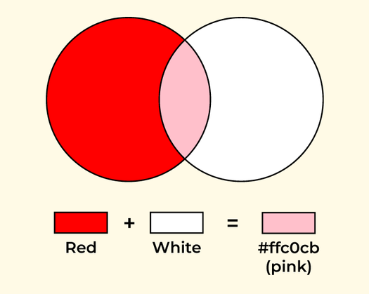
The color Black, White, and Gray are achromatic colors without hue. The color Black indicates the absence of all primary colors in the RGB (Red, Green, Blue) color model whereas the color White indicates the presence of all primary colors in the RGB (Red, Green, Blue) color model.
If you mix 50% of Black color and 50% of White color exactly then it will give a Gray color or sometimes it will give light gray or dark gray depending upon the nature of the other two colors. This is because there are different shades of Black color and different shades of White color. If you exactly pick the default Black color i.e., #000000 as in Hex Code or RGB(0,0,0), and the default White color i.e., #FFFFFF as in Hex Code or RGB(255,255,255) then it will provide the expected Gray color without having the shades of other colors.
Overview of Gray Color :
The Hex Code for default Gray is #808080 and the RGB combination for default Gray is RGB(128,128,128). There are different shades of Gray color. Some of them are Anchor, Ash, Slate, Shadow, Fog, Coin, Charcoal, Flint, Mink, Graphite, Dove, Silver, Steel, Iron, Stone, Pewter, etc.,
The color Gray was first recorded during the Seventh Century. It is also mentioned as Grey. The term Grey is mostly used in British English whereas Gray is most commonly used in American English. During Middle Ages, dresses were made by using undyed wool which is a type of Gray color. The color Gray was also used in ancient paintings. It attracted the attention of artists as well as dress designers. More outfits and paintings were using the Gray color. The color Gray expresses the following terms or meanings, such as Compromise, Neutral, Maturity, Reliability, Relax, Calm, Conservative, Control, Stability, Practical, Sad, Balance, Coldness, Depress, Reserved, Introvert, and Unemotional, etc., It is the intermediate distance between Black and White color. The color Gray is associated with nature in many forms such as the outer appearance of Animals/Birds such as Gray Parrot, Raccoons, Gray Fog, Gray Wolf, Wood Owl, Koala, Rhinoceros, etc., Flowers such as Gray Santolina, Paperflower Desert brittlebush, Algerita, Desert marigold, etc. We can see more Fish species are having Gray color appearance. Stones and some natural minerals are of Gray color. Lighten the Gray Color :
Gray is a mixture of two colors Black and White. Here the color White is a lighter shade when compared to another color Black which is exactly the opposite of White color. If you feel that the color Gray is darker than you expected and you want to make it a lighter shade of Gray then you will mix a certain amount of White color in the Gray color to have the desired amount of expected light-gray color. You can also add the minimum amount of White color or maximum amount of White color depending upon your requirement.
Gray is a mixture of two colors Black and White. Here the color Black is having a darker shade when compared to another color White which is exactly opposite to that of Black color. If you feel that the color Gray is lighter than you expected and you want to make it a darker shade of Gray then you will mix a certain amount of Black color in the Gray color to have the desired amount of expected dark-gray color or bright-gray color. You can also add the minimum amount of Black color or maximum amount of Black color depending upon your requirement.
Whether you’re preparing for your first job interview or aiming to upskill in this ever-evolving tech landscape, GeeksforGeeks Courses are your key to success. We provide top-quality content at affordable prices, all geared towards accelerating your growth in a time-bound manner. Join the millions we’ve already empowered, and we’re here to do the same for you. Don’t miss out – check it out now!
Last Updated : 22 Sep, 2023
Like Article
Colors
Colors are pretty, and they’re also pretty fundamental to painting. When painting, we want to be able to access and manipulate colors easily to do fun stuff like mixing them together or matching them to create visual harmony or contrast. We also want to be able to quickly find our favorite shades of red or favorite tints of blue without thinking or working too hard. All of this becomes even more important the more colors we have access to!
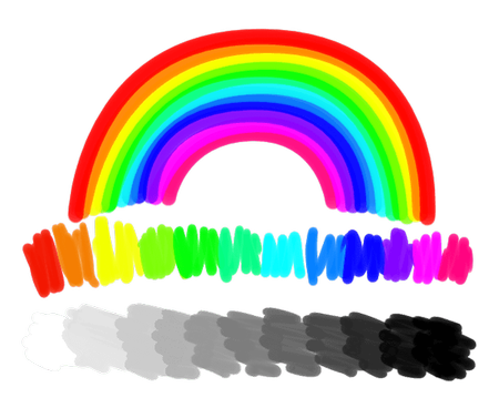
Naturally, the first thing we do is organize the colors, usually based on what we see in nature. For example, we tend to order hues in the order that they appear in a rainbow, and we think about brightness of values as a tonal range from white to black. Of course, nature itself is tied to physics, and the order of hues and the concept of brightness has everything to do with the wavelength and energy of light as it bounces around and eventually enters our eyes.
In the case of traditional media, we order the colors (hues) by how they result from mixes of other colors, starting with the subtractive primary colors: cyan, magenta, yellow. Mixing each primary color with each other reveals three secondary colors: violet, orange, and green. Mixing between those colors creates tertiary colors, and so on – the variations of hues between each named color are practically limitless! Thinking of colors in this way creates a circle of hues that artists call “the color wheel”! Each one of these hues can be made lighter (tint) or darker (shade) by mixing with white or black, respectively, and any color can be made less saturated (more gray or muted) by mixing with another color on the opposite side of the color wheel.
In the digital world of computers color is treated similarly, and we order colors by the way the screen generates them; each pixel of color on our screen is produced by combining super tiny red, green, and blue lights of varying intensities. Unlike mixing paint, where light intensity is subtracted by pigment and mixing all the colors together produces a muddy brown or gray, mixing lights is additive – no light at all is obviously black, and mixing all of the colored lights produces white. As such, we can make a list of possible primary color intensities:
Shown above is a table of different intensities of red light. Our screens can certainly create a lot of shades of red, but we only start to see the power of pixels when we add in the other primary colors, green and blue, and show the colors of light that are produced when they are added together! For example, here’s a table showing various mixes of red and green:
But that’s just red and green, what about blue? I guess we can make even more tables to show what happens when different amounts of blue are added into the mix:
This way of ordering colors is probably familiar to you if you have used some programs for making internet applications, like Flash. In fact, if we had made 6 samples instead of 5 per “channel” (that is, per each primary color), we’d have gotten the 216 websafe colors!
Showing the colors in a bunch of tables just feels wrong, though, doesn’t it? That’s because, while our tables are 2D, as we are mixing three primary colors, color can be thought of as 3D! It’s a bit odd the first time you think about it this way, but you can actually stack these tables based on the amount of blue and they become a cube!
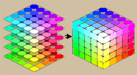
This cube is not filled with water, or sand, or even concrete, but colors! Colors are pretty abstract, and we typically talk about cubes and other 3D objects that represent abstract ideas as spaces, hence we call this cube a color space. Because this particular cube uses red, green, and blue as its axes, we say that our cube is in the RGB color model .
There are many more color models. For example, if we were to balance our cube on the black corner, the white corner would be right under our finger at the very top of the cube. And as geometry and maths would have it, if we were to cut the cube in half as we balanced it, the line from the white point at the top to the black point at the bottom would be the grayscale.
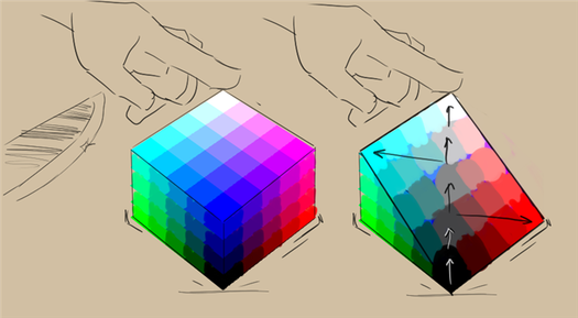
When you think about a strip of grays running through the middle of the cube, as we move farther away from that grayscale towards the outer edges of the cube the colors would begin to become more saturated (colorful and vivid). The circle of colors around that middle axis of gray would then define the hue, with a different color in each direction.
This is the basic idea of the HSV, HSL, HSI, and HSY color models . This particular model is called HSI (hue, saturation, and intensity), because it maps each unique color to the intensity of the primary colored lights that mix to create them.
There are other color models, like L*a*b* , where we look at the corresponding gray value of a color first, and then try to describe it, not it terms of hue and saturation, but by how red, green, blue, and yellow it is. Because our brains cannot really comprehend a color that is both green and red, or yellow and blue, this makes them good polar opposites in a sliding scale. We call this a perceptual model, as it is based on how we see color instead of how the color is generated.
Color models describe color spaces, which, in turn, are all sorts of sizes and shapes as well. Krita allows you to do operations in different models and spaces, and we call this functionality “Color Management”.
Color Management is necessary for CMYK (subtractive) support, but outside of that, not many drawing or painting programs offer the feature, as some developers believe that artists have no need for such functionality. What a pity! Especially because Color Management allows for far more cool tricks than just basic CMYK support, and the ability to manipulate colors like a computer can is perhaps digital painting’s most unique quality!
As Krita is giving almost unprecedented control of color, this unfortunately means that there are little to no articles out there on how to use color management for artists or painters. And so, we made this category and hope to fill it up with relatively short articles explaining color-related concepts in a light-hearted and visual manner.
We recommend going over the color managed workflow page next – even if you don’t plan on using it, it will help make sense out of the many features related to colors and Color Management. Other than that, each article should stand on its own and can be taken in at your own direction and pace!
- Bit Depth
- Color Managed Workflow
- Mixing Colors
- Color Models
- Color Space Size
- Gamma and Linear
- Profiling and Calibration
- Scene Linear Painting
- Viewing Conditions
How Paint Swatches Can Help
A fun and easy way to discover all the colors you can get is to make paint swatches or a color mixing chart. Draw a grid and start applying different mixtures of paints to each block. You can practice by seeing how many different greens, purples, or oranges you can make. Notate which colors you mixed for each swatch and you’ll have an instant guide you can refer to as you paint.
Here are the Arteza Watercolor Half-pans swatches that I use when I start painting with this vibrant set

Tips on Color Mixing
- Add dark colors to light colors. If you’re trying to get a lighter shade of a color, it’s best to add it to white or another lighter color than the other way around, since it’s more difficult to lighten a color than to darken it. For example, it’s easier to make pink by adding the red to white than keep adding more and more white to lighten the red. You’ll also use less paint by doing it this way.
- Use neutrals to make more vivid colors stand out. By placing gray or brown next to bright red, for instance, the red will appear more brilliant than if it was surrounded by another bright color.
- Don’t use black to darken a color. Although you may think it makes sense to just add some black when you want to darken a color, black can actually result in flattening or muddying the color. Instead, try using a dark cool color such as ultramarine blue or a warm neutral such as burnt umber.
- Shelve the black altogether. To create blacks that retain their vibrancy, try mixing complementary colors, such as red and green, together instead of using pure black from the tube.
- Cool off or warm up your colors. You can create a range of cool colors by adding blue while adding red or yellow will add warm undertones.
- Want to know what colors make brown? It’s easy, just mix together all the primary colors!
- Practice color mixing without paint. The website, Try Colors, is a great resource that will allow you to combine tons of colors without opening a tube of paint.
- Mix colors lighter than you want them to dry. Typically, the paint dries to a darker shade than what’s been initially applied, so mix colors a few shades lighter to ensure you’ll get the correct shades.
- Save your leftover paint. It’s possible to save the leftover paint on your palette once you’re finished painting. Simply scrape the paint from the palette into jars that have a secure top or you can purchase special containers for this at the art supply store.
- Don’t overmix. Be careful not to add too many colors when mixing or you’ll end up with a muddy mess.
The more you paint the easier color mixing will be. And, like many artists, you’ll find that you gravitate to certain combinations more than others. This is just one way you’ll develop your unique artistic voice. We hope this article has helped you understand color theory. Please let us know your thoughts in the comments section below. Most of all, have fun and happy painting!
Share It
5 comments
What are considered the primary colors on the watercolor tubes? (I have the 24 tube set)
Avery September 20, 2022
Hi Laura! Great question. We believe the color names that best fit the primary colors in the gouache set of 60 may include A106 Scarlet Red, A121 Mid Yellow, and A110 Ultramarine Blue.
Arteza April 28, 2022
I have the same question that Kimberly had about the Brush Pens, but in regards to your gouache set. I have the 60 set and I’m planning on filling some pans (14) with a few colors to make a smaller travel set.
If I had to assume, a primary red could be A115 rose, yellow might be A102 lemon yellow, and blue would be A110 ultramarine blue.
Which would you say are the “three primaries” from which all other colors can be blended?
Laura April 28, 2022
Hey Kimberley! We believe these are the color names that best fit the hues you listed:
Red: Red A101
Red-orange: Cadmium Orange A140
Orange: Orange A112
Yellow-Orange: Sunset Yellow A156
Yellow: Lemon Yellow A105
Yellow-Green: Acid Green A152
Green: Green A179
Blue-Green: Turquoise A171
Blue: Caroline Blue A166
Blue-Violet: Dark Blue A119
Violet: Violet A109
Red-Violet: Mulberry Pink A110
Arteza April 28, 2022
Which Real Brush Pens are the equivalent of the main colors on a color wheel? Some I assume. I know warm and cool primaries figure in, too, so which of your color names most closely represent these hues?
Red A101
Red-orange
Orange A112
Yellow-Orange
Yellow (lemon yellow A105?)
Yellow-Green
Green A179
Blue-Green
Blue (Cyanine A159?)
Blue-Violet
Violet A109
Red-Violet
Kimberley Broyles April 28, 2022


