The acrylic paper handled the paint very differently to watercolour paper. I was really happy with the results once I had got used to the soft consistency of the paint on acrylic paper. The transparent qualities of the colours allow multiple layers for building up depth and colour, especially when used in conjunction with the medium. Plus, the paint stays workable in the palette for quite some time.
The Last Flight Into The Sky – An Online Acrylic Painting Lesson

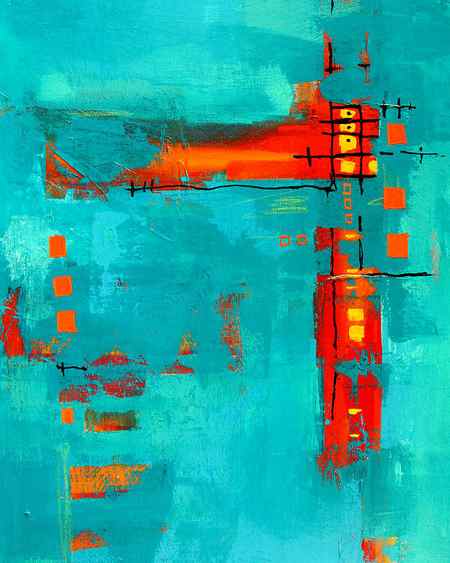
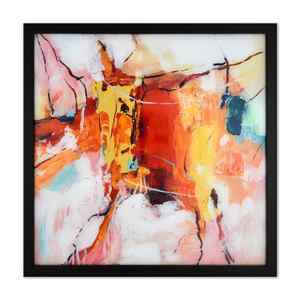
The Last Flight Into The Sky is an illustrative painting. Learn how to create an amazing atmosphere and mood and then how to create a story using symbols and characters. This lesson is an in depth start to finish painting lesson. That means I show you every single step in the process. There is nothing cut out. I show you how to choose your colors, mix them and then create an amazing work of art.
This lesson is about 6 hours long. It is split up into sections. There are 4 parts:
Part 1: Sky and Clouds
Part 2: Middle ground and finishing touches on the sky
Part 3: Left side foreground and character
Part 4: Right side foreground and character.
There will also be two additional videos. One explaining the materials used, and one showing how to do a drawing transfer for those who struggle with drawing on canvas.
Reference photos are included for all the characters and the middle ground. The sky is made up as we go. This is a fun exciting lesson! Join in and get out the brushes today!
You may also like…
To purchase this lesson, click Add to Cart, then click Checkout, and follow the onscreen instructions. Once you’ve completed the order, you’ll be able to instantly access the lesson by clicking the blue button labeled with your display name in the upper-right and then selecting My Painting Lessons.
Note: DVD orders are shipped via First Class mail and should arrive within 5 to 7 business days.
With every Tim Gagnon Studio online lesson purchase, you receive:
- Immediate access – just purchase and begin painting
- Start to finish instruction – no cutouts – you’ll see every brushstroke of every painting
- Easy-to-learn techniques – develop skills to promote consistency in your style for a more professional look
- Unlimited viewing, no expiration – view the lesson as many times as you’d like, whenever you’d like
- Download the lesson directly to your hard drive for easy, offline access
- No expiration – once purchased, you’ll have access to the lesson forever
- FREE access to Critique Corner community – get/give advice, interact, and share photos of your work with other artists taking the same lesson
Tim Gagnon is the creator of online and DVD-based instructional art lessons for over 17,500 students in over 30 countries. In 2012, he was voted as one of the Top 50 Emerging Artists by Art Business News. His easy-to-learn instruction and unique, modern style has propelled him to one of the most followed artists in the United States.
Stage 1

I began by painting out the white of the paper with Ultramarine, Burnt Sienna and Violet mixed with water and medium. When that was dry, I used the same colour to roughly mark out the shapes of the painting with a small brush. Then, using neat colour, I brushed Ultramarine, Violet and Burnt Sienna over the wall shapes.

In the distance I used Violet with Olive Green and Titanium White, changing to Yellow Green and Gold Ochre in the mid ground. Finally I used Olive Green and Cobalt Blue (hue) at the bottom. The application left plenty of exciting brush marks.
Stage 2

This felt a bit trickier than the more absorbent watercolour paper. The acrylic paper is a sealed surface and paint has nowhere to go but build on top. I made some mid values for the wall and sky using Cobalt Blue (hue), Burnt Sienna, Violet and Titanium White. This was quite opaque, so I began to add medium to aim for better transparency. The flow of the soft body paint left lots of hard edges, which I was keen to break up for more depth. I added another layer of yellow green and gold ochre on the mid ground grass.
On this paper I found the drag technique difficult due to the consistency of the paint. I’m confident this wouldn’t be a problem on canvas or canvas board. If you like soft paint, you’ll like these colours. The paint also stayed wet for some time even though I wasn’t laying it on thick.
Stage 3

To get a stronger dark, I switched to Violet and Olive Green, which made a beautiful dark grey, and I used this to reinstate some of the stronger values in the wall. Mid values were mixed using the same base with Titanium White added. This was then strengthened for the foreground grass with Olive Green and Cobalt Blue (hue).
The flow of the soft body colour was filling my brush and subsequently, I was adding too much paint to the shapes, so it was time to add more medium and aim for transparency. I used Sky Blue mixed with Titanium White and lots of medium to reframe the background and build up the sky depth. You can see how this turned the paint quite transparent over the background edge.

Frisket Paper
Moving inside, I laid the canvas flat on a tabletop and adhered prepared frisket paper (waterproof tracing paper with an adhesive backing) to the painting’s surface. Over the next few days, I cut the tidal-pool and runnel shapes from the paper with a frisket knife—which has a blade that rotates 360 degrees for cutting intricate shapes. The translucent frisket paper allowed me to see my acrylic sketch which was still faintly visible beneath the light blue gray that was sprayed on the lower portion of the canvas. Because this was merely a rough sketch, I was doing a lot of drawing and composing as I cut the frisket.
When I finished cutting, I pulled away the frisket surrounding the pools and runnels and then sprayed the exposed beach areas with dark, gray-browns. In this photo (above), the spraying is finished, and the tape, plastic and frisket-paper mask are removed. The basic color chords and the fundamental divisions of the composition are in place.

Blending
In this photo a number of different things have happened. Working with oil paint and a variety of brushes, I’ve painted the clouds so that they feel “meaty” and tactile compared to the spray-painted sky. To intensify the lower right of the sky, I mixed my oil colors with Grumbacher Alkyd painting medium and delicately blended them into the spray-painted sky, using a variety of soft, fan-shaped brushes. You can also see in this photograph that I have been subtly altering the luminosity and the edges of the tidal pools and runnels. The edges left by the frisket paper were too uniform and mechanical, so there was a lot of visual negotiation that went on between the paint of the beach and the paint of the pools to create satisfactory organic edges where the two came into contact. For the subtle tonalities and tide-carved surface of the beach itself, I dragged and pressured stiff paint (not thinned with turpentine or medium) with silicone-tipped Colour Shapers (Royal Sovereign). These let me create precise edges, where one color butts against another, and also smear colors together seamlessly – so the beach appears shaped by the surf rather than assembled from calculated brushstrokes.

Finishing Touches
Dragging and blending paint across an 8-foot horizontal canvas is an almost athletic activity, and the workability of the paint changes from moment to moment, resulting in a kind of give-and-take wrestling match. After about an hour, the paint is too dry to continue manipulating. The final appearance of the beach is the result of many built-up layers, leading to a dense, subtly striated opacity that stands in marked contrast to the deep, transparent luminosity of the sky and the smooth, mirror-like luminosity of the pools.
Originally I had included the diminutive figure of a fisherman off to the left, like a visual staple joining beach, water and sky. In the end, I eliminated the figure because it was too much of a visual magnet, preventing the eye from roaming freely along the beach in Low Tide, Sunrise (acrylic and oil, 30×96).
Born in 1947 in Washington, D.C., Jon Friedman received a bachelor of arts degree from Princeton University and a master of fine arts degree from Cranbrook Art Academy in Michigan. He has also studied at Corcoran Museum School and Skowhegan School of Painting and Sculpture. His works are part of numerous public and private collections, and the artist regularly appears in solo and group shows. During late 2007 and early 2008, the Cape Cod Museum of Art hosted an exhibition of his portrait studies on paper and his large landscapes. Several of his preliminary studies for portrait commissions were acquired by the National Portrait Gallery in Washington, D.C. Friedman divides his time between his studios in Cape Cod, Massachusetts and New York City